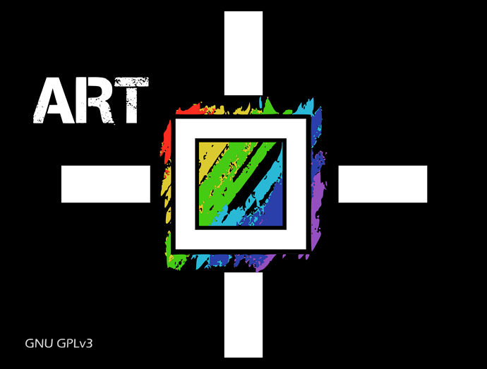
My 2 cts: the logo with brush strokes indeed makes me think more about painting software, such as Krita, than about photography software.
Like, you have an empty canvas and you create painting art.
A logo like the one RT uses makes me think about working on a colour image which already exists, and that you improve with specific tools.
But I don’t have any good idea to make a proposal myself.
Thanks everyone for your comments! I have decided for the logo that you now see on the webpage. I understand that it’s not perfect, but:
- I like it
- it has character
- it’s not recycled from Wikipedia
- it’s as least as evocative of what the software does as the gimp logo

That said, if a better one pops up, changing it is fairly easy… So, if you are unhappy, feel free to keep posting alternatives!
Alberto, keep it, it is very different from those of Darktable and Rawtherapee and over time it will participate in the identity of ART.
SM
Ciao Alberto, hope you stick with this, it’s striking and different. 
Hello @agriggio! My tiny contribution. Sorry for the delay. ART a fork of Raw Therapee 2|690x432
I will be a dissenting voice, sorry. The old logo was cute and well defined. The new one is too fuzzy for my taste.
ART
A RawTherapee fork
or
ART
A fork of RawTherapee
Hi, just for fun I redesigned the RawTherapee logo and then made a slight modification.
Let me share it with you in this subject that I think is apropriate.
PNG :
SVG :
Simple, elegant, photography related, RT related.
I Love it!
Most good lenses have an odd number of aperture blades. Though I have to admit, that the current RT logo also has an even number of colours ![]()
Nice! I think this would be a very good revamping of RT’s logo 
For ART, the ship has sailed – I like the current logo and I’m not going back (yet…)
Thank you for your feedback.
Good remark @heckflosse , I had just started from the RT colours.
No problems @agriggio , as mentioned above it was mostly for fun. 
IMHO a logo should be compact and ART should be inside the logo.
I would also add something to the word ART, otherwise you are near impossible to find on google. Reminds me of the great German band CAN, they would face similar issues today, but at that time there was no internet.
I think think it’s also a good idea to show its Rawtherapee heritage, maybe do the RT logo with crayons.
Alberto hopes that ART will become famous, as Word, Apple, Windows are… ![]()
To get famous it helps to get found in the first place.
ART - RAWditor
ᴬ ᴿᵃʷᵗʰᵉʳᵃᵖᵉᵉ ᶠᵒʳᵏ
Of course not us here, we know where to find it 
it’s more the contrapositive, i.e. I don’t care at all whether google can’t find it 
@agriggio Does the current logo exist in .svg vector format?
Here: Bitbucket
Thank you!
On the other hand the svg has a png in base64, it’s a pity 
xlink:href="data:image/png;base64,…
maybe @jllailes has the original in vector format?


