What story are you trying to tell with this picture? Do you think the sharpness supports that narrative, or detracts from it?
[edit: @priort ]
What story are you trying to tell with this picture? Do you think the sharpness supports that narrative, or detracts from it?
[edit: @priort ]
Not sure if you are directing at me or the OP…I would be happy with my result in DT. I guess I can load up and export his efforts to try and compare to see if I agree that RT is better or worse. It was left there for him to comment. I do think the capture sharpening on RT does do a nice job on fine detail or the perception of it but I think it remains to be scene how the diffuse module compares. I have not really taken it past the presets. On my few attempts to adjust beyond the presets I usually get pixelated result…it requires a bit more reading on my part and some experimentation…
Just throwing this out there but using the new version of chromatic aberrations module I feel like setting the channel to blue vs the default of green gives a noticeable improvement or the perception of improved sharpness in fine detail…perhaps others can try it and evaluate zoomed in and see if I am making things up or this is true. I shot a little screen capture of a zoom on my leg and initially I turn it off and on with blue then green then red and then maybe the best is with CA on just cycle through the channels finishing on blue…(not sure if it will show up) noticed this also in a play raw I did with some foliage…trees in the distance seemed to sharpen up…
Indeed. Default channel is green because it is usually less noisy, so better default in general, but depending on the image other channels may be sharper. Quite frequently, blue is the sharpest one, but it depends on the image and amount of chromatic aberrations.
To me this looks way oversharpened and “digital”
That’s a very nice tip, thank you
Hello priort,
your Jpeg is sharp enough, of course - but again, I see that the image looks crisper and rougher than the RT result. With RT everything is finer and still the leaves look clearer and sharper. Exactly what I have already noticed in my tests. It’s not so important with this subject - but it does matter with Protraits.
Hello Matt-Maguire,
your thoughts are absolutely important and correct. When I saw the subject, I wanted to take a photo that did something of the chaotic arrangement and the semi-decaying objects. Sure: more sharpness would hardly make the image more interesting. But I chose this image just to address a question about sharpening.
My current question is only whether I want to stay with RT or whether I should switch to the much vaunted DT. I’ve spent quite a few hours learning DT and I’m somewhat comfortable with it. Only I notice that the sharpening with RT seems to be unattainably good. And this I would like to clarify in the forum if I’m doing something wrong when sharpening with DT.
I wouldn’t judge DT by my edit. I likely pushed too hard trying to get too much sharpness hence my comment. Perhaps a few others with more skill will have a go at it…
Turn off capture sharpening in RT and the results will be much closer. There is a module in DT master that is similar.
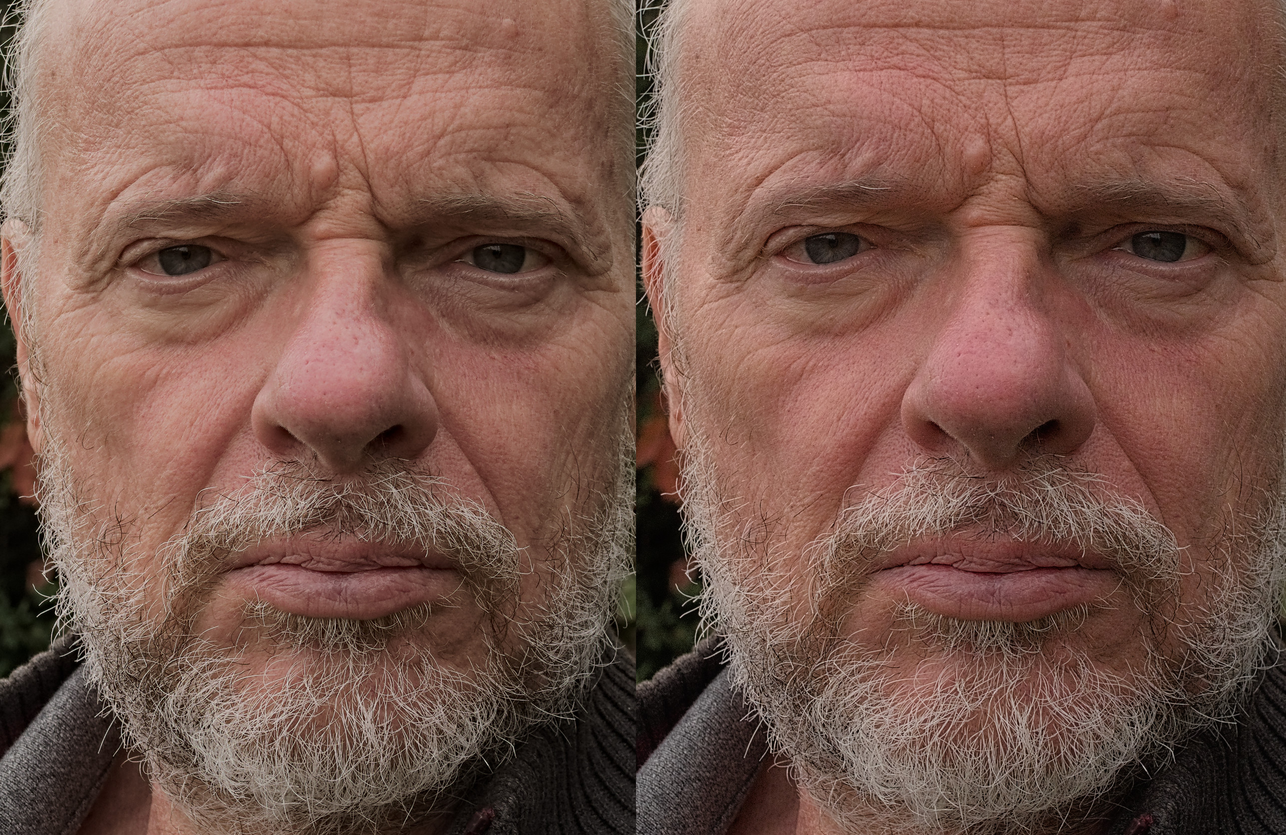
Here is another example: Here you can see how fantastically well RT can sharpen. In RT the skin is more delicate and much more natural, but at the same time the beard hairs are much sharper, more plastic, even the eyebrows are much clearer. This gives the image a much more realistic look.
My question, is it possible to achieve the same in DT? I have not been able to.
iBb.RW2 (23.1 MB)
iBb.RW2.pp3 (12.5 KB)
iBb.RW2.xmp (13.3 KB)
If someone manages to create similarly good results with DT, I’m happy, if not, I’m just as happy to know I can use RT.
Dt does not currently have a module that can match the might of rt capture sharpening. However in development master version at GitHub it does have the diffuse or sharpen module, which is designed to do something similar. That would be your best point of comparison. You can either use it now by downloading development master, or wait til Christmas for official release.
Assuming for your comparison images that your RT is the reference I would esp for color try to use the same white balance in DT to better match the color and Euclidean color preservation seems to work better if you use filmic for this one (my bias of course) and use surface blur to knock down some detail where you don’t want it or the details threshold mask if the results are too detailed globally as this will focus the effects on the areas of details . The DT edit used for comparison is too crunchy compared to your RT edit ( you seemed to use multiple sharpening modules) and maybe a bit over contrasted with local contrast instance…setting highlights to zero in your local contrast edit or maybe don’t use it…it seems to put a shine on the face that you don’t have in RT… That’s what I noticed from a quick look as I saw them others will no doubt perhaps have a different evaluation.
Edit: I did a few quick edits…your wb is a bit warmer in RT than what DT would start with and it looks like maybe you tweaked it in RT…On my monitor your RT edit looks either a bit out of focus or maybe blurred. I tried to do a couple of edits where I did not use filmic and tried to add something like your two tone curves…In the end using the details threshold and some combination of contrast eq, local contrast , or diffusion I think you can come pretty close if your reference for detail is the eyebrows and hair…as for the skin …exact tone and level of detail will be a personal taste…here are the xmp files from a bit of messing around I did…they may be of no use but I will share them anyway… From 3.7 dev…
iBb_03.RW2.xmp (16.0 KB)
iBb_02.RW2.xmp (7.0 KB)
iBb.RW2.xmp (10.1 KB)
iBb_01.RW2.xmp (14.6 KB)
iBb_04.RW2.xmp (26.6 KB)
iBb_05.RW2.xmp (8.9 KB)
Side by side, darktable on the left, RawTherapee on the right. darktable is using the diffuse or sharpen module preset sharpen demosaic (AA filter) with the iterations set to 3. I also adjusted exposure and used color balance rgb to try and get closer to the tonality of the RawTherapee image
Another side by side: RT on the left, DT 3.6 on the right.
I tried to roughly match overall tone and color.
When coming to sharpness, in RT is being used “Contrast by Detail Level” here, so I used Contrast Equalizer which is the equivalent function in DT.
Sharpness looks similar to me (and it’s too much for my taste in a portrait), maybe RT does a sligthly better job for fine details in the beard, while DT captures skin texture better
This thread shows something else I’ve been pondering. RT tends to give faces a sort of luminous colour. I don’t like it and few if any other software produce it. Anyone know what it is? Perhaps in a new thread?
Todd,
When I open 3 of your sidecars I get a strange effect at the edges:
I see it on 03 and 04 also.
Edit: It comes from lens correction.
I found this too, ie that much of the look of the RT edit came from the CBDL that seemed to have the largest impact…there were two tone curves also that I tried in a couple of edits to roughly mimic instead of using filmic…
I saw it in one preview. I didn’t notice it in the others. I thought it was a preview artifact…I guess not