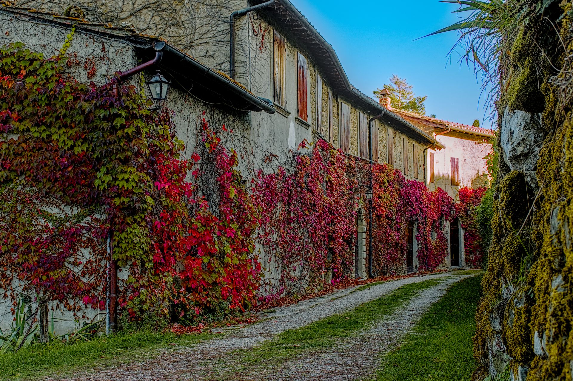
Hello,
here you are the photo to play with…
DSC_1319.NEF (23.3 MB)
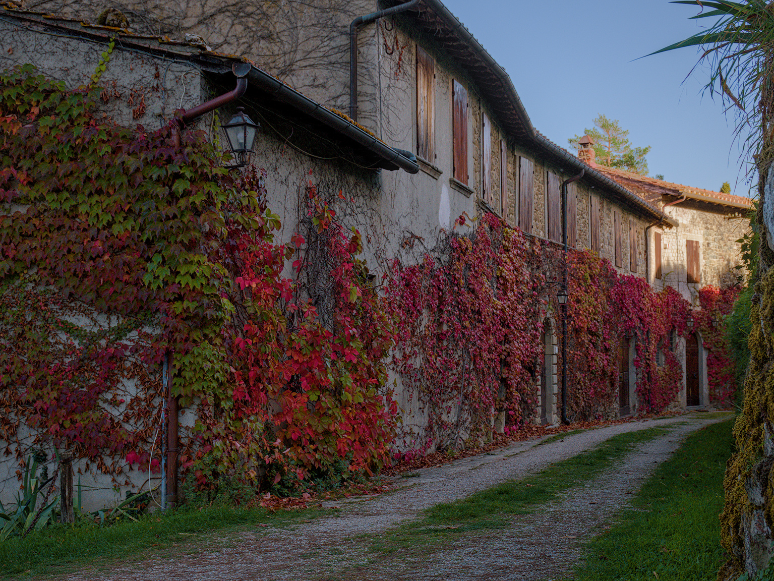
and this is my attempt with darktable 4.4.2

the sidecar file :
DSC_1319_01.NEF.xmp (55.2 KB)
This file is licensed Creative Commons, By-Attribution, Share-Alike
Hello,
here you are the photo to play with…
DSC_1319.NEF (23.3 MB)
and this is my attempt with darktable 4.4.2
the sidecar file :
DSC_1319_01.NEF.xmp (55.2 KB)
This file is licensed Creative Commons, By-Attribution, Share-Alike
Hi @Ivan_M76, and thanks for the play.
I believe it might be a Parthenocissus quinquefolia,
and how red do you want it to become? Here is one
swift play:
I just added one module to your history: the color look up table.
Have fun!
Claes in Lund, Sweden
Thanks for the play! Three different approaches:
Same edit …second one relative render first is perceptual…
DSC_1319.NEF.xmp (16.7 KB)
EDIT Maybe a primaries tweak for more red less orange… bit brighter
Edit:
Add in a sigmoid edit with some CB gentle warming… (new sigmoid)
The last image has strong halos in the sky. Did you perhaps also play with tone EQ?
Doesn’t show in xnview which is usually faithful or on 100% zoom in DT or on WIndows photo…
Maybe I will re upload and see if it is still there…
Zooming I did notice I enhanced or created some CA in the palm in the sky so I could address that but if you look … same in DT 100% zoom… not showing…
Could be a browser colour management issue (I see it in Firefox and in Chrome). I don’t see it in Geeqie and in the Gimp. Sorry.
Edit: it’s visible in darktable (my display is wider than sRGB).
Edit2: it’s also visible in t the Gimp if at load time I select Convert → Perceptual (but not with Relative, or not with Keep).
No apology. I was trying to sort it out… so in win 11 you see it in the preview in file explorer but not when you open it in photos… It could be the rendering… I sometime do relative as I like the punch but sometimes perceptual is nicer when it doesn’t look washed out… In this case I posted the relative rendering so maybe the gamut management varies between apps… Here are the relative again and the perceptual one that I didn’t post for the sigmoid edit…
I had added some blue to the sky with an instance of the tone eq… simply dropping the opacity a little on that allows for a relative render… but its a good example of the different way they handle out of gamut parts of the image…
Nice shot!
Here’s my go - I used the brightness sliders in a second instance of color calibration to raise the reds, as well as a little colour grading in color balance rgb.
DSC_1319.NEF.xmp (16.4 KB)
Here’s my attempt in DT 4.4.2
A bit of cropping and trying to re-create the late afternoon in a Mediterranean village …
DSC_1319_02.NEF.xmp (16.4 KB)
As soon as I read “Help me to pop up the reds!”, I thought of the color similarity mask in ART. I used it to select the reds and increase their saturation. While I was at it, I used another color similarity mask to restore the blue in the sky a bit. I tried not to get carried away with it to keep the image believable.
DSC_1319-1.jpg.out.pp3 (15,1 KB)
This is a challenging image. I suspect this is one scene that would have benefited from a HDR approach using bracketed exposures. But here is my attempt.
Red Ivy_02.NEF.xmp (14.7 KB)
The end result here really seems to rely on the intent. If you keep it darker which may be more faithful to the original and the scene light you don’t really do much with those lovely flowers… If you want to show off the color then you go brighter lifted version which may not be what the original was… I guess there may also be a sweet spot in the middle…