[RFC] [Builds available] Masking panel revamp and new masking possibilities

Why

One of darktable’s strength is undeniably its super powerful and flexible masking system. However, there are some hardcoded limitations in the current system (in terms of mental model, UX and capabilities) that, to me, always felt arbitrary and introducing unnecessary friction. Among the main pain points:

  • Disjoint mental models apply to shapes, parametric and raster masks
  • The hard to understand include/exclude and positive/negative polarity used to combine drawn and parametric masks
  • Parametric channels can only be intersected, whereas shapes can be combined with different operators (e.g., union, exclusion, etc.)
  • Only one parametric mask (albeit multi-channel) per module
  • Raster masks cannot be combined with anything else, it’s take it or leave it, which greatly limits their usefulness
  • A UI divided between a module’s mask panel and the mask editor, which sits all the way across the screen and uses a different mental model (set operators instead of “exclude/include - positive/negative” as in the main panel)

So, over the course of the last weeks I started working on a proposal to refactor how masking works and move past all these limitations.

The result

Behold the Flexi mask panel (this is an awful working name, but for the time being it will do):
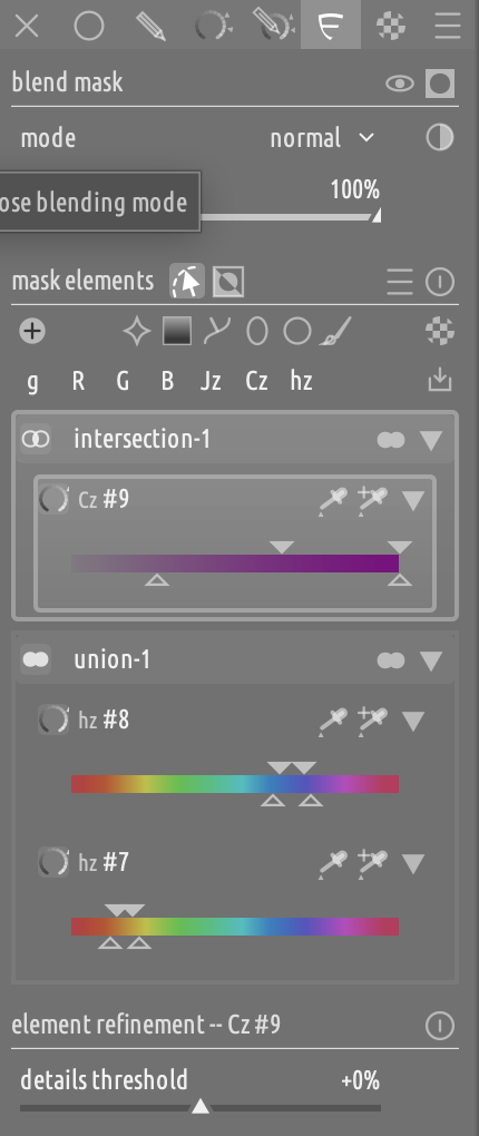
What this is

  • A working implementation of a proposal to revamp the mask editing UX in darktable around two guiding principles:

    1. A simplified mental model, in which all mask elements are mask elements (be them parametric channels, shapes or raster masks) and can be combined using the same set of operators
    2. A focused UI where all mask-related functionality lives in one place, as opposed to being split between a module’s mask panel and the mask editor.
  • A personal endeavour, which at the moment of writing has no buy in from @Pascal_Obry or the dev team. In fact, no one knows that I was working on it.

  • A way to collect feedback from the community (and the devs) on a concrete proposal and a working prototype instead of just handwaving and daydreaming.

NOTE: While this is a very early prototype, I have done countless iterations on it. I have tried hundreds of different configurations and tried many different solutions. What I propose here is not just a “quick and dirty sketch” of a feature. It is the result of a lot of thought and experimentation. This is not to say that there is no margin for improvement, but rather to stress the fact that the choices that I made concerning the underlying model and the UI are based on thoughtful considerations and experimentation.

What this is not

  • A preview of a PR ready for review
  • An assertive statement about how masking should be done
  • A polished, finished product with no gaps and all bugs squashed out: everything more or less works, but
    • the code is defnitely not production quality and
    • I didn’t spend too much time trying to make it efficient
  • Something that has already been discussed with @Pascal_Obry and the rest of the dev team and that got some kind of green light from them (I know that I said that already before but I think it cannot be stressed enough)

Documentation

Overview of the Flexi panel

In a nutshell:

  • Parametric channels, raster masks and shapes are all mask elements.
  • Mask elements are arranged in groups, which are composed from the bottom up, like the pipe.
  • You can have as many groups as you like, and as many elements (of any type) as you like inside each group. So you can have a group where you combine a raster mask with shapes and parametric channels, and you can have multiple such groups in each mask.
  • You can apply refinements at the element, group and whole-mask level.
  • Within each group, elements are unordered and they are combined with a single within-group operator: union, intersection or screen (i.e., soft union, to smooth out feather overlaps).
  • Each group is composed with the previous group using a between-groups operator (i.e., all the set ops already available in the mask editor, plus “screen” and “multiply”).
  • You can drag and drop groups and shapes to rearrange stuff.
  • You can create group-presets to store and reuse group layouts that you plan to use frequently (only the groups and their ops are saved, not the mask elements).
  • The clicks-per-mask ratio is not higher than the classic panel for simple masks, and I would argue that it is much lower for more complex ones.

This README file explains in more detail how the Flexi panel is different from the classic one:

Demo

In this short demo video, I am desaturating the high saturation blue and orange, to demonstrate a union of parametric channels:

User docs

For the brave people who want to try this out

Builds

Check the Releases page of my darktable fork, and download the latest release tagged with masks_revamp, e.g.:

My ask to the community

Ok, this is the most important thing of the whole post, so I left it for last.

I would like if as many people as possible could give it a try, and let me know what they think. I don’t care so much about the fine details (i.e., I do not like this icon, or this icon should go there instead) as much about the mental model, the functionalities and the main UX abstractions:

  • Is the new mental model simpler and easier to understand?
  • What are the main wins and losses of this new proposal?
  • What do you like and would like to use?
  • What do you think that is not necessary and could be done without?

In all cases, please factor in your habits and biases, and try to judge it objectively. We all (including myself) are certainly more proficient with the “classic” mask panel, because of muscle memory and because we trained ourselves extensively with it.

What do I expect from this exercise

Not sure. It will depend on the response of the community, and especially that of the devs. If there is an agreement that it’s by and large a direction that we want to pursue, then we have a good starting point that we can start refining iteratively. If there are some clear NOs and DONTs or we find that the proposal lacks in some obvious way, then I am happy to iterate on it until we reach some kind of consensus and then try to get this merged. We can also decide that we do NOT want anything like this, which is also a totally plausible final state.

Thanks for reading this long post, looking forward to your feedback!

P.S.: A special shoot out to @Terry, with whom I had discussed my intention to do something along these lines a few months ago, @martinus who was asking for better group support a couple of days ago, @s7habo because I would really love his feedback and @Thad_E_Ginathom who is keeping an eye on my work on masks :slight_smile:

P.P.S.: Please, let’s keep this discussion focused and grounded on technical considerations. There is a lot to unpack and if we start branching out in unrelated directions it’s going to become very messy very soon.

29 Likes

@Masterpiga Very interesting concept! Incredible work. Awesome demo! I have a couple of questions.

  1. How does the feather guid / radius, blurring radius, mask opacity / contrast now work? Are they over the whole grouping? Maybe I mis understood.

  2. In my the post from a couple of day of I was referring to merging (consoling dating) of drawn mask… is that included in your plan as well?

  3. This is maybe controversial. Wouldn’t it be better UI wise do this is all in the ‘mask manger’… rather underneath every module? With more complex modules like color balance rub, the module itself gets in the way of doing this…

2 Likes

Thanks @martinus, please give it a try :slight_smile:

  1. You can refine at the element, group and whole-mask level. Refinements are cumulative, not exclusive. So, in the same group you can refine each element in a different way, then you can refine the whole group to make it more uniform, and then refine the whole mask to blend all groups together nicely.
  2. A group is already consolidated, in the sense that you can move it around and refine it as a whole. Other functions could be added.
  3. Where the panel should live is a matter of preference. This subsumes the mask manager, so that could go if flexi was merged. Ideally, I think that it would be nice to offer the following options: (a) embedded in the module (the current implementation); (b) no in-module panel, replace the mask manager - your proposal; (c) a dedicated panel on the right, next to the iop modules; (d) a floating panel. My personal preference would be (c) or (d), I don’t like (b) because one has to move across the whole screen to switch between mask and iop editing.
2 Likes

Masking in darktable could certainly use some love and refinement, so I really commend the initiative.

My first thought. Some time ago I wanted an effect to apply to the g and b channels, and only the darker parts of the r channel. I used a parametric mask on r channel to take it out of the highlights, which had the unwanted consequence of also taking out of g and b channels for that range. If i understand correctly, it looks like this effect would now be possible with all the different operators?

I am not sure I understand what you mean but maybe yes, you should give it a try :slightly_smiling_face: The multiply operator may be what you were missing.
1 Like

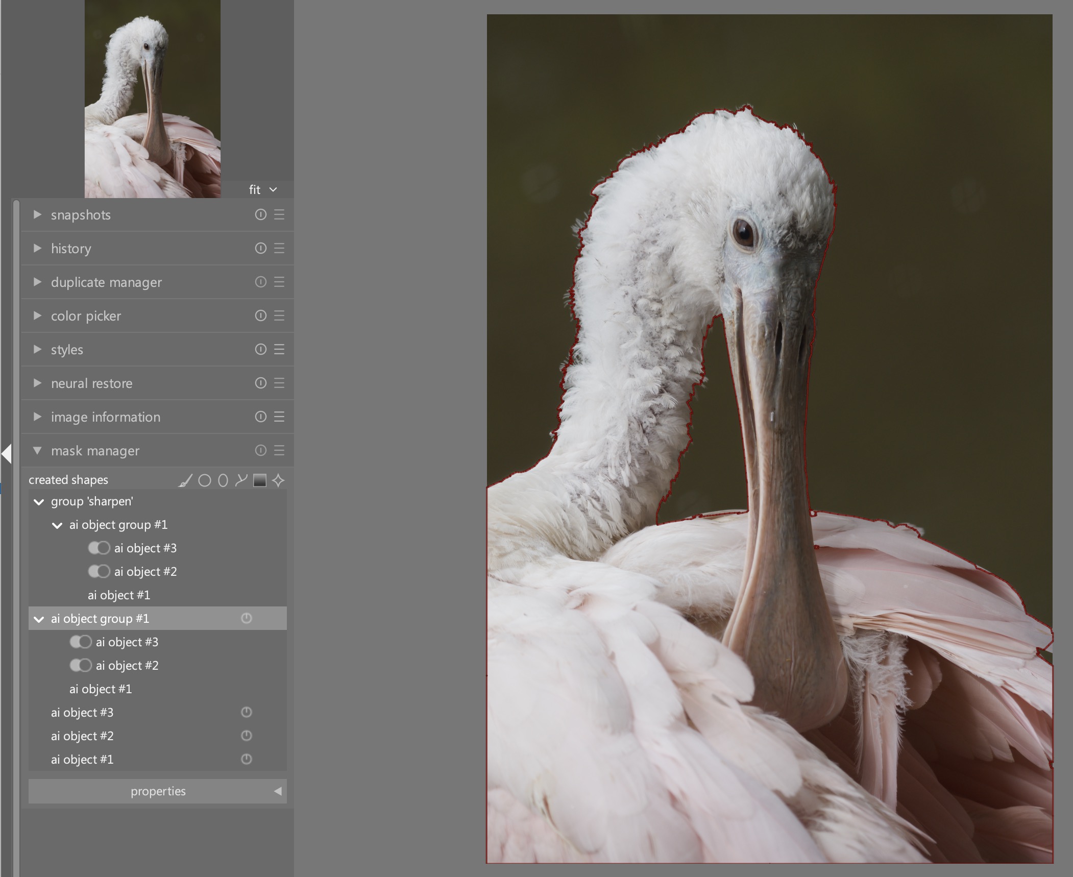
Let me clarify a bit what I looking for… this is my image (of course I could / should have use a parametric mask here, but this is for the sake of the example)

My general feeling is: why - for crying out loud - are there 12!!! items in my mask manager?? This boils down to two irritations I have with the masking:

  1. currently it not possible to merge / consolidate the ai object group #1 into one mask. I will never need the individual mask… only the whole subject

  2. I never understood why there is a copy of the mask for each module that is using that mask… I can’t see any practical reason for that… If what to change something to the mask, to make it specific to a certain module… I can make a copy of that mask myself…

As a personal preference I don’t like floating panels. But I can see people liking that options. There are not much floating panels around. But I think that the current implementation is the most problematic one.

darktable’s data model does not allow a module to publish more than one raster mask. I.e., you cannot rasterize each group independently and then use it upstream. This proposal (in its current form) does not change that.

However, with Flexi you can get around it by (1) creating the mask once, using as many groups and whatever combination of elements you want (shapes, parametric, raster) and then (2) using the whole thing as a raster mask in upstream modules.

Unlike with classic masks, you can combine several raster masks with parametric masks and shapes, so there is no loss of generality. I.e., you don’t have to choose between the raster mask and everything else, you can mix them as you please. You can have a mask for each subject, bring them together in the same mask and then add gradients and parametric filters on top of it.

The new model is way more expressive than the classic one.

4 Likes

Thank you very much!

My first thought is that this looks amazing but is more than my small brain can actually handle. But… That was my first reaction to parametric masking as it is today, and that I now don’t find difficult. I have absolutely wished that I could create a mask with includes/excludes for one channel. You’ve included that in your demo :).

I’ve resisted running more than one copy of dt up to now. I’ll give that a rethink. But what I can’t rethink is the number of pictures (and the people in them) that await my work (I’m glad I’m not a professional!). I really should be editing right now , not reading about it.

Consequently I can’t really offer testing soon.

Just a couple of general thoughts. I don’t like the mask manager. I too never understood why it has so many entries, especially since ai masks. I keep the left-hand panel collapsed during normal editing and don’t want to have to do more stuff there. Thus I’m in favour of keeping everything with the modules.

When reusing masks from another module, there are two ways of doing it and I have not got my head around the difference. But I would like to be able to add a copy of a mask that I can alter in that module without affecting the source mask.

I find it difficult to get my mind around the combination operators — but that’s just me and it needs more practice as only once in a while do I need more than inclusive or exclusive.

PS… Thank you for all the good work!

2 Likes

I like what you are proposing. I definitely like the idea of more than one parametric mask. My only concern is that I often use the + or - polarity symbol to quickly invert the mask for various reasons. I am confused how this would be achieved with your proposal. but I also presume you could improve this feature by allowing the individual mask elements to have the polarity changed. At this point of time I believe that in the case of multiple drawn mask elements they all must share the same polarity, but I might be mistaken.

BTW: I love the fresh ideas you are bringing to DT.

1 Like

Hi Terry, that is already possible. You can CTRL+click a row icon to invert each mask element or group. This is documented here. And, unlike with the classic mask, you can change the polarity of individual shapes as well.

1 Like

I should have stated in DT 5.6. It seems you have already done what I asked in your proposal.

I like the idea. It’s interesting to be able to use multiple regions of parameters (e.g. only orange + only blue) in one module instance. Might make drawn masks easier to manage too.

I like the ‘solo edit’ button too.

Not sure if the ‘ctrl/shift’ modifiers for functions can be replaced by extra buttons? I know, extra buttons in the UI, but I’m wondering how to signpost that extra functionality clearly. (Is it okay if it’s just mentioned in a tooltip maybe?)

I was only wondering about parameter input values, but this seems to be per-module still? I can’t find a download link at the linked builds page.

1 Like

Sorry, I didn’t understand what you mean.

Check the Artifacts section at the bottom of the linked page.

I think your plan to improve the interaction of the masks is great. The idea of grouping the masks—regardless of the type of mask—and letting them interact with operators is very good and makes sense.

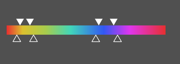
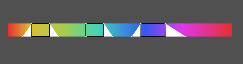
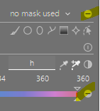
When it comes to individual parameters, I think it would be much easier and clearer if you could select multiple segments for a single parameter instead of having to duplicate the entire parameter each time you want to combine different segments.

So instead of, as in your example, combining yellow and blue by copying the hue parameter twice and then combining the blue and yellow ranges with the union operator, you could have both segments on a single copy:

Yes, I agree with that as far as drawn masks are concerned.

However, I would have preferred it if the masking area for modules were an extra dockable window that you could dock anywhere you like in the right or left panel. Then, depending on which module is active, the corresponding masking options would appear there, just as they do now below the module.

In any case, thanks for your effort!

If I think of anything else, I’ll let you know.

4 Likes

Thanks for your feedback, Boris! I like the idea in peinciple, but:

  1. That widget is already complicated, I wouldn’t make it even more so
  2. It does not scale well to more than two selections
  3. Also with two selections, the ranges may be partially overlapping, and understanding which indicators refer to which range would be complicated
  4. You would need a separate widget to express the combination operator (union, intersection, screen), which would deny the simplification of the mental model (per group operators, atomic mask elements).

That said, I agree that there is some wasted real estate and a more efficient (space wise) rendering should be possible.

6 Likes

I do like the ability to drag-n-drop the elements and the groups, and the ability to change the operators. There is a lot here to unpack, and probably some re-learning, but once it clicks, I think you’re onto something powerful here!

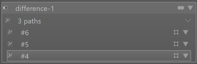
I don’t use many complicated masks, but when I do, I want it as intuitive and easy to use as possible. My biggest frustration with darktable’s masks has been the frustration with trying to include or exclude certain elements of the mask - I think you have done a nice job having the simple “difference” operator available to help fix that.

For me, when learning a new UI, I prefer not to use the documents first - I believe the more user-friendly the design is, the few glances at the documentation. That said, it took me a bit to figure out how to change the operators between groups - I was looking for “difference” and it’s the (on my screen) very small icon to the left. Once I found it, I now know, and I think it’s in a good location.

I did find myself getting overwhelmed trying to figure everything out - I don’t know how much of that is a UI issue and how much of that is just the fact that masks are complicated.

The biggest issue I had was with the “triangles” on the far right - what was I opening, what was I closing, why were the things showing that were showing.

One of those things that made it overwhelming are the triangles on the far right - after awhile, they get lost as to which item does what and if it’s opened or closed. Most triangles like that in darktable are used to open/close a section (hence a frustration noted above): open the tip points down, closed the tip points to the left. You have them set as tip pointing up to open a control for that group/element.

And, because those triangles are used to open/close things, I kept trying to “close” a group so only the name was showing and none of the elements were showing - I kept clicking on the far right hand triangle to “roll up” the window.

@Masterpiga If you need specifics with screenshots I’d be more than happy to provide them.

@martinus yes, when there are 3 or more shapes in a group they can be “grouped and closed”: darktable/dev-doc/flexi_masks/user_docs.md at masks_revamp · masterpiga/darktable · GitHub
Open with 3 of the same type of element:

Those 3 elements closed:
2026-08-06_10-32-50

2 Likes

I’m bringing this topic up again to make sure we haven’t overlooked any important aspects.
I think it’s better to clarify the fundamental questions before you start coding:

That’s true, but it might be worth considering adjusting the sliders to be like the ones in DaVinci Resolve, for example:

We could think about adding something like a zoom option, similar to how we currently have boost factor sliders for the brightness parameter.

If the areas overlap, then it’s one area, not several. You expand one area instead of creating two.

Combining operators doesn’t make sense to me within a single parameter. Either you have one larger selection or several smaller ones along the entire range of the parameter. Anything else is excluded from the total range anyway. Only inclusion is relevant here.

Combining operators between different parameters makes sense, as you demonstrated in your example with hue and saturation above.

6 Likes

Thanks, Boris, very insightful as always!

I like this, it would save some space! Kind of orthogonal to this proposal, but good to keep it in mind, thanks!

(I mean, this would warrant being implemented regardless of this proposal, at least the single-range version, see below.)

Not necessarily. You may want to have an intersection between the tapering areas (slopes) rather then within the straight areas. It’s a niche case, but I wouldn’t trade off expressivity just to have one less slider around.

That is correct, unless the two tapering areas overlap, in which case “screen” and union would yield different result. One would have to choose which one to use. I would argue that one would always choose screen in this case, but then the mental model becomes more complicated. It is no longer just “all elements within a group are combined by means of the selected operator”. You have to add a clause that “multi-range parametric channels are internally combined with the screen operator before being combined with the other elements”.

IMO, the (1) increased complexity of each widget, (2) the loss of generality and (3) the complication of the mental model are not offset by the reduction in the number of sliders.

4 Likes

Agreed, that would be my preference too.

6 Likes

If the markers are thought of as opacity values, then the two centre markers are 100%, while the two outer ones are 0%. If there are two overlapping sections, all that happens is the outer opacity never gets to 0%, they overlap before they get there. It is just one shape (or range) with varied opacity. For this to be possible, the outer markers of different sections only need to be allowed to overlap.

That solves one dilemma, but not the other of having different operators between the two sections, since they are just one section. So either, a) don’t provide that use case, since it’s likely to be very niche, or b) allow both, where users can either add multiple sections to one slider (thus saving vertical space and complexity), or they can choose to add another slider with a different operator.

2 Likes