[RFC] [Builds available] Masking panel revamp and new masking possibilities

I just played with it for a few min before I had to head off to bed…

One comment, I found it too easy to delete things with a right click. I can see that this might pass with time and use but I deleted things a lot by mistake looking for context options. I wonder if you could put a deleting x where you now have the expand icon for opacity and find room or space for that in the bottom corner or create the expand some other way… I just think a dedicated deletion for options that you had to visually initiate/select rather than right click would be good, or give people the option…

I didn’t see initially and I am tired so sorry if I missed it, but I didnt see how to replicate the drawn and parametric mask in a single group, but here I found that using two groups I could get it done as I could use a different interaction between groups that I couldn’t get using it in the same group…

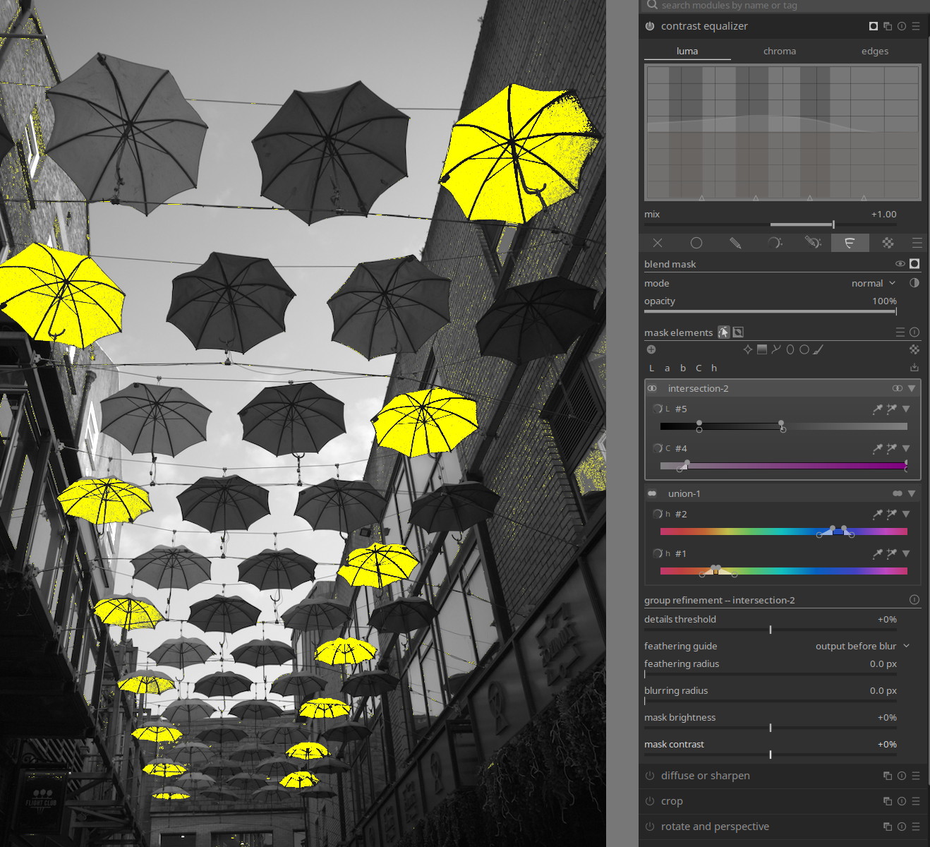
Would this be right ( the way I did it) … ie two channel parametric for the sky and then confine it with the path in a second group set to interact…
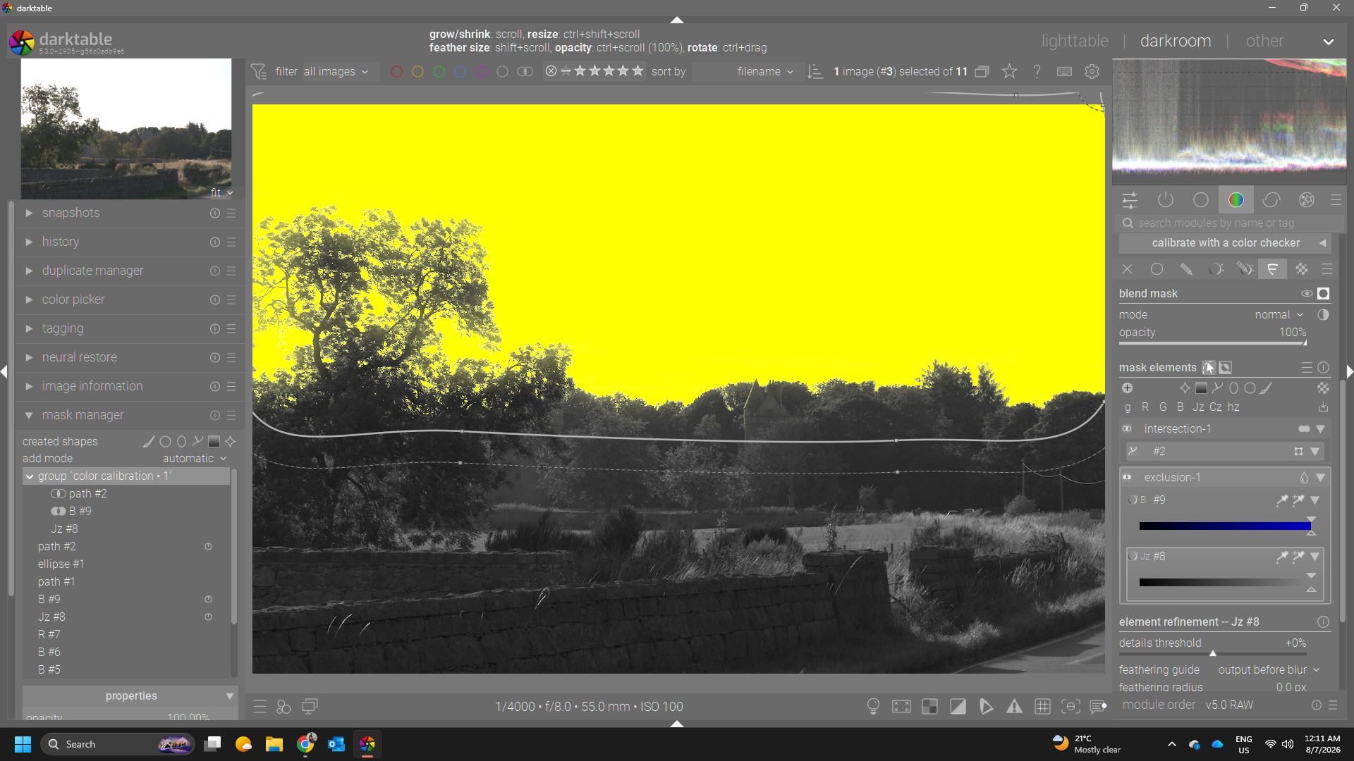
This to restrict the parametric mask which would otherwise be…
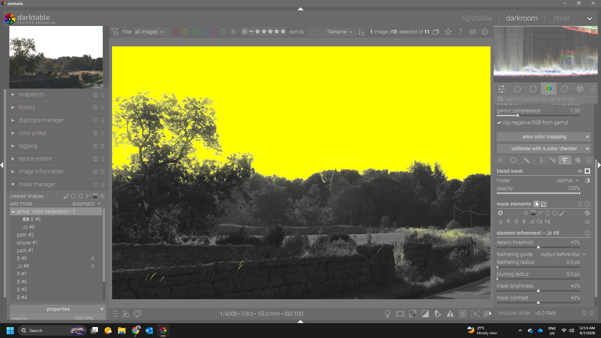
ie some small area that you would want to exclude…

One other thing I noted, if you delete a group the whole panel collapses and the icon for flexi is still active so you have to unselect and select it again to continue with edits…

Just a few quick things…I will try to do some more testing… This is really slick and at first glance you don’t need all the mode buttons for drawn parametric and drawn and parametric and raster as you can construct all those in organized groups in Flexi it would seem…

Its really really nice imo…

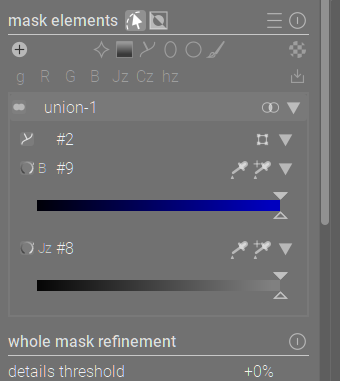
EDIT, with Ctrl click I could name elements in the group but I couldn’t see how to name the groups away from default…is that intentional??

EDIT 2…figured it out I was changing the group to group mode to get it …changing the within group to intersect was the ticket to get to that typical use case in one group…
2 Likes

I would be in favor of this solution. On the one hand, I appreciate the reduced complexity of using just one slider, because I think this would be the most common approach in practice, without complex masking.

On the other hand, a key argument in favor of multiple sliders combined with different operators—as @Masterpiga suggested—is the ability to combine areas with different levels of transparency. For example, with the hue parameter, I’d like the blue area to be affected 100% by the corresponding module, while the red area only partially, perhaps 30%.

1 Like

Thanks a lot for the valuable hands on feedback, Todd!

I agree. I used “right click to delete” because this is how drawn elements are deleted from the canvas. However, I am not a fan of this (also on the canvas, too easy to delete something by mistake) and in general I do not think that it is good UX.

Note that I didn’t use context menus because they are almost banned in darktable. I tried to make a case against this decision in the past, but my line did not pass :slight_smile: However, this is exactly the case where a context menu would make a lot of sense. There cannot be an explicit widget for everything that you would like to do with en element (delete, solo, solo-edit, invert, properties, rename, …) and a context menu would be the best way to make all those options easily discoverable. Having to do without forces one to either (1) cram a lot widgets in the UI, or (2) lose discoverability and rely on tooltips, which yields suboptimal UIs. But I won’t spend time refactoring this to use context menus unless @Pascal_Obry blesses this course of action, as otherwise it would be a lot of wasted effort.
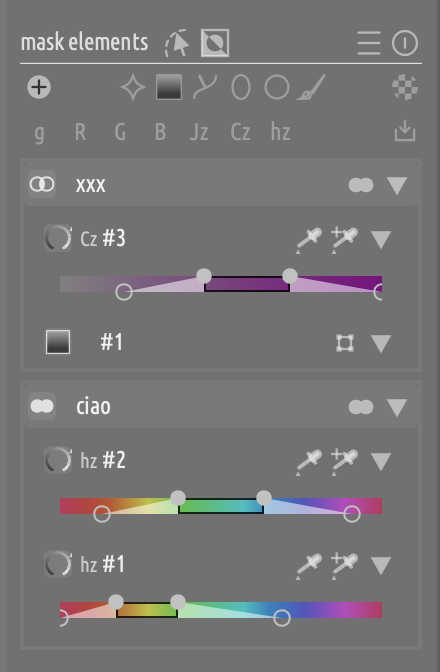
Yes, there are a couple of bugs related to panel refreshes, every time that I squash one another one raises its head :slight_smile:

As you already discovered, the easiest way would be to have one single union group with with all three elements and the within-group operator set to intersect. Three groups with one element each, with between-clusters operators set to union, intersection, intersection (respectively) would achieve the same result. It’s all set operators, so generally there is more than one way to achieve the same result.

Hidden feature: if you click on the “hamburger” menu on the mask panel header (the one with the button to select which mask to use) you can deselect the mask types that you don’t want to use. But regardless, yes, Flexi subsumes everything that you could do with any existing panel + mask editor. I am also not sure why “drawn” and “parametric” are still around, as they are completely subsumed by “drawn + parametric” already.

No, that’s a genuine feature gap.

1 Like

Thank you all for your feedback!

Updated version with a few improvements from the conversation so far:

  1. More compact range selections (thanks @s7habo)
  2. Groups can be renamed too via CTRL+click (thanks @priort)
  3. Issue with disappearing groups hopefully fixed (thanks @priort)

New builds will be here

8 Likes

I would add my encouragement to take this forward. It looks a lot much more logical than the current set up. Currently if I try and combine masks I just flap on random bits of the mask manager until it works and forget how to do it for next time…Thanks for your work so far!

3 Likes

@Masterpiga …
without getting my hands on this new addition so far , as I have no idea how to get this into a working build for me personally , I am quite impressed what might make it´s way into future versions of DT !!!
So I can´t give any constructive feedback … sorry .
Just my wishes that you will be successful

Cheers Andreas

1 Like

Hi Andreas, builds for all platforms are here:

Scroll at th bottom of the page. In the Artifacts section you will find the packages ready to install.

Ah ok … thx for the info .
Will try later …
Good luck for you

This is looking very impressive. Some small feeback:

  1. The black border of the now selected area looks a bit of thick side compared with the rest of the ui. Maybe slightly thinner is better.

  2. The number of buttons and info is getting it bit overwhelming… I am wondering…
    do we need these indicators? Scherm­afbeelding 6 as I think it is already clear for the color slider if it is a g, R, G, B … etc… Also the number of color pickers and triangles get’s a bit much… I don’t have a solution, this is just an observation
1 Like

Some sliders are similar (g, Jz). Also, the indicators are there for consistency, and the icon state is used to signal the inversion state.

I agree that ideally there should be leas clutter, though, especially on the right side. Thing is, without context menus (see a couple of posts above) everything that is not on screen is de facto hidden.

One could make most of the controls show only on hover. I had something like that at some point. It looks more polished, but it is also less discoverable and less immediately interpretable.

I guess I need to create a github account to see the download links on that page?
I found the downloads at the releases section now, and I tried that. Works nicely. Don’t worry about my ‘parameter input’ question.
Quick testing:

2 Likes

Very cool! This is a feature I’ve been dreaming of, except more powerful.

I think it’s to quickly turn off shapes or parameters, perhaps to see which is causing a problem. And on that topic, I love the “solo” mode for this kind of debugging. Maybe a “disabled” would be a useful group combining mode? In the past I’ve run into a situation where my mask was too restrictive and I didn’t know which channel was responsible. I think solo mode will help fix that, but it would be even easier if I could keep my eye on the mask and disable one layer at a time. It’s easier to keep my eye on a barely changing mask than to view each layer in solo mode and reorient my eye each time different objects are highlighted. Though if more than one layer is responsible for over-masking the same region, disabling layers won’t help find the problem but solo mode will.
Edit: setting opacity to 5% works pretty well to disable. Btw, why did you set the lower bound to 5%?

Something that’s beyond the scope of your change but I should mention anyway is that it would be helpful to perform operations on the input to the parametric masking logic. For example I don’t want to apply a strong denoise to my image that would remove fine detail, but I want to denoise the hell out of the mask. That would be best accomplished by denoising the data that builds the mask. Using the detail slider is a band-aid, since denoise is more intelligent. I think this new UI would support that (add an operation instead of a mask element), but it’s not the same type of code change.

I will play with this more tomorrow, but it’s very cool. It is intuitive to say “select highlights, but subtract blue hue”. I was surprised the order of evaluation was upward, but it’s actually pretty useful for the newest thing to be close to the mask buttons. And I do like right clicking to delete during testing. I’m not sure if I’d like it less in real world usage.

1 Like

I’m not at my PC and so trying to remember from last night but you can do a per group detail threshold maybe…I’m not sure now but with the dropdowns each group can have its own refinement controls I think and would that not let you achieve what you wanted, that is if I remember that correctly…

1 Like

Uh, a bypass mode, very nice idea, I will implement that, thanks!

No, that is not by design, I will have to check, thanks!

Uh, I like that! Some pseudo-groups that perform transformations, neat. As you say, probably out of scope for this POC, but definitely something to keep in mind if we have compelling use cases. In the case of denoising, I agree with @priort that probably you can achieve that with refinements (feathering + opacity + contrast).

The refinements apply to whatever is selected. If an element is selected, they apply to the element. If a group is selected, to the group. If nothing is selected, to the whole mask.

2 Likes

That’s what I’ve been dreaming for ever since I started using darktable!

1 Like

Sorry, I had missed this.

Yes, I am still fine tuning the discoverability. That said, I believe that everything is documented in the tooltips. Far from optimal, but there’s that.

A new binary release is available, incorporating @finestructure’s feedback.

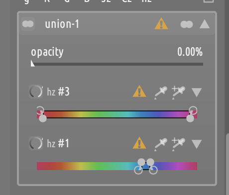
  • Opacity can be reduced all the way to zero. The hardcoded 5% was not introduced by me, it is a pre existing and meant as a safeguard for people inadvertently reducing the opacity to zero and then not being able to see their masks. I replaced it with a badge on the group/element row that shows as soon as the opacity of an element goes below 10%:

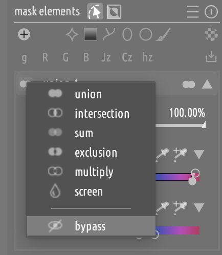
  • Added the bypass operator to the between-groups mode selector. A bypassed group can only be re-enabled, and while it is bypasses its controls are disabled (so that one does not risk modifying something that they cannot see):

6 Likes

Really start to like where this is going :slight_smile: wow!

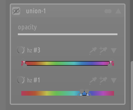
What is the reason we need that first icon? before hz #3, hz #1… ?

1 Like

For visual consistency (each row starts with an icon), and to have something to ctrl+click to invert the element and show the inverted state (so that it is the same for all element types).

You won’t be probably able to solve the major limitations, because they are caused by dt architecture, the fact that dt applies mask post operation. So all operations that rely on neighbour pixels (like blur) are already done contaminated the masked areas with pixels from unmasked.