During the discussion in this thread, the idea of a secondary panel was floated.
With the help of Gemini and Claude, I decided to explore the feasibility of the idea, and it turns out that it’s really not difficult:
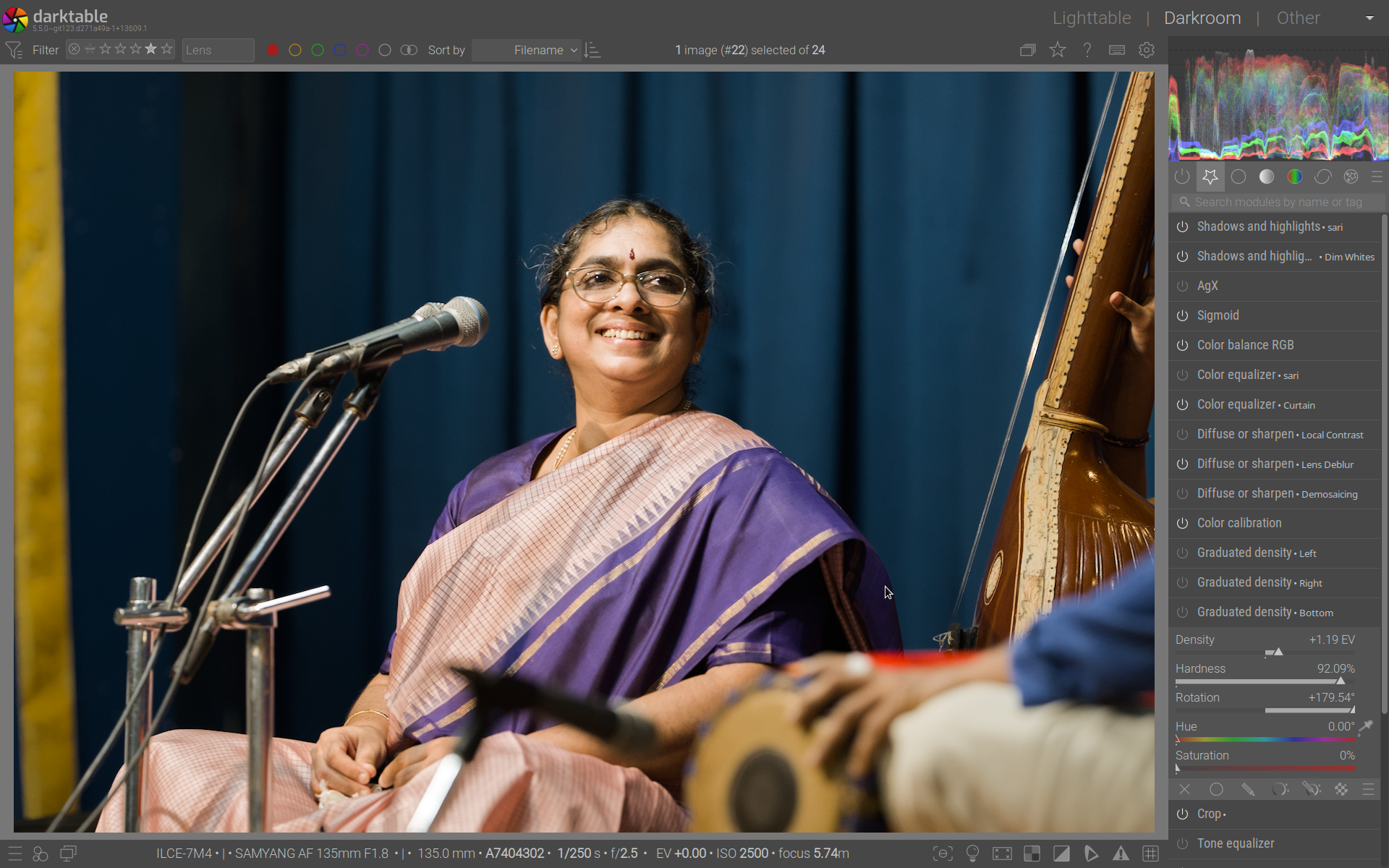
The secondary panel is just a dumb container, all the logic (including pixelpipe position) stays in the main panel. When a module is moved the secondary panel it leaves behind a placeholder that can be used to adjust the position in the pipeline. The panel disappears automatically when empty, and appears when at least one panel is added. A couple of actions make it possible to move modules back and forth with a key press. Drag&Drop is also supported, even though I am not using it in the video because I find shortcuts more ergonomic.
Even in this very simple form, it makes it possible to adjust two or more modules at once, without the need to move back and forth, which is something that, for my workflow, I find extremely useful. For example, I like to dodge and burn using masked exposure layers. With this addition, I can easily change the sliders of all the exposure instances in a more coordinate way and with much less grudge.
And, if you don’t want to use the secondary panel, you don’t even need to know that it exists. The UX is completely unaffected if you do not move modules there.
The whole thing is 500 lines of coide.
I would like to understand what are the thoughts of users and devs on this. Is it worth investing more time in refining it and aiming for a PR?
I like the basic idea behind it. I probably haven’t quite got the hang of it yet.
For me, for example, it would be helpful if, when I click on ‘Exposure’, the menu opened in a new column on the right instead of dropping down.
One of the differences with the QAP, is that the QAP is pre-defined in your settings.
The idea here is that put one (or more) modules to the side so can use them together without switching all the type.
I can also see myself using such a feature to just focus on one module (and thus hiding the whole list with modules) like a ‘focus mode’. What would be helpful is you are using darktable on a small screen like a laptop
Honestly, the use case you talk about and the demo look very “specific”. I understand the idea of using two modules to dodge and burn and both being able to be opened “side by side”, but to me this implementation looks “hacky” or like it is bolted on (which in a way it is by design ).
I am also not sure if the use case for this feature would be very apparent to a new user (both new to darktable and new to this feature). It reminds me of the new feature of opening an image in a second darktable window. It is something that just doesn’t make sense for how I think about things. I’m not saying this is a bad idea, just that to me it seems like an unnecessary feature that feels quite niche.
For me, this idea does open up some ideas that do make sense for how I think:
Separate processing order from module display for a more advanced QAP. Two panels: pipeline panel on top (used to visualize processing flow and for re-ordering), and develop/edit/etc. panel below that for custom module order and parameter editing (similar to current module panel but with custom ordering that doesn’t affect processing pipeline). Freely rearrange modules in the develop panel, with the currently active module highlighted in the pipeline panel. This feels like the foundation for a much-improved QAP. This idea could be paired with a more granular approach to hiding controls for a less busy UI (right click parameter, select “hide”, right click module header to see a list of hidden/visible parameters).
Extend this logic to support multiple module panels within darkroom for custom layout organization. Instead of opening to the side, which to me feels really odd, I think I would prefer to have the selected module pop out into an initially floating but dockable panel. This way, you could do things like dock all of your mandatory modules to the left side of the darkroom, or dock all of your retouch/correction modules at the bottom, or the left or whatever. Basically, it would be more for creating a custom organization based on your own editing logic.
I just commented in an issue that while you could do this you should NEVER display both, because of the possible confusion about what is what, especially for new users who might think they are adjusting the display order and instead change the processing order and then the image changes and they have no idea what happened.
The design concept for darktable was to focus on the image being developed with as few distractions as possible. Turning the side panel into a video game (tetris? ) and hiding the image doesn’t align well that concept.
I would say that wou should not display both, unless you make it obvious that the processing pipeline is an tool to adjust internal processing order via massive UI changes (The modules in the pipeline view should look almost nothing like the modules in the “development” panel). They could be made to look like a nodes in a graph, or something else, but yes they would need to look very differently.
I agree. I am not really saying that I would prefer my suggestion over the current setup, but rather saying that a better use case for the proposed feature (duplicating the module in a different panel) might be an organizational tool rather than the OP’s use case.
I don’t generally like floating panels, and it never felt great in GIMP. But I was just saying that having a secondary module panel bolted onto the side of the existing panel felt like an even worse idea. So I tried to come up with an idea that feels less “bolted/hacked” on.
It is exactly that - an organizational tool. @Masterpiga is referring to another post where among other things was discussed that he (but me as well) are often working with multiple modules at the same time.
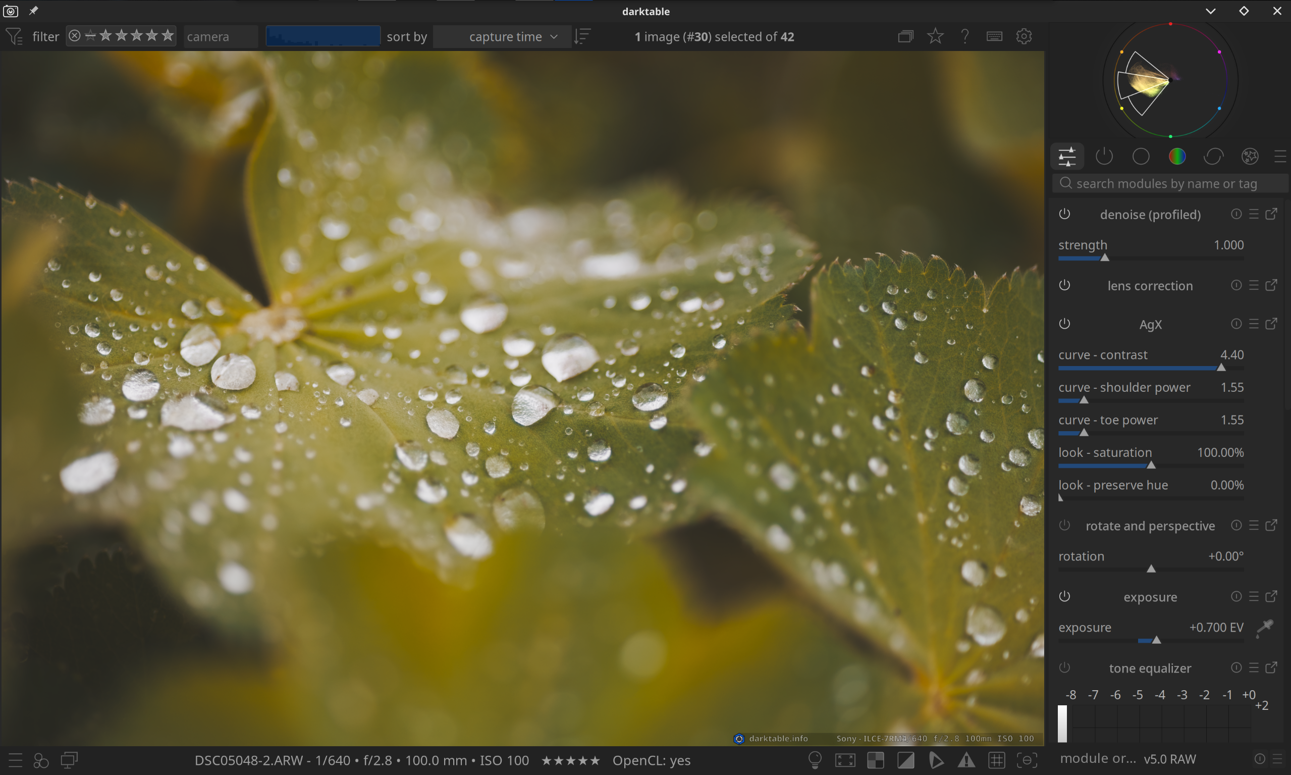
For me that is tone equalizer, agx and exposure. In the video posted by @Masterpiga you also see the combination and agx and exposure. He also mentioned this as a use for dodge-and-burning situations.
But with working with multiple modules at the same time comes a prices of constantly switching modules and a lot of clicking.
@Masterpiga mentioned in that topic that he sometime would be happy with floating windows.
I commented that I prefer a dockable system. I am not a fan of floating windows as it creates clutter, will overlap your image (and more).
I a respons to that @Masterpiga threw this demo together. Very quickly, very much pure as a concept demo. (really love that you did that!)
It is not a tool to replace the QAP. It is an organizational tool to work with multiple modules at the same time.
And seeing this, it can also see that I would use something like this to temporary place the 3 mentioned modules on have them all extended to reduce the number of clicks and have a focussed moment in my workflow.
And of course the demo is just a concept, and a rough sketch.
Regret that, as already mentioned, from me this is a Just… No.
The most precious screen area, for me, is the image. I want everything else to be as narrow/shallow as legibility/usability permits. I was even happy to accidentally discover that shortcut ‘B’ hides the hide/display arrowheads. Another few mm gained and I don’t mind at all that it is just one extra keystroke when I need to display a hidden area.
I same layout as you. I hide as much as possible. For me it would be awesome to have only that dockable secondary screen visible with the modules I am actually working on.
I do most of my work on my laptop screen. So, yes, for me the space really matters as well.
I think when I think of “organizational” tool, I think of something for persistent organization, rather than temporarily being able to have multiple modules open near each other. But I understand the benefit, even though it isn’t something that I think would benefit me.
Well… the only difference between temporarily and persistent organization if it the state of the modules is saved of course… If there is much interest in this, I can’t see why it cannot grow as that.
I have a 34" ultrawide monitor, so something like this would be fine in terms of taking up real estate (for me!). I’m not sure it’s something I would use that often if it were just for working on a couple of modules at a time. I rarely do that, and I’m usually fine with the “auto-collapse” functionality enabled in preferences.
But where I can see it as being useful for my image editing is if this extra panel could include the mask manager. Currently I really don’t like switching to the other side of the window to mess with masks. Having all masking tools close to each other would be nice.
And here’s another thought: I currently rarely use the QAP because I spend most of my time in my “favourites” panel, where I have all my most used modules. But I might be tempted to use the QAP if it could be displayed side-by-side with my main panel. The QAP could have my most commonly used sliders, and then I still have my main panel open for more advanced work.
So, in summary, I think this idea has merit as a way for users to customize the interface more. In fact, the more I think about it, the more I like it. If I could send whichever modules or panels I like to it, it could be a really nice customization option. There could even be a setting in preferences for you to choose the traditional 2-panel layout or a 3-panel layout (3rd panel can always be hidden/unhidden).
The key is that this has to be purely optional (not everyone has an ultrawide monitor), and I think it needs to be more versatile than just for working on a couple of modules at a time.
As you can see, there’s plenty of room for me to have another panel. I can imagine that those of use with ultrawides or 4K monitors would appreciate the ability to make better use of the space we have.
For the record, In my thinking of the secondary panel, it should not be required to use it if someone does not want that. I should be a place where modules can be docked, but in no way be a default place for stuff.
If I had @europlatus 's monitor, I think I would like this idea. But I do a lot of my editing on a 15" laptop, and I actively use the left side panel. I want a good view of my image, and two panels on the right would take up too much space, not leaving enough for the image. I’m not sure I would even want it on my 27" QHD monitor on my desktop. So I agree with @martinus that it must be fully optional.
Yeah, I think it’s a given that this would be fully optional. There’s no way it would be a default. Like the AI functionality, it could have a setting in the preferences to completely disable it.