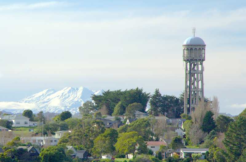
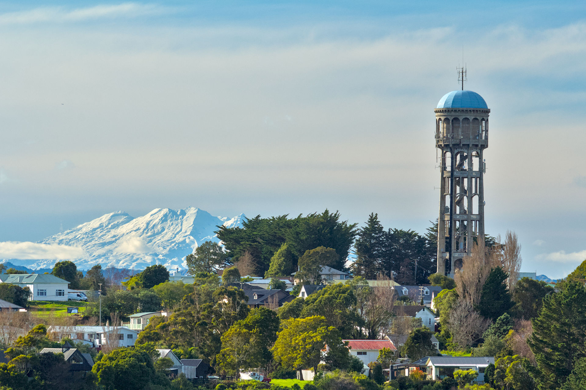
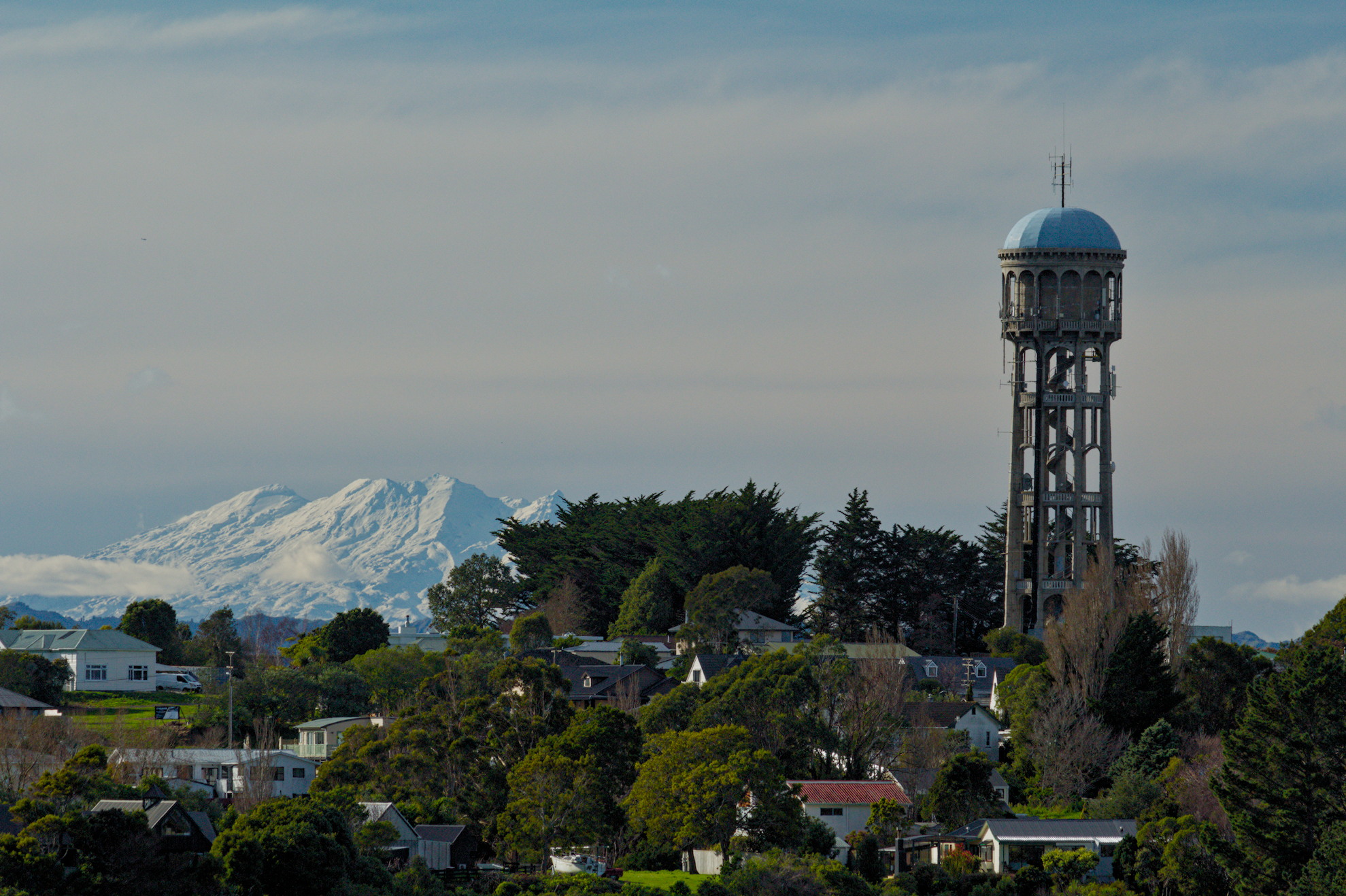
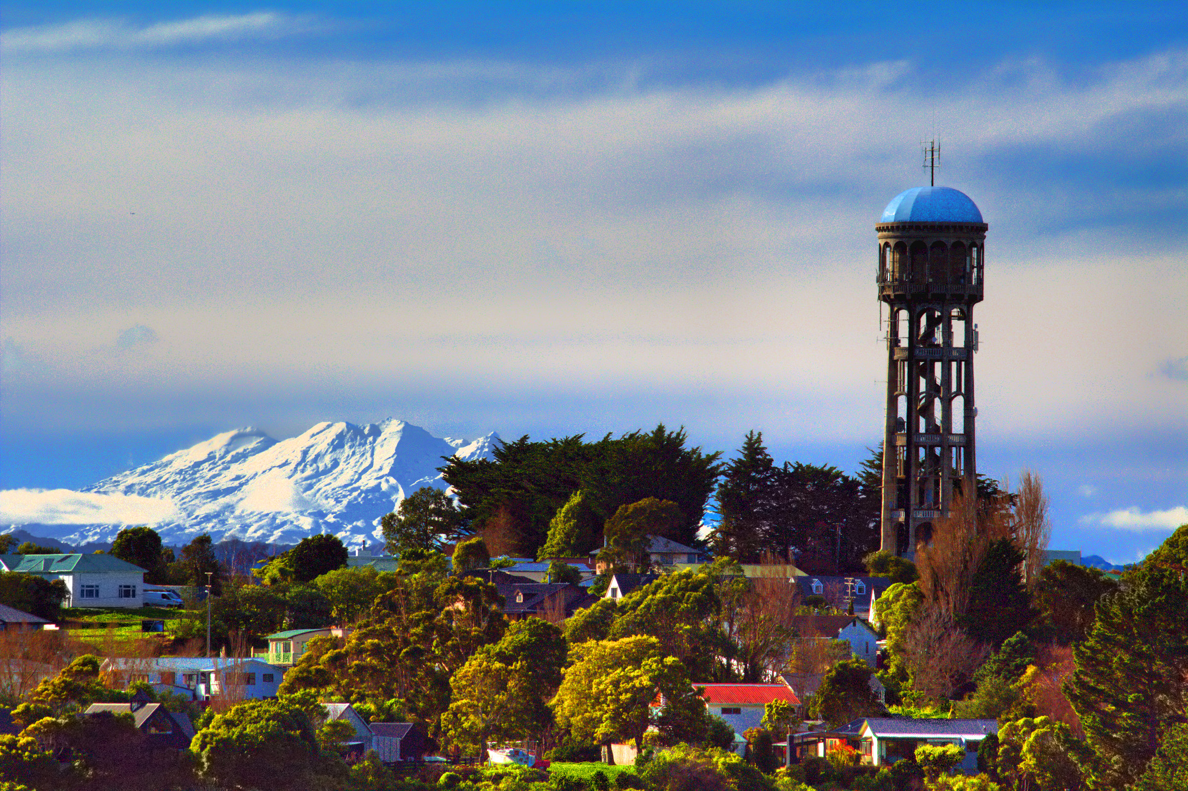
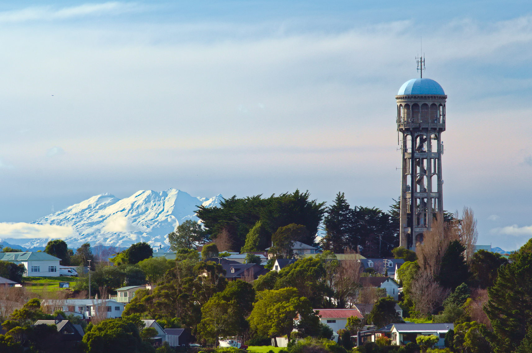
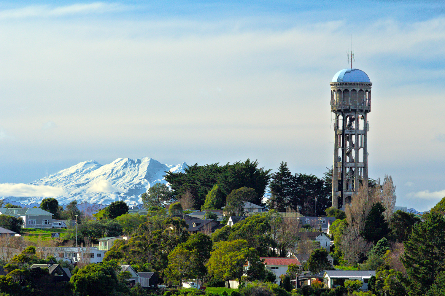
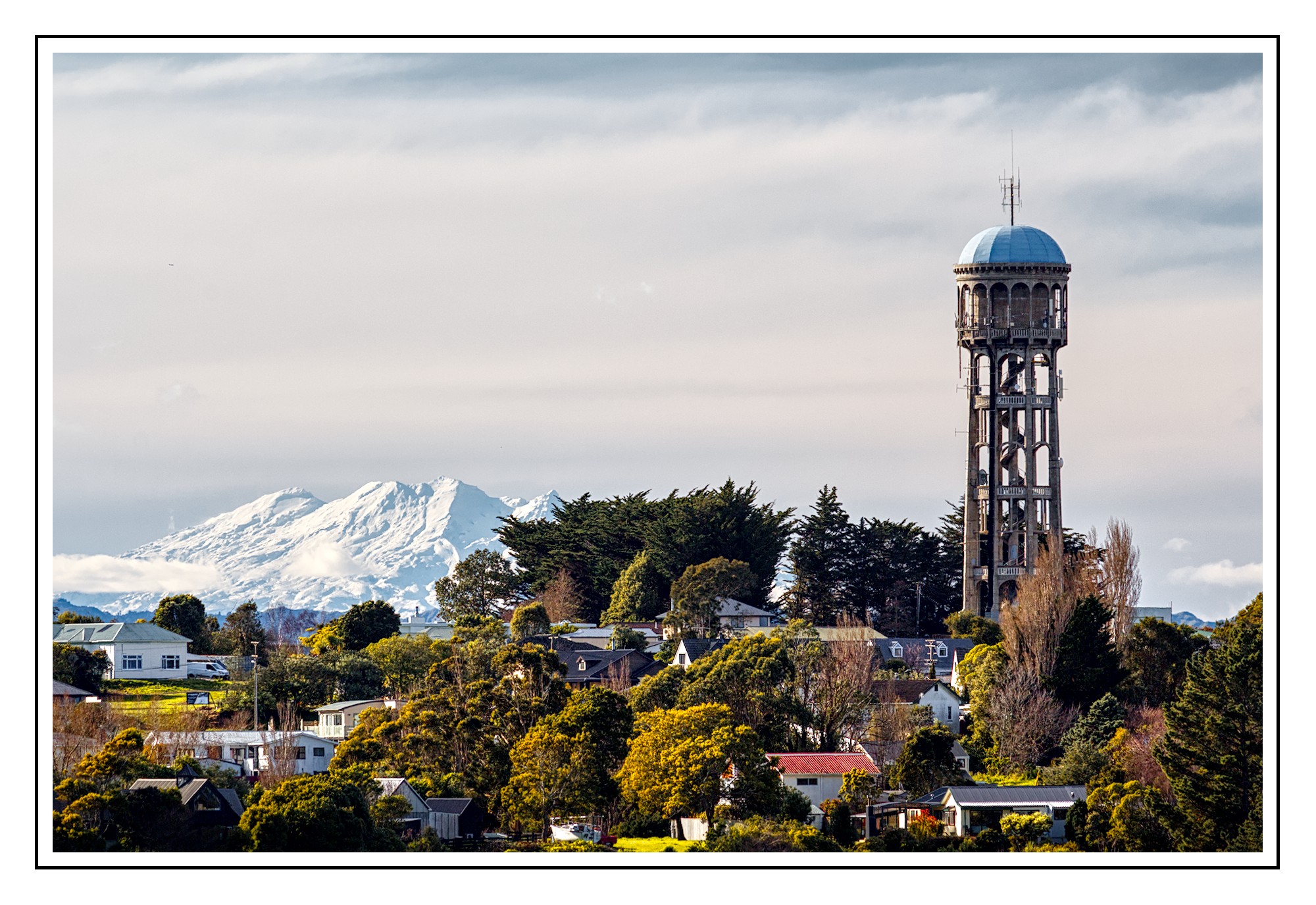
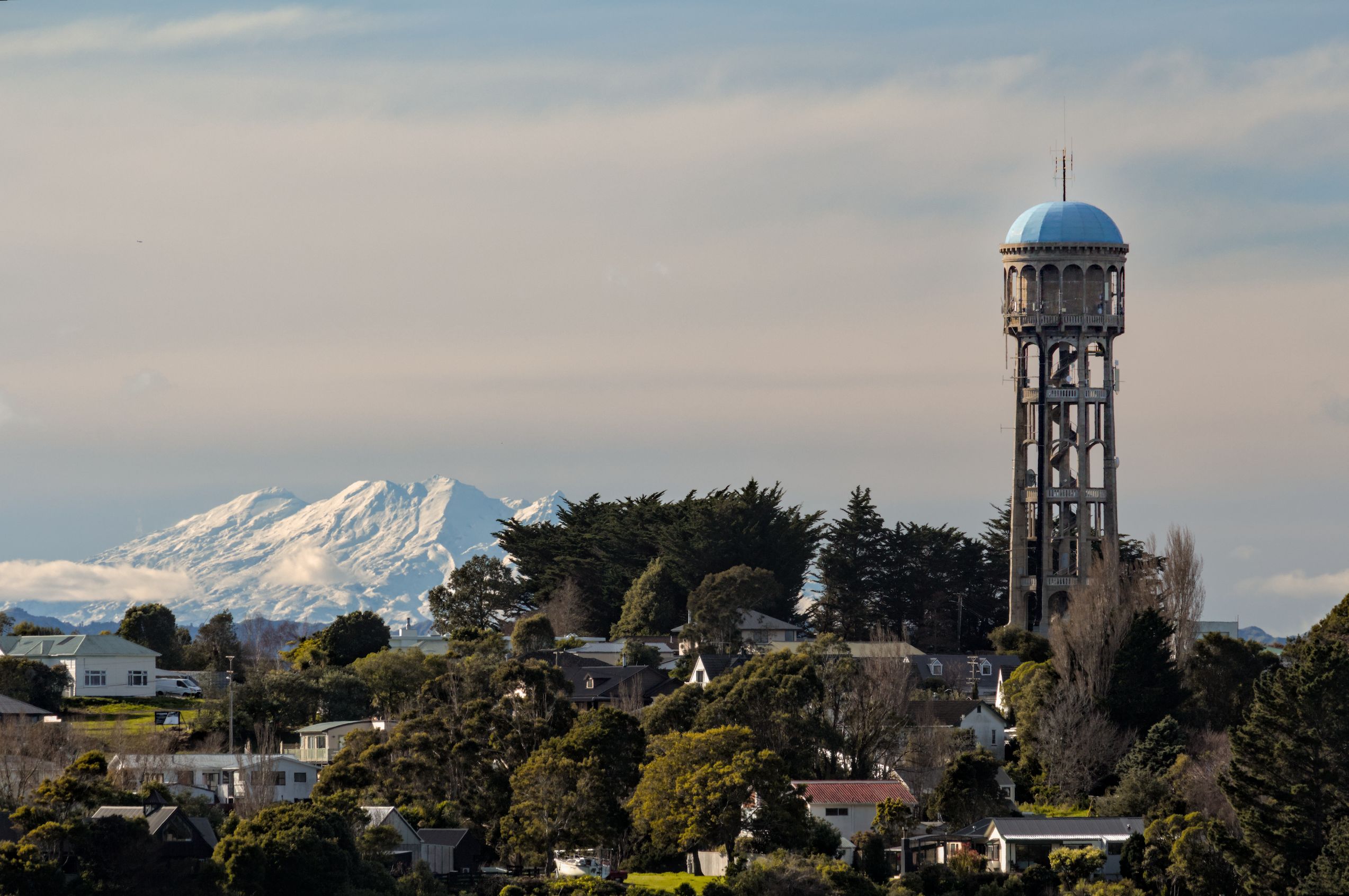
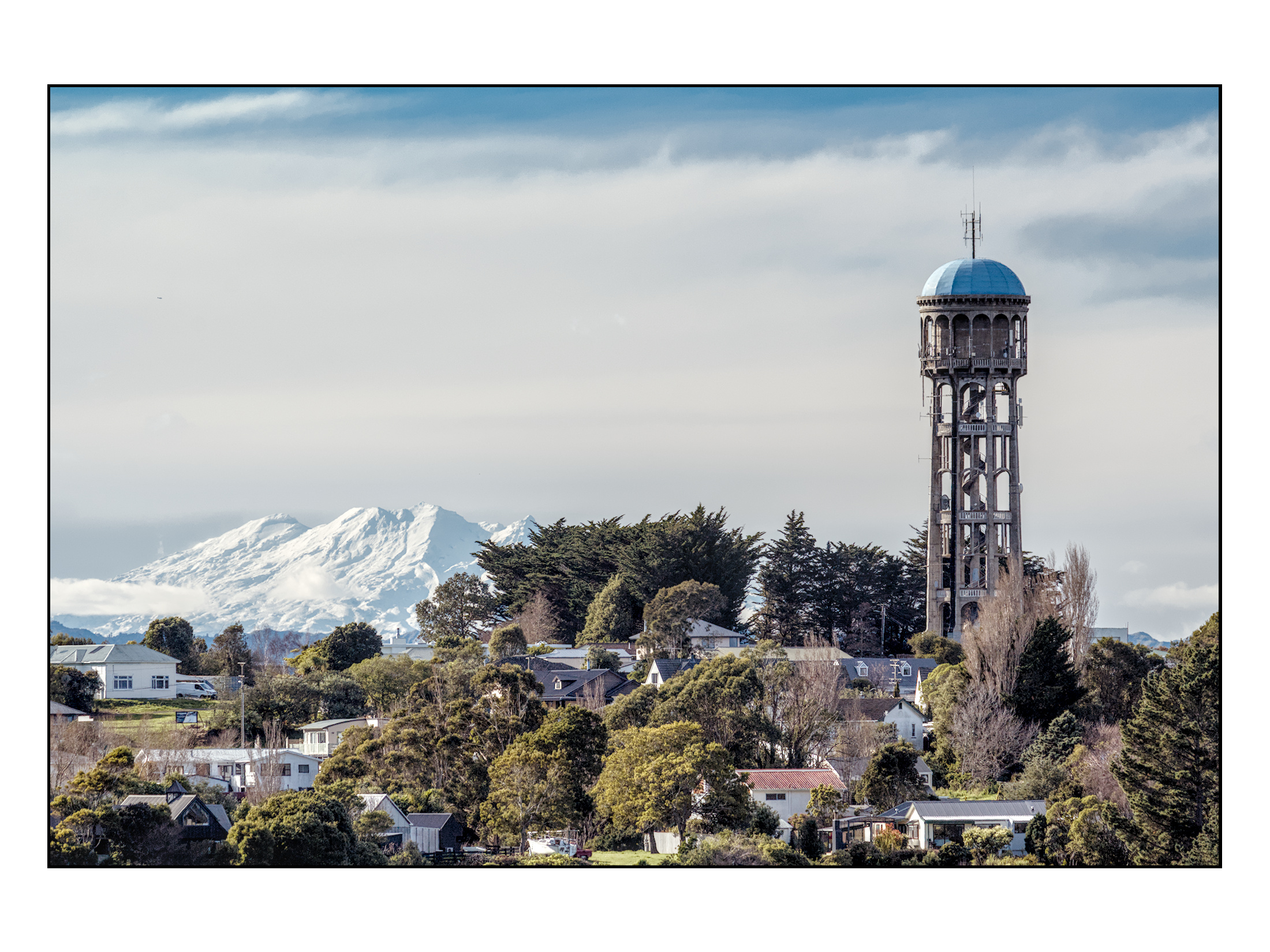
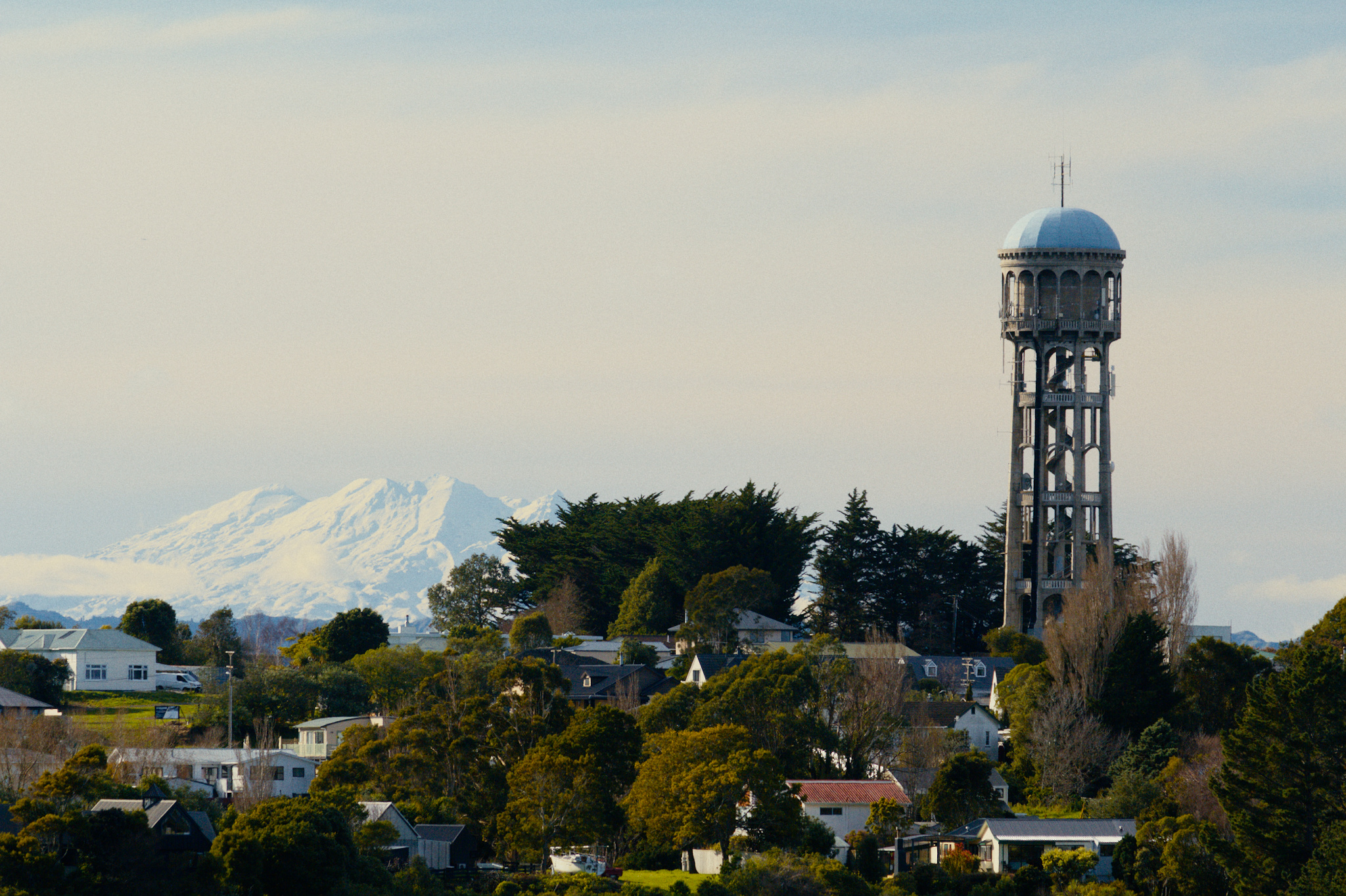
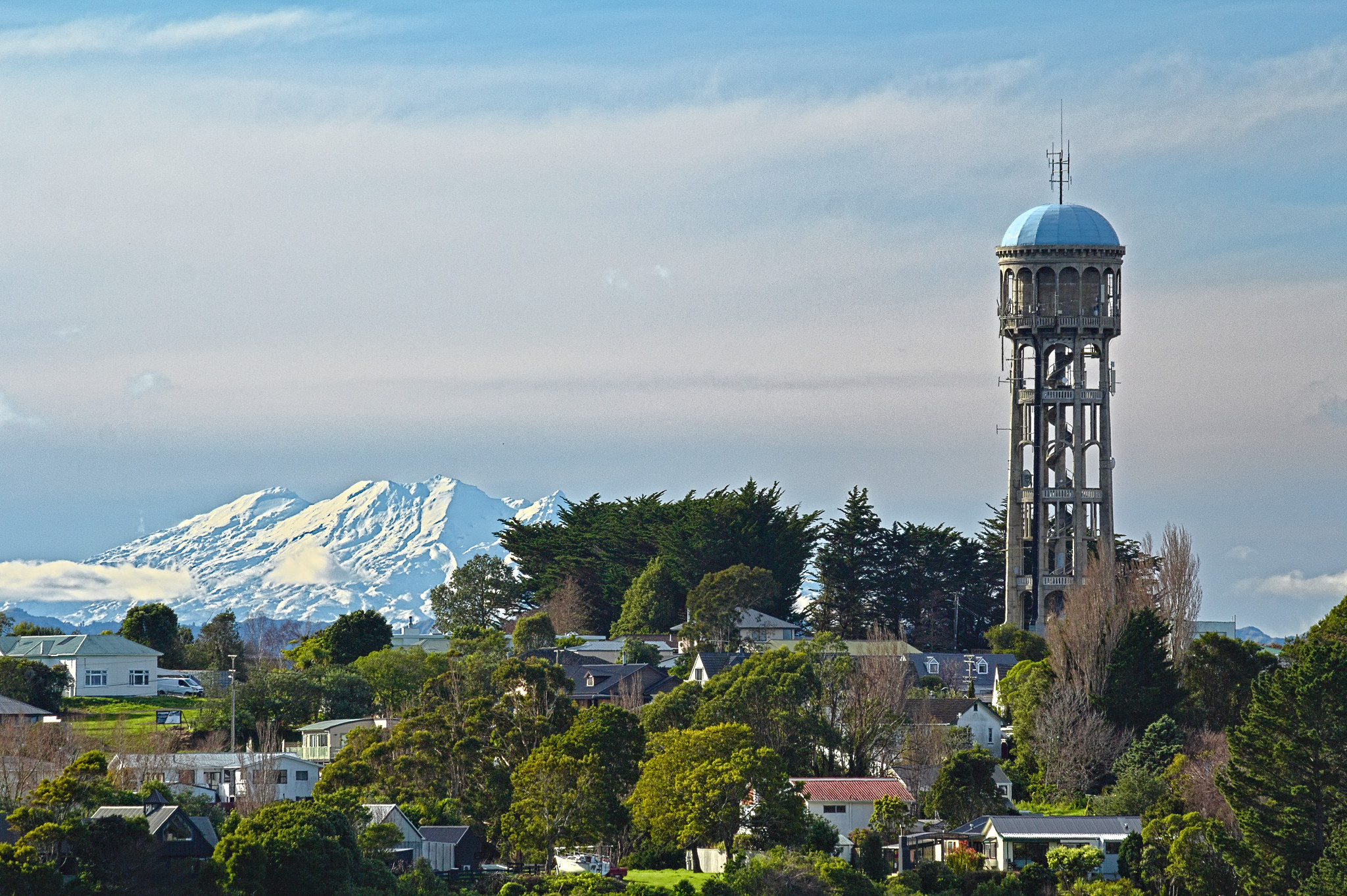
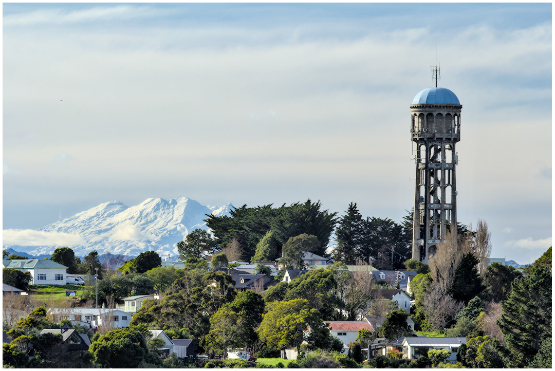
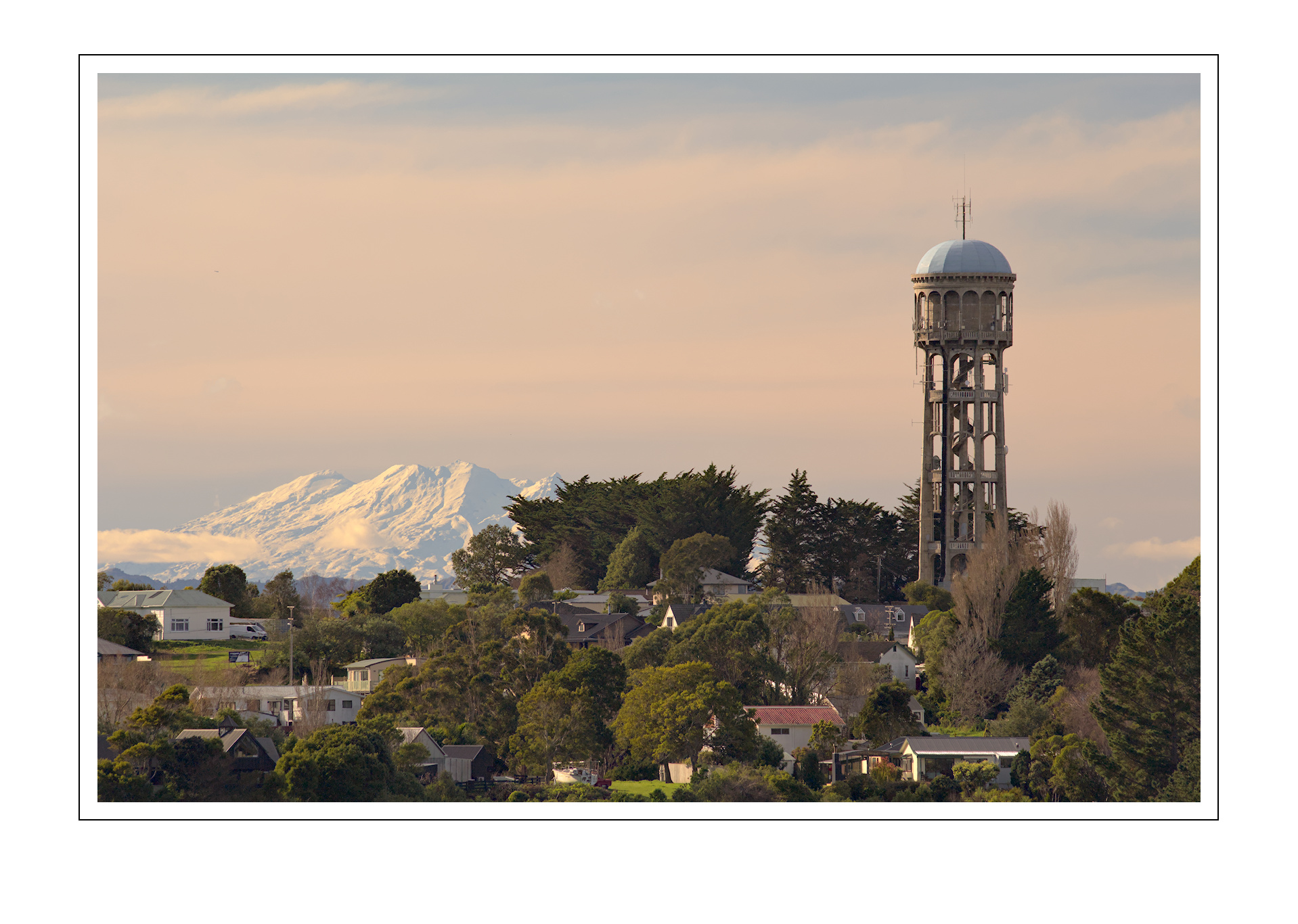
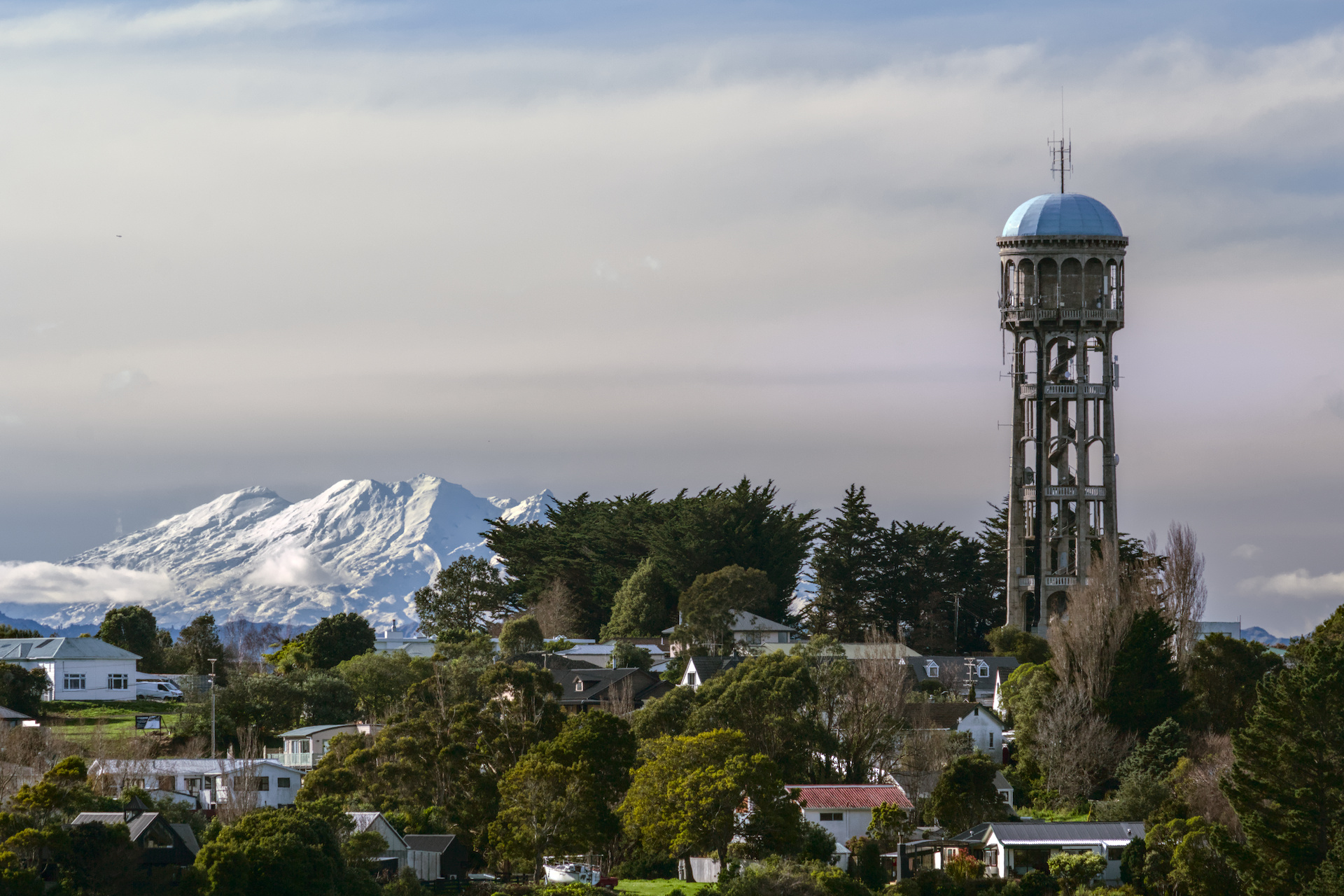
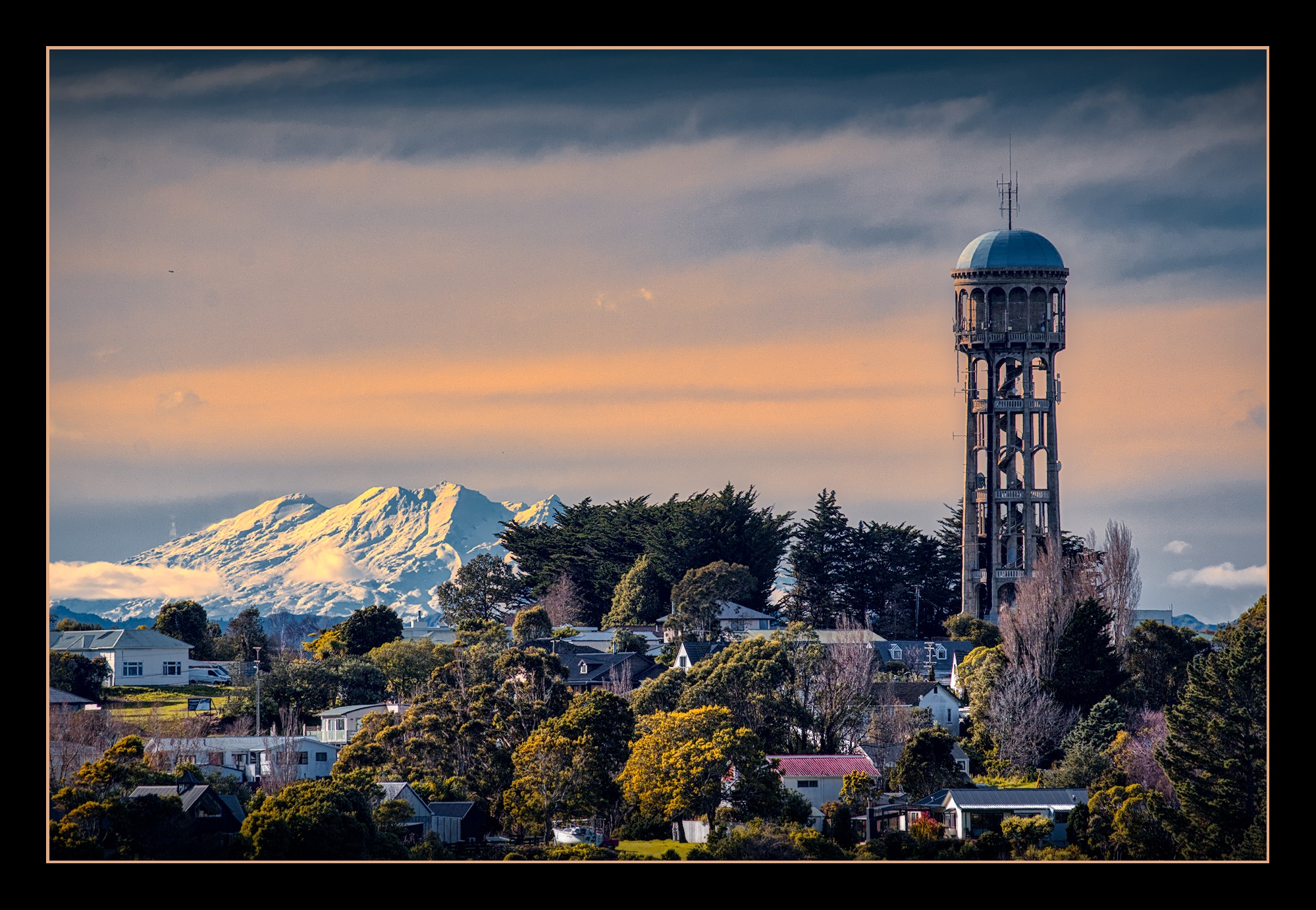
Took some finesse of contrast, and a bit of color saturation. I also rotated the image a bit to straighten out the water tower; it may have been geometrically straight, but it just bothered me:
Maybe you could offer it a bit larger. Without the possibility to load it in dt or RT it’s not that easy to judge youre edit. Anyway, at the shown size it seems that I like it.
I’ve given it lots of targeted local contrast adjustments with DorS, CE, CB-RGB and then global LC module. Might have a little haloing around the tower, but that might be avoidable if I draw an intricate path around it instead of trying to tweak the other mask settings.
Yeah, I’ve been encouraged that direction before. It’s about my ‘proof’ size, 800x600, which I still like very much in my inhouse web interface to the picture repository. I sometimes change the major dimension to 1080 for various reasons, but when I’m primarily concerned with tone and color, usually don’t see the need.
We’re also still on DSL for internet access, which really affects how I schlep images. We now have a fiber ‘pot’ in the yard, but getting service has been a story worth a script for “The Office” TV show…