Shades of brown

I’ve been experimenting with base module settings for one of my cameras and looking for some test images I came across this, what I initially thought to be, dull image I made a little while back. Started to edit it and I do like the result…


test.dc-lx100m2.015.rw2 (18.7 MB) darktable 3.0.1
dc-lx100m2.test1.rw2.xmp (7.6 KB) License: CC BY-NC-SA 4.0.

Do your magic, I like to see what others do with this one!

Seems to be a good one for a B&W edit now that I come to think of it, maybe I’ll try that tomorrow :slightly_smiling_face:

5 Likes


test.dc-lx100m2.015.rw2.xmp (6.6 KB)

1 Like

Rawtherapee 5.8

2 Likes

Oh yes, begs monochrome…

I processed it to linear rgb, applied aggressive color saturation (twice normal), then I grayscaled it with R0.0+G1.0+B*0.5, and finished it with an s-curve to increase contrast. The apparent trick to the silver finish was the grayscale, pulling the predominant red to 0.

When you remove the color, you can do all sorts of manipulation Mother Nature did not intend… :sunglasses:

7 Likes

I really like this one.

Digital B&W is an area that I really need to put some time into. I used to have a darkroom back in the analog days and I’ve never been able to create adequate looking B&W in digital (let alone good looking). I’m still not sure what I’m missing.

Thanks for lifting the veil a bit on what it is you did to get this result, I’ll try implementing/experimenting using that knowledge.

Anyway: Beautiful!

PS: Was this done using your own software?


test.dc-lx100m2.015.jpg.out.pp3 (12.2 KB)

2 Likes

Thanks! Myself, I was rather surprised at the result, but it reflects some of my recent thinking, trying to explain monochrome elsewhere.

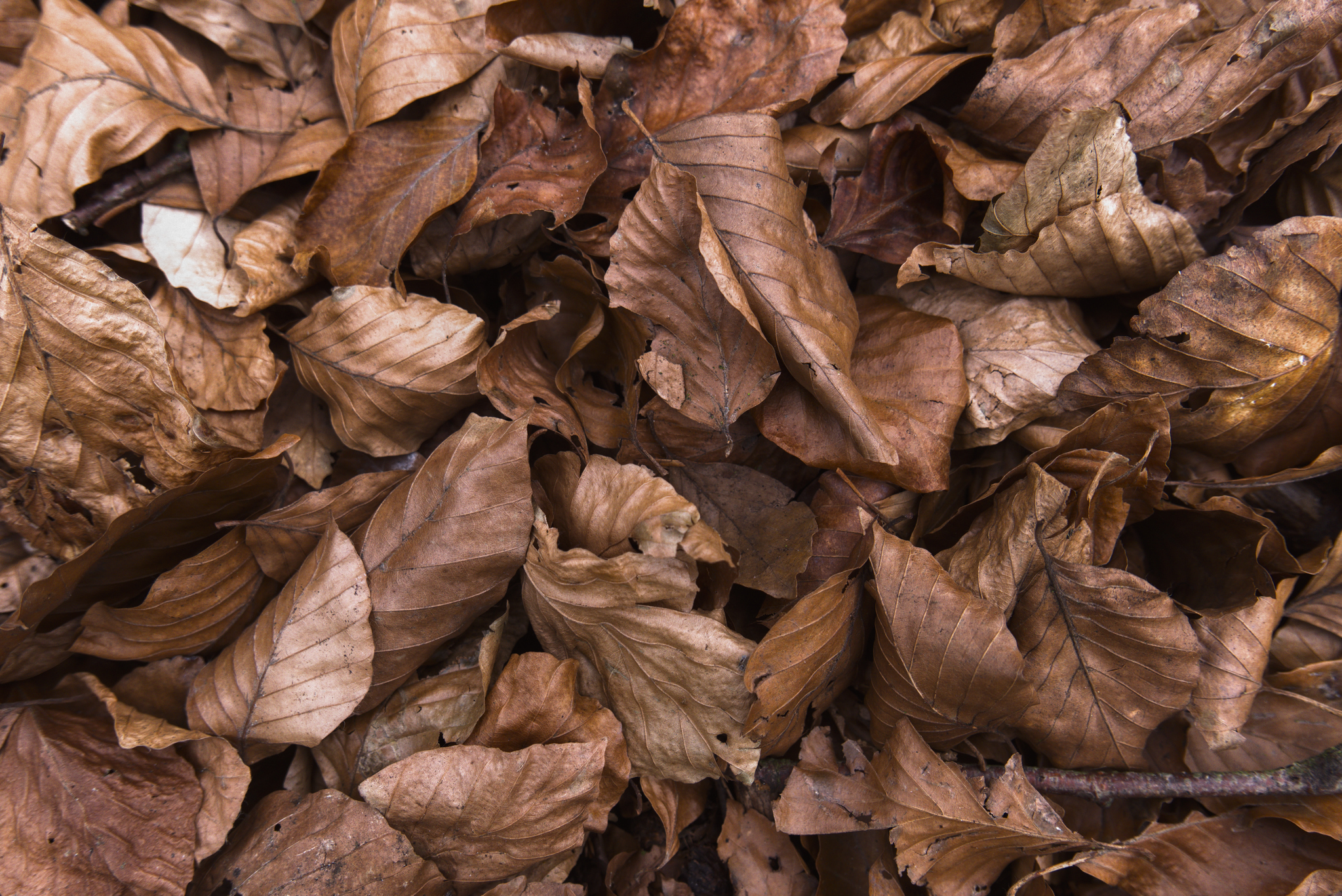
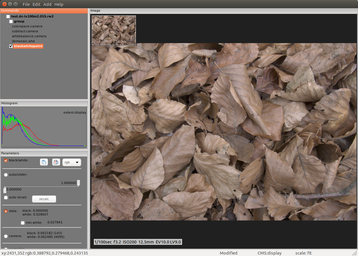
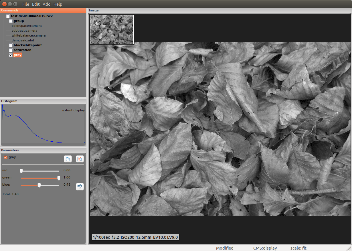
Yes, I did this with my software, and for this purpose it supports what I believe is something essential: the grayscale tool needs to go after any color manipulation tools, as it’s those colors that are transformed to their fundamental tone. At risk of polluting the thread, I’m going to post incremental screenshots of my processing; first, here’s the linear RGB image:

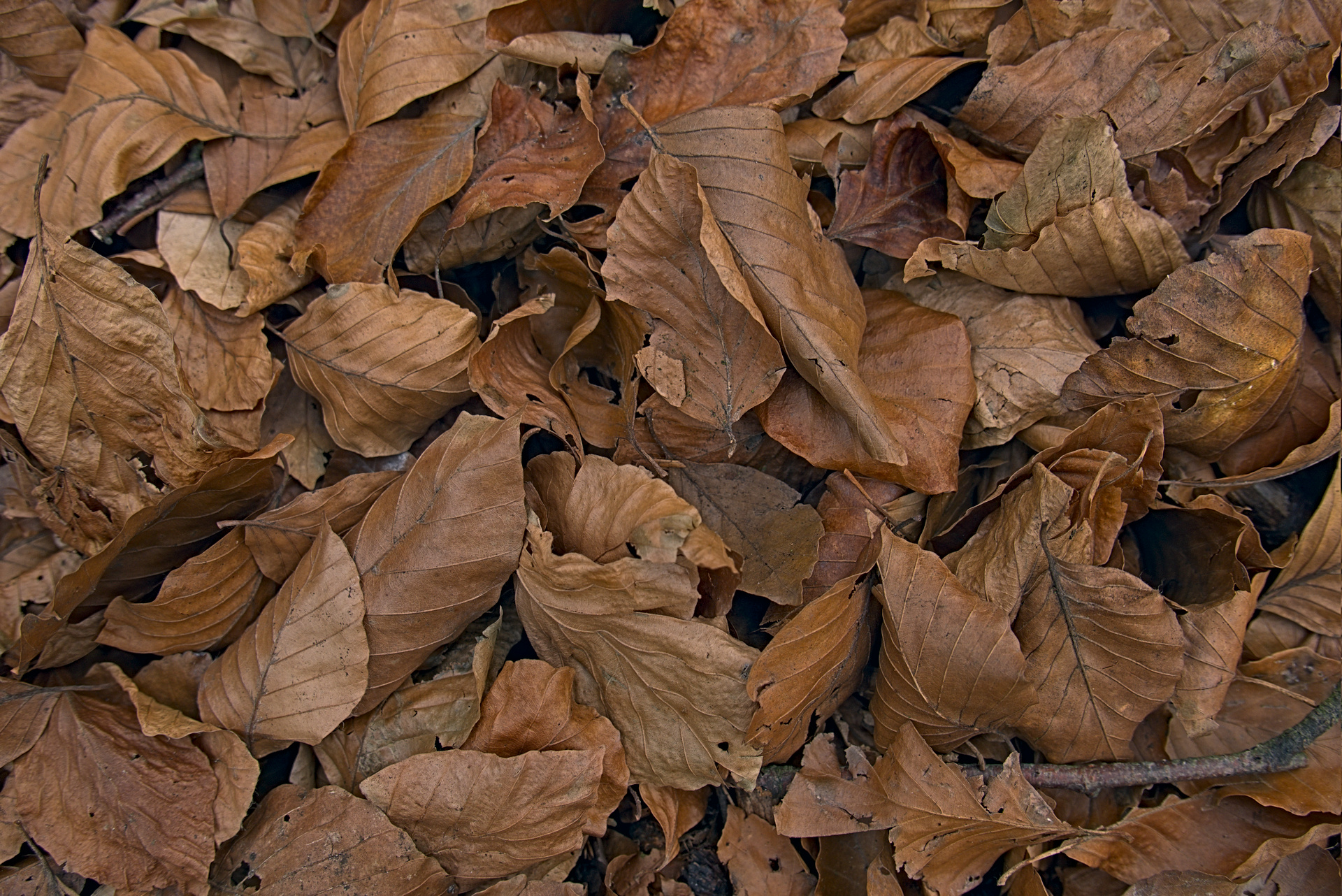
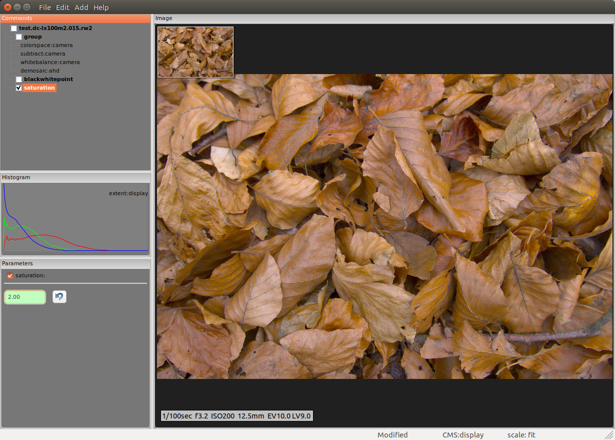
Of note is the histogram; the raw image from the file is 10-bit, so only 4095 separate gradations of tone. So, since the image by-channel is predominantly red (the red channel mean is significantly larger than the other two channels) I decided to try amping up the color saturation prior to grayscaling to emphasize the dominant color, brown. Next screenshot shows application of a simple HSL saturation set to 2.00 (normal, no-saturation is 1.0):

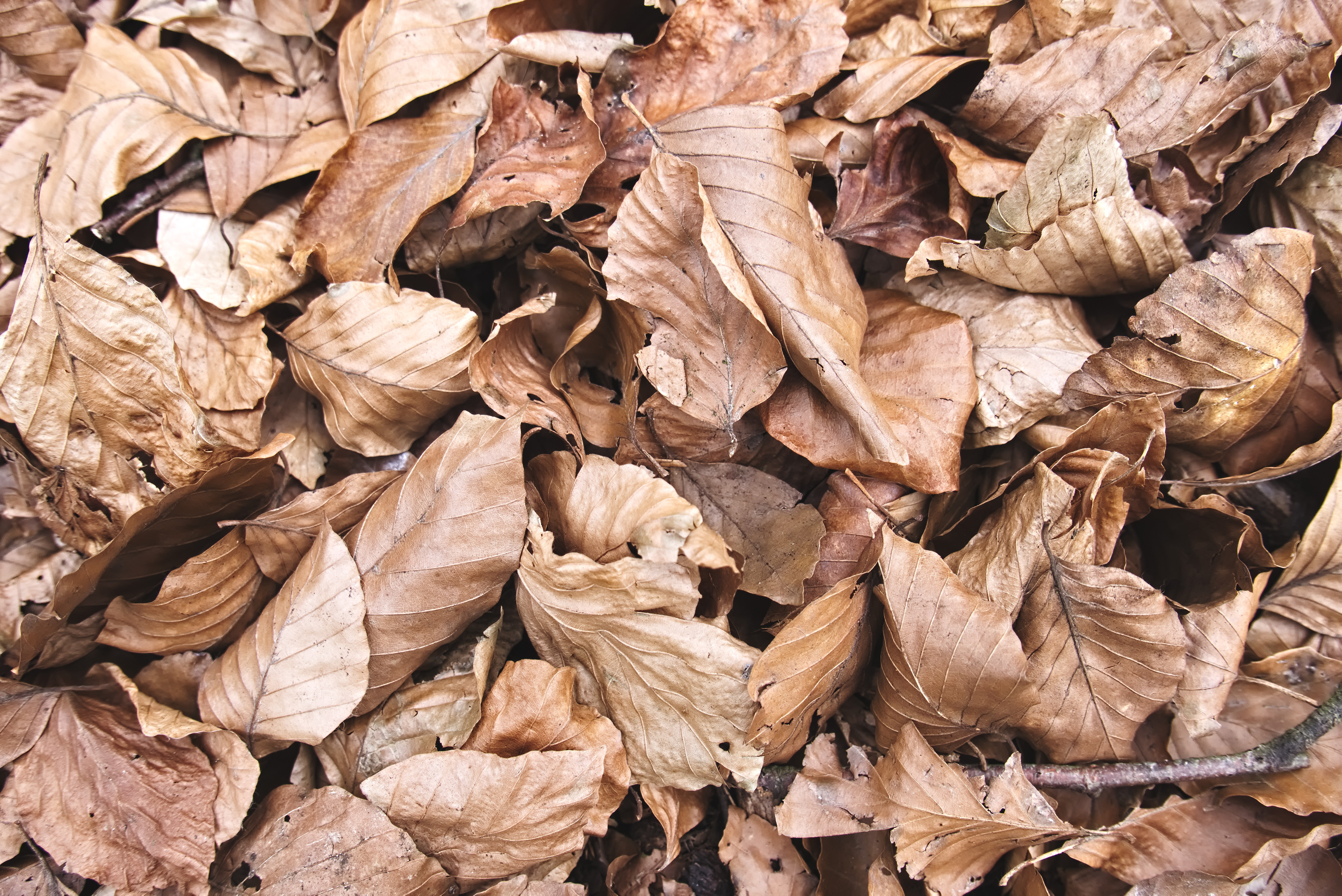
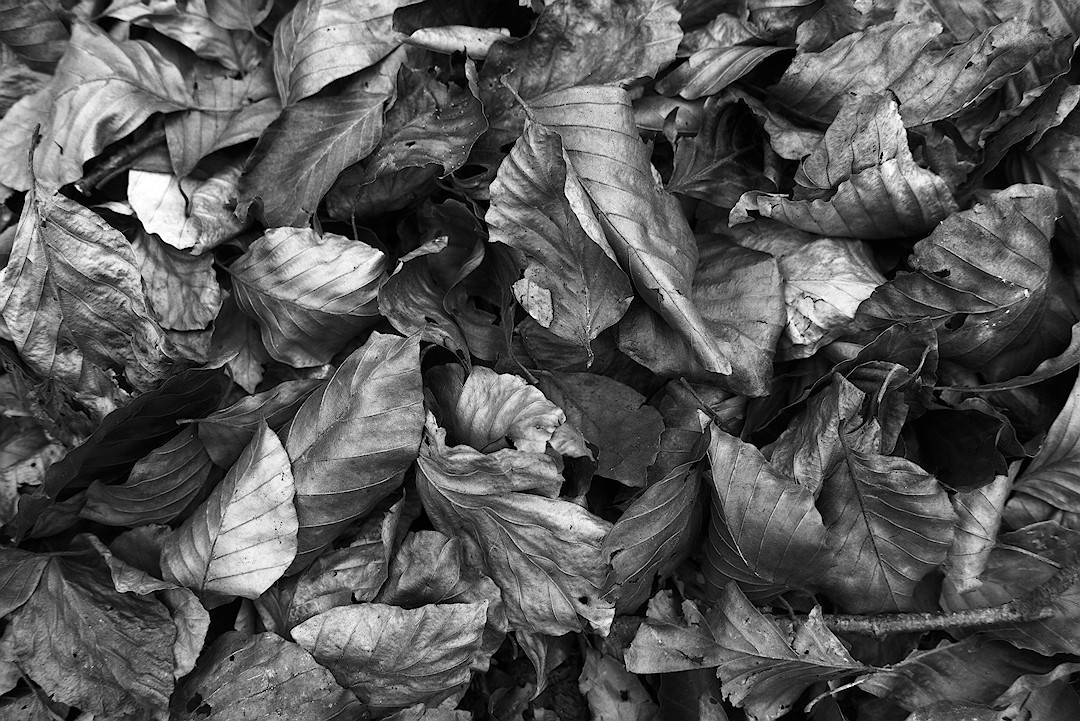
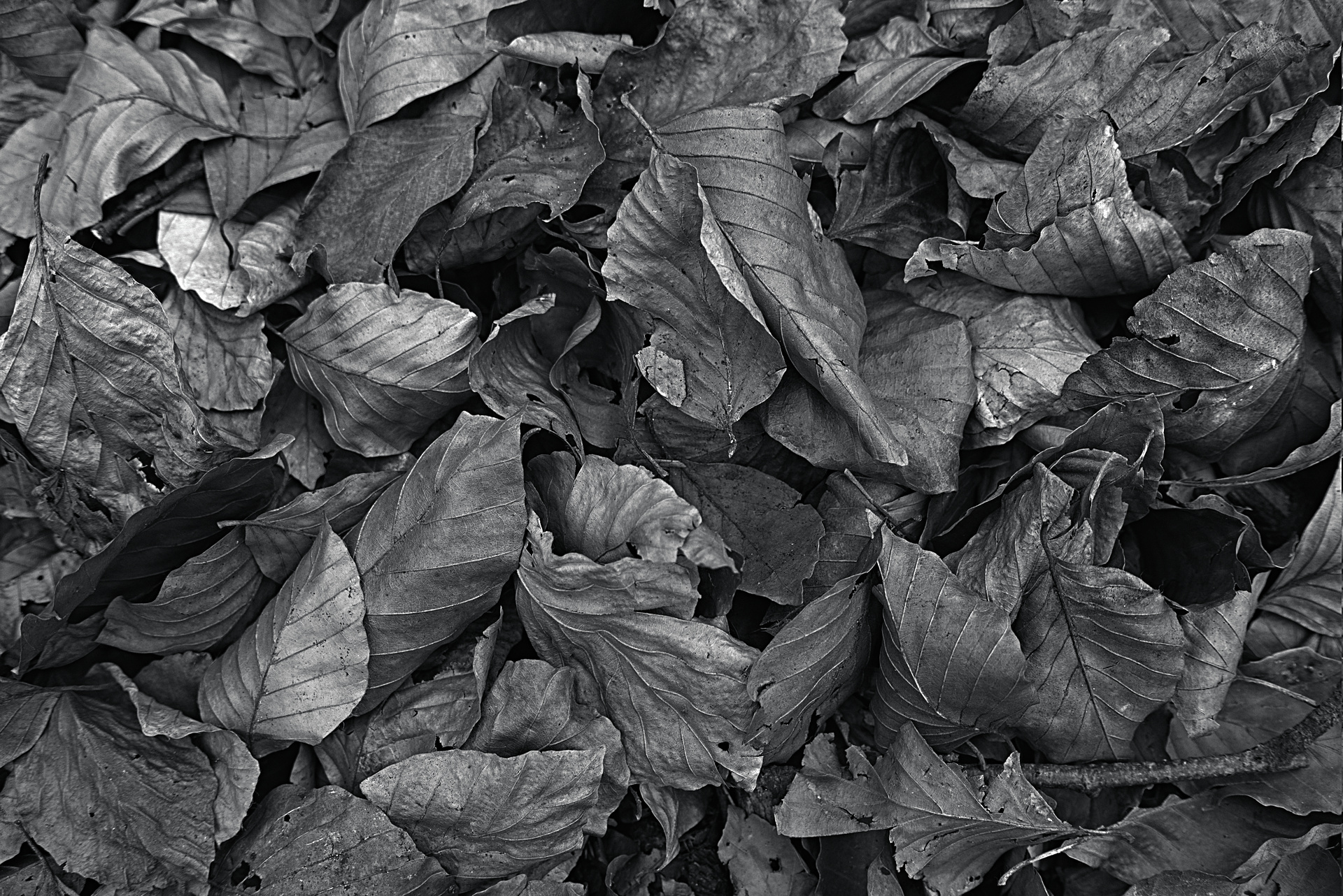
I would never do this much color manipulation in a color image, but that’s not where we want to end up. Now, here’s the grayscale:

This is where the magic happens… So, grayscaling an image is essentially turning each RGB pixel into a single monochromatic tone value. In rawproc, that starts as a weighted sum:

G = R*0.21 + G*0.72 + B*0.07

Those weights are what produces a perceptually accurate tone. Now, you 'll notice the sliders in the paramters pane are decidedly not those numbers; red is crushed to 0.0, green is amped up to 1.0, and blue is ~0.5. I can’t really explain the specifics of how those numbers produce a particular pleasing tonality to brown (which, according to Wikipedia, is R=150, G=75, B=0), but it has to do with taking the red and green components of brown and basically inverting their contribution to the tone.

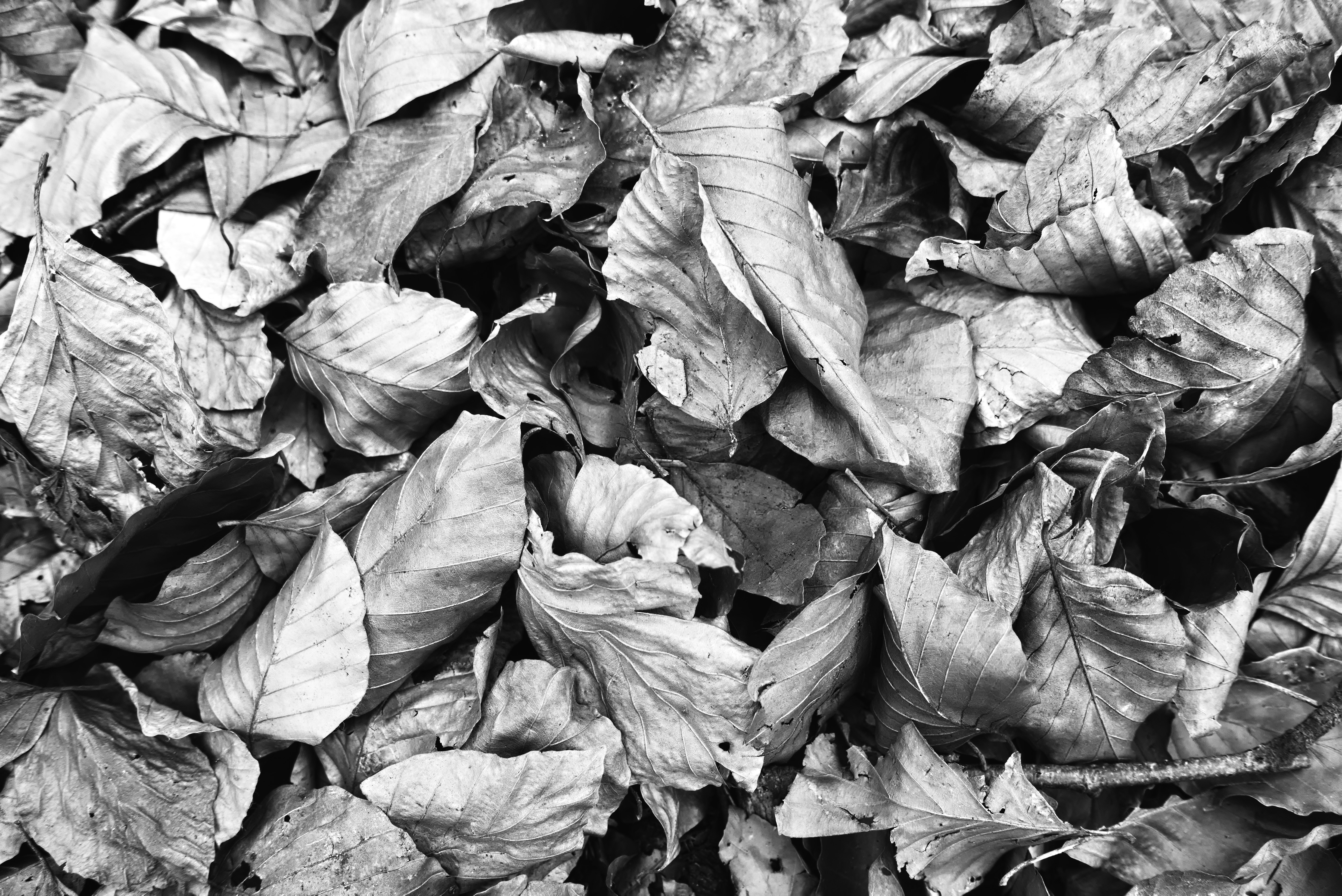
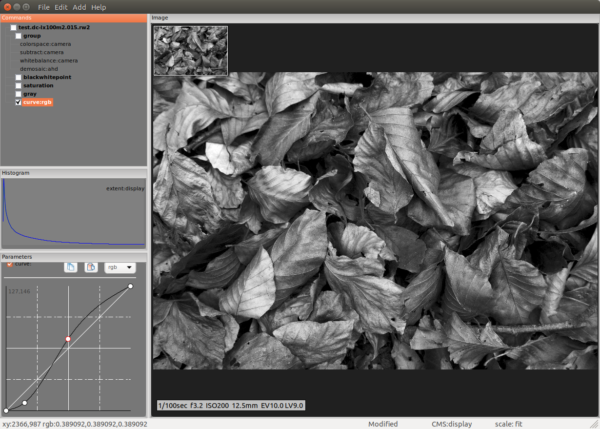
Now, once the image is monochrome, one can do things to the tone you’d never think of trying on the color equivalent. I’ve applied tone curves to other monochrome images that’d make you wince, but for this one all I really wanted to do was increase contrast:

Note here that the histogram and curve are depicting and working on the lower end of the image, which internally was still ‘linear’ up to the point of applying the curve. In rawproc, whateever tool is checked is what’s piped to the display, where it is transformed using the display profile. I bring this up because it illustrates what @anon41087856 has been trying to explain: the display tone transform should be considered separate from our discretionary manipulations.

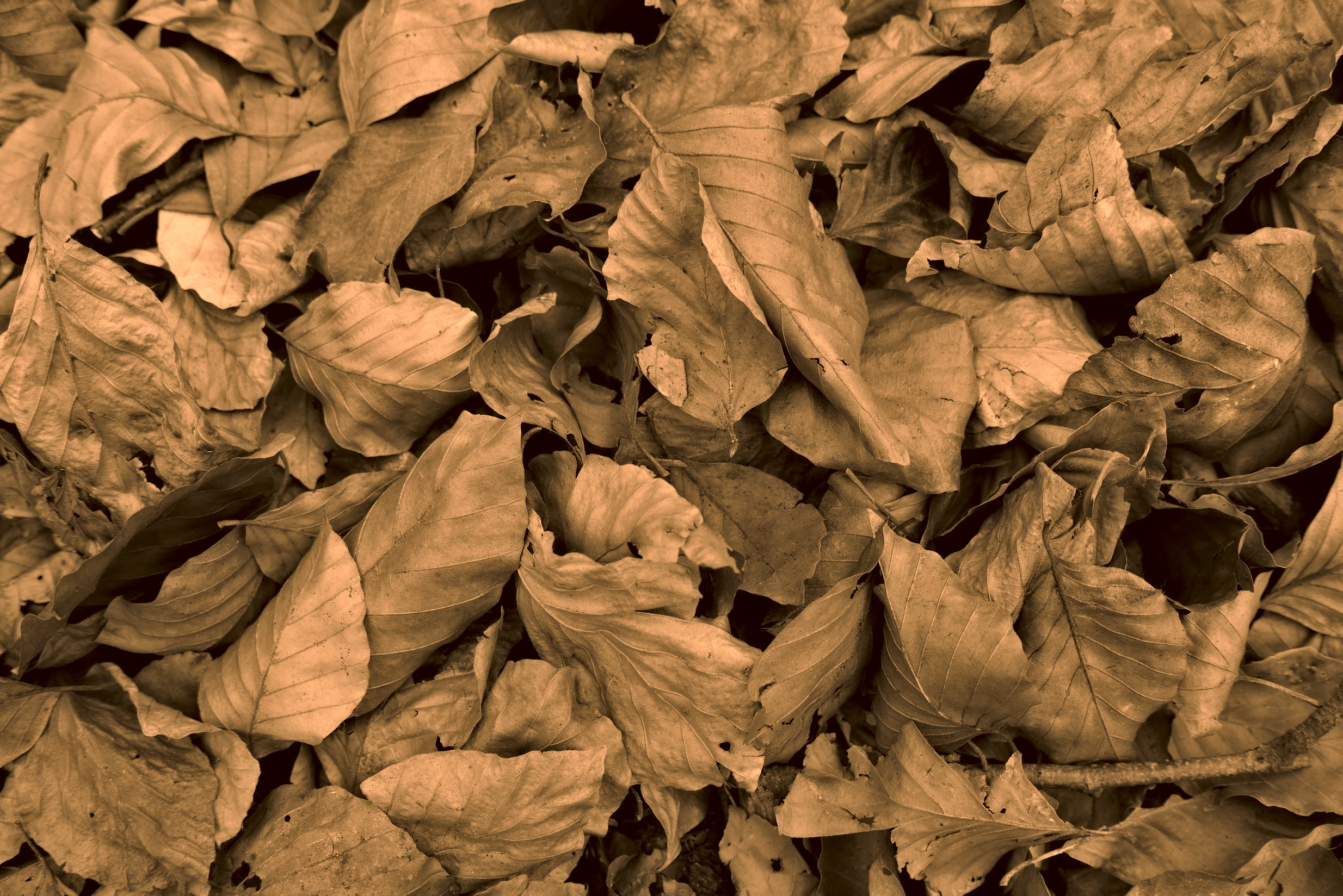
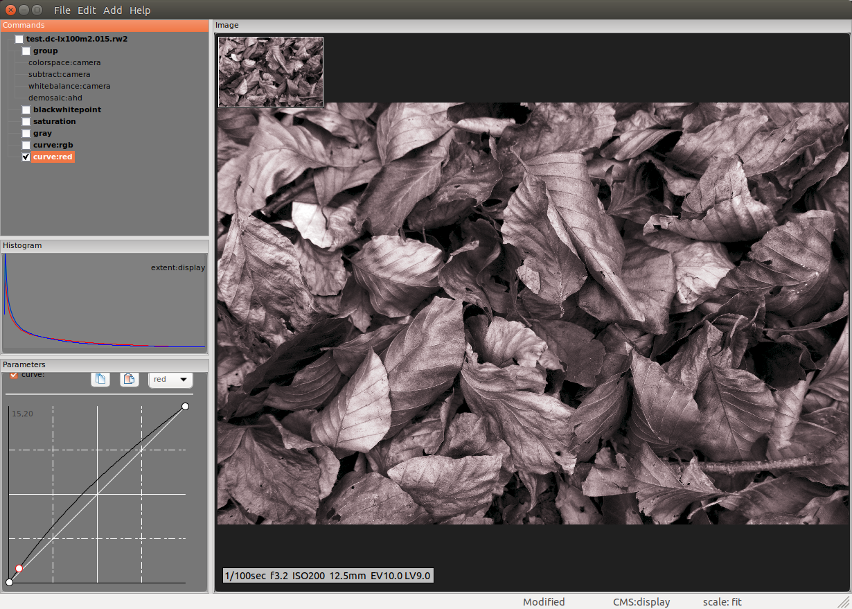
Ah, just saw @heckflosse posted a “toned” monochrome, nice! To that end in rawproc, the monochrome image is still RGB, where R=G=B, so one can re-introduce such color shifts by adding a per-channel curve. Here’s what I usually do to replicate sepia:

The curve works just the red channel; just a slight lift on the low end is all it takes. Knowing brown is a red-green mix, one could also add a green curve to mess with both components.

I hope the thread space I took up with this is helpful…

Oh, probably need to do this, even for screenshots:
All screenshots licensed : Creative Commons — Attribution-NonCommercial-ShareAlike 4.0 International — CC BY-NC-SA 4.0

4 Likes

With my color version, I tried to keep it “natural”. Here my monochrome edit (using just 5 simple modules), which is somewhat mere experimental:


test.dc-lx100m2.015.rw2.xmp (5.9 KB)

2 Likes

No risk at all!

I much appreciate the time and effort people, you in this case, put into the edits and an explanation often goes a long way.

I kinda intuited that based on some other edits I did, but my experience with doing black and white isn’t as of yet good enough to be sure. I’m glad you mention this so I can walk that path with a bit more confidence.

I sometimes use the relative luminance formula when working with colour images (this edit for example; channel mixer). I have tried using it with B&W edits and do like it when a lot of green is present in the shot. The puzzle pieces are starting to come together very slowly now and “all” I need to do now is start editing B&W shots.

About the 150, 75, 0 vs 0,100,50: Those two (mostly) are part of a triad or tetrad colour scheme, which might explain the aesthetic.

Question about the examples you posted: Your software’s pipeline order is as shown in the commands window (saturation → grey → curve)?

Definitely a helpful answer/explanation and it gives me some handholds I can experiment with/build on.

Thanks!

BTW: I really miss a colour analyse/info module in darktable. Using the colour picker and then getting a result like what this site does would be nice: RGBto or even better, something based on this: Adobe color

I like the brittleness that this edit seems to convey. A nice contrast to the oily/silver edit done by @ggbutcher.

Yes. In rawproc, when you open an image file, if there’s no toolchain in input.raw.default, it’ll just display the raw values as-is. You then add, one-by-one, tools to the chain to do the conversion, in the order you desire. The tools work in top-to-bottom order.

That’s what I do. I know enough about color-mixing to be dangerous, but in monochrome you can afford the danger… :face_with_raised_eyebrow:

I like vivid metallic look:

darktable and GIMP (GMI’C lut - “drop blues” from Creative Pack).

6 Likes

Don’t know exactly why, but this immediately reminds me a bit of those Dutch Golden Age/Baroque paintings, especially those depicting still lifes (fruits/animals/fish). Might have to do with the oil paint look and the saturated (dark) brown/orange colours.

Oh, and that’s meant as a compliment, I do like this one!

2 Likes

That may be. While editing I am often influenced (consciously or unconsciously) by the paintings. I like how the painters then and now can control and handle light. As photographers, we can learn a lot from them. :wink:

Tell me about it! The first time I saw the old masters Rembrandt, Frans Hals and Johannes Vermeer up close and personal in the Rijksmuseum I was deeply impressed by the way they ‘paint with light and shadows’.

@s7habo The little reddish-magenta in the top left quadrant is throwing me off a bit.

You already know a lot after looking at the pictures! :point_down:

You can learn a lot by analyzing them. Take this one, for example

If this was a photo, many would have turned on Filmic immediately to compress the dynamic range and first lighten the shadows to see the details. :laughing:

And as you can see, the subject lives precisely from this strong contrast and fact that the main subject is nicely framed by the shadow areas and thus becomes even more expressive.

This is just a quick example. We could talk about this for hours. :wink:

Edit: Post edited to fix the link

1 Like

Yeah, it doesn’t look real, but that’s what I was going for. :wink:

Your link does not work here

Do you know how to fox that?

https://upload.wikimedia.org/wikipedia/commons/5/5c/Albert_Bierstadt_-_Among_the_Sierra_Nevada%2C_California_-_Google_Art_Project.jpg

I hope this way you can copy and paste it into a new tab