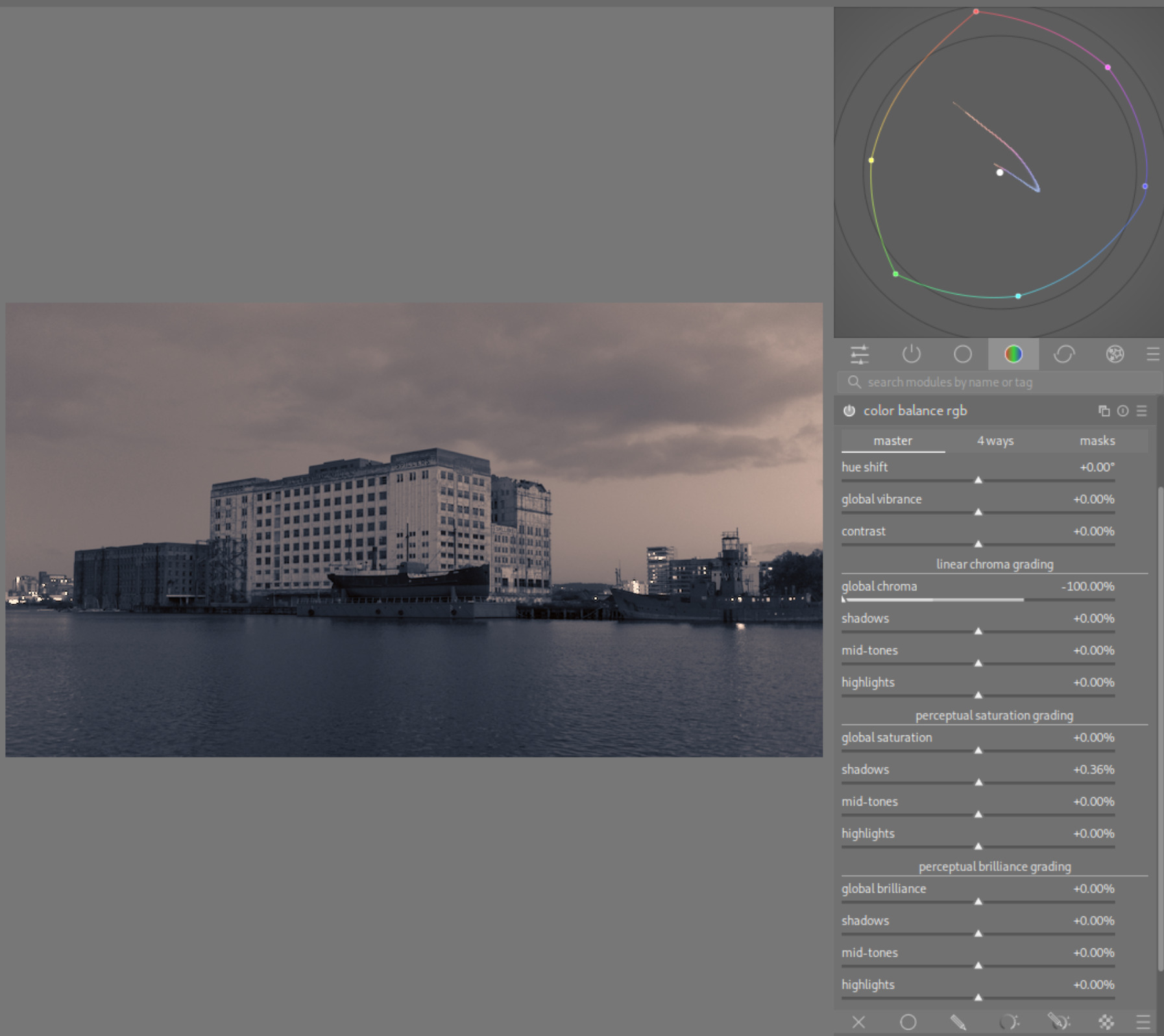
This is intended as a condensed tutorial on the ‘4 ways’ tab of the Color Balance RGB module. I don’t usually write tutorials like this, so please excuse me if I go into too little / too much detail.
Edit 1: Added info on the colour pickers, and images for example 1. Mention ASC-CDL in the offset section.
I have created a test image of sRGB values from 0 to 1.10 to help with visualising the effects. The xmp has a blur that you can remove if desired.
tone chart srgb.tif (61.9 KB) (licensed under CC0 1.0)
tone chart srgb.tif.xmp (6.7 KB)

Preface: ‘Linear chroma’ in the ‘master’ tab happens before the 4 ways tab, and ‘Perceptual saturation’ happens after the 4 ways tab.
Luminance and chroma sliders are soft limited (you won’t usually need to go outside of these limits), they all have hard limits of 100% for chroma, negative and positive 100% for luminance.
The chroma sliders add whatever hue you choose. If there is colour already in the image, you may need to adjust the hue slider to reach your desired colour, e.g. if you wanted to turn a yellow area orange, you would need to add red.
Global offset
This is known as ‘offset’ elsewhere (see ASC-CDL ‘SOP’ (slope, offset, power)). It affects all values in the image. It has a larger effect on lower values. It works like, but not exactly like, the ‘lift’ control in AgX ‘look’ section.
Luminance
Negative increases contrast. Crushes blacks (be careful!). Positive decreases contrast. Use this to raise blacks. Offset luminance on its own is usually unnecessary because the tonemapper afterwards is also built to raise or lower the black point. However, I’ve found some success in using this slider with masks to increase contrast in specific image areas.
Chroma
Will add a colour cast primarily to the darkest areas. Can be used to counteract shadows or power adjustments and neutralise the darkest areas, with negligible effect on anything brighter than shadows.
Power
This is sometimes known as ‘gamma’ elsewhere. It affects all values, except 0 and the ‘white fulcrum’ which is set in the ‘masks’ tab. It is recommended to use the picker for the white fulcrum when using power, as it ensures the normal function of this slider, which is to raise all image values when positive (and vice versa). Area of strongest effect is also dependent on white fulcrum - by default this is at (or near) middle-grey.
(White fulcrum doesn’t affect any other part of CB-RGB)
Happens after global offset. (If offset lifts values above 0, they will now be affected by power)
Luminance
Use it to affect ‘brightness.’ This will change the image’s mid-grey point. Similar to AgX ‘pivot target output’ or ‘brightness’ (in ‘look’ section).
Positive values decrease contrast in brighter areas and increase contrast in the darkest areas. Vice-versa for negative values.
Chroma
Use this for a colour cast on the whole image. You can counteract its effect in the brightest and darkest areas with the other three sections (global offset, shadows lift and highlights gain).
Shadows lift
Acts on the shadows region set in the ‘masks’ tab.
Luminance
Similar function to the exposure module, but with a parametric mask. Different result than ‘shadows brilliance’ in master tab.
Chroma
Use this to add colour to shadows and darker areas.
Highlights gain
Acts on the highlights region set in the ‘masks’ tab. Basically anything above the mask middle-grey point. There is some overlap between shadows, middle grey and highlights to avoid harsh transitions.
Luminance
Similar function to the exposure module, but with a parametric mask.
Chroma
Use this to add colour to brighter areas.
Examples
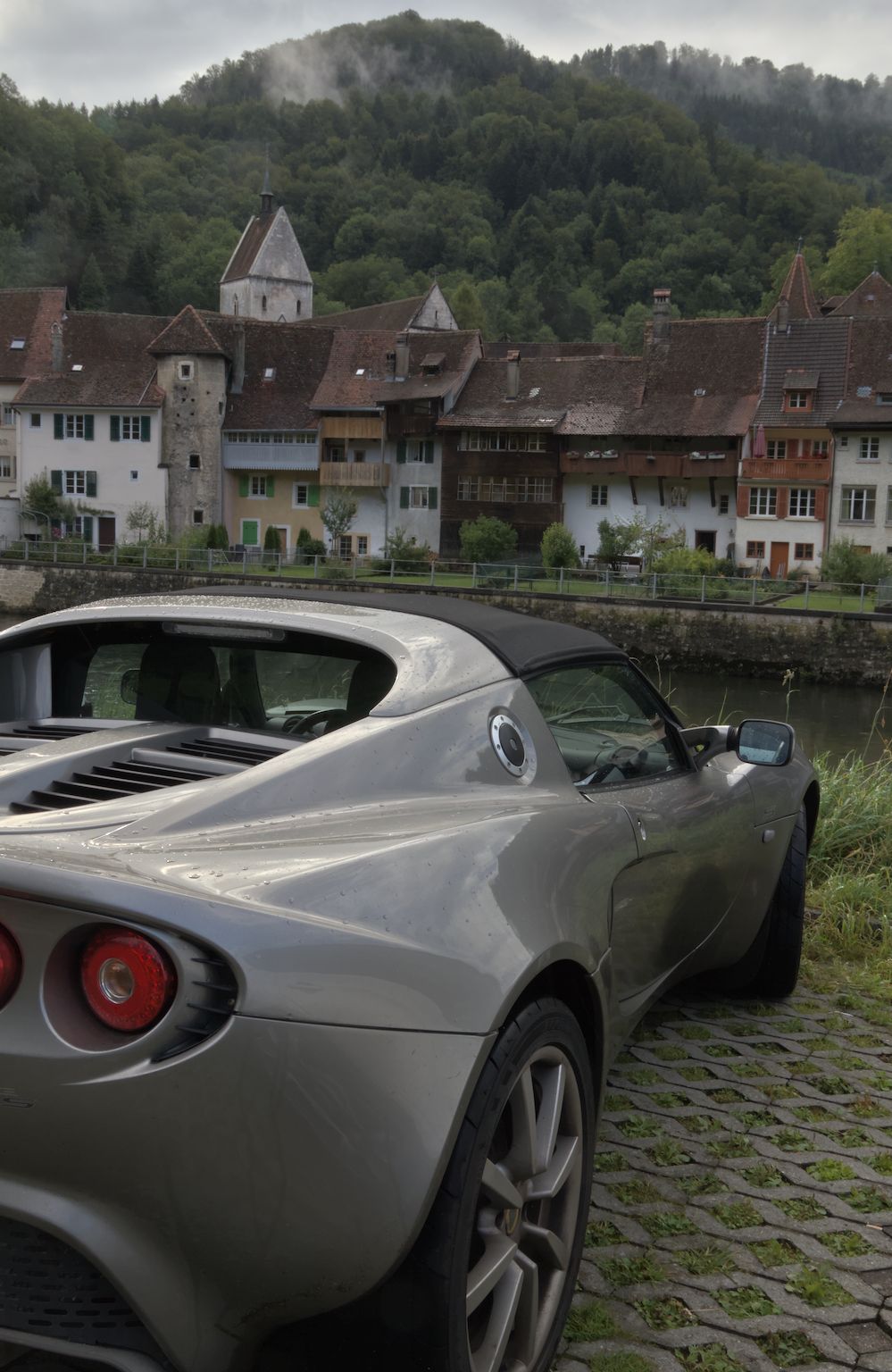
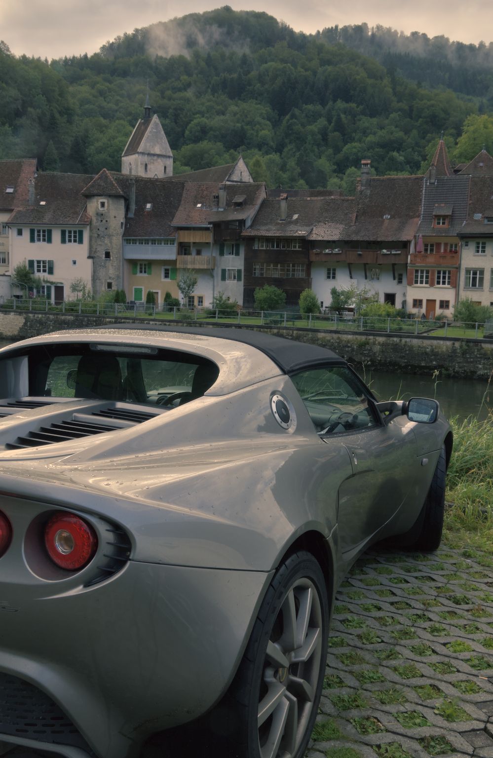
First let’s add a little classic ‘teal and orange’ in Switzerland. Download the CR2 raw from the linked post, as well as this xmp file I’ve attached, place them in a folder together and import them:
IMG_0026.CR2.xmp (11.3 KB)
xmp is made with DT 5.6.0, but it should open even on 5.4.1.
This xmp is a starting point, with no tonemapper active (i.e. Filmic/Sigmoid/AgX), and a default CB-RGB instance. Start by going to the ‘masks’ tab and pressing the picker icon next to ‘white fulcrum.’ It puts a selection box over the whole image and adjusts the value accordingly. Now press it again to deselect the picker and go to the 4 ways tab. Remember this step is all creative, the values are approximate, and you can adjust things to your taste.
- Set highlights gain hue to 65 degrees, and chroma to 5.00%.
- The red channel in some image areas is now slightly above 100%, so you may want to reduce the luminance slider here to bring that back.
- Set shadows lift hue to 230 degrees, and chroma to 5.00%.
- There is a little colour cast at the lowest end of the histogram/waveform. You can set global offset chroma up one step to 0.01% at the default 0 hue to mitigate this.
- Raise power luminance to 5% to put more emphasis on the trees and tyres, or lower it to put more emphasis on the car’s brighter areas.
Example 2
Here is an old building in a dock in London. I’ve again included an xmp with minimal adjustments, but the scene’s exposure is raised and it doesn’t really say ‘6pm in October’ anymore. We can add some colour and tone adjustments to enhance the feeling a little.
Download both of these, put them together in a folder and import the CR2.
IMG_8526.CR2 (31.6 MB) (licensed under CC BY-NC-SA 4.0)
IMG_8526.CR2.xmp (8.9 KB)
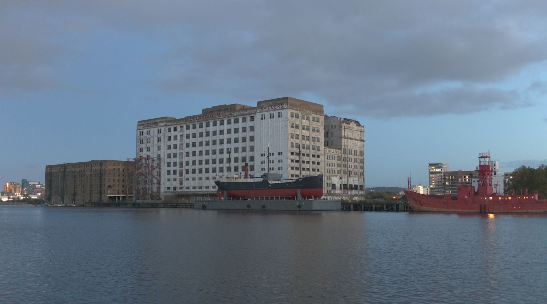
- Start by going to Color Balance RGB masks tab and press the picker next to white fulcrum. Press again to deselect.
- Go to 4 ways tab. Change highlights hue to 60 degrees and chroma to 6%. Set luminance to +50%.
- Change shadows hue to 250 degrees and chroma to 17%.
- Change global offset hue to 20 degrees, chroma to 0.15% and luminance to negative 0.40%.
- Change power luminance to -25%, hue to 300 degrees and chroma to 0.50%.
It’s now a little more harmonious. (click to unblur result)
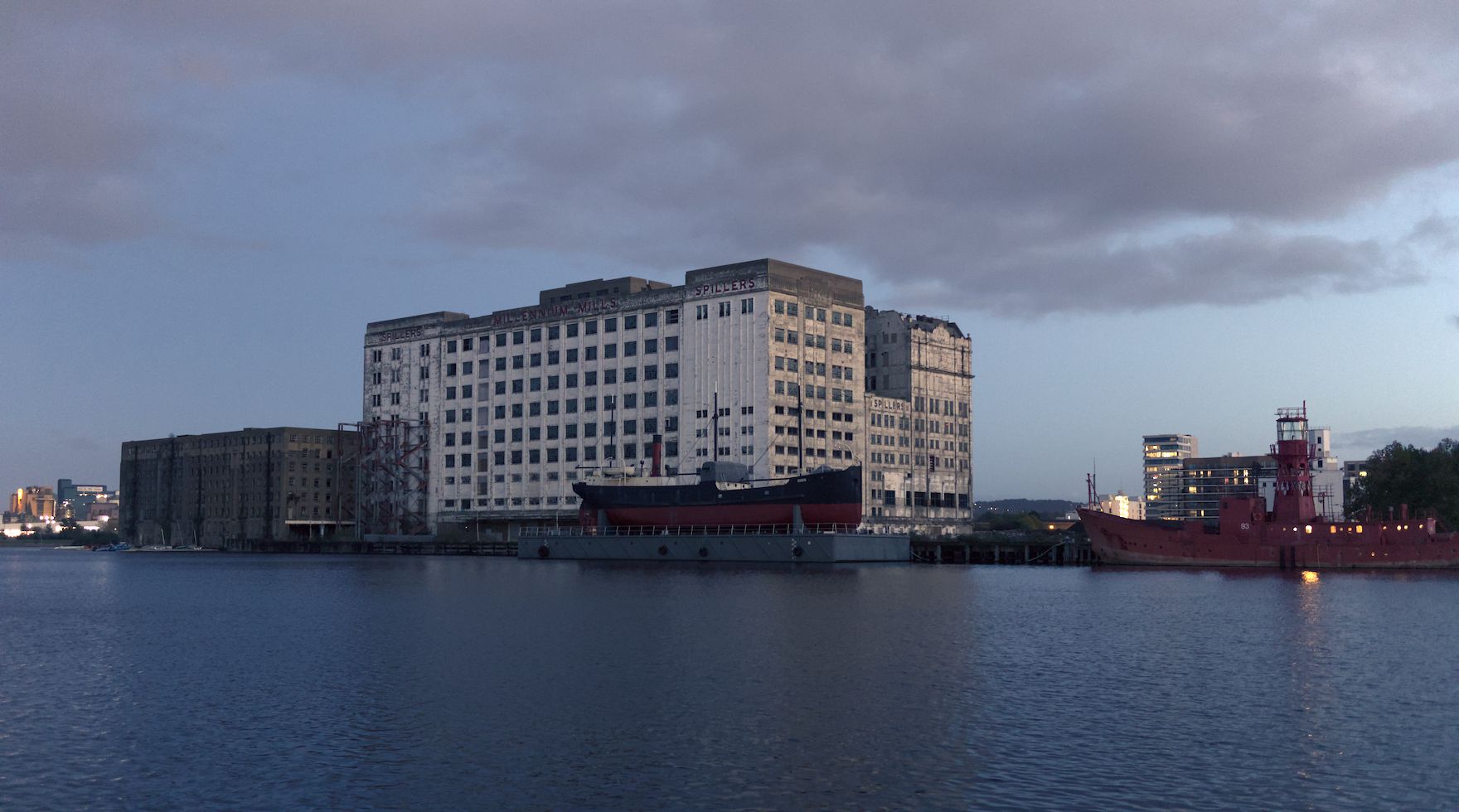
You can add local and global contrast to taste with other modules, of course.
Colour pickers
There are pickers next to each hue slider. By default, these select an area. They will provide the opposite hue of the selected area’s average (before any changes introduced by the module), and all four provide the same chroma percentage. A simple option for starting to neutralise colour casts. Ctrl-click to select the same hue instead. (This also changes from area to single point mode so it gets a little bit confusing)
That concludes just about everything I know about the 4 ways tab.
Tutorial written for @Tim and for anyone else who’d like a text reference.