I may be wrong, but I don’t think that with the current implementation it is possible to target the header of an active module. The only way that I could think of is using the has selector to find headers where the first button is checked, but that doesn’t seem to work, e.g.:
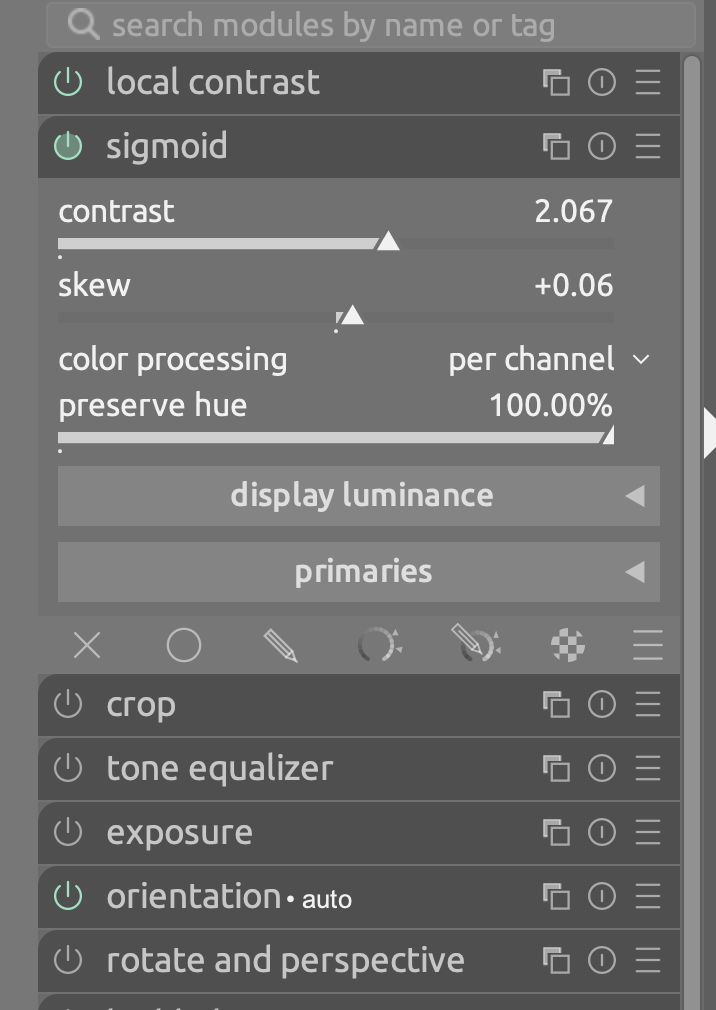
Thanks again, I combined this with @todd 's color of green as I found it more visible. Always had a little trouble seeing if a module was active - my eyes aren’t too good unfortunately. Kind regards, Jetze
Hello,
Thank you for sharing this code.
I think it’s great. Since I work on a laptop, I also gain a little vertical space.
I just made two changes to the first few lines: I made the header a little lighter (0.85) and used a light red color (F65B3C) for the active buttons.
I’ve always found the off/on state a little bit difficult to differentiate. I just tried it and it solves my problem. Thanks! +1 for adding this to the theme options.
Thanks @Masterpiga , nice.
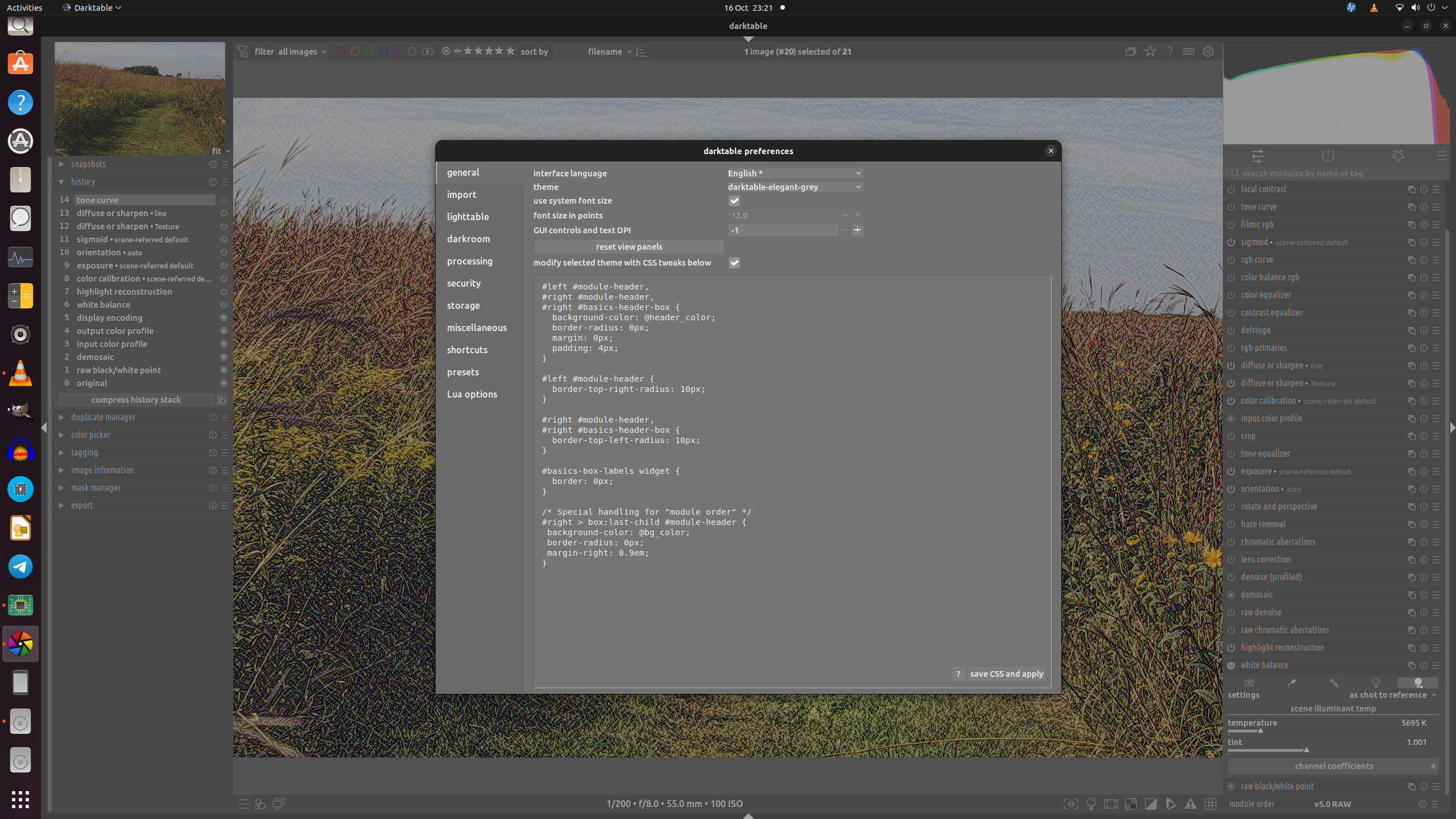
I’ve never used CSS or modified DT so I’ve perhaps messed up… It’s not working for me. I pasted into general but no change. I also quit DT and re-launched in case that helped. Here’s what my prefs now look like:-
I have clicked “save css and apply”!
I’m using the Appimage, 5.3.0+450~gc554ed8046, in case that’s relevant.
It created user.css in .config/darktable as it said it would, looks ok on a quick eyeball.
You’re missing at least one line from the beginning of the snippet. I think this happened to me too when I initially copied and pasted from here, not sure why it missed some lines.
Thanks, that’s fixed it, and the green is nice too. I think missing the lines is to do with the scrolling window in my browser. I should have checked more carefully though!
Thanks, @Masterpiga. I personally find the subtle visual distinctions these alterations introduce to be very helpful. I appreciate that this may not be so for everyone; but for me they’re really useful. Many thanks for posting so that those who like the effects may use them.