It seems that the switch between these looks occurred around 2008 - 2010. In fact, there is a Tarantino movie from 2007 which is one of the last examples of a movie being able to accurately create this look.
Hello, same guy here. I had more examples as well as examples of the difference of newer film, but pixls.us only let me reply 3 times. If you need more context, i will be happy to rewrite my response.
Keep in mind that a lot of these scans were done with older technology and may not represent accurately what was shown in the cinemas and what a good modern scan, which is more faithful to the final product, will look like.
Also I don’t think your comparison is fair. One battle after another had a lot of shots in direct sunlight which would be a better comparison vs for example the good, the bad and the ugly.
Thank you, I understand perfectly now what look are you talking about. Yes, I agree with you, these shots are great I mean look at those colors how beautiful they are, some people may call them muted. I remember when I was a novice in editing my photos I cranked up the saturation slider to get more “vibrant” colors I’m glad I’m past that.
Have you seen this? https://www.youtube.com/watch?v=za20Kb2VSN8&t=504s
I think you may find it interesting.
Also you should read this book: LIFELIKE: A book on color in digital photography – Dehancer Blog
In my original example before i got cut off i actually did use both shots from magnolia and OBAA (both directed by PTA) as a distinction between how new and old film looks.
Also most of the scans i sent were from 4k re-releases, but i do think part of the appeal of this look is due to how the celluloid has aged over time. Still, the difference between modern film and film before 2009-2008 is clear.
I will look into these! However, i think the colors while they are very beautiful and miles ahead most modern cinematography isn’t what sells this look. Rather it’s the way these colors blend into each other and spill over the edges in a both organic and imperfect way. There are modern movies that have good color palettes as the classics that still fail to achieve this special kind of quality. Personally, i don’t really understand the point of shooting on film nowadays if it’s just gonna look akin to an arri alexa.
I watch a lot of latest release Korean dramas and often the cinematography is exceptional. I feel a lot of it depends on how the footage is color graded. In the 1970’s most films were relatively disgusting in how they handled night scenes. It seemed that shot in daylight, underexposed and used a tungsten like white balance to add blue to night scenes. Technicolor was one of the greatest color films ever made. The reason, is because it was three strips of black and white film and not color. Then the film was used to produce natural and vibrant color prints for projection. This process is very similar to the RGB sensors now used in digital cameras. We can edit our images with a softness in both color and resolution similar to the film look of yesteryear or we can produce garish vibrant colors and maximize sharpness to produce some modern interpretation of what is good. The skill is in editing to achieve what you desire.
Ik it is still under development and a lot of stuff like RAW import etc is being setup which is great!
I keep refreshing the commits and we finally got it running on dev and refactor branches.
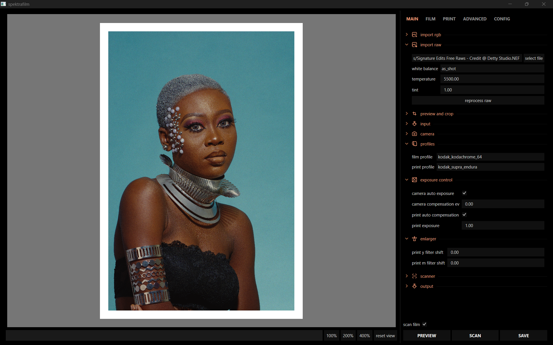
Great, I love the Kodachrome 64 look! I actually just bought Fred Herzog’s book, A Color Legacy, today and I’m fascinated by his photographs. He used Kodachrome film and the photos has that oil painting like quality that we talked about here. You can see some of his work here: The Estate of Fred Herzog | Artists | Equinox Gallery
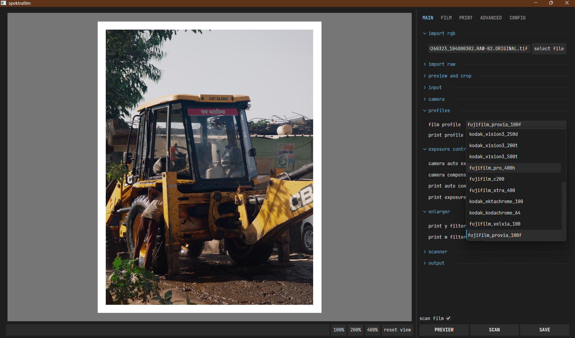
yeah, I had the mind space to re-enter the project in the last couple of weeks and had some fun with refactoring and laying down some ground work to not loose my mind in experimenting with positive film. the positive processing is still kind of hacky and i need to explore more aspects of it, but the profiles shows already some traits of the stocks. saturation might be completely off, and the amount of inhibition couplers should be tuned. they are still not “released” because they are unfinished.
just for fun i added some quality of life improvement to the gui, big work in progress also there. i implemented a few of the ideas that were proposed in the thread, and i have a couple more in the todo list
i renamed the project to spektrafilm, following the suggestion of some members of the forum, that pointed out that the name agx-emulsion is too similar to the agx tonemapper and it creates confusion (amazing work by the way). the new name makes also more sense with the project, i think.
Technicolor from 1932-1953 (Gone With the Wind, Red Shoes, The Wizard of Oz, etc…) was shot on three separate strips of film. Technicolor from 1954 on (Rebel Without a Cause, The Godfather, Vertigo, etc…) was shot on one strip (or three-in-one), though I believe used the same dye transfer process. It is one or both of these that would be the classic technicolor look you are likely referring. (We also have to remember that different cinematography techniques played some part in “the look.”)
I’m not sure whether the linked site has any useful information for these spectral film simulations, but is a goldmine of information about old film stocks.
Great decisions!
The project has always been an exploration quest of sorts to me. Spektrafilm suits it a lot better and we can run it with spektrafilm instead of the script before which is also a small but good change🙂
In my experience with negative stocks, the images from fuji cameras and others already have good levels of contrast but my pixel DNGs usually lack saturation and contrast so playing with it is very rewarding compared to other tools as we have multiple ways to do it with both film and print.
Now with positive stocks print controls are out the window and I don’t have any experience with the development process so I wouldn’t know how that could be handled .
really cool to see the updates! could you give me some update hints? i noticed you moved dye_density → channel_density, base_density… anything else? maybe different normalisation or scale?
also the positive film seems to be a relatively small change flipping a sign in only a few places, is that right?
[edit] the most important subtle change: empty data points are now null instead of NaN
i split the old dye_density in channel_density, base_density, midscale_neutral_density. this is to be able to have cleaner code later for black and white profiles, and naming is more clear.
i haven’t changed much more, i streamlined the profile creation of the negatives and removed unnecessary fittings of the density curves that i had before. so no big changes, mainly refactoring. i want to add black and white level correction, and add the option to save an image “for print”
for now, positive film processing just inverts the sign of the log_exposure correction of inhibition couplers. results are ok, still i haven’t done enough research to be sure this is the best way. i worked mainly on getting the data and exploring the profile creation side.
null seems to be the JSON compliant way for missing values.
i changed slightly the profile info, and now i specify type (negative or positive), channel_model (color or bw), and support (film or paper)
thanks! i think i got this working again. for now my stance at positive film is just that it simply skips the printing step and uses the “scan film” code path that i had previously. will do some cleanup/testing and push.