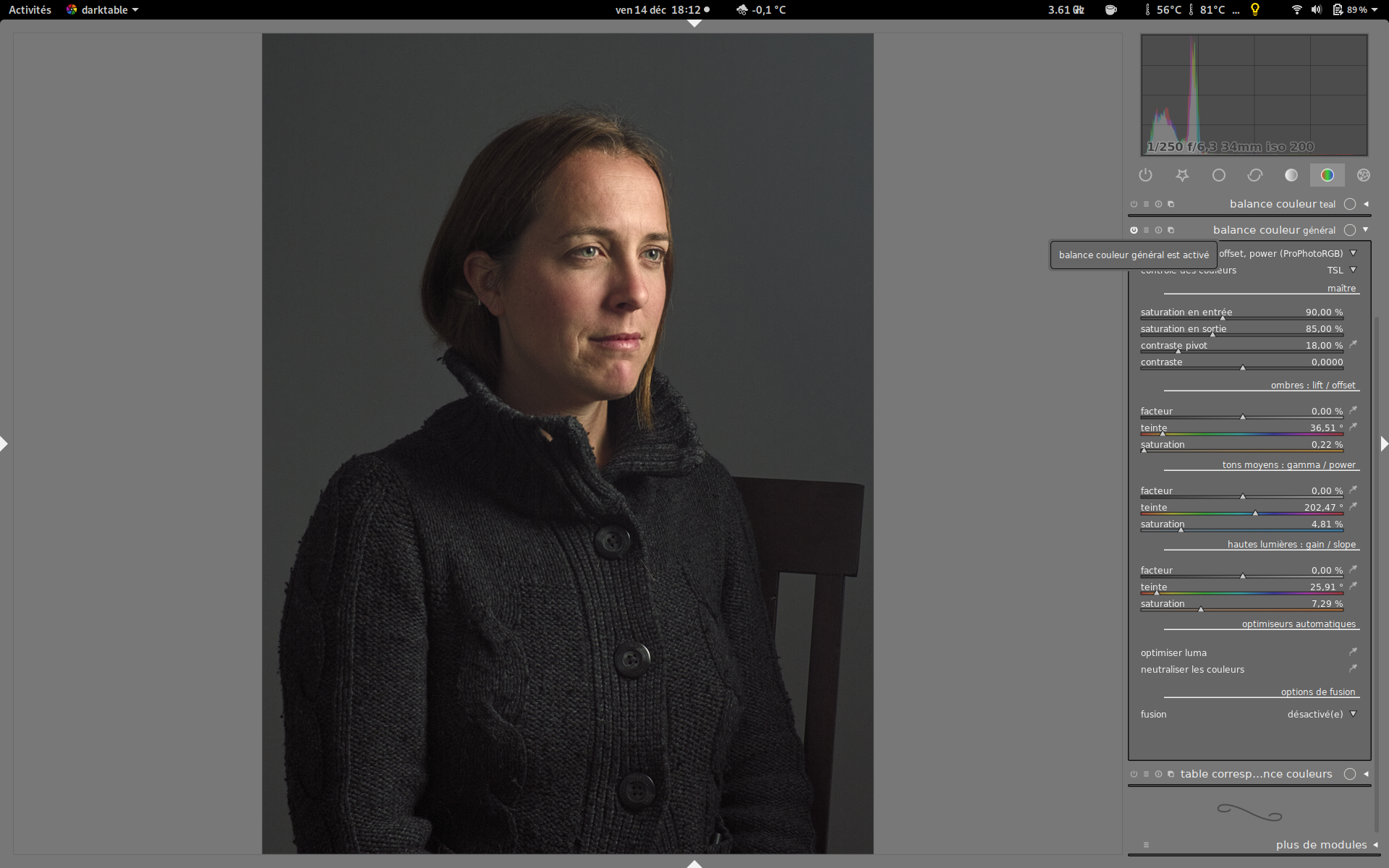
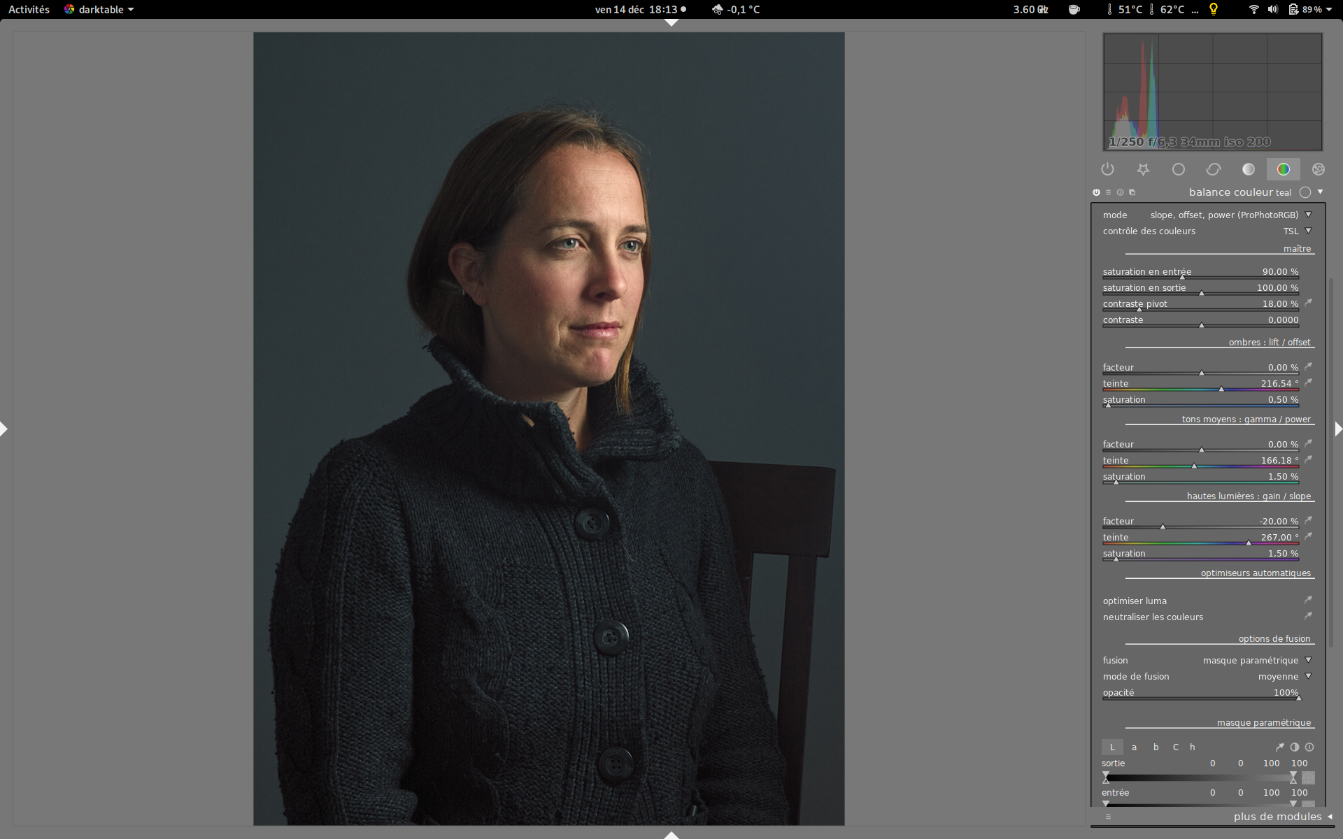
Color-grading is a well-known process in the cinema industry. You could describe it as the process of giving a slight and selective color shift to create a specific mood. The most famous it the teal-orange look, because it boosts the color contrast between skin tones and everything else, and is really easy to use when you have people in front of neutral-ish backgrounds (concrete or faded tones).
In darktable 2.6, I have upgraded the color balance to do just that, and you will find a teal and orange presets to get you started (the presets are fairly universal, although you might need to fine-tune the masking parameters to adapt to each case). Before this “creative” step, I advise you to use a “corrective” instance of color balance to neutralize possible parasite casts and have an overall balanced image.
Example with Mairi Troisième from @patdavid:
base image (filmic enabled in chroma-preservation mode):

with global neutralization :
add a teal instance (as in the darktable default preset):
and add an orange instance (as in the darktable default preset):

Color-grading works really better with neutral-ish colors. When your background is too saturated, to still get a color cast without destroying the image, you can first decrease the input desaturation of the color balance. If you desaturate heavily the input, the color balance can then be used as a split-toning too.
Then, when you are happy with the hues but find the output too saturated, you can decrease the output saturation to dampen the effect a bit, without affecting the hue.
The new mask feathering feature in darktable 2.6 makes it really easy to isolate areas with a sharp contour, so this kind of editing becomes a breeze.
Orange mask with feathering through guided filters : (thanks to Heiko Bauke)

Also, when using filmic, to prevent the tonemapping from shifting the hues you struggled to get, enable the chrominance preservation option (and don’t forget to set the output saturation to 75-85 % in the first global instance of color balance).
For some reason, this technic is still not widely used in photography. That’s a shame because it’s really powerful, either to correct odd colors (on this picture, the raw colors seem off) or to get a specific look (color film or else). In combination with the color-checker module and film emulation LUTs, darktable becomes a workhorse to quickely master your color work. (It’s going to be better once we make the pipe fully RGB-able, but color-balance and filmic work in RGB already, so as long as you don’t touch the Lab modules in-between, you are safe for now).
It’s also a powerful technic when you have several light sources in an image, and thus several white-balances. You can mask the regions and adjust the white-balances selectively (for example : one white-balance for direct sun-light, one for reflected light, etc.). The color-pickers right to the hue sliders are intended to find the right parameters to neutralize the patch you selected with an optimization, so you spare yourself the trouble to find the best parameters for hours. Select a neutral patch in highlights, then shadows, then mid-tones, and you are done. You can also trigger the optimization button (bottom of the module) to refine the first estimation (or completely degrade it if your patches were ill-chosen, e.g. not really neutral).


