Hi all! I am relatively new to the new scene-referred workflow and I have been reading up on it, but it still goes over my head at times I am mostly happy with the results, but sometimes run into problems.
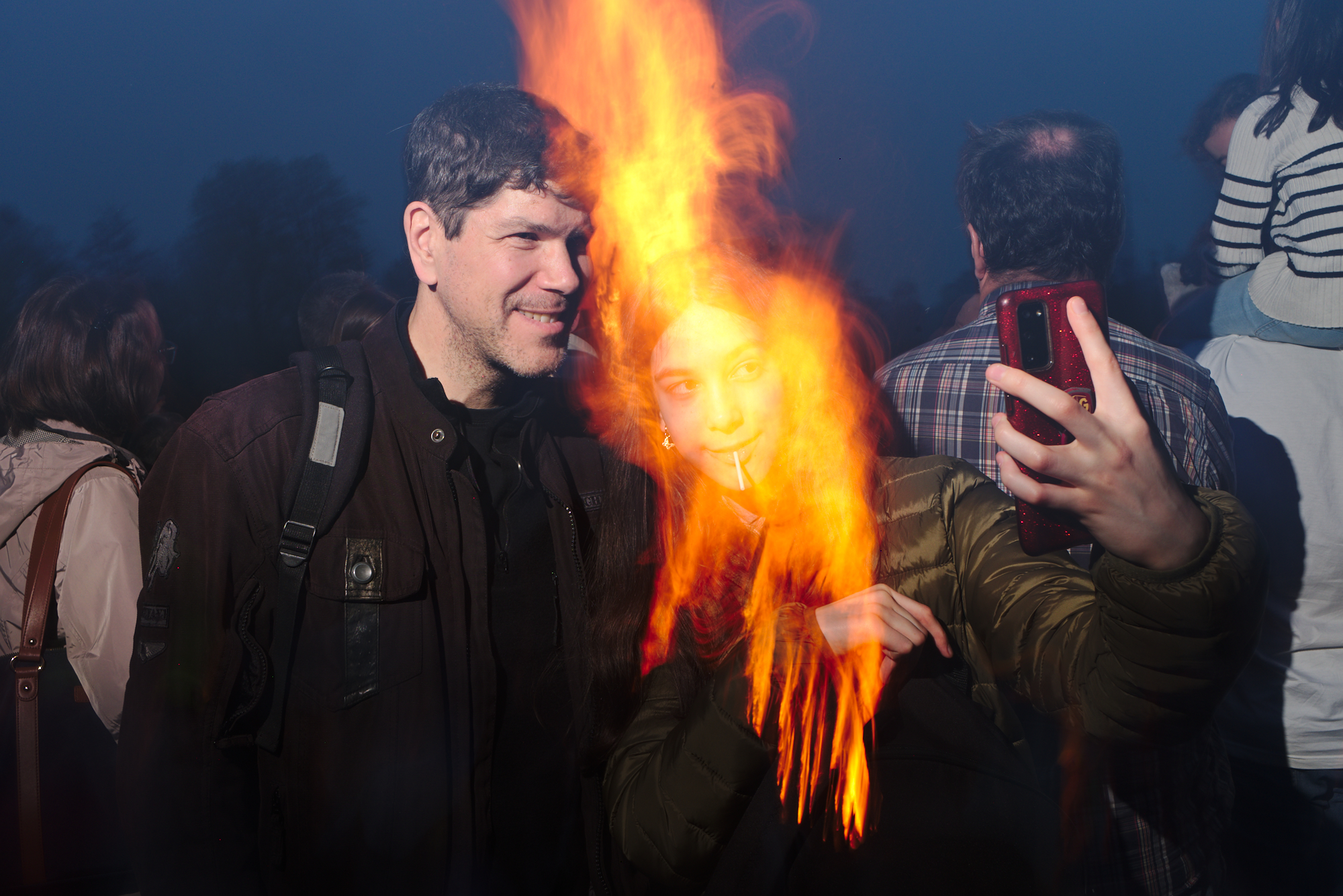
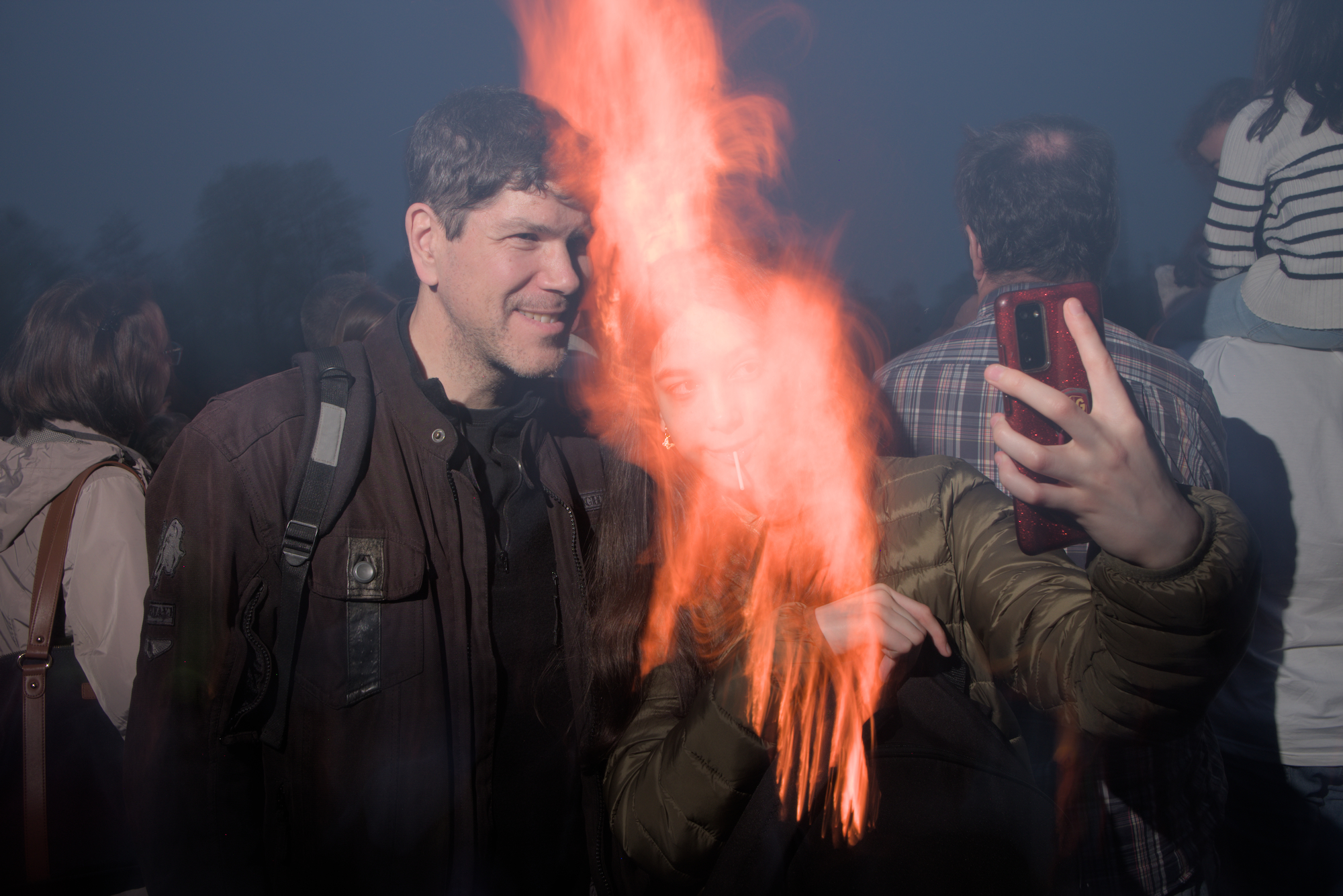
I have recently tried to re-work an older photo that I had still processed with the older screen-referred dt version. After “discard history” I noticed a severe hue-shift that renders the fire in the image in a strange unnatural salmon-like orange.
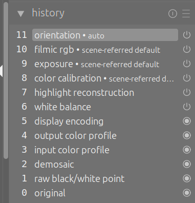
I’ll add three images below:
Old Version
When I first learned that the yellow you see in the flame is actually a hue shift introduced by e.g. JPEG processing, I almost didn’t believe it What Filmic and Sigmoid do is hue shift correction which, in my opinion at least, doesn’t look natural at all. In my book most bright orange objects (sunsets, fire, sodium vapor street lamps) follow this sort of gradient: (not exactly, but you get my point)
Wait, this exact problem was the first ever post I made on this forum 2 years ago
@priort and @kofa were the first people that I ever interacted with here … nostalgia
I still remember the day I learned how to combat this hue problem and was so excited, thanks again, Todd, for help
EDIT: Kofa, when I first tried Sigmoid, I think I didn’t know about the hue slider, so I didn’t pay too much attention to your answer
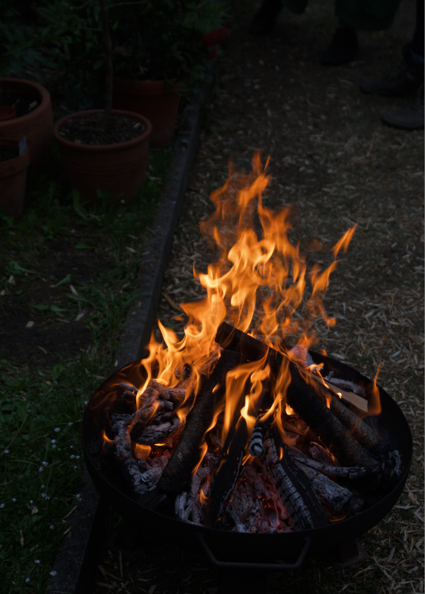
I recently did a little experiment outside at a birthday party.
We had this fire bowl and 5-6 people were standing around it. I asked the people present to describe to me exactly what colors they saw in the flames. I was particularly interested in the difference between the lighter and darker parts of the flame.
No one (including me) saw yellow color in lighter flames. At most they were yellowish-orange with less saturation than the darker ones.
I remembered the color and edited this photo the same evening as I perceived the colors of the flame:
Hi @Daniel2 you have some great answers here already. I am going to make an alternative suggestion. Turn off filmic and turn on Sigmoid. Decide for yourself which rendition you prefer. However, be warned that the colors in Sigmoid are more colorful straight out of the box while filmic generally expects you to play with saturation later. I personally use Sigmoid as my default tone mapper because I like the results that I get straight out of the box without any user input for most images that I shoot. Good luck.
Exactly the reason why I use Sigmoid like 99% of the time, it sometimes almost feels like cheating haha.
Occasionally, there’s a photo where I need detailed and saturated highlights, like clouds on a sunset sky of an overall high contrast scene, and so far I have never been able to pull that off with Sigmoid. In those cases I use Filmic v5/no and skew hight/shadow balance one way (idk which one)
Yes, although Filmic is arguably going too far in preserving the hues in many cases (try searching for salmon sunset). To control it you have the highlights saturation mix slider in v7 and the preserve chrominance option in v6 and older.
This video by the Filmic developer goes into more detail:

")