I am new to Darktable. Since I started right away with Darktable 3.2 (still using it), I adopted the scene-referred workflow from the outset. I find this new workflow very appealing conceptually.
So far I have been busy learning to use Darktable by applying it to diverse test images. For some of my images I much prefer the result that I can obtain easily with Darktable and the scene-referred workflow. This seems to be especially true for outdoor images with high contrast, like in a photograph featuring a background of glowing mountain peaks during sunset, where filmic seems to help to preserve color in the highlights without producing a HDR look.
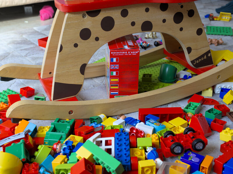
But in other cases I noted that the colors produced by Darktable with the scene-referred workflow look really strange. I know that novice users tend to complain about Darktable not reproducing out-of-camera JPEG colors exactly, and I understand that out-of-camera colors are subjective. But I have the impression that the issue that I observe goes beyond that. Here is an example image that demonstrates the problem. (I hereby release this image into the public domain.)
I’m actually a bit surprised that the filmic result has rather strong contrast and saturation (isn’t it supposed to be rather neutral by default?), but this is not why I am writing this up.
I am most puzzled by the color of the purple brick with plums in the right bottom corner. Looking at it directly with my own eyes (both in daylight and artificial light) both the plums and their background have a purple color. I know that purple is problematic with digital camera sensors, but the OOC JPEG does preserve more-or-less the natural appearance of the brick. The same is true for the Darktable-produced result when filmic rgb is disabled. When filmic rgb is enabled, however, the background color of the brick goes from purple to pure blue. In reality, the color of the truly blue bricks (like the long one in the bottom center) is clearly different from the purple one. There are other such color changes in this image, but the one of the purple brick is the most striking.
Surely, this must have been discussed before, but I could not find an explaination. On the contrary, I read that filmic rgb is not supposed to do anything to colors, only to luminance.
Would someone be so kind to shed some light on this issue or provide a pointer? Many thanks!
Nope, a neutral tonemapper has a linear section until it starts to rolloff the highlights and nothing more.
This kind of tonemapper is implemented in negadoctor.
Keep in mind that filmic use rgb ratio for hue preserving, this means that there is a lot of hue shift.
Pratically using the max rgb ratio is the same of doing the tonemapping in hsv color model, the rgb average is the same as hsi, rgb luminance is the same as ycbcr.
Thanks @s7habo! Both of your suggestions work for the specific problem of the purple block.
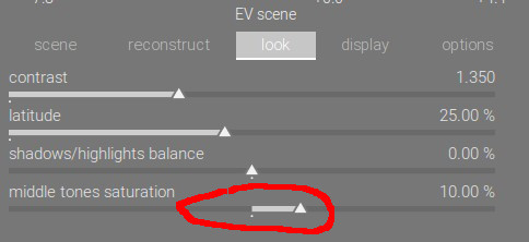
This taught me that the “middle tones saturation” slider controls not only how much shadows and highlights are desaturated, but can also increase the saturation of midtones (this is not directly visible in the graph since the y-axis only goes to 100%).
The above image looks better with “middle tones saturation” set to 0%, but I like my outdoor images more when it remains at 10%…
In a video about the scene-referred workflow I heard the advice that people who hesitate to abandon the old tone mapping module should use filmic rgb for mapping luminance and color balance for mapping color. That’s why I naively assumed that filmic should not touch colors, at least not too much.
Say that I decided that I would like to set “middle tones saturation” to 0% by default. Is there actually a way to do this in Darktable without affecting any other settings?
I know that I can create a default preset to be applied to all newly imported raw images, but this preset also seems to fix all the other parameters of the filmic rgb module. For example, the default values of white and black relative exposure as applied by the filmic rgb module depend on the image in some way (that I do not understand), but using a default preset sets them always to the same value for all images.
I always set filmic midtones saturation at 0, and adjust saturation using other tools - either color balance or channel mixer (color calibration now). See if that helps you.
White/Black relevance sliders both have an auto button beside them. But saving a preset doesn’t save the action of clicking the auto button, it saves the values of the sliders, meaning you have to re-do it for each image. But that is normal operation, and the same whether you have a preset or not. So you might as well save a preset with default white/black relevance values and mid tones saturation 0 to start with.
I also find that saturation algo in filmic is too harsh and produces strange hues in some images, especially for blues. I very much prefer to adjust saturation in color balance, however that one acts on all tonal range, not only on midtones.
I wonder if it is possible to adopt the color balace saturation algo in filmic
The tone mapping curve, naturally, only goes to 100% (display) brightness, as its task is to map scene brightness to display (output) brightness. The 100% mark is about brightness, not saturation.
The saturation curve is the other, slightly darker curve, by default looking somewhat like an inverted U or V. The width of the U is governed by the latitude control (which actually also governs how big the section is, where contrast is kept roughly constant; so, where the shoulder and the toe start). Shadows/highlights balance lets you slide the area defined by latitude up or down the x axis (scene brightness), around mid-grey. Shadows and highlights, outside the latitude range, are gradually desaturated: pure black and pure white have no saturation. The middle tones saturation slider controls how much the saturation of mid-tones (inside the latitude) is boosted.
Here’s another question: As you say the latitude control parameter controls two things: (1) the width of the linear section of the tonemapping curve, and (2) the width of the plateau of the (de)saturation curve. I guess that the decision to couple both together in this way is a design choice motivated by the desire to mimic photographic film.
Indeed. But instead the tooltip says: “desaturates the output of the module specifically at extreme luminances. increase if shadows and/or highlights are under-saturated.” Also, reading the documentation, I got the impression that this control is only about decreasing the saturation of some parts of the image, not increasing it.
<strict>
Is that really a log-log plot? Darktable 3.4 shows a tick for zero on the y-axis.
The x-axis (EV) for sure is logarithmic, but the y-axis corresponds to the “display-referred output range” and that must be rather a power function (gamma-correction)? </strict>
But in any case both axes are roughly perceptually linear, so the middle section of the tonemapping curve is where mapping is roughly perceptually linear. Returning to my question above, I do not see a fundamental reason why the plateau of the color saturation zone should correspond to this zone, but I guess separating both would make little sense in practice and defeat the purpose of the filmic module.
Use parametric masks so it only affects range you want. g (grey) you can take it out of highlights and shadows. Cz (chroma) you can take it out of already highly saturated areas. Hz (hue) you can have it affect only certain colours. Play around to your hearts content!
The advice from Boris is a good one. The saturation slider in filmic often helps with oversaturated colours. However, for skin tones I prefer filmic without chrominance preservation, since the preservation modes often tend to shift them into dull reddish colour.
Yeah, I build master branch on a daily base for testing.
I tried color balance rgb, although not extensively as it is slow (it doesn’t have yet an OpenCL code path).
I am perplexed, for a few of reasons:
I don’t fully understand it
contrast / contrast fulcrum from old color balance is removed, and I don’t see an equivalent in DT (don’t tell me tone equalizer)
function auto neutralize colors in old color balance based on shadows / midtones / highlight patches is removed, and again I do not see an equivalent