Using AgX as "Digital Film Stock"

In a previous post of mine, I mentioned how I sped up my workflow by ignoring the auto-pickers in the AgX module, and treating the module like a “digital film stock”. I want to explain that idea in a bit more depth as well as provide some additional tips on how I use the module. Either way, I hope it can be thought-provoking.

What do I mean by “Digital Film Stock”

Film Stocks are, in essence, a physical tone-mapper that photographers use, or misuse :wink:, to accomplish their creative intent. It takes in light from the scene, and converts it into a physical image/negative on the display medium (the film itself before enlarging/printing).

Film stocks all have their unique looks based on their chemistry/tuning, and this is one thing that makes them so fun. You take a picture, and before you even develop it, much of the image’s characteristics/dynamics/colors are already semi-determined by the very nature of the film stock.

The goal of a “digital film stock”, or DFS, is to provide a similar set of unique look characteristics and/or built-in color shifts, in an easy to use format, while enabling the end user to experiment, manipulate, or create their own DFS as they please.

This is already possible and done via styles, but the issue with styles is that they are not entirely simple. There are pitfalls one can fall into unless they are familiar with how styles work. Module presets, on the other hand, are pretty much foolproof.

This is where the AgX module comes in.

Using AgX as a DFS

There are few things I consider when designing a DFS:

  1. Light Dynamics:
    • Dynamic Range (How many stops of light will the DFS be built to handle?)
    • Mid-tone Contrast
    • Highlight/Shadow compression
    • Target White/Black
  2. Colors:
    • What color shifts do we want, if any?
    • Overall saturation level?

Let’s go through each point and create a DFS using AgX.

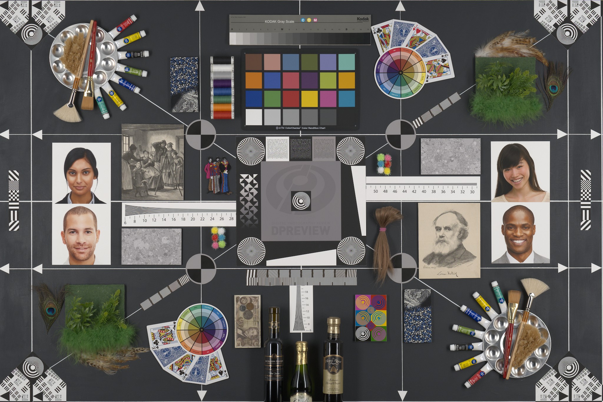
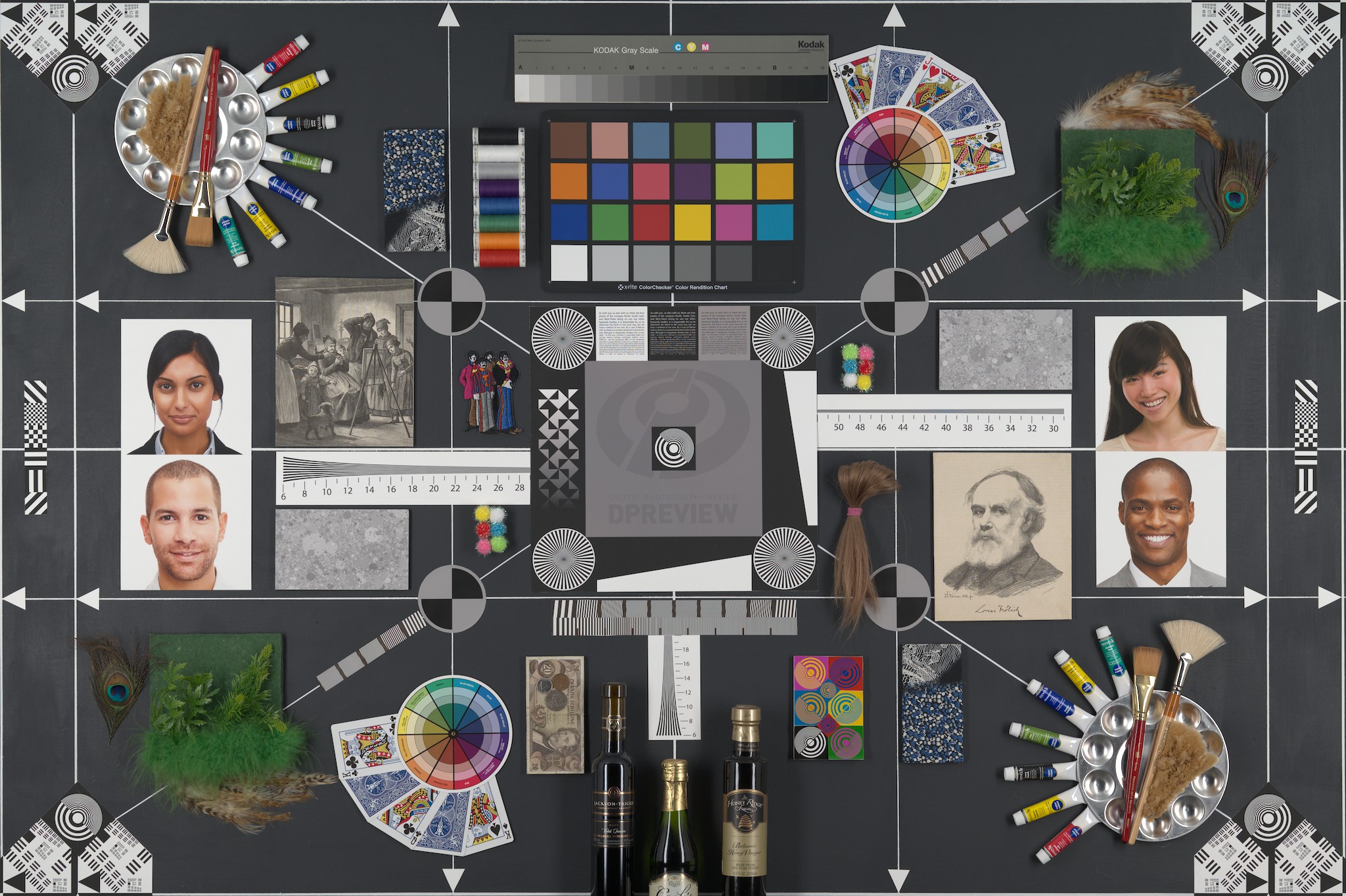
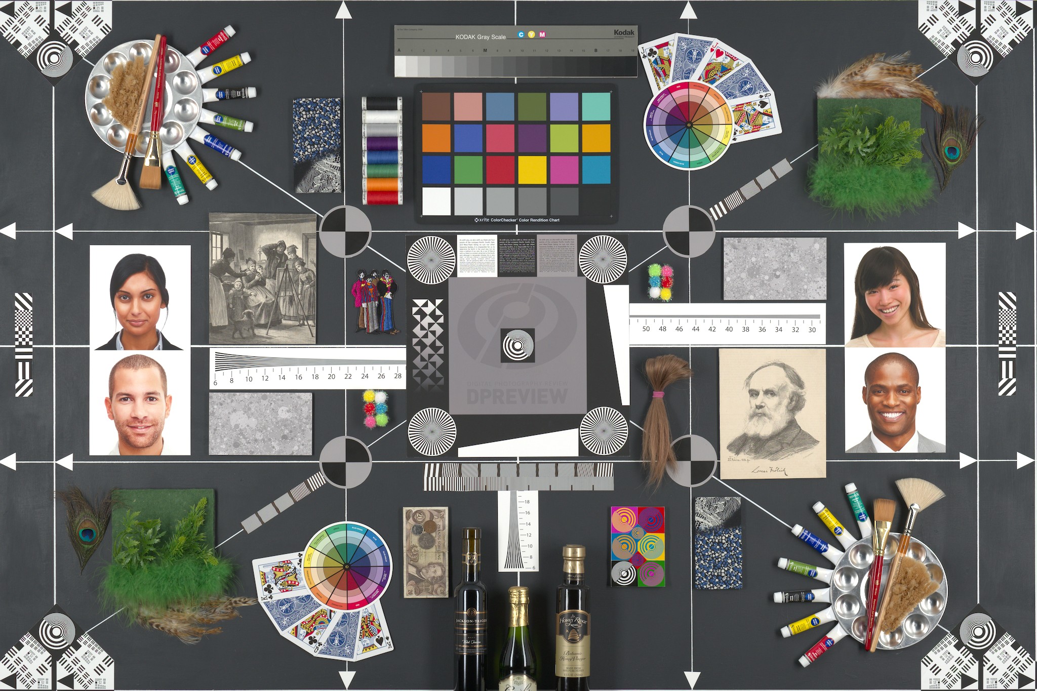
Pick a Good Reference Picture

A good reference image is one that

  1. Covers a relatively wide dynamic range (could contain pure black/pure white after adding some contrast)
  2. Has some amount of midtones (There should be some kind of midtone-ish subject matter preferrably)
  3. Has a wide range of color hues in it (so that we can accurately assess our DFS on various colors).

Set the Initial Exposure

Set the exposure to a good place, based on your taste.

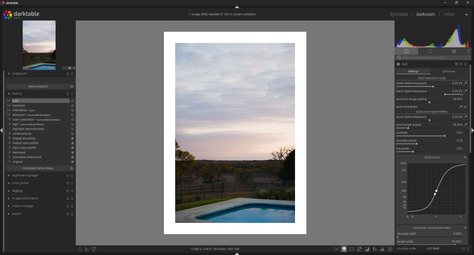
AgX: Input Dynamic Range

Now it is time to set the input dynamic range in AgX.
This is roughly how much data you are expecting your DFS to handle as input. This maps roughly to the final dynamic range of your DFS, but is not exactly the same (Some dynamic range is “lost” after adding contrast, increasing shoulder/toe power, etc.). You can leave it wide open to maximize the digital capabilities, or you can narrow it in order to create a DFS with a narrower dynamic range.

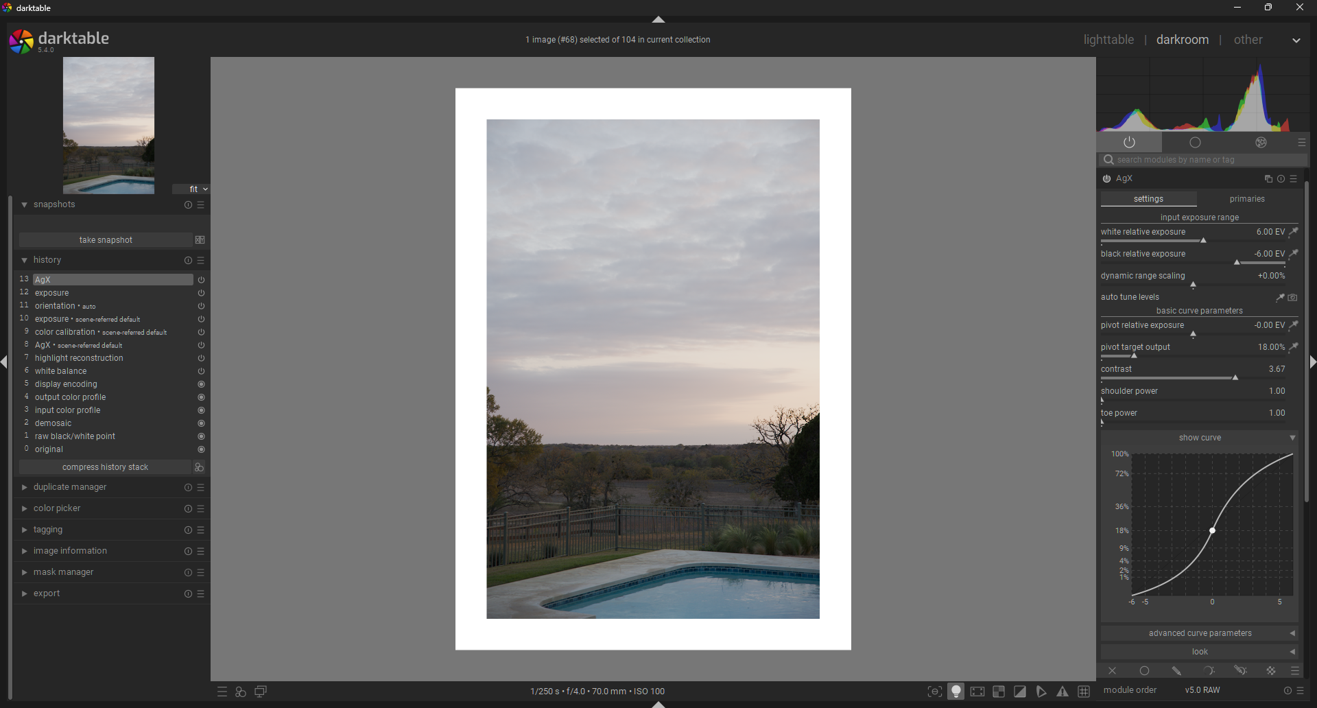
Here are two examples, one with -4 to 4 EV input exposure range, and one with -10 to 10 EV input exposure range. Immediately, you can see what this does to the image. Take a look at how the “-4 to 4” version is practically clipping already. This is important to understand: If you select a wider input Dynamic Range, you will be able to boost contrast more, before clipping. On the other hand, narrow dynamic range films/DFS tend to provide a naturally dramatic look.

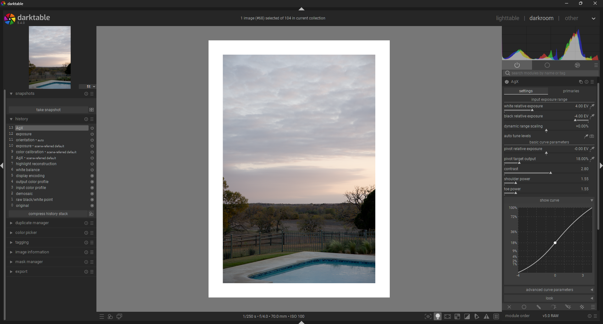
In this case, I will go with something more reasonable: -6 to 6 EV input exposure range. My goal is to avoid clipping at this stage, since further steps will continue narrowing my effective dynamic range.
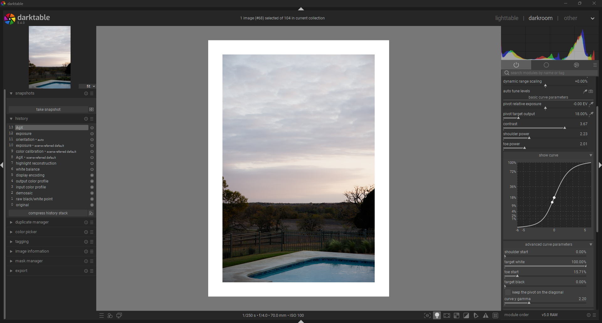
AgX: Contrast

This is a crucial step. Set shoulder and toe power to 1. We are setting the contrast primarily based on our mid-grey subject, NOT on the shadows and highlights. Setting the power sliders to 1 helps me judge only the contrast change occurring in the midtones. Contrast in the shadows and highlights will be handled in the next step.

AgX: Shoulder & Toe Power

Adjust shoulder and toe power to taste while keeping these things in mind:

  1. Shoulder Power: Increases the contrast in highlights, while crushing ultra highlights. Overdo it and you get sort of an HDR look. Keep it low for a more filmy look.
  2. Toe Power: Increase to bring out some additional definition in the shadows, while crushing low-shadows into the darkness.
    I ended up going pretty moderate on both power sliders. I didn’t want to absolutely crush the shadows, and I did not want the HDR look in the highlights.
  3. Increasing the power of the shoulder and/or toe significantly, will reduce your “effective dynamic range” (The number of stops between minimum and maximum brightness).

AgX: Shoulder & Toe Start

Increasing the shoulder start and toe start sliders increases the linear midtone latitude/range of your DFS, meaning that you are increasing how much of your midtone range is at peak contrast. In addition, you are effectively hardening the “knee” of both the highlights and/or shadows. This means that the transition from peak contrast(in linear part of the curve) to extreme low contrast(in extream highlights/shadows) is much faster when it does happen.

Here are some things to keep in mind when setting your shoulder & toe start positions:

  1. In analog film, the transition from midtones to extreme highlights is generally smooth, while the transition from midtones to extreme shadows is generally faster.
  2. In some digitally processed images, the transition from midtones to highlights is very harsh. You can avoid this by keeping the shoulder start value low.
  3. Increasing the start positions for the shoulder & toe further reduces your “effective dynamic range”. If you want to know what your minimum available dynamic range is at the current contrast, increase the shoulder and toe start values to 100%.

For my DFS, I increased the toe start slightly to increase my shadow definition and crush the extreme shadows a little more.

AgX: Target White, Target Black

Fairly Straightforward. Tips:

  1. Increase target black to get the faded black look from analog film
  2. Decrease target white to get the soft white look from movies.
  3. Don’t touch this if you want to maximize your dynamic range and preserve pure black/white.
  4. Increasing target black or decreasing target white will decrease your effective dynamic range.


I ended up bringing up the blacks a little and decreasing the target white as well. I think this helps create a DFS that is naturally unifying and glues things together. It helps remove the distraction of details in the shadows and highlights. Feel free to go the other way and maximize image clarity.

AgX: Color Balancing with Primaries

This is a tricky one. You can ignore it, or dive deep into it. If you want to add some color shifting to your DFS, Here is some tips and how I would go about it:

  1. Before you start, reset all primaries adjustments: 0 attenuation, 0 rotation, and same for boost and negative rotation.
  2. If you want to do something similar to film, then take a look at your favorite film’s datasheet. There is often an RGB response curves showing how the three different color layers react with the same amount of exposure. You can emulate this by adjusting the attenuation of your input red, green, and blue primaries inversely and then boosting then equally back up to make up for the saturation loss.
  3. For example, Kodak Portra has blue, green, and red densities at a ratio ~4:3:1. You can emulate this by setting your attenuation sliders to Red: 75% (1/4th density), Green: 25% (3/4ths density), Blue: 0%(100% density). You can then add this purity back in, while maintaining the rgb ratio, by increasing the output red, green, blue boost sliders by 33% each (There was a total decrease of ~100 percentage points, and now a total boost of ~100 percentage points).
  4. You will notice that you lose some overall saturation at this point. You can boost overall purity more with the “master purity boost” slider. In my case I found a value of 175% offset the overall saturation loss.

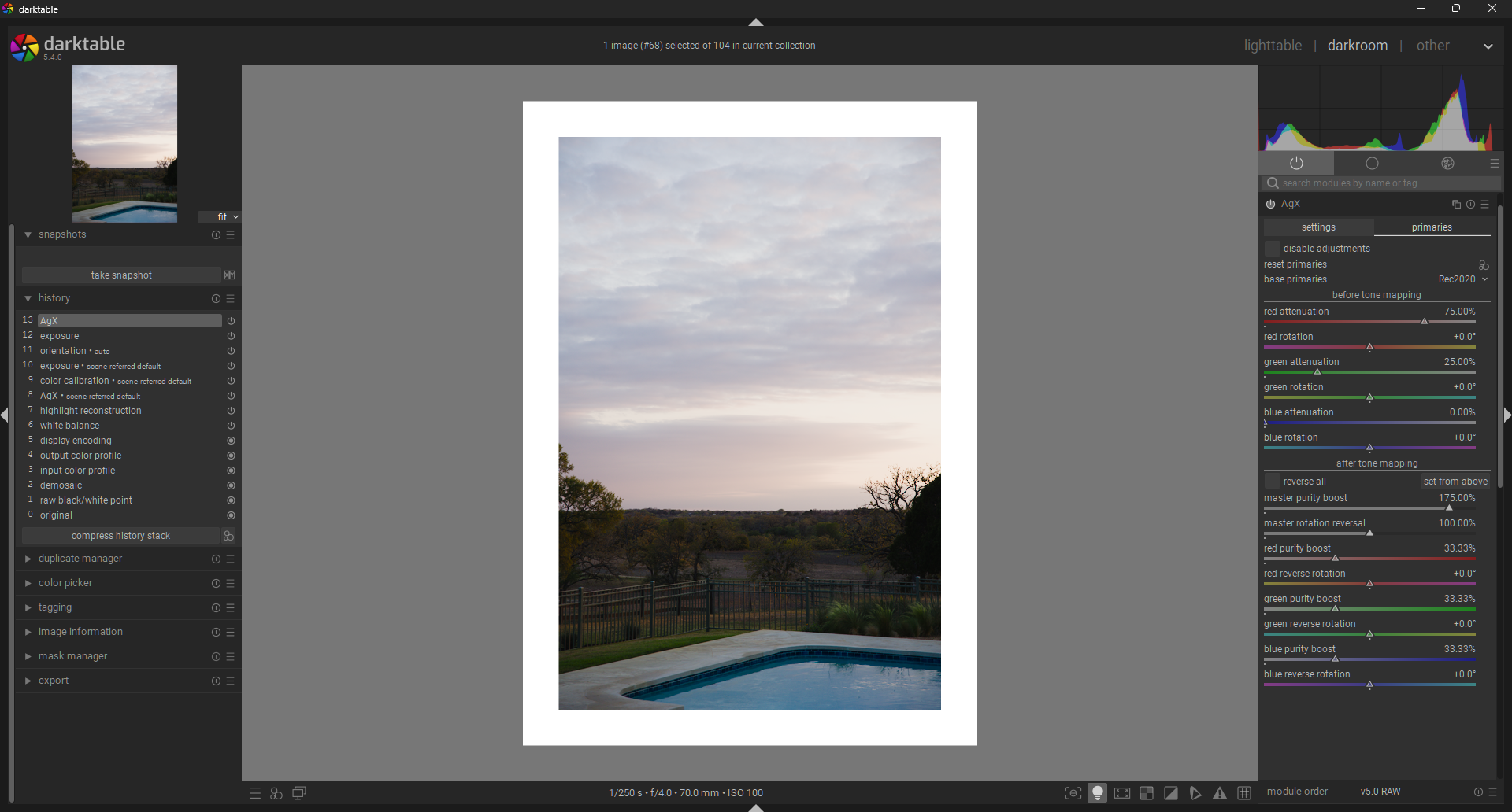
AgX: Hue Shifting with Primaries

We continue the modification of color, now with the rotational sliders in the primaries section of AgX. Here are some tips:

  1. One great way to see the effect of all this is to use the Vector scope to see the overall effect.
  2. If you want to squish the hue in a similar way to many analog film stocks, then rotate red towards orange a little, green towards yellow a bit, and blue towards cyan slightly more.
  3. Or forget emulating analog, and go crazy.

AgX: Saturation

Simple: boost saturation to taste. Keep in mind that this is meant to be generally applicable DFS, not ultraspecific to THIS PHOTO.

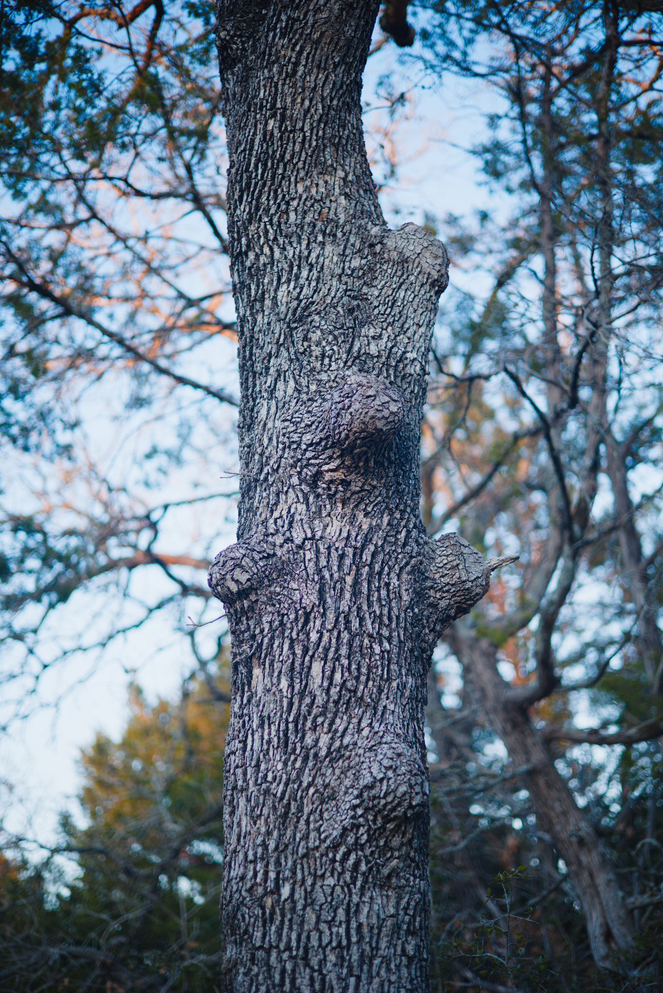
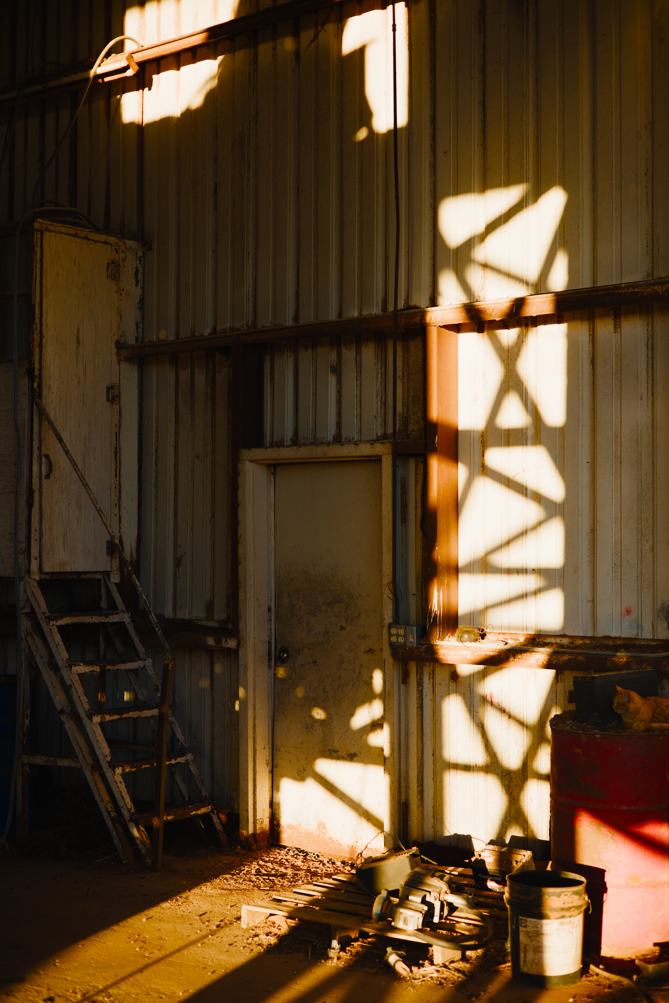
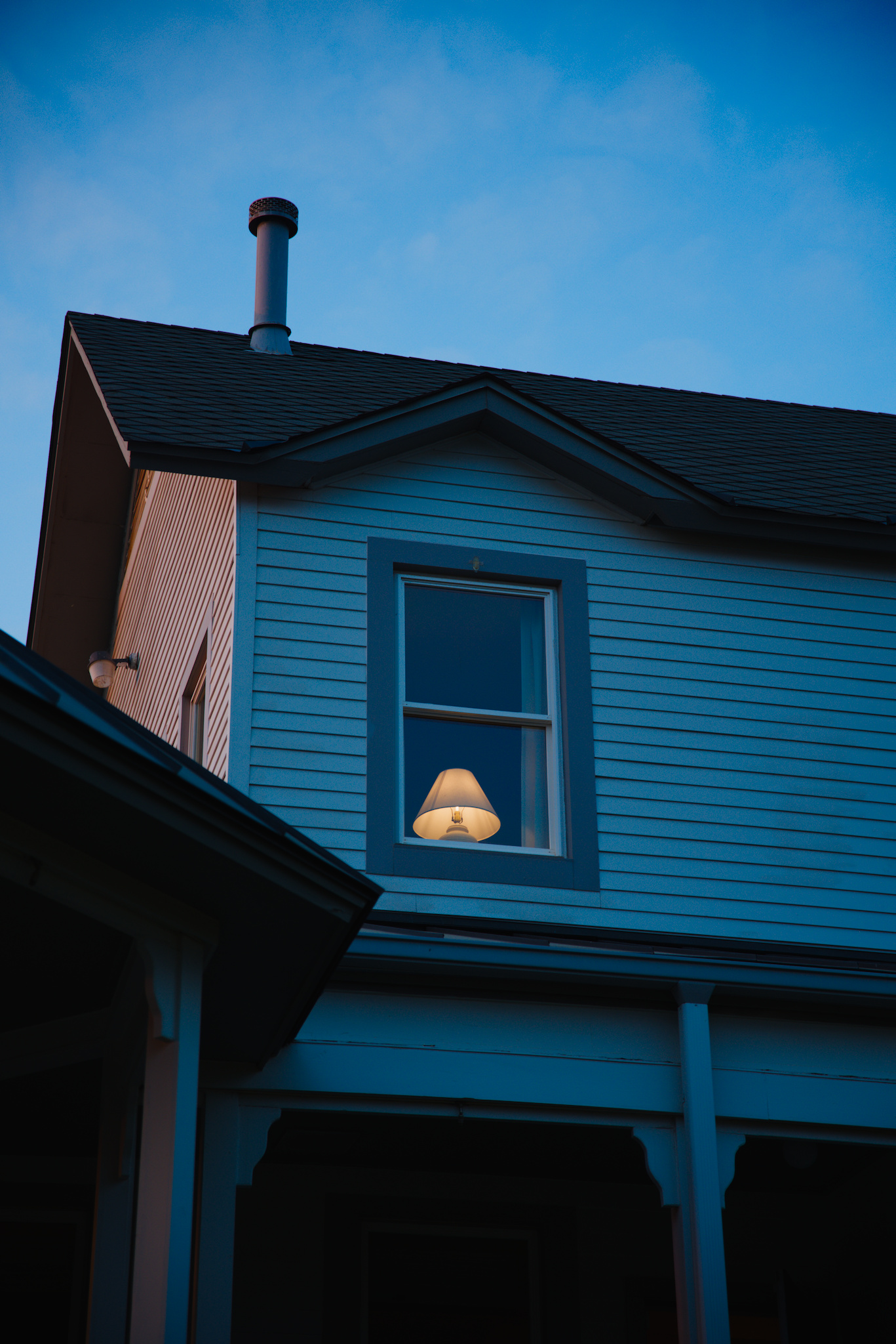
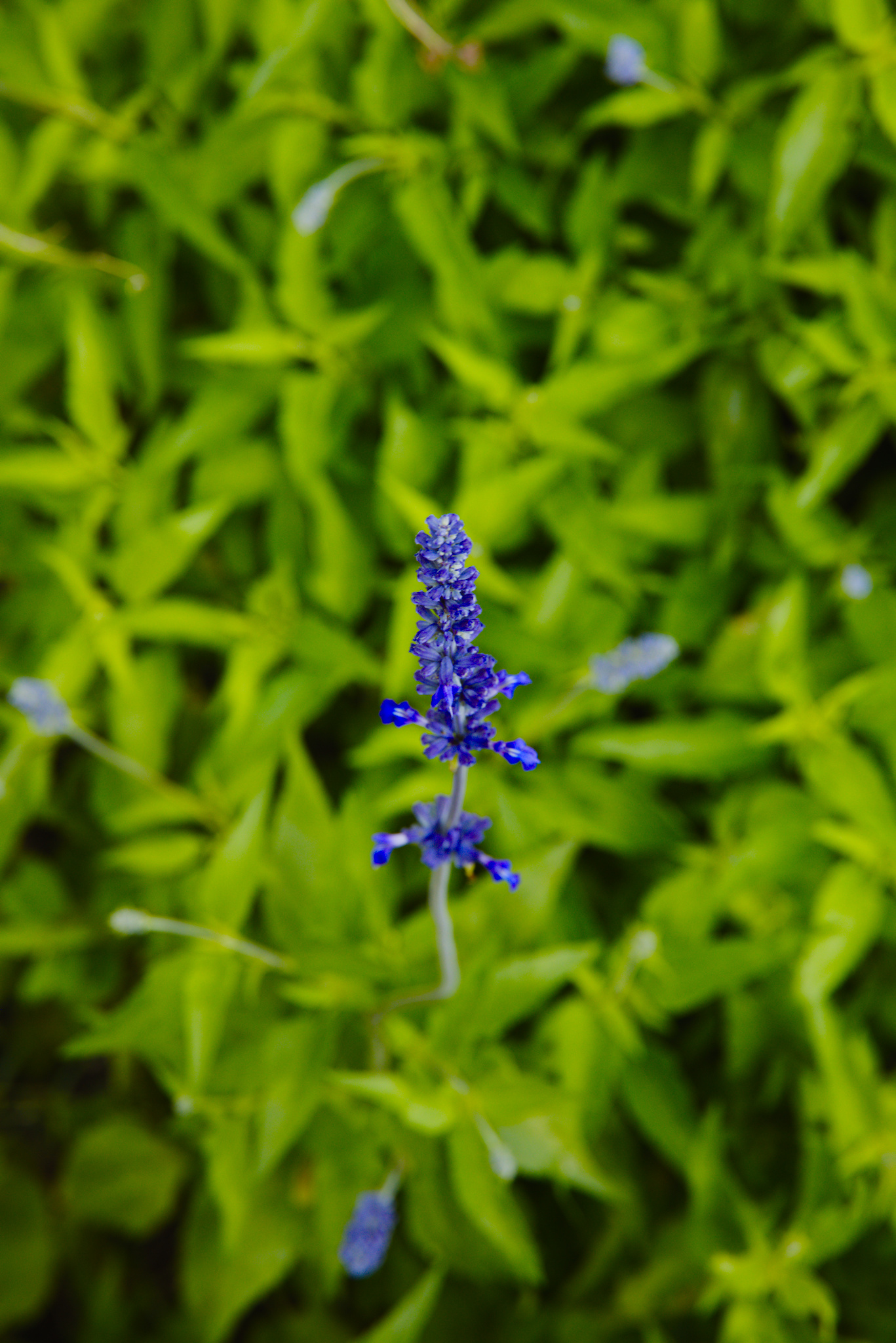
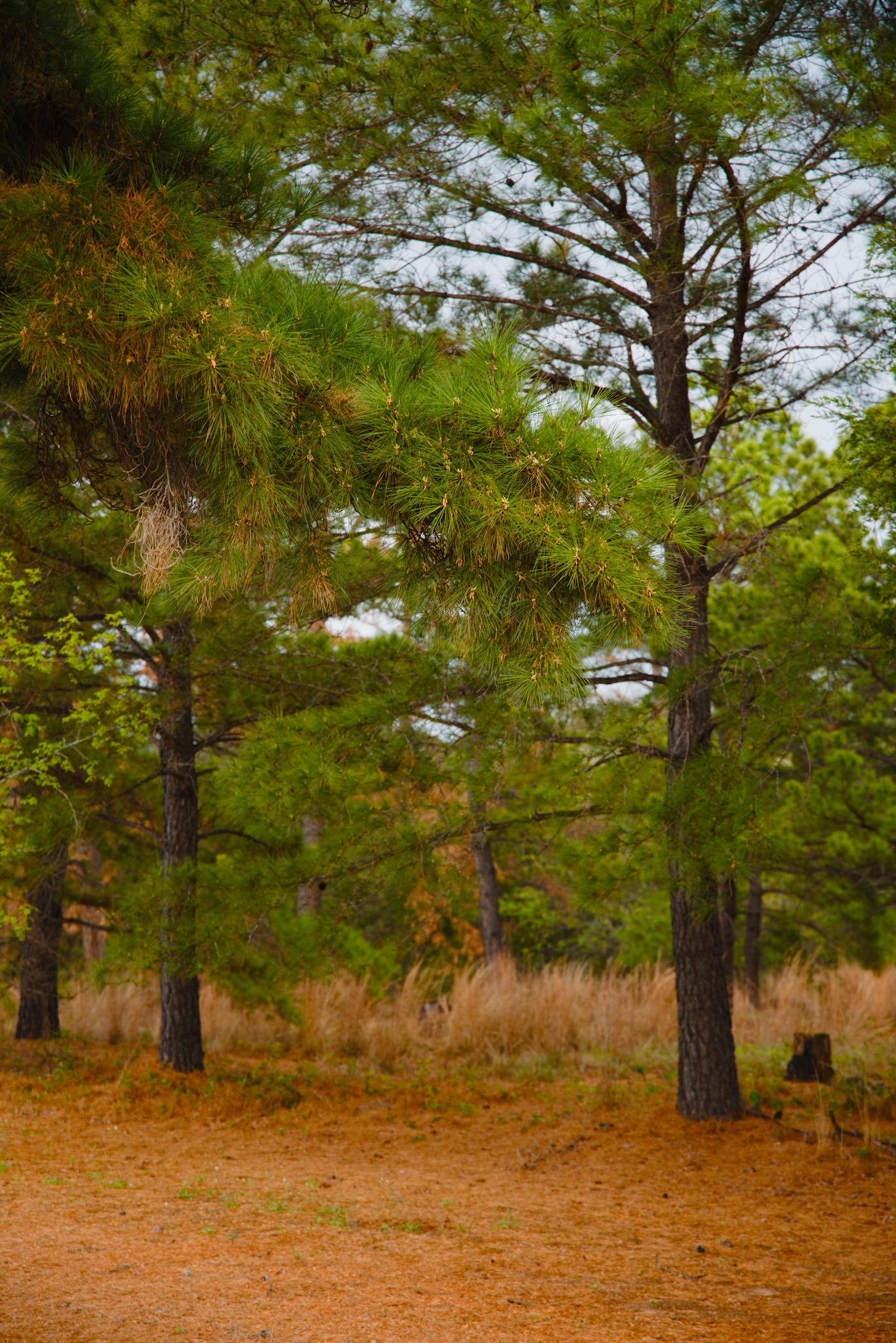
DFS Application Examples

Here are some examples of this exact DFS (AgX preset), applied to some other images of mine. Exposure, Crop, AgX. That’s it.

Closing thoughts

The beauty of this method is that you never know exactly what you will get at the end. I was genuinly suprised at how this DFS looked on every image I threw at it at the end. Of course I can refine any of those edits further and tweak things, or throw some additional modules on them, but I don’t have to. If I want, I can just enjoy what the DFS gives me.
If you want to try this AgX Digital Film Stock yourself, you can download it below:
agx_digital_film_stock_example.dtpreset (1.2 KB)

Let me know what you think of this enormously long writeup, if you got anything out of it, if you think any of this has merit, or if you hate it with every cell in your body :slight_smile:

31 Likes

Wow, thanks for the detailed write-up. I’ll take some time to review for myself. It may be worth reconsidering my workflow.

The photos are beautiful.

A couple of initial questions:

  1. Does this approach manage the “notorious 6” at high luminance? Perhaps that’s implicit in the approach, I can’t tell.
  2. How broadly-applicable do you think your presets will be? I’ve noticed in my own photos that color grading that “works” for one set of photos does not work well for another set. I can easily “tone-down” a too-strong color preset (rgb primaries, color balance rgb, or even a LUT) by setting a uniform mask and turning down mask opacity. But that doesn’t seem like a good idea with AgX.
  3. For your own use, do you envision creating a number of different presets for different film stocks? Any other considerations?

I imagine indoor photos could be a challenge. It’s already a “can of worms” with modern LED lighting.

Thanks again.

2 Likes

I think it’s absolutely valid. See

N6 is the property of all per-channel curves.
The highlight desaturation reduces its visibility, the hue shifts may make it more visible, I think (e.g. red → orange shift helps green ‘catch up’, adding more yellow). You still have hue preservation under look to limit it.

5 Likes

Thank you for your write up on the topic. It encouraged me to explore AgX in more detail and understand some sliders a bit better. So a very worthwhile exercise for me.

However, I presume your preset is only really suitable for your module camera. What model camera would that be?

I tried it on a canon R7 image and the results suggested this preset is not going to be universally applicable. But the concept is an interesting one. Recently I have made a camera specific AgX preset which is helping with my workflow.

2 Likes

It only handles it to the degree that AgX handles it. If you notice an issue, then you can leave the primaries untouched and make color balance/hue rotations with the dedicated RGB primaries module.

That is the beauty of this concept: you can expand the idea of DFS to be whatever works for you. I myself use this as a base for further editing, rather than a one click edit in all cases.

I think you can think about it the same as analog film stocks: very few people would use Cinestill for a daytime wedding. Every preset/style or “DFS”, in this case, has its place. The beauty of this method is that over time you can refine your DFS recipes and get to know them well enough to be able to know when to use different ones.

Concerning the desire to be able to tone down the effect of the primaries modifications: you can open up the RGB primaries module and copy the primaries setting from the AgX DFS and then disable the primaries change in AgX. Then you can use a uniform mask to blend the effect of the primaries modifications within RGB primaries.

This is obviously a serious workaround, but you can also just focus on making sure your own DFS presets don’t push colors too strongly one way or another (the example in my writeup is pretty extreme I think).

I plan on creating some additional presets geared towards acting as DFS but I am content with letting it be a natural evolution. I already have a couple that are fairly generic, and I usually pair them with the RGB primaries module (simply out of habit. I tried to keep it more concise and AgX exclusive in my writeup).

My only other thought is that this isn’t just a fun experiment or a torture test of AgX. It is a method for designing base formulas for quickly processing images without much thought. A perfect example for when I plan to use this kind of restrictive method is when editing personal photos from a family vacation or something. It is better to get photos delivered quickly rather than agonizing over editing them all on an individual, very analytical, basis.

4 Likes

The images I shared were all taken on a Canon r6 (original model). I don’t think that the limiting factor is the camera model. I think the primary limiting factor is understanding the DFS and what it is good at. It is the same with all film stocks: some are good at outdoors/direct sunlight, some are better for softer scenes, etc.

The goal is not to create a universally good preset, but to utilize the concept of fast, minimal contact editing via “digital film stocks”.

Part of the beauty of analog film is that it imparts its flavor on every image, even when another look would have been technically more ideal for the shot.

P. S.
I actually don’t think your image looks bad with my preset but the beauty of the proces s is that you can create your own DFS without waiting for a manufacturer to design it for you. Darktable is our own little Digital R&D lab :smile:

3 Likes

Yeah for sure, but that is primarily a white balance issue. Color calibration should be the best tool for that.

@thumper thanks for the reply. I agree that AgX allows us to create a preset that lets us create our own film stock so to speak. That is were I am progressing with my use of AgX. Your tutorial got me to explore and understand a few more sliders. Thanks.

1 Like

Great stuff, thanks for sharing. I will explore this as soon as I can. But I have a question, do you think that we can achieve the color cast of film stocks only with the primaries from AGX? I mean when I want to shift the hue and add a color cast to the entire photo I use rgb primaries module or colorize module and then reduce opacity.
And the second question, do you plan to make presets for popular film stocks? That would be great.

1 Like

Why do you think that?

Once you are past the input color profile, differences between camera colours should be largely eliminated.

DPreview test images, Fuji XT-4 vs Nikon Z6 II, no tone mapper, exposure set from middle of the frame, no other adjustments (wb + color calibration as default):


Same, with color balance calibrated using the ColorChecker in the photos (exposure set according to what the calibration suggested):


And a Canon Rebel T6i, also calibrated:

2 Likes

Because it didn’t look good on my R7 image so I presumed it was camera specific

1 Like

It may be a question of taste. Also, profiles are not perfect and don’t eliminate all differences. If you check above, the Canon image is cooler than the other two. I’ve now tried picking the illuminant in color calibration from both from the central square, as well as from the Color Checker, but the difference remains.

1 Like

I think that this approach makes a lot of sense, combined with your other post. I will start building up my own library of presets in AgX.

2 Likes

From my perspective, this is not so much ‘good’ or ‘bad’ as much as personal expectations or preferences. I think many people would actually say your result looks great, but you also need to bear in mind that it’s a very different subject matter to the examples @thumper showed (and probably based this particular ‘stock’ on.)

1 Like

Note that @jssfr’s post quoted above links to a tool that can take a raw and a JPG and create a style with custom-tuned AgX + rgb primaries settings.

To use it, one needs:

  • A picture in linear, unprocessed form (e.g. a specially-prepared RAW file; see below for instructions).
  • The same scene, but with the desired look applied (e.g. an out-of-camera JPEG), prepared as sRGB floating-point data (see below for instructions).
4 Likes

I don’t think that perfect film color emulation is possible with AgX. Rough estimations, or “digital relatives”, are certainly possible, especially if we add in the possibility of including other modules.

I have a plan to try and create “digital relatives” of at least some of my favorite analog films, but I am not limiting myself to only attempting to emulate existing films. I think part of the liberty/joy I find in this method is getting to experience something digital in an “analog” way.

For example, The Digital Film Stock I created during the writeup was created during the writeup, and it’s behavior and final dynamics/color characteristics surprised me when I began throwing it on other images. The DFS sort of has a life of its own, especially when I make an effort to treat it like a “black box”. I don’t know if that makes any sense.

1 Like

I think it comes down to subject matter, and scene type. The images I shared are a very different style and subject matter to the image you shared. One is not better than the other, just very different. There are still some common attributes in the results however: Subdued reds, punchy blue & green, softened blacks, etc.

This makes a lot of sense to me - I have found similar behaviour when I have created styles, especially slightly more complex ones (complex in things like hue shifts and tonal dyamics, not masks etc) and really enjoy the process of almost discovery when applying it to different images.

I didn’t know anyone else found this too!

Yes… exactly. I think (and I genuinely mean this without judgement, just acknowledgement) that some people see this as counterintuitive and counter productive. But to me, it’s a beautiful and fulfilling part of the creative process.

1 Like

I just tried your example AgX preset on a PlayRaw image that I was familiar with. It works well. To my taste, in that one case saturation was high, but that is easy to reduce using “master purity boost” in AgX.

This is definitely giving me an improved perspective on color grading, and it’s enlightening to see pre and post-tone curve adjustments the way you have done things.

I have also taken a quick look at the styles from @jssfr. These are nice too, and there are a number of styles provided. In the example I used I see that “rgb primaries” is used once before the tone curve, and once afterward. So the concept is similar.

I sometimes have difficulty deciding “what colors need to change” when making an image look “good to me.” This is why I like to be able to toggle “color grading” on and off to see the effect. With your preset approach, I suppose I could just alternate between different AgX presets for that purpose. I may start doing that.

Thanks for a great post. :grinning:

1 Like

I understand, I like your method of exploring the digital in an analog way.

1 Like