Hello everyone! I am a new RawTherapee developer. I’m currently working on adding new scopes. Because this feature’s usefulness depends on the user experience, I would like to collect your ideas and feedback.
Waveform
This is a standard horizontal waveform. The red, green, blue, and luminance can be toggled individually. The RGB indicator bar on the right shows the values of the pixel under your cursor, just like in the histogram. Clicking and dragging the waveform allows you to change the “brightness” of the plot (also works for the vectorscopes).
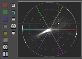
Hue-Saturation Vectorscope
Typical vectorscopes plot colors using the U-V coordinates of the YUV color space. This is not very useful for editing photographs, so I implemented two other vectorscopes. The hue-saturation vectorscope uses the HSL color space, which is useful for visualizing clipped colors. In the screenshot, the cross-hair shows the color of the pixel below the cursor. The dashed line, approximately 30° above the red line, is a skin tone line. Keep in mind that HSL is not an absolute color space. The line may not be accurate for non sRGB output profiles.
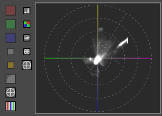
Hue-Chroma Vectorscope
This vectorscope is in the CIELAB/LCH color space. The a* and b* axes are shown with colored lines while the skin tone line is the dashed line. The hue-chroma vectorscope is better for judging skin tones, but understand that real skin tones vary. Not shown here is the cross-hair for the pixel under your cursor.
Buttons
Currently, there is a new button (the second-to-last one) which toggles the visibility of the second column of buttons. The second column allows you to quickly switch between any scope (from top to bottom: histogram, raw histogram, wavescope, H-S vectorscope, and H-C vectorscope).
There is some discussion about flipping the two columns. Essentially, you would select the scope type first and be presented with available settings in the second column. The scope type buttons would always be visible, while the other buttons can be hidden. I would like to know which set of buttons you think you will use most often. It will help in deciding which layout to use.
Feedback
Again, I would love to hear your feedback and any ideas for improving the new scopes, particularly for the button hierarchy discussed above and any other questions which pop up. The GitHub pull request is here if you want to take a look. I can also answer any questions you may have. Thanks!
Hi,
Thanks a lot for implementing these. Since I started working on some video color grading, I found these tools really useful for video, and I think they’ll be very handy in RT.
Generally, the RGB parade is presented as 3 side-by-side panels (R, G and B) in addition to the composite RGB panel. The separate panels are useful for judging the balance between the three primaries, because the RGB composite view gets easily cluttered. I know that in RT you can switch between single channels, but you cannot have the 3 side by side, unless I missed it. I guess it’s by choice so as to avoid to take too much screen real state, but if you can find a solution to display the R, G and B waveforms side by side I think it would be nice.
@Lawrence37 Good to see you on the forum and thanks for your work on RT.
I am a fan of labels and markings. For example, percentage saturation, colour locations and gamut limits on a vector scope. I guess the latter would depend on average luminance of the ROI.
Speaking of ROI, I would love to be able to choose whether the scope is computed from the full image, a drawn area or where the mouse is. Wish all histograms, waveform and vector scope plots could do that.
@sguyader Thanks! RGB parade is nice and is on my to-do list. The current waveform is still very usable. The colors should be easy to distinguish unless you are color blind. In that case, the RGB parade is a must.
@elGordo
Here’s an image with the RGB indicators in action so it’s easier to see.
@afre
The histogram area is usually small. I’m almost afraid to add labels. Maybe labels which disappear when the panel is smaller than a certain size? Anyway, the markings on the scopes show some information. The horizontal lines on the waveform indicate 50%, 25%, 12.5%, and so on, just like the histogram’s vertical lines. The circles on the H-S vectorscope indicate 25%, 50%, 75%, and 100% saturation. On the other vectorscope, the circles are somewhat arbitrary. Part of the reason why is that there’s really no clean way to show gamut bounds in a flattened CIELAB space. The H-S vectorscope should be used for this purpose.
Regarding the ROI, you can use the crop tool as a workaround. Implementing a ROI for the scopes is an entire task by itself.
I would say it’s more sensible to choose the mode of representation first (left column) and then show the options for that particular mode (right column). Options could/should persist between different modes (e.g. if you picked only the G channel in the regular histogram and then choose the raw histogram or waveform, only the G channel will be shown there as well).
Is the full cross-hair necessary? Would the dot or a mini cross-hair be sufficient?
I have a visual-brain disconnect. I am not really colour blind but I can’t ID colours all that well. Lines are easier to understand once explained but you see I also have a bad memory. So labelling would help me immensely. If possible, allow the plots to expand to their own window to give room for labelling. People with disabilities or poor eyesight would thank you.
In terms of gamut, it has a 3d shape, so it would be cool if the outer edges adapted to that or when doing soft-proofing. I know this is an impossible request (as are my others; at least, more work than there is time) but one can dream, right?
I have a dream… (and more, but I will keep my other ideas to myself for now.)
Could you thicken the lines to make them easier to see? Same with the current histogram plot. They are too thin for me to see quickly and clearly.
Loose feature requests would be:
an indicator for clipped pixels in the waveform. It is clear if you have many pixels too bright or too dark, but if 0.5% of blue pixels getting clipped…that might be hard to distinguish on that dark grey background whether they touch the dashed light-grey line or not.
different plot styles for the scopes. Right now it looks like every pixel is turned into a white pixel with a certain opacity…if one has many of them for that saturation region, it is turning white on the grey canvas at their coordinates. Maybe an opacity control for the drawn pixels? Or if the density gets very high a change in color (saturation clipping a bit easier to detect this way)?
Again, thank you for this! One of my long ushered requests…I think these can be immensly helpful tools.
These would be a great addition…I use the ones in Davinci Resolve. They are very clear and easy to use if you want to check on that implementation for ideas…
Davinci has the ability to control the brightness of the waveform and axis separately so you can fade out the axis…less important to me but often I find that the specular highlights esp in red and sometimes green are hard to see…so it is nice to be able to brighten up the display of the waveforms. They also have a mode that looks like it does a running average or something on the waveform (actually its called low pass so they must run a lowpass on it)…just makes them less fuzzy when there is lots of spread in the plot…this can make it easier to see as well…Finally they have fine white lines that show the extents high and low if you turn that on…best shown here… Wipster | Creative Collaboration and Review Software your take looks awesome but I thought I would just throw this your way…
Just a dot is hard to see. A mini cross-hair would work, I think.
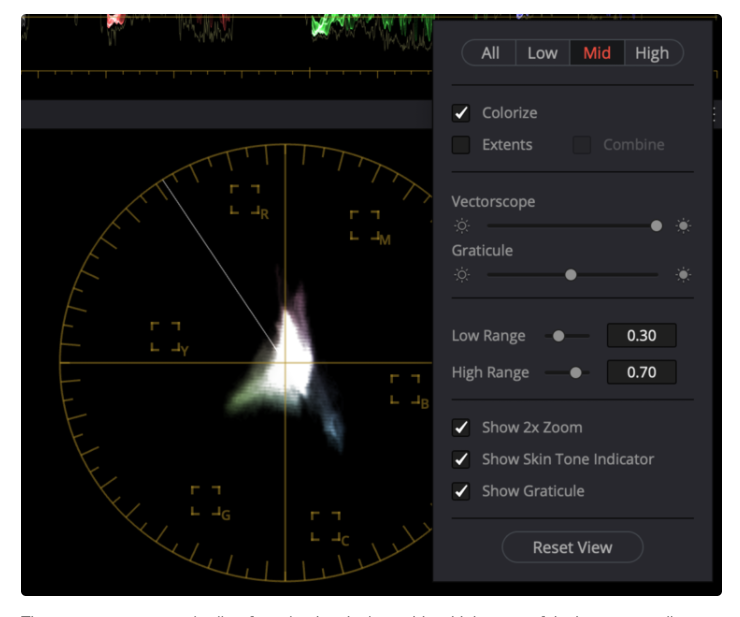
Do you have suggestions on how to label? There’s an (old) example of the vectorscope from the pull request. I think moving the labels outside the circle will reduce clutter.
Their locations don’t matter[1]. The font size could be smaller. The coloured lines are kind of distracting. I have seen an implementation use a ring of colour on the outside. (I still wish the inner rings are labelled.)
[1] I noticed that the colour axes are equidistant from one another and the rings are perfectly circular and equidistant from the origin. My colour science hat isn’t on at the moment… but it makes me wonder: Is this a correct representation of colour distances? Or is it okay for it not to be?
I am not sure this translates well into text and static images. This may have to change to make it easier to document and explain. Otherwise, you will have people asking the same question repeatedly in the future.
Perhaps, include a vertical slider in the remaining space where the icons are. I don’t know if GTK3 can do it elegantly.
Thanks so much for this. In addition to video uses, it would be great for getting an intuitive sense of vignetting and uneven illumiation going on in an image, removing the guesswork of manually correcting vignetting on unprofiled lenses.
Note the boxes in the Davinci vector scope…when you look at color grading with Davincin the boxes are angular targets for hue but also limits for saturation. They use a rule of thumb that saturation should not extend in any direction beyond a line that could be drawn between any adjacent boxes …not sure of the exact science but its a good double reference…