Up to now I haven’t seen anything odd in my system, and when I was looking for a color managed image viewer I installed a lot of them, and I ended up using Xviewer (default viewer of Linux Mint, and based on Eye of Gnome).
If I’m not wrong, Gimp is fine if you use an sRGB profile (and mine is close to it).
About browsers, the problem is (was, to me) that Chrome just loads the primaries of the profile, and then does what it wants. About Firefox, if you configure it properly (look at my first post), renders images the same as RT.
So I guess I’m fine right now. But I will take the advice into account. 
Regarding Bruce Lindbloom’s website, I read it in full a few years ago. Really interesting information there. And it’s not too bad reading it again from time to time. Thanks for the links!
I was aware from the beginning that my profiles were not a perfect match with sRGB, and that my display is not a brilliant performer (far from it), but I wanted the most of it, even if there are colors that I’m unable to see onscreen.
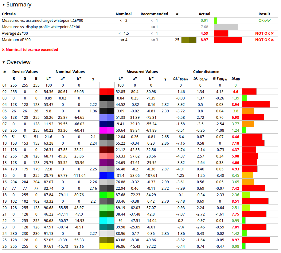
I tried creating 3 different curve+matrix profiles, and none gave me a match as close to sRGB as the LUT+matrix I finally installed. Let’s say it from a practical point of view: RT and Ffox don’t render an image as close to that of Chrome without the LUT+matrix profile. The only other way to get an exact match to Chrome rendering is by setting an sRGB profile system wide.
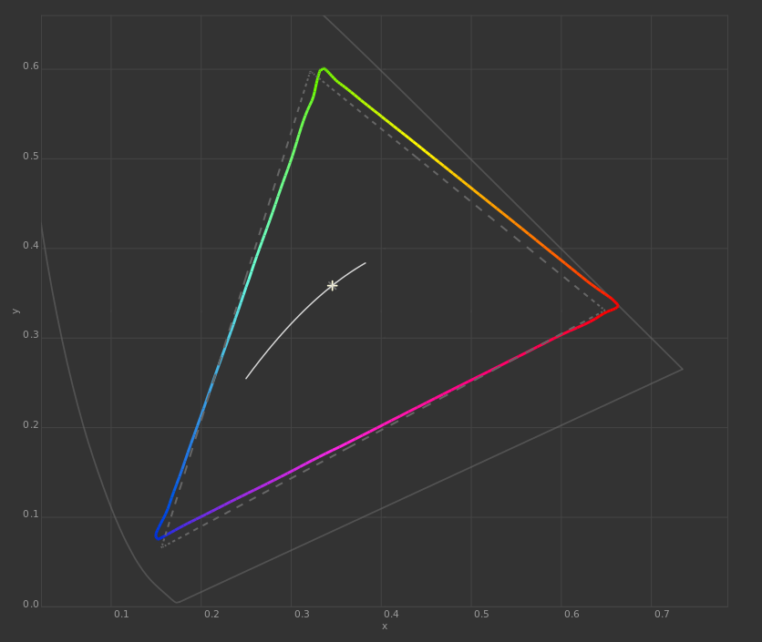
My current profile has these values:
- gamut volume: 102.7%
- gamut coverage (sRGB): 94.67%
And here are 3 different perspectives of the 3D rendering of my gamut (colored volume) against sRGB gamut (grey wireframe):
As you can see I have an extended range of oranges, yellows and reds, while suffering a lack of the most saturated and brighter greens, blues and purples. Did I noticed that? No. And I don’t think I will ever notice it unless I put my display next to a proffesional, 100% sRGB coverage display.
And looking at it into perspective, in the image I chose as an example there is a good range of yellows and oranges, and maybe because of that I saw the differences so clearly.
Anyway, thanks for the info.
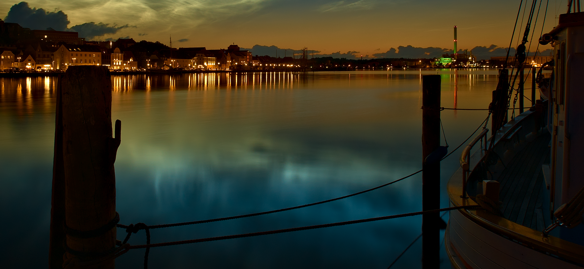

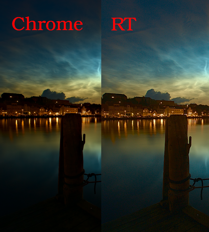

 The image looks almost the same in Chrome, FFox and RT with my latest custom profile set system wide.
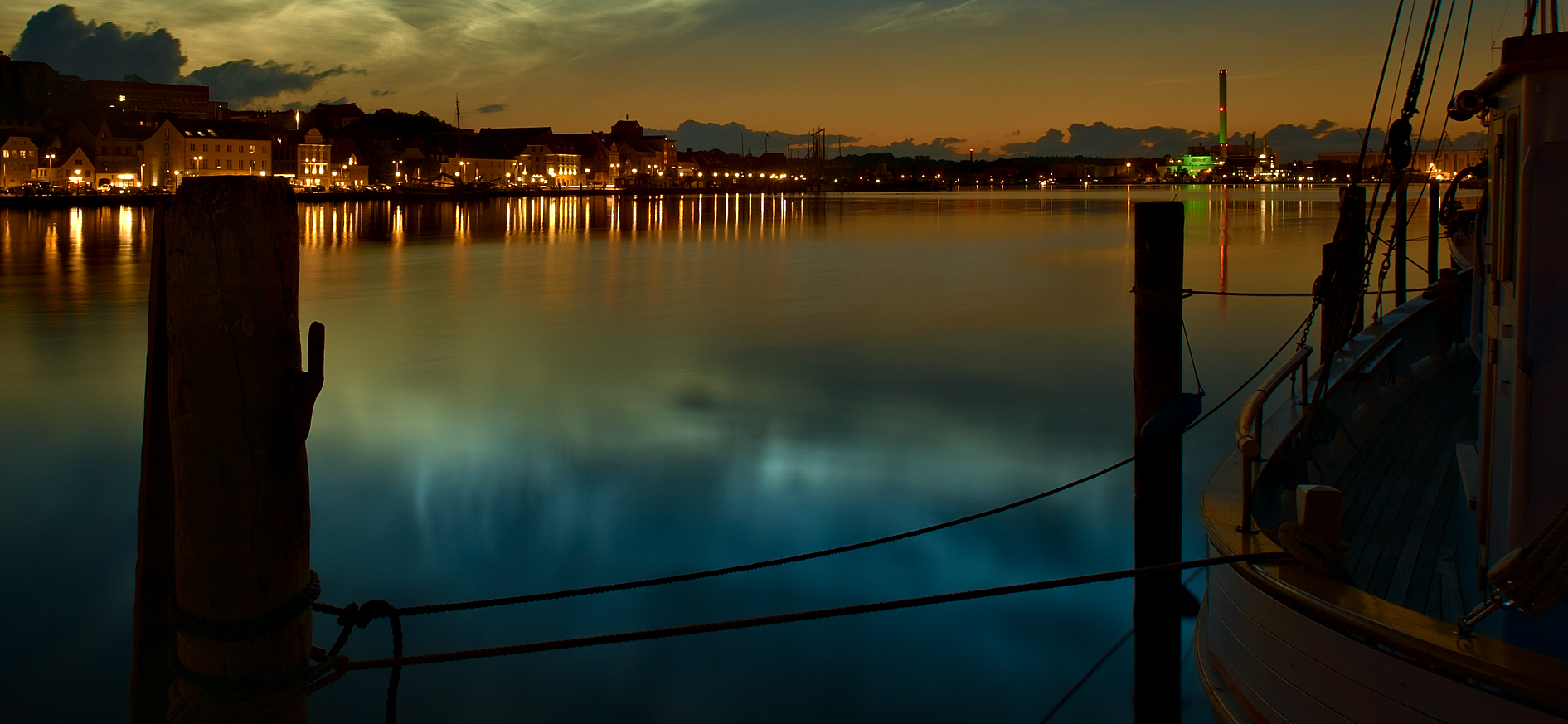