TL; DR
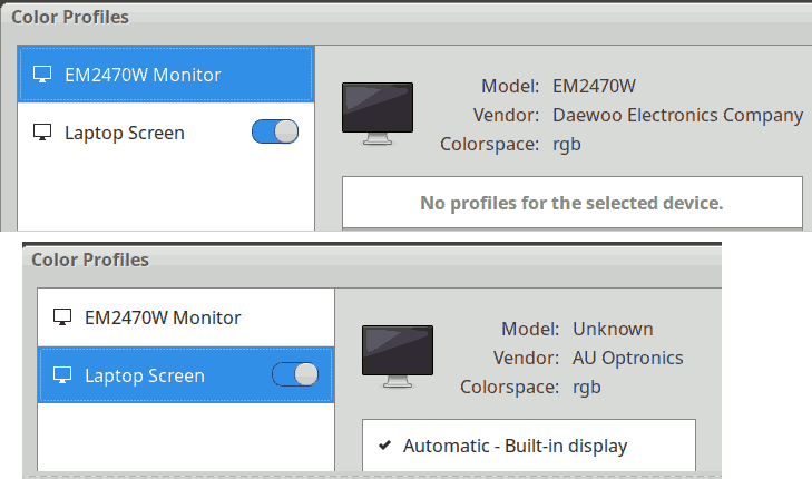
- My new HP laptop’s Xubuntu has a weird “Automatic - Built-in display” color profile enabled by default in the system settings, for the internal monitor.
- For some obscure reason, when this profile is enabled, it seems to be applied in Firefox to every image that has an embedded profile (but not to profile-less images), even when displayed on an external monitor, and this is the only change I notice on my system when toggling this profile on and off.
- Keeping this profile off allows me to see the same thing in Firefox and other apps.
- The “Color appearance” tool is probably not to blame at all, but I should perhaps refrain from doing overly fancy things with it, especially the “Viewing conditions” part.
Original post
Hi. Sorry, this will be a somewhat lengthy post, but I’m being driven insane by color stuff again. I did my best to highlight the main questions with quote markup and gave them numbers. ![]() Well, they’re more like groups of questions, but still…
Well, they’re more like groups of questions, but still…
For some reason, after putting more than twenty series of pictures online over the course of multiple years, it’s only now that I realize that they look different in Firefox than they do in RawTherapee, in my image viewer (Ristretto), in Chromium, and in a GIMP import. Basically, all those apps show me impossible-to-distinguish results, except Firefox, which yields warmer and slightly more contrasted results, be it for JPGs or PNGs.
I then looked around and stumbled on Web browsers color management (solved). To be perfectly honest, beyond the few things that I learned to deal with camera profiles in [Questions] How to choose a DCP profile (if at all) (after which I just basically stuck to Adobe’s “Neutral” profile), anytime I’m dealing with such topics, I feel like a toddler trying to lean quantum mechanics. Despite how perfectionist I can be on many RawTherapee settings, I never got the motivation to properly delve in that color profiles stuff. I just noticed that my pictures looked satisfactory to me on my screen, on my parents’ screen, on my mobile phone, and that people were generally happy. So the last thing I needed was yet another dive in what has been poetically described as…
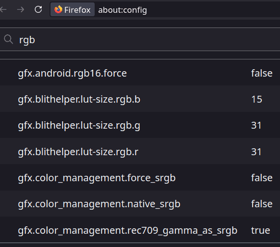
The aforementioned thread about web browsers, even if mostly cryptic to me, allowed me to notice that Firefox’s gfx.color_management.native_srgb setting (from about:config) seems to be the main culprit: it is false by default, and setting it to true makes Firefox “agree” with the other apps.
Hidden details about caveats when fiddling with this setting
- I need to close the browser tab and re-open the picture ; a refresh, even a “hard” one, does not seem to do the trick.
- Probably due to weird Firefox optimizations, it seems that trying to open the same picture simultaneously in two tabs such that one has
native_srgb = trueand the other “native_srgb = false” fails: the config change is ignored for that picture as long as the picture is still open in one tab, so it looks the same in both tabs no matter what I do. (This is not a real issue but it made my analysis harder until I understood this).
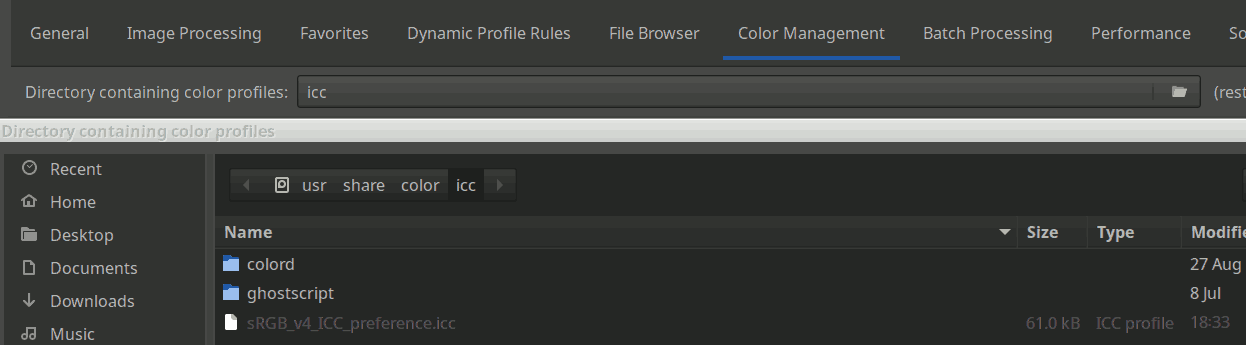
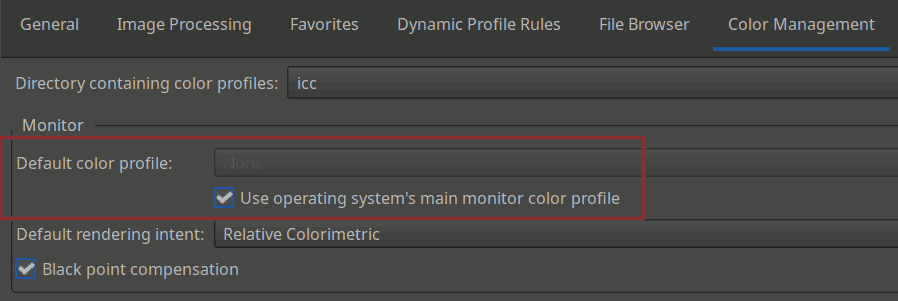
Expandable details about my system and my very basic, very default-ish settings
RT 5.12:
Xubuntu 24.04:
Firefox 142.0 (snap):
Question 1
What’s the deal with that
native_srgbsetting? I read on the web that “It hands off color management to the system” (whentrue, I suppose). I don’t get why it’s nottrueby default, then. Perhaps that changed recently – that would explain why I did not notice the differences until today. What’s the point of letting the browser do weird stuff with our colors? Unless letting Firefox handle this (false) allows it to parse the embedded profile, but that would mean that Firefox’s weird warm display is the most accurate one and that _all the other apps, including RT, have been misleading me?
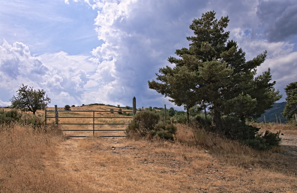
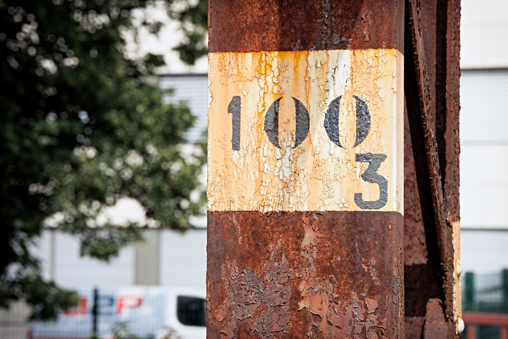
I initially thought that it was only happening on my newer pictures, processed with RawTherapee 5.12, but it seems that it’s actually just that it’s more visible when there are orange-red-ish colors (and perhaps blue skies too?). This matches the following observation:
The rust on top of that RT5.11 pic becomes distinctly more vibrant on Firefox (at least on my machine…), for example. Perhaps the phenomenon became worse with 5.12 but that would be weird.
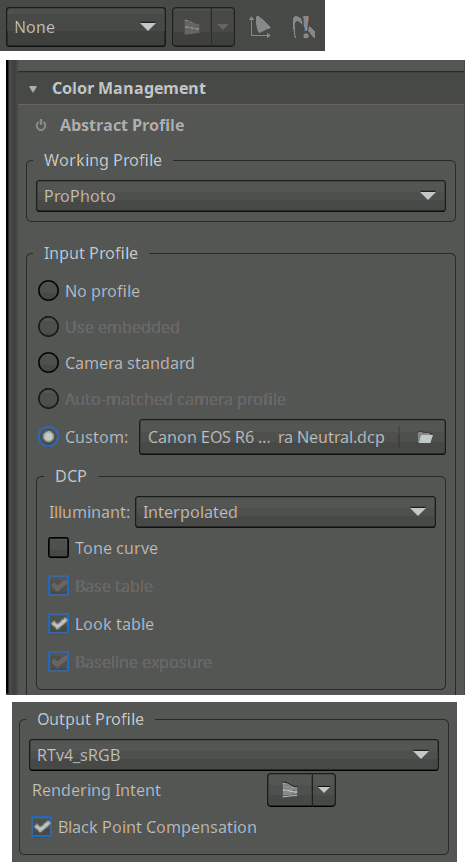
Beside the RawTherapee upgrade, though, there is a thing that changed in my workflow: I started using the “Color Appearance” tool from the “Selective Editing” tool – generally with a “global” spot, but also sometimes locally, and occasionally both at the same time. To make matters worse, after noticing that applying the “Color Appearance” tool seemed to make my colors colder, I took the habit of “fixing” this by slightly bumping up the “Chromatic adaptation/Cat16” value (no further than 2 or 3, but still) in the “Viewing Conditions” part of “Color Appearance”. One thing leading to the next, I also often fiddled with the other sliders of “Viewing Conditions”.
Question 2
Could “Color Appearance” (in a global spot and / or locally) be making the “looks different in Firefox” issue even worse? I’m getting this impression, even with the default “Viewing Conditions” settings. But it seems even worse than worse when I fiddle with the “Viewing Conditions”. Am I imagining things? Should I go over my whole recent picture series (on which I spent dozens of hours already…) and revert some of those settings before putting anything online?
Expandable comparisons
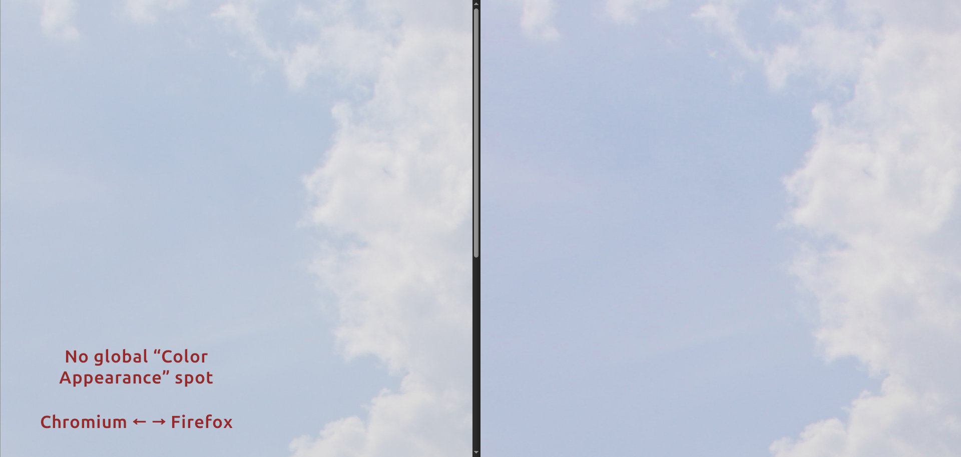
No “Color appearance”: Firefox looks a bit more vibrant and contrasted, but it’s not really a bother:
Intentionally ridiculously high value for viewing conditions: The pictures look distinctly different to me:
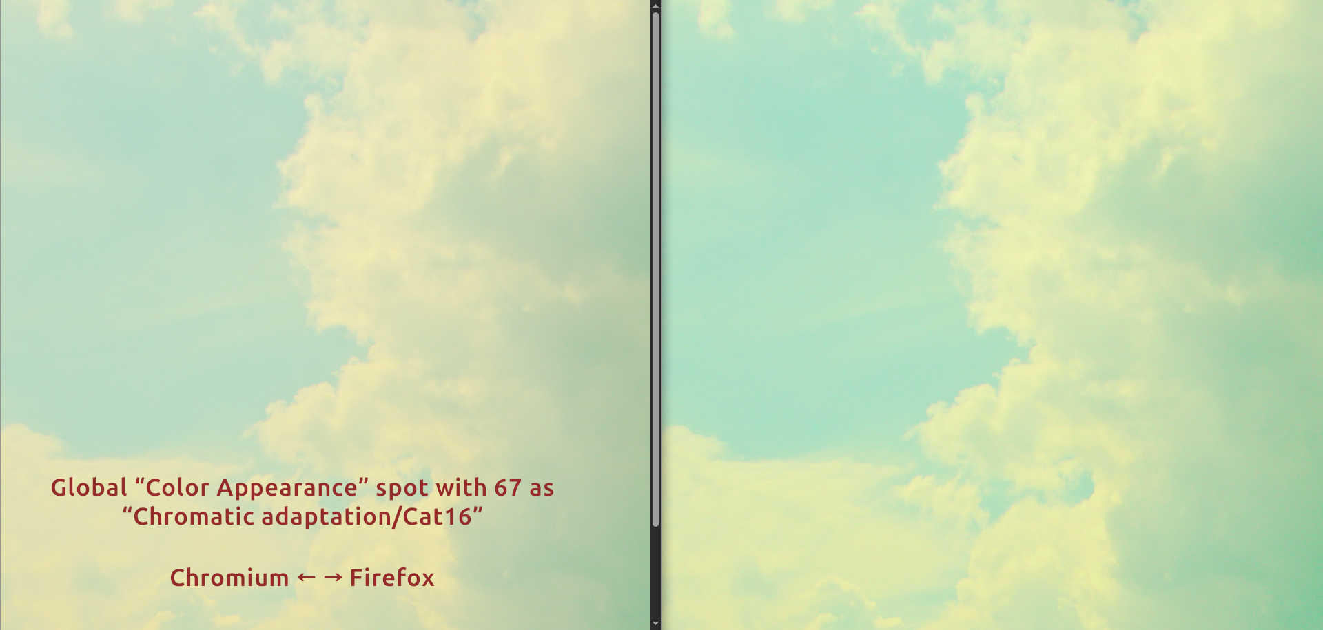
Honestly, I was not sure what the “Viewing Conditions” settings are intended for – I assumed it was meant to adapt to specific viewing conditions, like when physically exposing pictures in a place with suboptimal or unusual lighting conditions (RawPedia seems to confirm that, if I understand it correctly), but I did not think it would have any adverse effect if I used it like some kind of hack, as long as my white balance made sense. Kinda like color toning or the RGB curves, so to speak. Perhaps I was utterly wrong and made a big mistake there – on dozens of pictures. ![]()
Question 3
Should I stop fiddling with the “Viewing Conditions” settings if I’m not trying to adapt to… well… real viewing conditions? But why does “Color Appearance” keeps making my pics slightly colder? Am I supposed to systematically counterbalance that with a “Warm / Cool” tool in my global spot instead?
Question 4
I surmise that there’s generally no such thing, in the absolute sense, as being “wrong” or “right” regarding colors, but still:
Question 5
Finally, perhaps the most naive and stupid question of all – please don’t laugh or scold me:
Question 6
Why embed profiles into exports at all, if they seem to cause issues like that? Why wouldn’t the file just toss RGB values for each pixel and call it a day? Why embed something that makes the picture’s look depend on the browser, its settings, and even possibly the OS?
I did a very stupid test: I imported my file in GIMP, let it convert the colors from the embedded profile to its own profile (I don’t see much of a difference between what “Keep” and “Convert” yield), and exported the image as a new file while un-checking the “Color profile” box, so the new file was profile-less. And guess what? This profile-less file has a consistent appearance across apps…
Expandable comparison video
Not sure the .webm will do it justice, but here’s me switching between two Firefox tabs. The version with the red-ish sky and not-quite-black shadows in the tree is the one with the embedded profile (the “oddly warm” version), while the version with the more cyan-like sky and contrasted tree is the GIMP-produced profile-less version, which looks like what my other apps display:
Here’s a low-quality version of the picture (but perhaps the server will perform weird conversions on it that will remove the profile? Nope: If I download it, it still has the profile):
Seriously, I’m now considering trying to script this process in order to upload profile-less JPGs on my website. Or to ask RT to export with no profile, but I’m not sure at all that it’d be equivalent and harmless. Or just return to not caring about this, especially considering that my family and friends will look at my pictures on all kinds of devices, monitors, operating systems, and lighting conditions – but for this I would still like to know whether the most accurate representation of my picture is Firefox’s weird warm version or the other one. ![]() And whether the “Color Appearance” tool and the “Viewing Conditions” settings are “dangerous” in that regard. Hence the questions.
And whether the “Color Appearance” tool and the “Viewing Conditions” settings are “dangerous” in that regard. Hence the questions.
Well, I’m supposed to be at work in seven hours and I still need to shower and stuff. And get some sleep, obviously. ![]() See you, everyone. Thanks to anyone willing to shed some light on any of this.
See you, everyone. Thanks to anyone willing to shed some light on any of this. ![]()