I may be a little late to the party, but I found this interesting video on white balance, and it makes sense
 Approach")
I may be a little late to the party, but I found this interesting video on white balance, and it makes sense
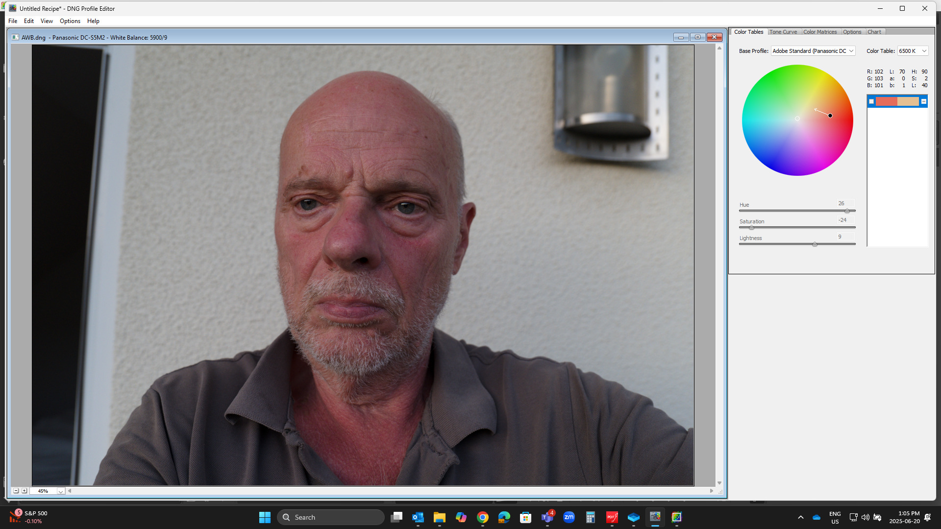
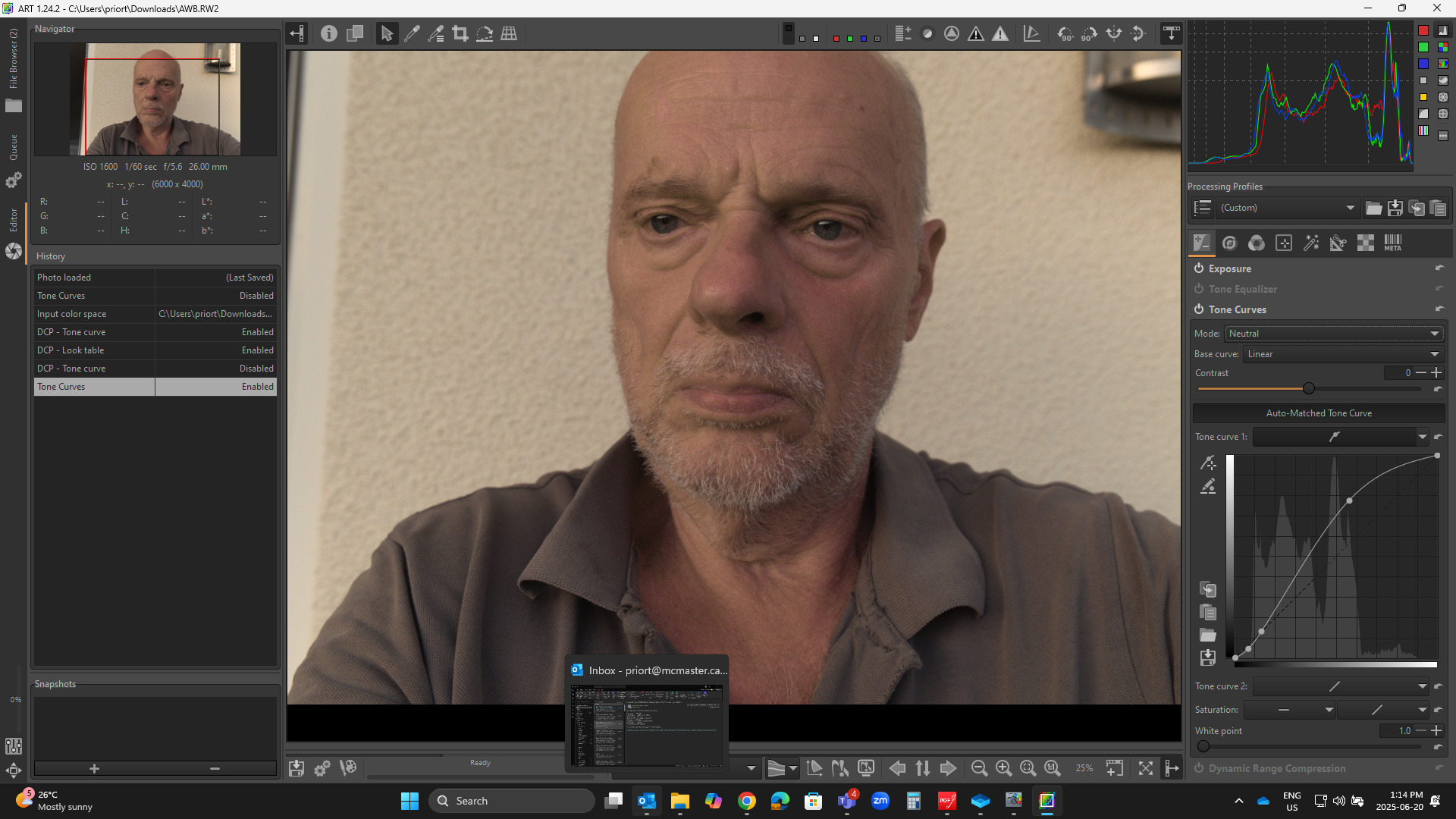
Trying the Profile editor approach.
Converted to DNG so it can be loaded into the profile editor…
I just sampled the chest where the color seemed very overly intense.
No correction
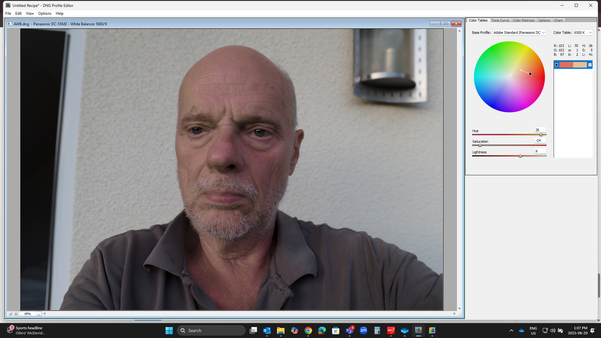
Correction for that one color
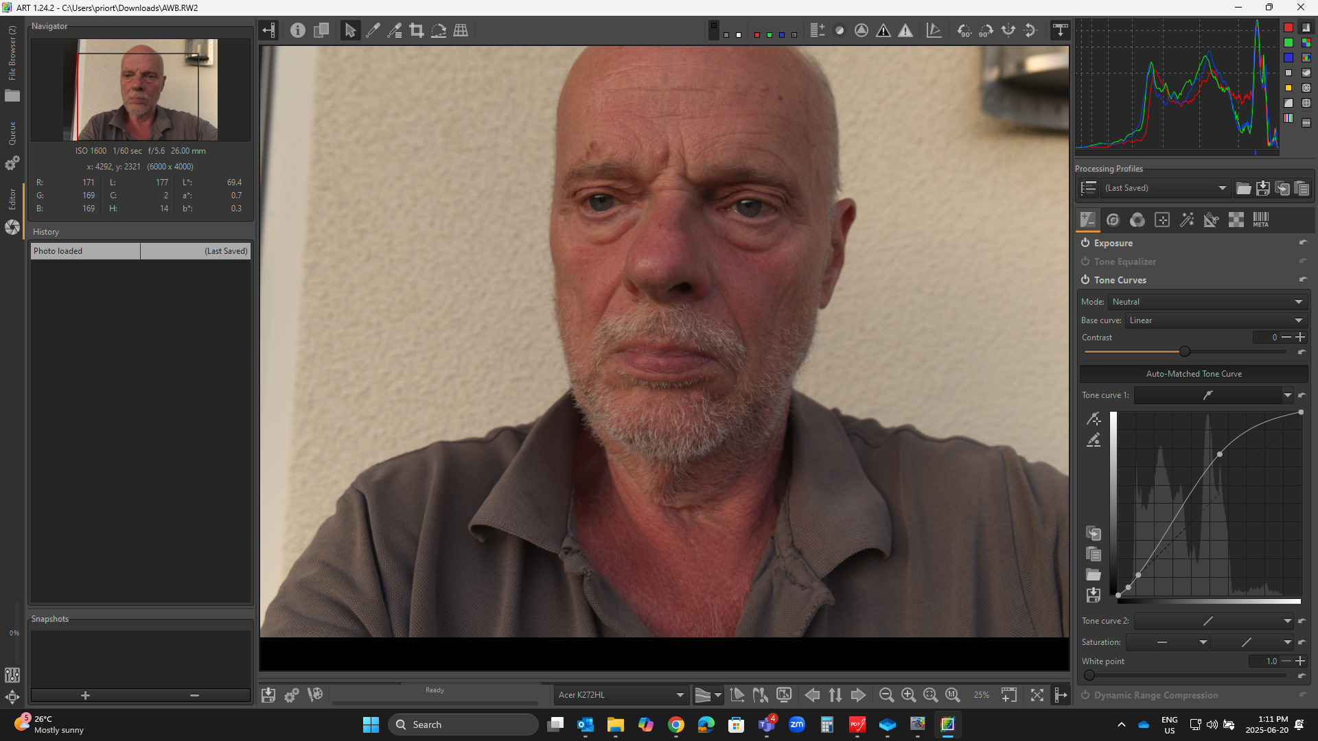
In ART
Std camera profile Automatched TC …Linear and Neutral
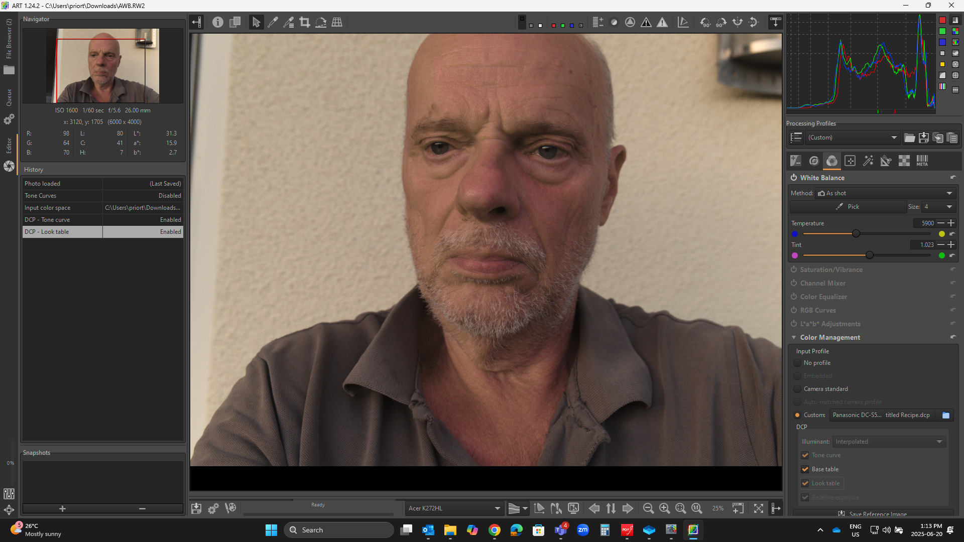
Edited Adobe Profile made from the DNG of your image…
ART TC disabled…using Profile TC and Look Table…
Then keeping the DCP profile but turning of the profile TC and using that profile with ART’s TC as above…
All are with as-shot WB no adjustment…
It seems like it could be a way ie make a custom profile for your skin tones and make the edits better than me…I was just trying to negate the offender and might not have left the best skin tones but it shows what you can do…and options when using the DCP profile…
Hello @PD1
I know this good video and have just watched it again. For scenic photography, it really makes sense to set the camera to 5500K.
But: It is possible to set this as desired during raw development, even if you have photographed with AWB.
This was described very credibly earlier in this topic.
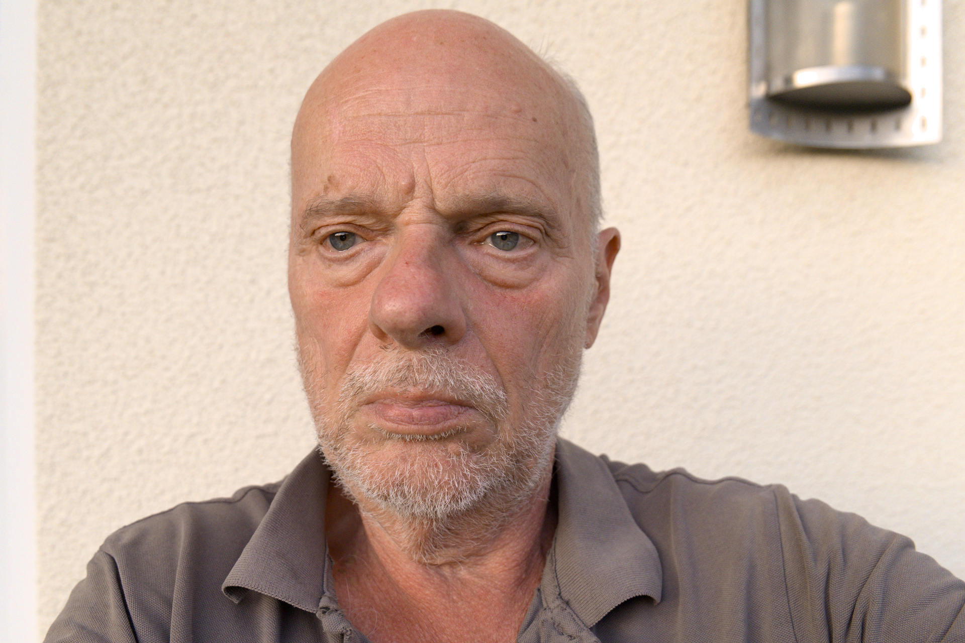
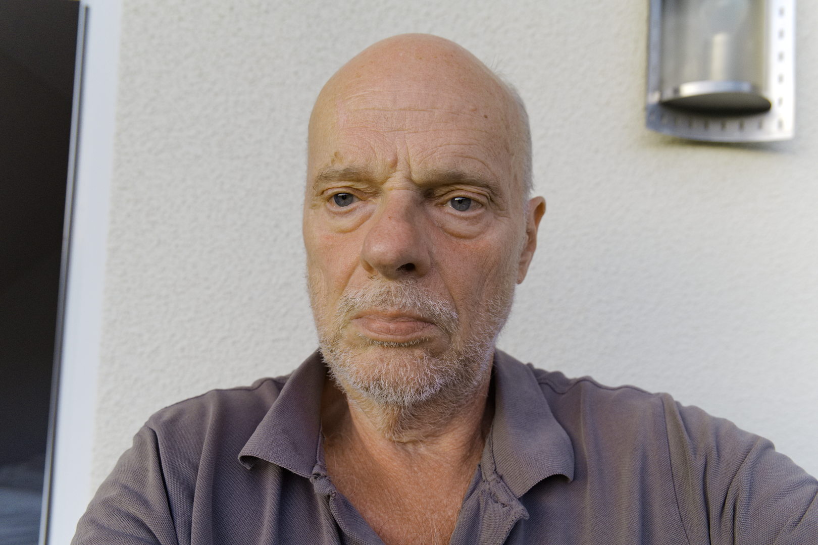
My most important question is how to do the WB and color grading so that the human skin looks natural, not reddish like sunburn and not as yellow as kidney disease.
I firstly converted the file to DNG and then I edited it slightly in darktable.
The skin looks a little tanned or am I wrong?
So it would be normal to be reddish…
Hello @lightlover
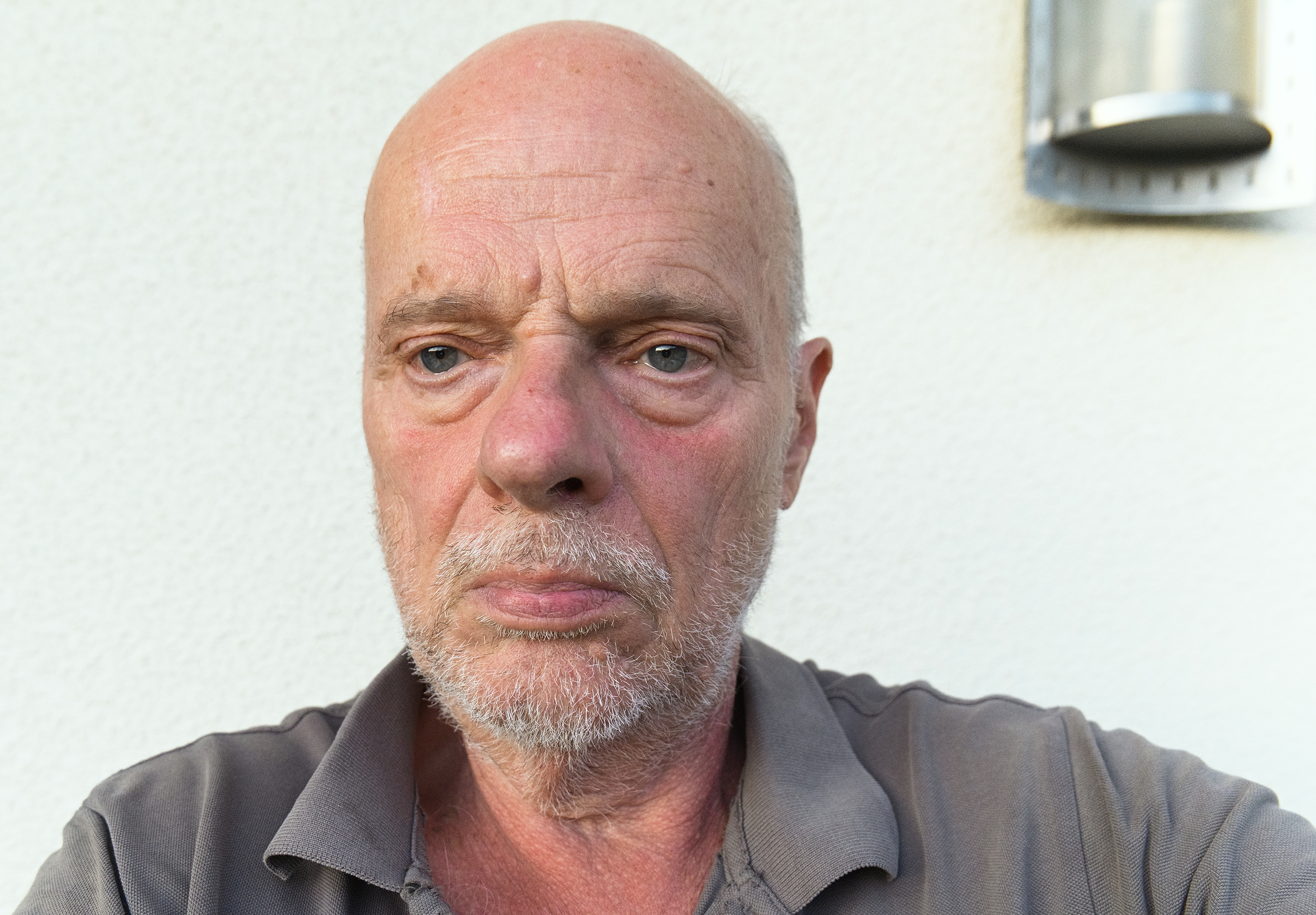
Your result is pretty good. Yes, converting to DNG is something I have already done. Could you please upload your .xmp.
Yes, the skin is tanned, but the jpg in the RAW file has too much red or mangenta.
I’m sure it’s also because of the skin, which is probably similar, but also because of the late evening light, which really promotes this red tint.
And I try to get rid of this red.
AWB.dng.xmp (9.0 KB)
Sorry @micha, there was an uploading error. I’m not able to recover from that.
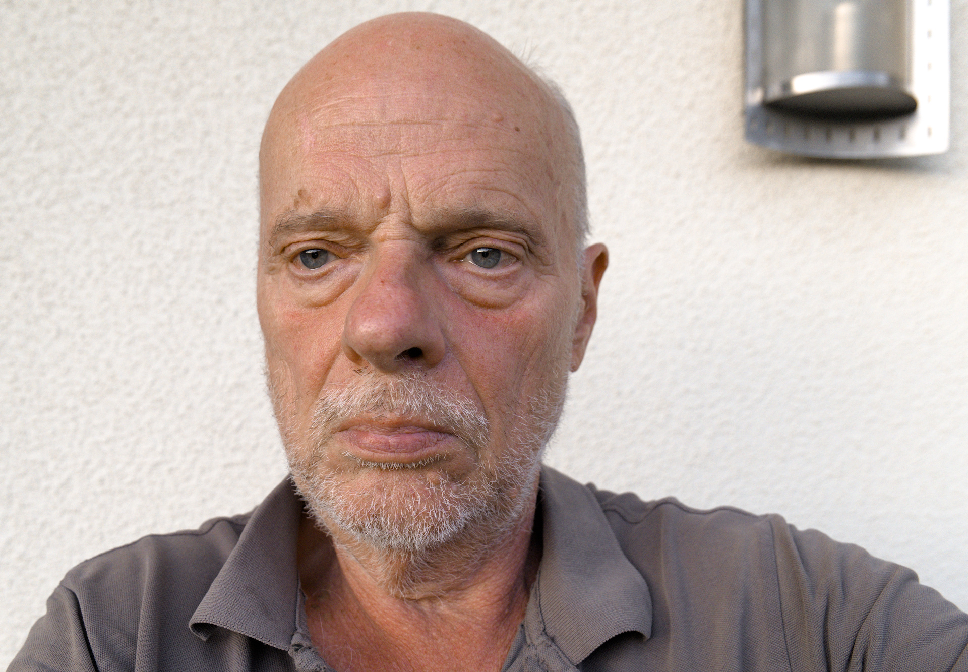
I redid a similar edit, i hope this helps.
Hello @lightlover Your version looks very good, I’ll take a closer look at it. But I have to familiarize myself with darktable first, that will take some time. I’m very curious.
You can’t make this great color setting with ART by any chance? I’m just interested in how to get rid of this unpleasant color cast. You’ve done a great job.
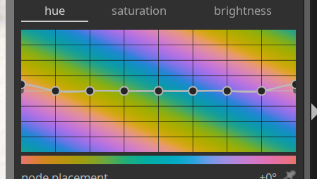
The answer is no as the mountain just indicate the portion of pixels that are each color zone. Yes I did increase the red chroma/saturation and this meant the magenta was also increased to some degree as it was a gradient effect to lift the warm tones.
As for picture styles in the camera I avoid neutral because it is dull, flat and unappealing in my view. It is also not natural looking. I tend to use standard and I also avoid using portrait.
The attached image is my attempt to calibrate using a neural target on the grey shirt. I don’t like the look. I feel @lightlover has produced a nice result.
AWB.RW2.xmp (9.1 KB)
Hi Micha,
you look younger and younger ![]()
IIRC you were using RawTherapee before. Therefore here my approach in RT 5.12:
Altering the white-balance did affect the picture, but not really the skin tones. My conclusion ist: this has nothing to do with the whitebalace, its a panasonic-related thing.
With standard settings (Tone curve) i tried the HSV-module and found some pleasing settings (from my point of view), you could use as a partial profile as a start. But these settings also would affect other red tones within the picture, ie. red shirts a.s.o. see here:
AWB.RW2.jpg.out.pp3 (17,7 KB)
That for, i switched off the HSV and started local editing, put a spot to the reddish parts of the skin and tried some modules. The module “color and light” alredy brings out some results, more pleasing than before. see here:
AWB.RW2-1.jpg.out.pp3 (21,2 KB)
I am sure, you can find some similar functions in ART.
Best regards
Martin
Hallo @marter
Yes, I had been using RT for a long time.
ART also has a Color Equalizer, so you can do the same as with: HSV in RT.
You’re probably right that it’s not (only) a question of the WB, but in my case a Panasonic problem that thankfully doesn’t always occur, but only in special lighting situations and with people whose skin is relatively red.
Hello @lightlover,
please tell us the secret of your color grading.
Your version surpasses everything I’ve seen. And I’ve been struggling for a long time with faces that are too red. I only manage to make them either yellowish or greenish or reddish, but I’ve never been able to get that beautiful brown (oh, I’m not that beautiful in real life), such a nice pleasant skin tone, unless the shooting conditions were perfect.
My greatest concern is to understand your way, your method:
But now I’m off to study your darktable .xmp, I’m sure I’ll understand more afterwards than I do now.
I can already see that you basically had to do very little: above all “color balance rgb”, I haven’t quite figured out what was changed there and why.
And, probably most importantly: color equalizer:
I’m very curious, and I’m sure everyone else who is active here is too.
Best regards
Michael
After I first watched Sean Tucker’s video, I started shooting at a fixed WB of 5500 too.
Even on the latest cameras, AWB is not reliable and almost never delivers optimal values, even in broad daylight I find. And I’ve never figured out good AWB settings that would work both with artificial light and daylight.
Tucker’s approach is based on the idea that a “neutral”, medium-value WB makes it easier to recognize the mood of the scene when sitting down to edit later, where using AWB risks taking all of the mood of the original scene away.
This is particularly true when shooting over a wide range of light situations within a single session, where AWB might end up “hiding” really good photos among your day’s haul.
Using fixed WB is obviously no good for JPG snapshots, but since we’re all processing anyway, it makes sense to at least give it a shot. I have one of the wheel-dials on my camera set to K adjustment, so when I’m shooting in more stable, reliable light (indoors etc) I can easily adjust it to have a more plausible starting point for editing.
Yes, that’s true and it also makes sense to be able to see a colored scene on the PC in the mood as you perceived it when you took the picture: very warm or very blue. That can be a very good guide when editing. But I wonder whether it’s not also very easy to do this manually when editing if you then set it to 5500K manually.
Sure is. It’s just a decision of when to do it, either in camera or as a badge edit on your PC later.
I’ve come to prefer setting fixed WB in camera because of the “seductive power” of AWB. I prefer forcing myself to rely on my own judgment from the get-go, it’s better than having the camera’s AWB distract me from my own judgment by “chiming in” with its half-baked opinions because AWB is accurate about as often as the proverbial broken clock, and I’ve found that with AWB as the starting point, I tend to go back to images a LOT because it just makes me insecure about what I see with my own eyes.
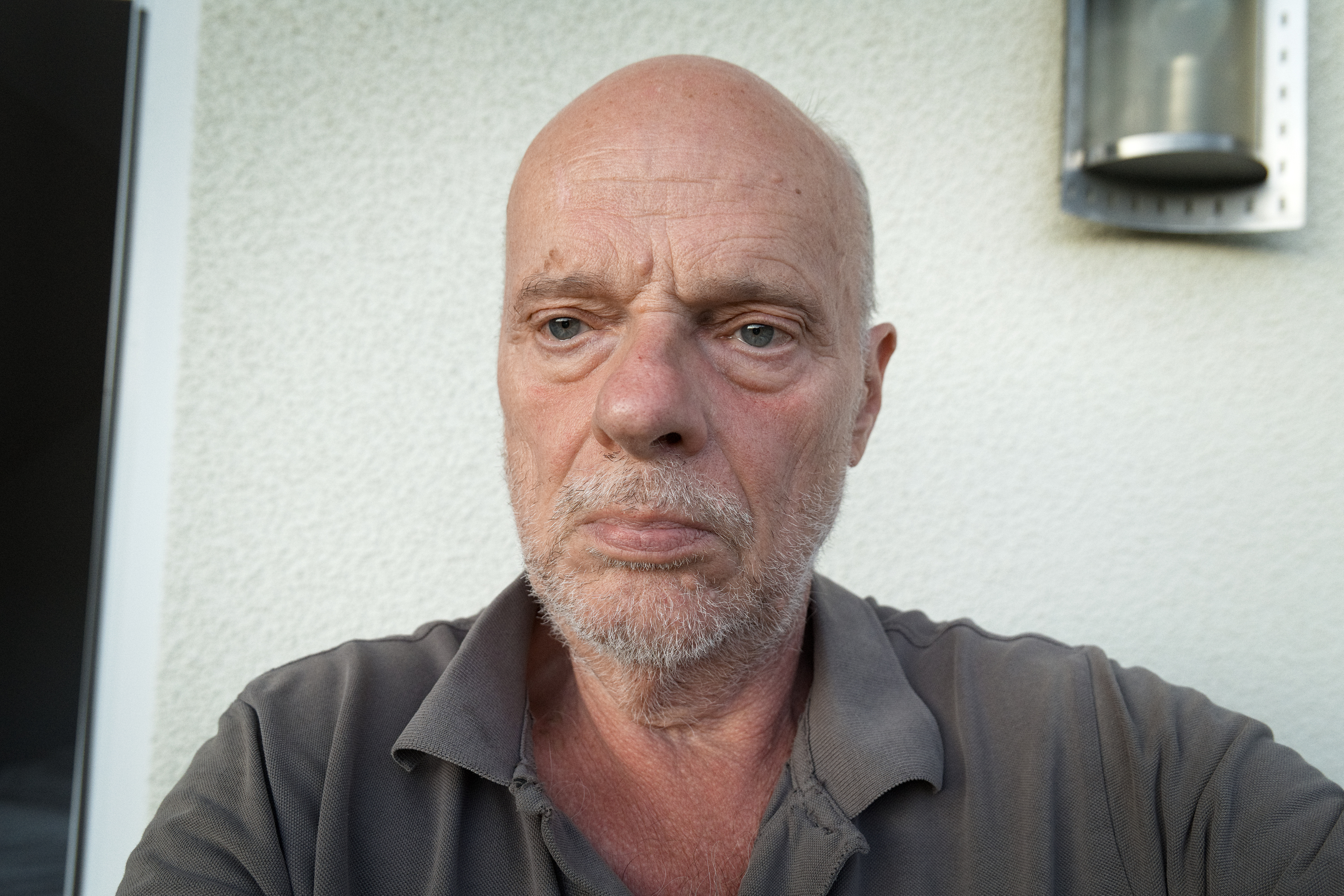
At the moment, this is the best I can achieve with ART. But I will certainly continue to develop - with your help.
The wall in the background is reality even more yellowish, at least not white, which makes color matching even more difficult.
I got a nice result with the lab curves…I think just added a control point on either side of the target and dropped the curve to taste with a third point…It worked pretty well actually. I agree I don’t think it’s a wb thing…
Tomorrow, i’ll try to give you some tips…
Maybe you meant the raw data?
On my Sigma SD9, the in-camera selected WB or Custom WB matrix is passed in the raw file to the converter as meta-data. The raw data is not affected by the WB setting … or ISO for that matter
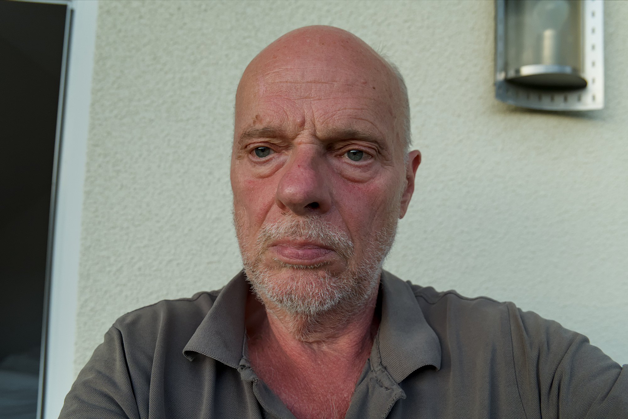
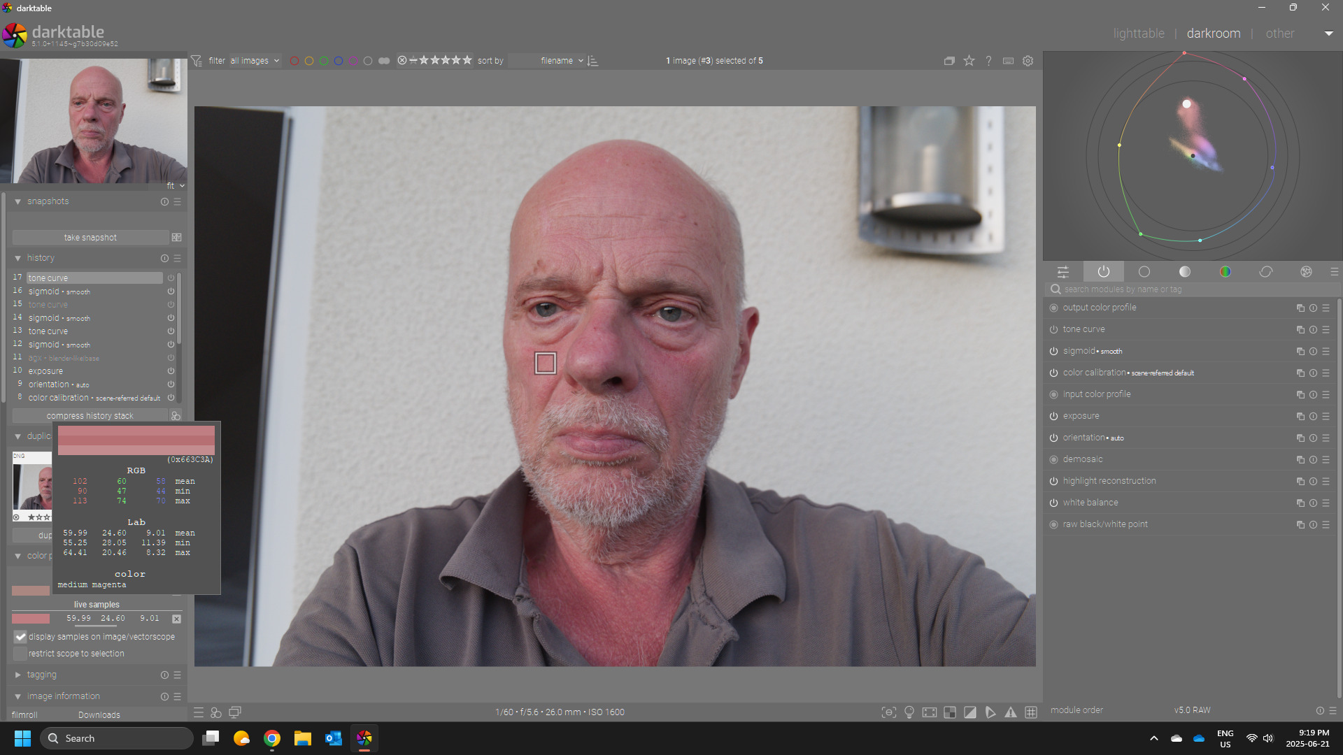
Here is an effort simply using the tone curve and the color picker in DT…you can easily replicate this in ART with similar lab adjustments.
Here opened and only exposure and the smooth preset of sigmoid…
I sampled the cheek…note the starting color…
THen I grab the “a” curve at 24 and drag down and the “b” curve and move up a little to until I get the balance that falls in the caucassian skin tones…there are charts for these and people debate numbers and skin tone lines for skin tones but AP put some references in the color picker to use if people wanted to and you can quickly learn to balance these by eye or to your taste…so hsl type tweaks or these sorts of ones can be effective.
I took a look at @lightlover’s edit and I noted that there was not much done…the bulk of the change was in the color eq with a simple hue shift and saturation tweak and in fact it does a great job but funny enough I like that edit even better without the custom wb tweak…which to my eye made the skin a bit too yellow but again this could be my perception and preference and not a valid assessment of the correction.
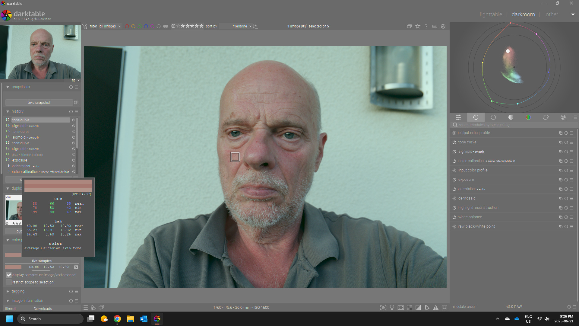
So back to the LAB TC tweak here is with the tc added… (I have done this also with RGB but I find it easier and quicker with the LAB curves)