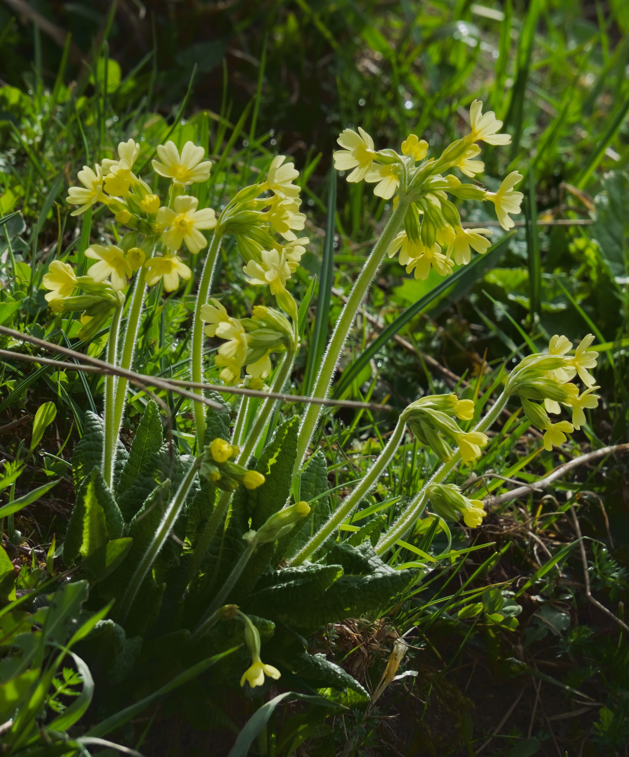
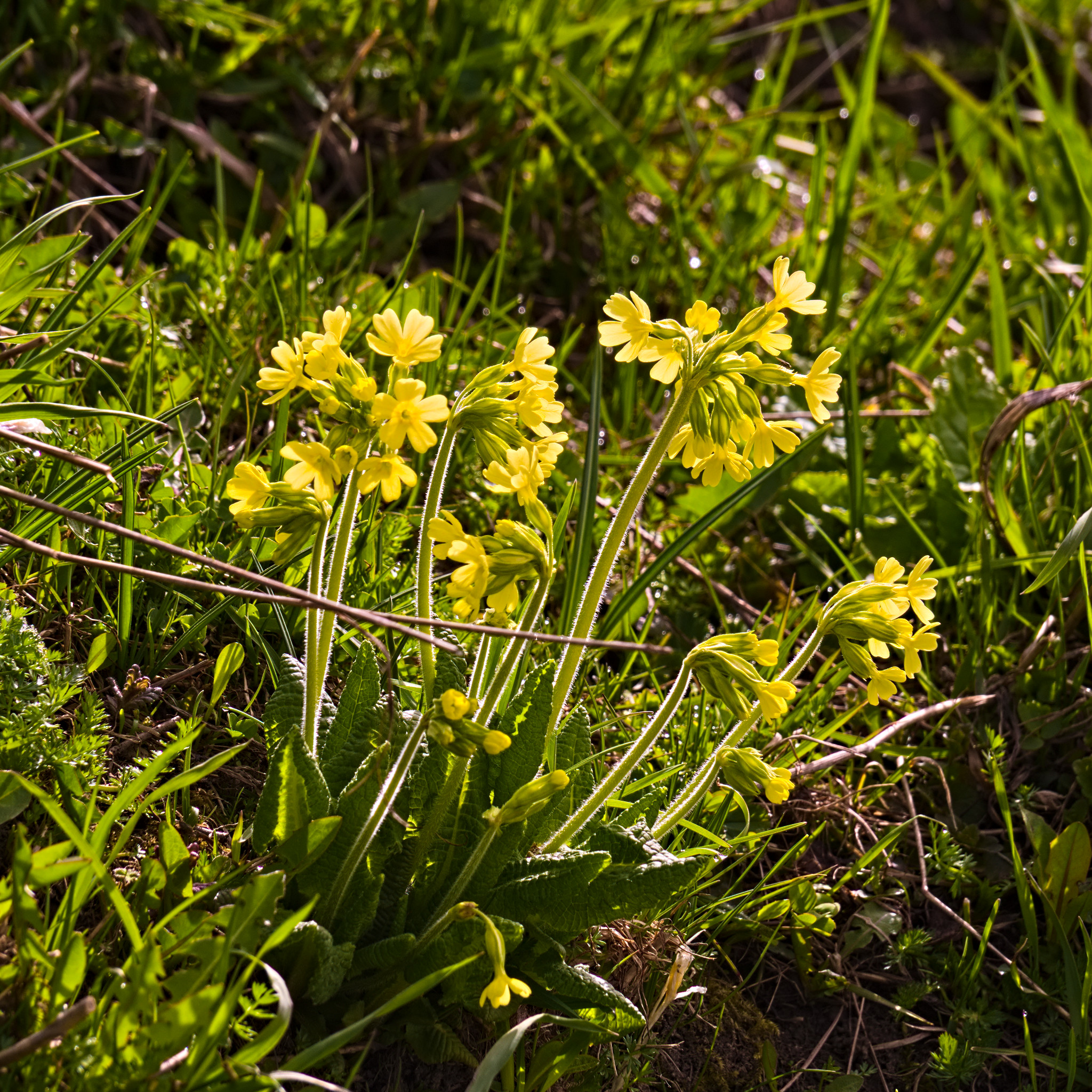
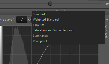
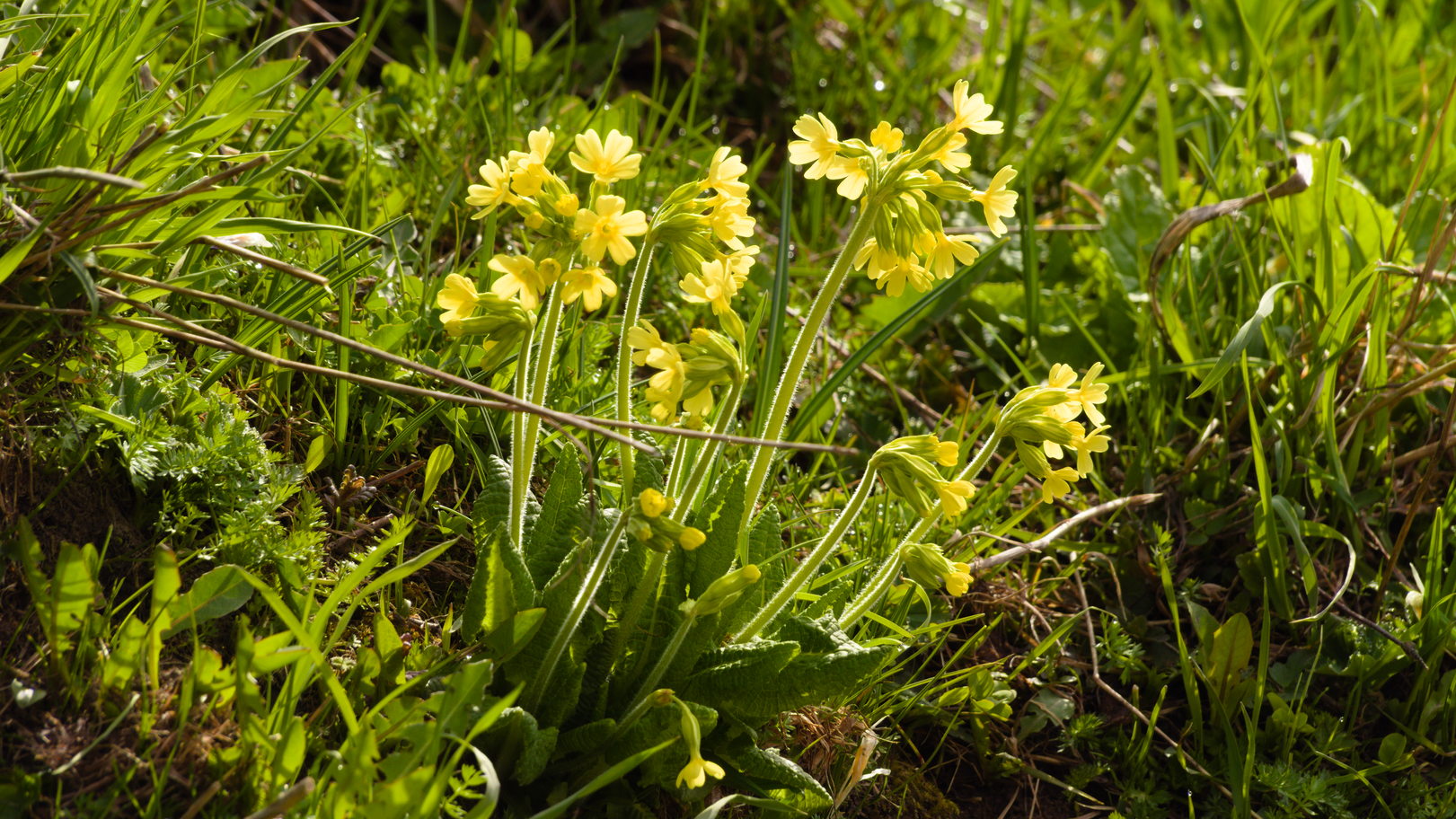
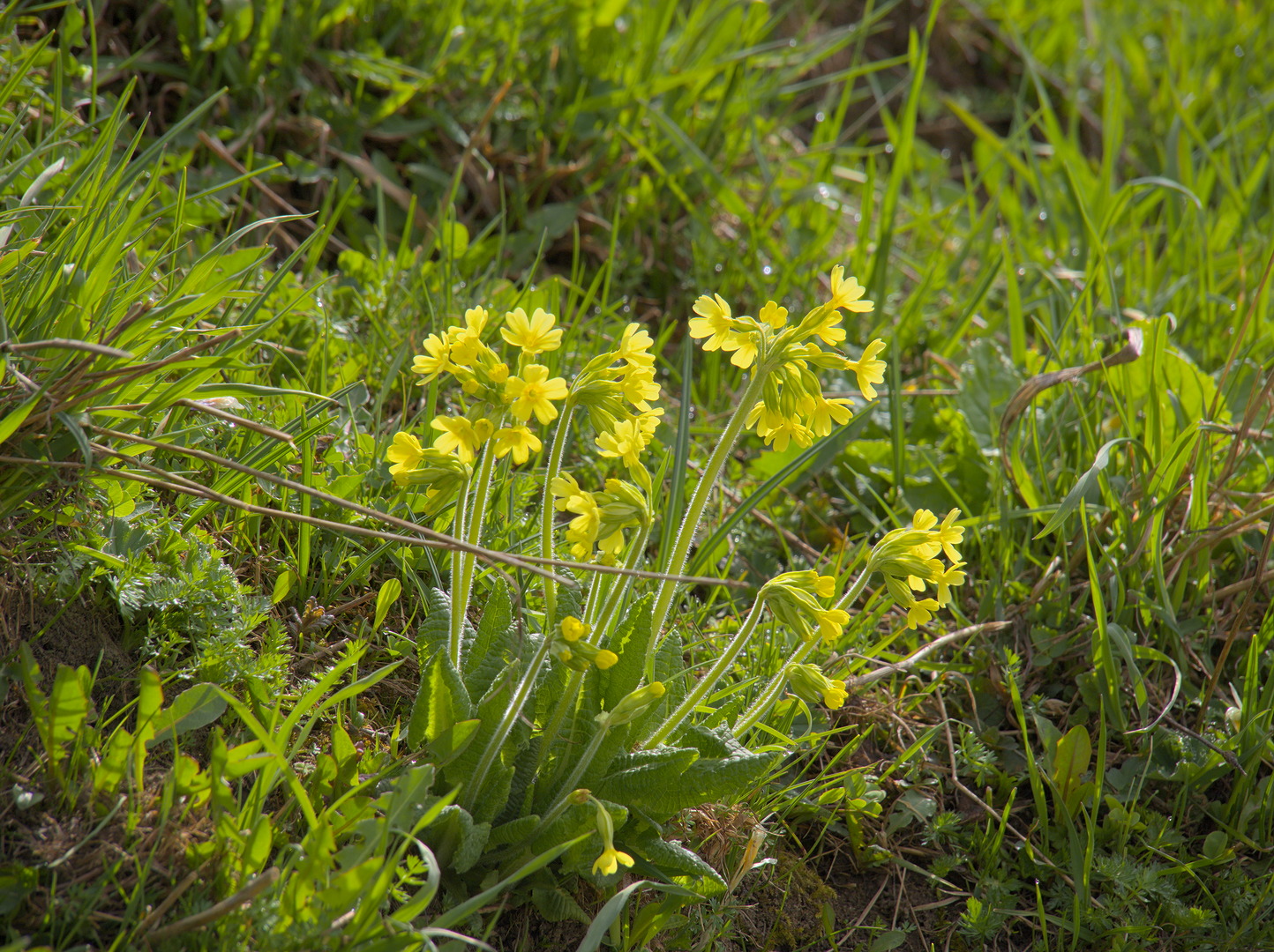
I’m not as comfortable with Rawtherapee as I am with other tools, but I gave it a go within that program. Is this a little closer to what you had in mind?
Color work is just a little bit of vibrance, but mostly Channel Mixer: in the red channel, a little bit more red in red input, and balanced out by taking red out of the green input. I tried some adjustment in HSV Equalizer as well, but I may have disabled that for this particular output.
The yellows are very bright in the exposure. I don’t know if I have the skill to make them look more saturated without making it look unrealistic.
I know your initial question was about a color correction matrix, and on that note I am no help at all.
Can you give a comparison image? Maybe the camera JPEG or something you are trying to achieve?
Flowers are very difficult to get saturated yet realistic colors out of, especially in sRGB gamut. To make it look more true to life color wise on the flowers, you need to lower the overall exposure of the image, or else it’ll look a bit overcooked.
With this kind of direct sunlight it’s also even more difficult For me flowers in their natural environments are the most difficult subjects.
It’s really a ‘color interpretation’ matrix, needed to transform the camera colors ultimately to colors the rendition medium can display. The camera values aren’t wrong, they just need to be adjusted to fit the small color gamuts of displays and printers, and the camera matrix provides the information to do that.
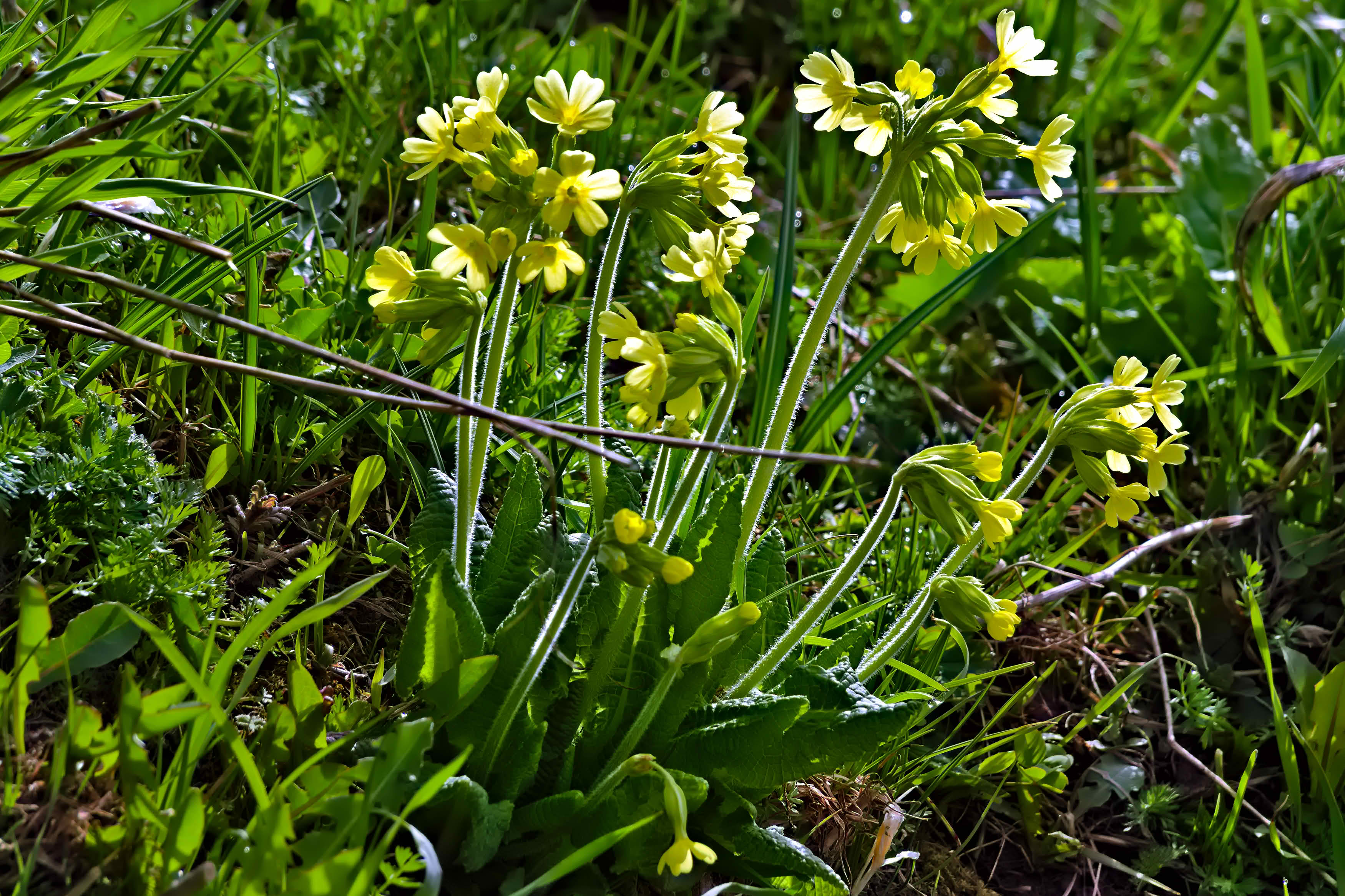
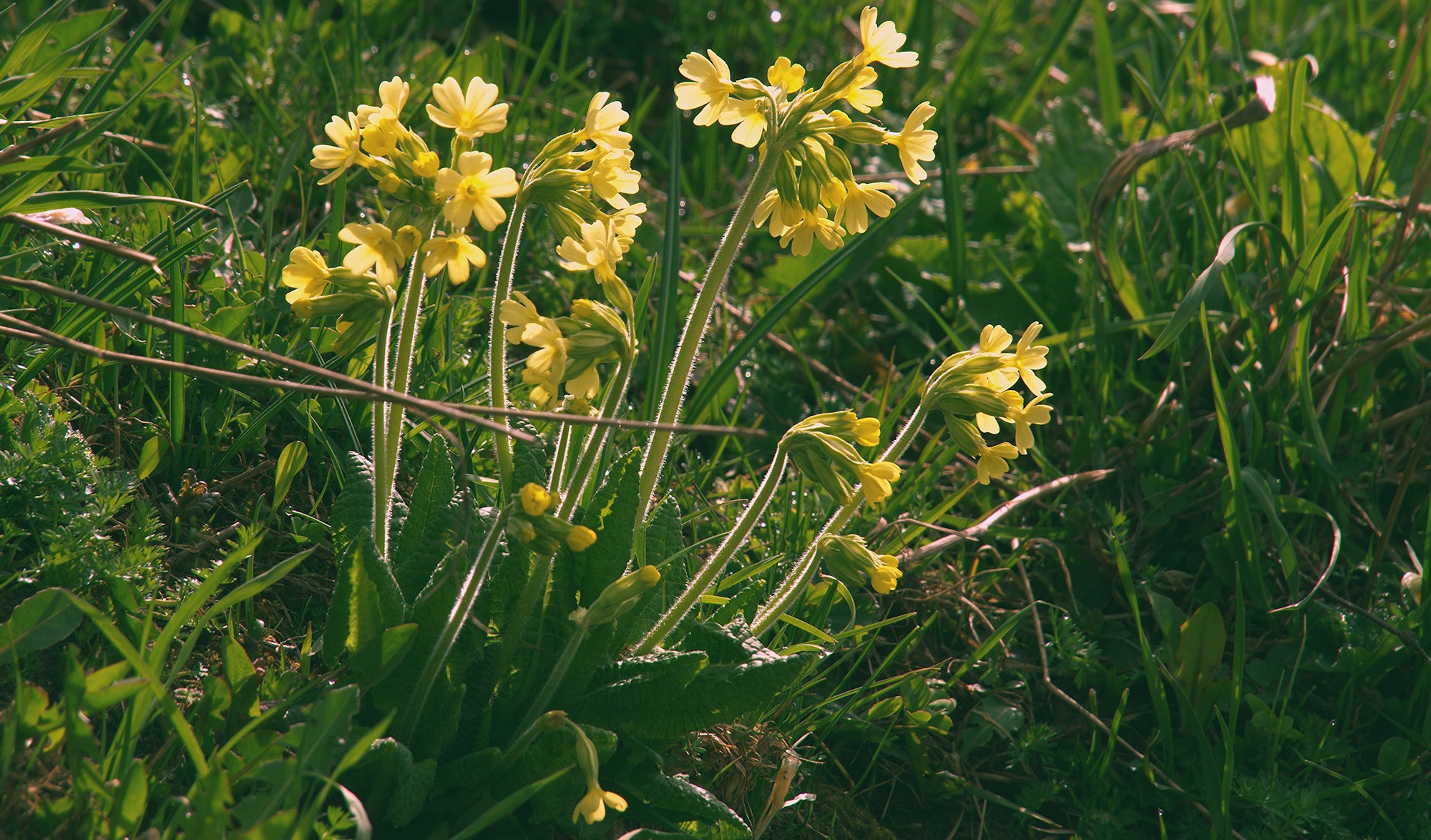
Here is my try.
I think when almost everything is greenish, WB may get “confused” sometimes.
Here I raised the colour temperature a bit and set the Tint slider to 0.8, e.g. less green
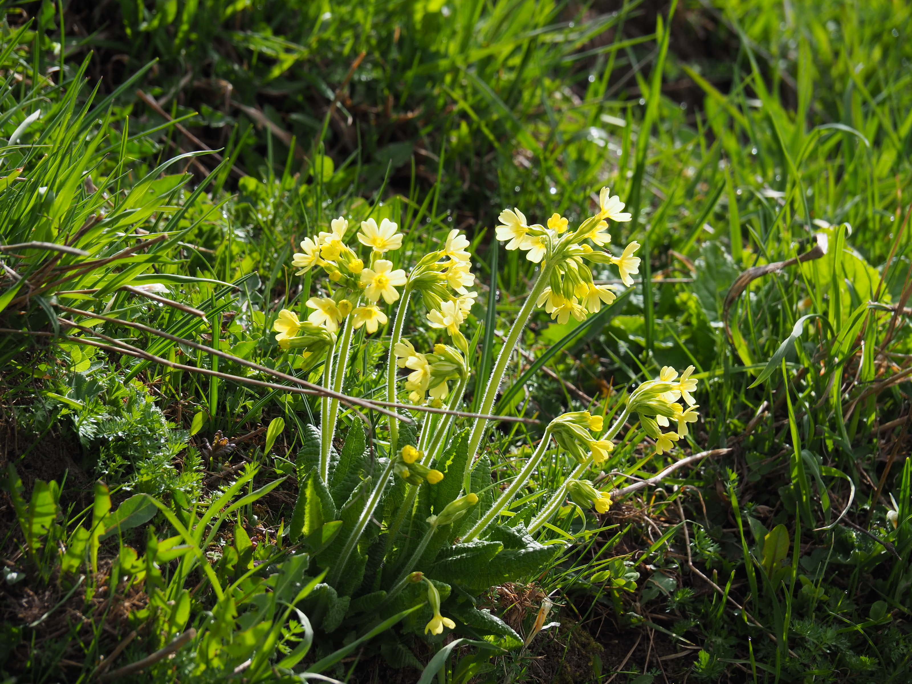
My take: White balance (gray world), contrast increased on red and blue channels, green reduced, a little bit of red saturation, and moderate sharpening. (Not in RT though)
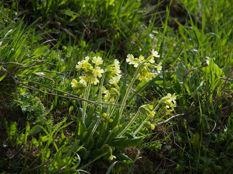
This is a very nice shot. With some very basic settings in RT 5.13 rc1 you will find this as a starting point for your edits, for me no issue with yellow saturation:
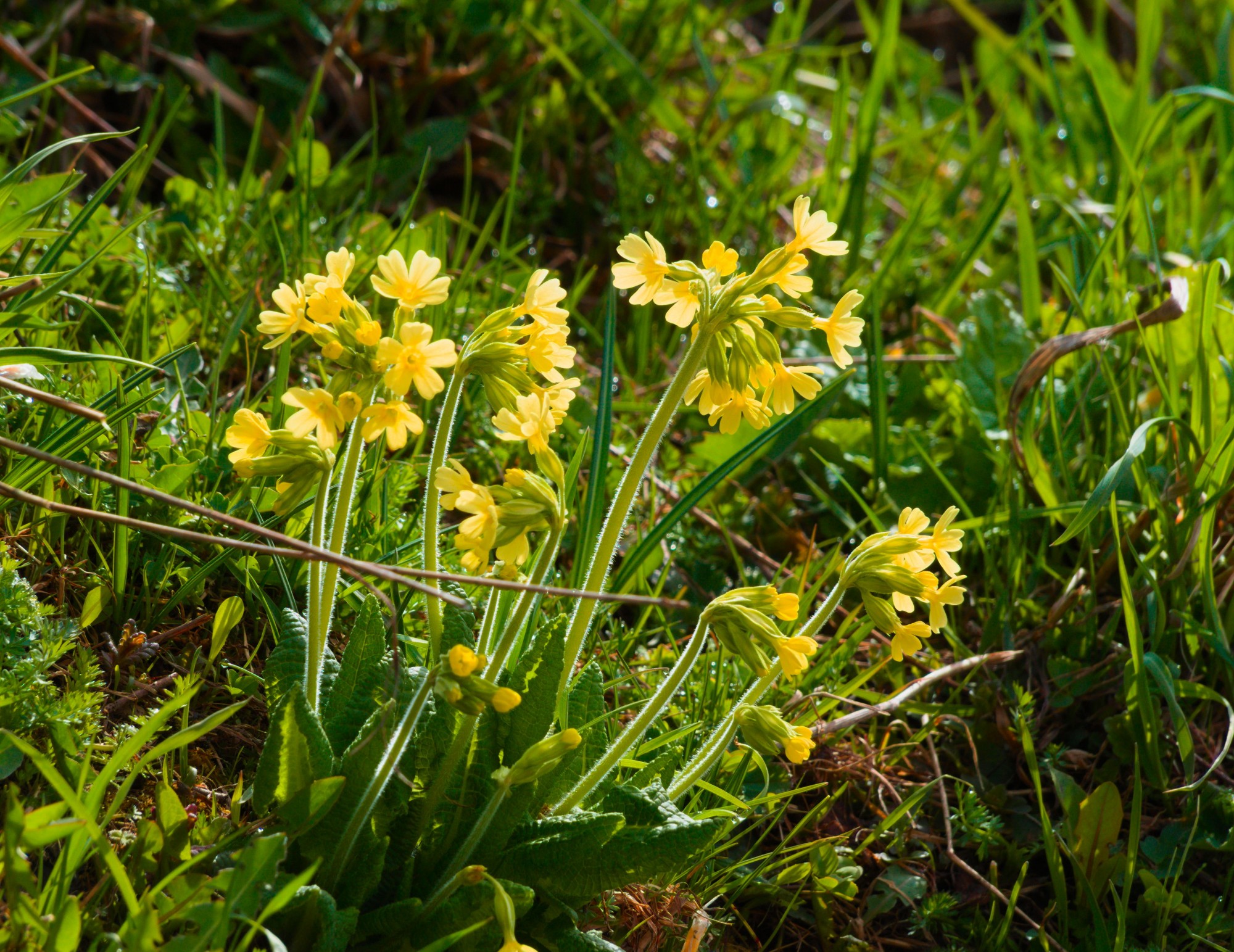
Hey, it was interesting processing this shot. I use RT 5.13 rc1, and generally apply the Game Changer starting point; my interpretation of this is in this sidecar, which I load directly after selecting Neutral processing profile (to clear out any SOOC jpeg stuff)… Basic Start v3 .pp3 (19.1 KB). Feel free to use this as starting point and go from there
I had a couple of goes (not much difference so here is just one) and find the yellows pretty bright/colourful (at least on my sRGB screen, processing in my preferred ‘neutral’ room):
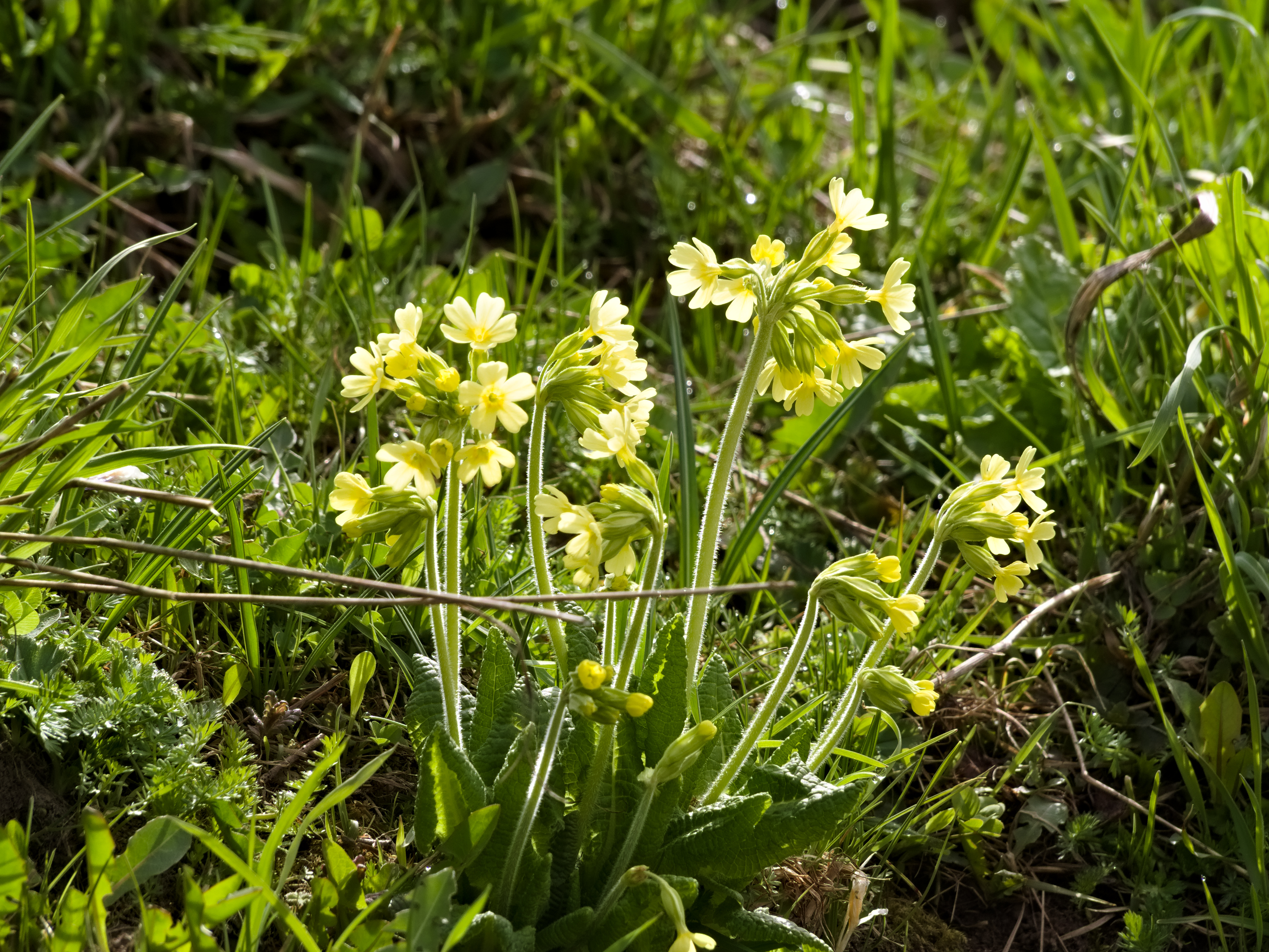

 For me flowers in their natural environments are the most difficult subjects.