Agx terminology (UI)

I’m working on a tool that will helpfully answer some of those questions.
But you can already try the default presets, and you’ll see the saturation changes mostly affect the highlights. As @Eary_Chow suggested, you can tick the ‘reverse all’ to restore saturation to midtones and shadows.

Unmodified primaries:

Now we inset the primaries (reduce purity). This affects all colours, yes. Left: without, right: with 30%:

And now we restore the purity (left: no reduction; right: 30% reduction + restoration):

The midrange has been recovered; the highlights remain desaturated.

No insetting vs inset + outset (recovery):

Hi, thank you for developing AgX, definitely the best dynamic range compressor available so far and, having tried it, I am going to default to it for 99% of my uses and I think it would be great if it was a default choice in DT 5.4.

I don’t particularly mind the current arrangement or naming of the sliders. Familiarizing with the sliders on the settings tab took me maybe 10 minutes, not a big issue. But since you asked how to clean them up I tried to think of a clean UI looking from a new user’s perspective.

Thanks for the link to the docs - I will of course read them for my own benefit. The above was meant to reduce a reliance on the documentation as most people will never bother with it and if they hit a problem they will simply switch to another module or tool.

We want to reduce the saturation of the highlights in the blue sky. For simplicity’s sake, unmodified primaries:

Attenuation of blue in “before tone mapping” and exact reversion (purity boost) of blue in “after tone mapping”:

Here is a comparison with unmodified primaries in Agx and desaturation of highlights with color balance rgb. Note the saturation of other colors in the photo:

2 Likes

Thanks, this makes sense. I thought this correction is applied gradually (not starting from a threshold) and couldn’t quite understand why the post-mapping step is needed.

This is a complex concept, both to understand and to configure (if real images are used). It would be good to have the above visualization built into the module itself.

BTW, I just tried rotating and attenuating primaries like in the picture 2 above and that affected dark colors. From above visualisation I understand this was not meant to happen. Version 5.3.0+524~g2ed91dc97e

Is this raw file available somewhere to download?

Here is a hack tool for geeks, I hope it will be useful for some of you to explore how AgX works:
https://tech.kovacs-telekes.org/dt-agx/agx.html

It exposes most, but not all controls. And it uses Rec 709, but the “blender” parameters are actually the Rec 2020 values. Not a big deal for a demo. Also, the original Python code uses gamma 2.4, which I haven’t noticed until now. :weary: Darktable uses 2.2. The difference is not huge. The visualisation also uses 2.2.

You input your RGB triplet that you want to test. You can then shift it up/down in exposure.

Then you configure the curve. Hue preservation ended up there, too. In execution, that comes after the curve (how much of the original HSL hue to mix back after the curve is applied).

Finally, you set your primaries (again, the ‘blender’ button loads a somewhat wrong approximation, but that should not influence the demo, as far as demonstrating the steps and the idea is concerned).

Curves:
This is the one you see in darktable, but shows the input-output for each channel via the x and y coordinates of the dots):


The x coordinates take the inset + rotation into account; the y coordinates are simply the output of the curve.

This one also has the hue restoration and the output primaries changes, and the result is the linearised output:


You’ll notice you get crazy values if you use too high purity boost.

The 3rd curve actually shows the linear input → linear output mapping. This is important, as it shows just how steep the curve really is, and how flat it becomes. I’ll explain later, why that’s important:

And, below all that, is a large table, that shows your input, what the values (and their ratios, compared to the largest component) are after the inset (attenuation + rotation before the curve), after the log mapping, after the curve, linearised, after hue restoration, and finally after the outset (purity boost + rotation reversal). The rows show how those values vary if you shift the input up or down, in 1 EV steps.

5 Likes

Minor update: the calculations in the table were OK, but on the linear-Y graphs, the effect of hue restoration was reversed (hue restoration pushes the middle value off the curve). Also:

  • negatives are forced to 0 for the log input
  • the input of the power function (linearisation) is clamped to [0…1]
  • the hue is indicated in each cell.

Results of the polls - thanks to everyone, who participated!

So, for now, toe / shoulder power remain.

But the ‘power’ control will be flipped → and called ‘brightness’.

3 Likes

To illustrate what I see (unmodified base primaries vs unmodified base primaries + 50% attenuation with after tone mapping disabled):

I get a similar result when I rotate primaries (all colors are rotated regardless of brightness). Is that expected?

Yes. That’s why you have the ‘after’ sliders, to reverse stuff.

I’ll write about this, but it takes an immense amount of time.

3 Likes

There is no threshold and there are no gradations. In AgX, everything is global. The tone curve is the only element whose effect directly depends on the input value, but that is enough to do everything. I’ll write a detailed description during the weekend.

Wonderful work: thank you so much! Speaking as a mathallergic numbodumbo, I’m finding the documentation clear and the module approachable. Taking first steps: haven’t even got one finalised pic yet, although my early attempts seem promising.

Toe and shoulder seem reasonably intuitive to me. one is up there, the other is down there. Watching Boris’s video made me realise that I never previously understood the technical term “purity” before.

I’m only a couple of days in and learning. Getting to grips with some new words should not be a problem for people. Personally, I don’t use the word “attenuation” very often, but years ago I had an amplifier on which that was what the “volume” knob was called. The displayed numbers seemed to go the “wrong” way: but I soon got accustomed to it. Not a big deal.

… Reflections from a non-technical user.

Aah, my bad, sorry, ignore my last two messages. I was looking at your test screenshots and did not realise you were comparing two images, with a line(!) in between. I though AgX is meant to have some “threshold” and only affect colors above certain brightness. :man_facepalming: It makes a lot more sense now.

I still think the sliders on primaries tab a bit excessive and require a test pattern to set correctly (unless the user wants to distort the color space for creative reasons). From a user’s point of view, it would be nice to have a single slider for setting the “strength of the AgX effect”. No idea what would that mean in practice - just throwing an idea. Of course there are presets, but it would be nice to have something in between them and a dozen of sliders.

There is a “preserve hue” slider, which I initially thought was serving that exact purpose, but in practice its effect is very subtle. It does indeed “preserve hue” when set to 100% (BTW, why isn’t it a default?) but it is not clear to me what happens when it is set to 0 - AgX is still working as normal, just there are some hue inaccuracies left.

You can sort of do that on the back end I think if I understand the master sliders…these scale the settings for the post so you can reduce or bump the “effect”… so maybe matching them to the pre settings and then using the master would be somewhat like what you are thinking of here if I understand how it works…

Probably won’t be a single slider, but i would advise to have the reverse all checkbox checked, I think it should make a good default to have it checked, but Kofa would be the one to decide.

Because that effectively disables the “hue flight” effect Introduced by the per-chanel curve , if you set it to 100%, and then have that reverse all checkbox be checked, you would find that the rotation slider has no effect on the “hue” then, It effectively turns AgX hue flight mechanism off. If you inverse the direction of the preserve, heels lighter than it can effectively be the strength knob for the AgX hue flight mechanism.

(I decided to delete my reply and repost it after correcting the typo. I hate how the edit button is gone. I’m also using voice to text on my phone, and it’s generating a lot of wrong words.)

1 Like

Uhh, sorry, preserve hue slider.

1 Like

In situations like this,…

…you quickly get artifacts in the gradients:

I find the current preset to be best for most cases.

Yeah I guess The current default is “safer” on that sense. The catch is, new users will get very confused about how the two sections interact. I guess there’s no perfect answer.

I agree.

But I believe that sometimes you have to understand things in order to be able to use them.

In such cases, it may be more worthwhile to make a greater effort to make it understandable.

@kofa is on the right track here, and we should support him in this.

9 Likes

I’ll scale the “brightness” a bit in a non-linear way, so lower values don’t crush the shadows so quickly.

soft max (2):

1.5:

Neutral (1):

0.5:

0.1:

Minimum (0):

One can push it upwards by overriding the soft limit, e.g. 10:

If no one screams, I’ll write the migration logic and submit a PR tomorrow.

2 Likes

This will be a series of posts, maybe spanning several days.

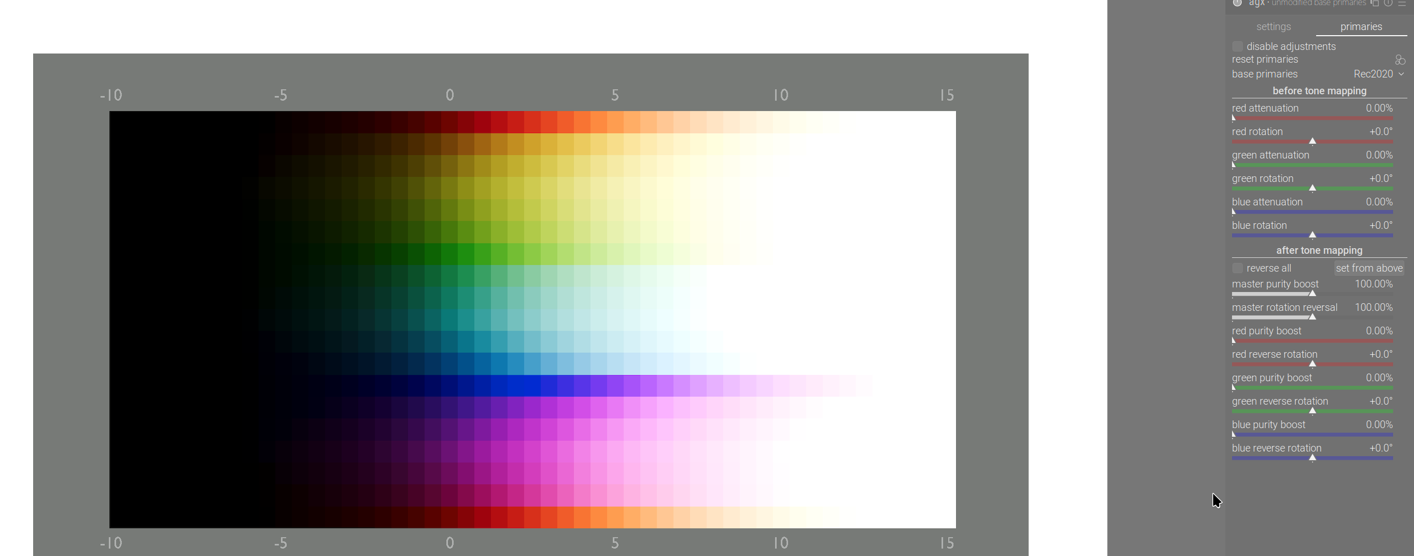
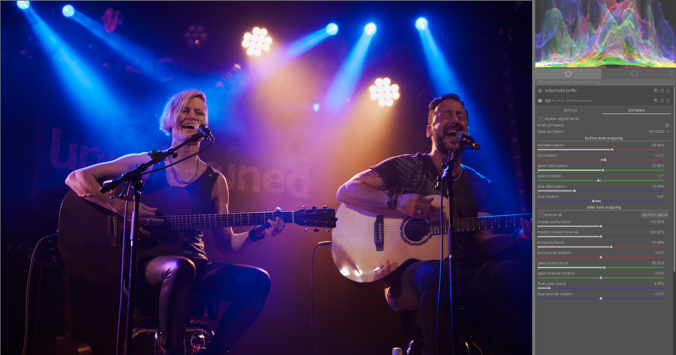
So, what are the mysterious “inset/outset” (primaries attenuation, purity boost) and the “rotations”?

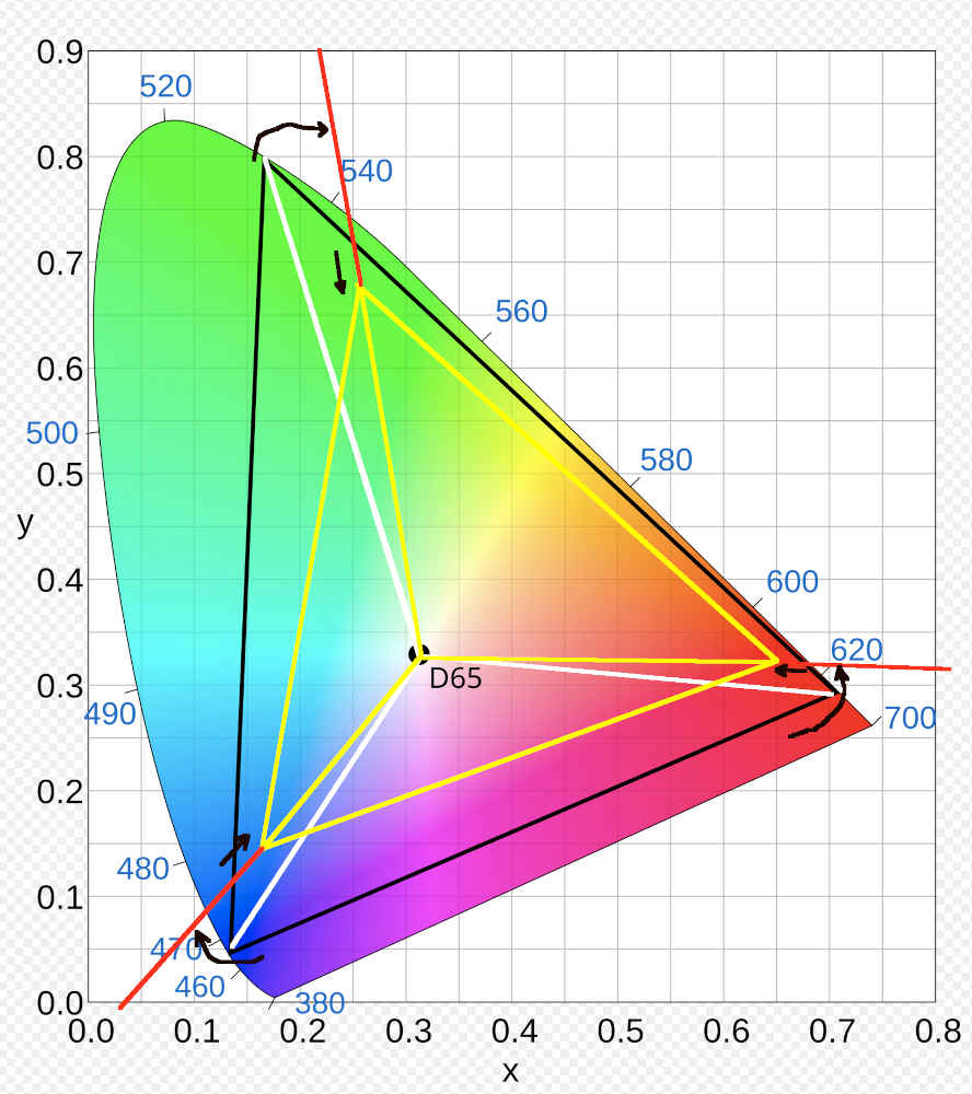
We start with the selected “base” space. In this figure, it’s Rec 2020, the original big black triangle that touches the edges of the horseshoe-shaped diagram, which represents the colours visible to humans. The primaries of that space are the vertices of the triangle.

Then, we take the lines that connect the primaries with the “white point” (also: achromatic - this diagram does not represent brightness, only colour (in the “hue” and “saturation” sense, but those quantities do not correspond to the axes or anything else on the diagram)). These are the white lines.

We rotate the the lines (see the curved arrows), introducing a hue shift. These are the red lines (mostly covered by yellow, see below).

Finally, we move the points where the rotated lines intersect with the sides of the original triangle (intersections of the red and black lines), determine the distance of that point from the white point, and reduce the distance according to the “attenuation” value. These sections are marked in yellow. The ends of the yellow lines are the primaries of the new space, its boundaries shown also in yellow.

Then, we take the input RGB value, and without a colour space conversion, “reinterpret” the meaning of the RGB values as if they belonged to a colour in the smaller colour space (introducing the hue shift caused by the rotation, and the desaturation introduced by pushing colours towards the achromatic (white point)). In Gimp, this operation is called assign profile.

We then convert that shifted / desaturated colour back into the original “base” space. The colour remains shifted / desaturated, and we get new RGB values in the base space, which represent that shifted / desaturated colour.

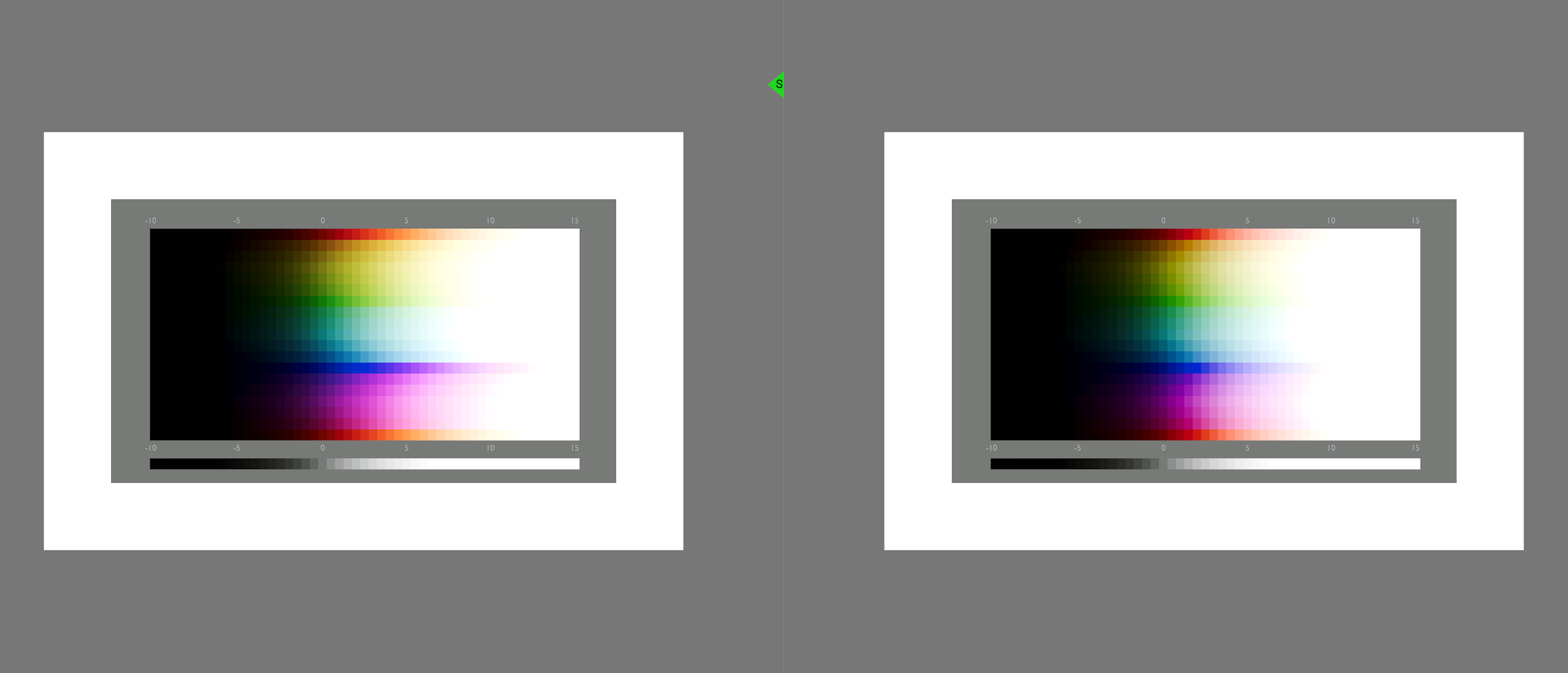
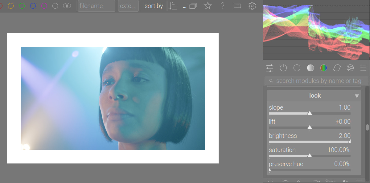
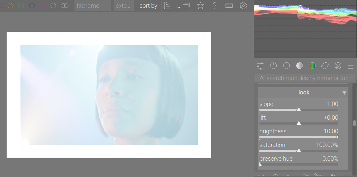
As an illustration, the effect of assigning the sRGB profile (much smaller space) to an image whose native space is Rec 2020:

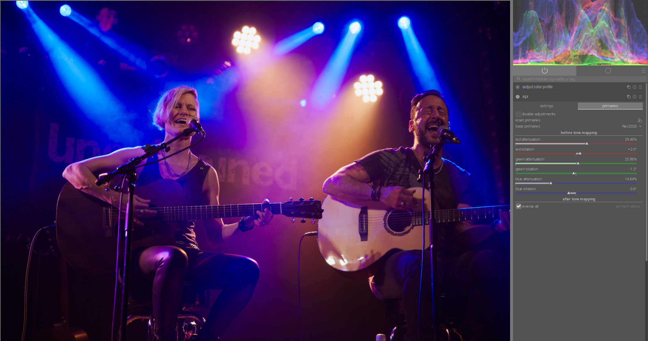
That would be achieved using the following rotations and insets:

Why is that important?

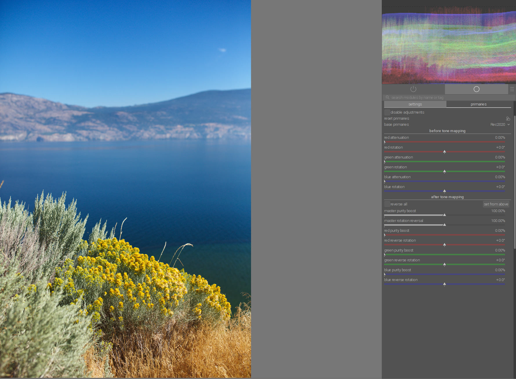
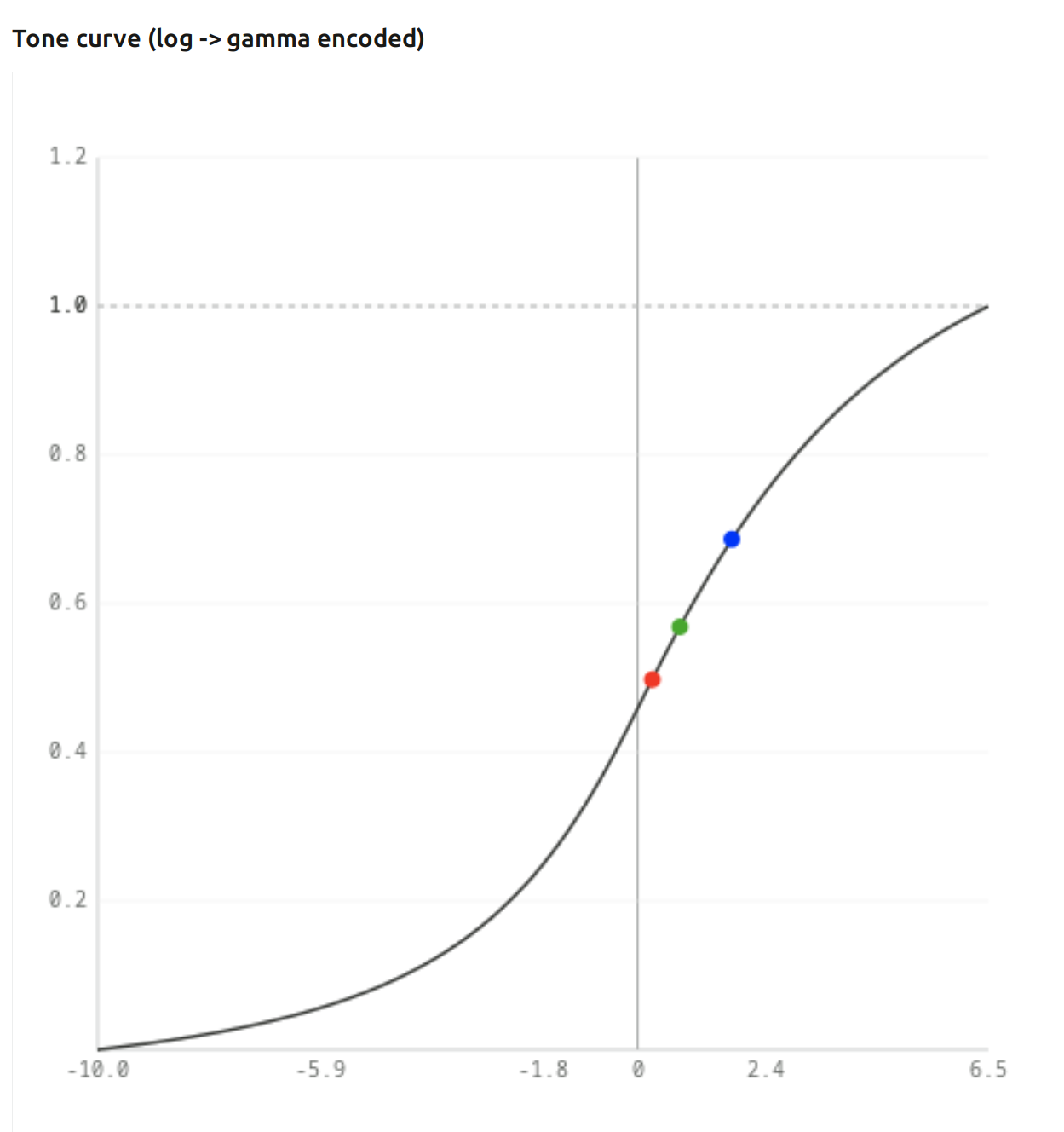
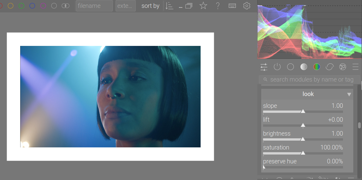
Let’s fire up AGX Color Transform Simulation, and examine what happens to a single primary colour (that’s the simplest example).

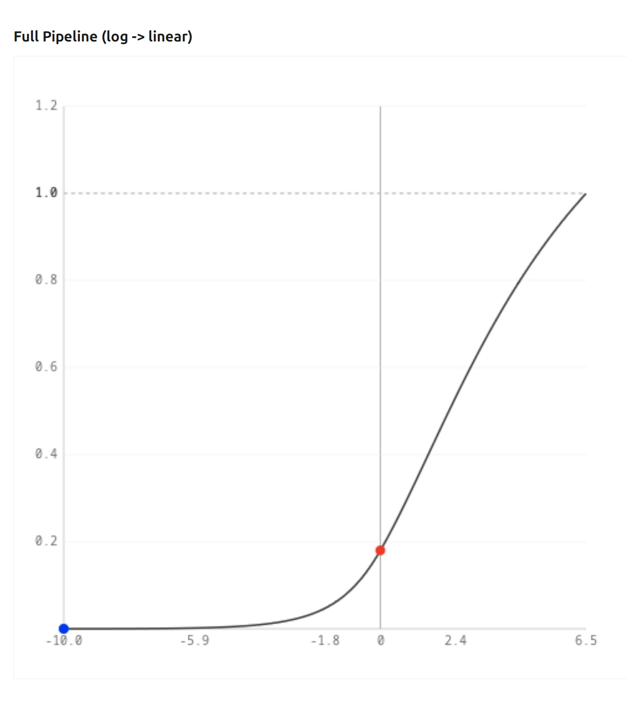
If you look at this chart, you can see we only have red; no green, no blue: it’s a primary. No matter, how bright I make it with exposure, the output value cannot raise above 1 for red, and remains 0 for green and blue. There is no white:

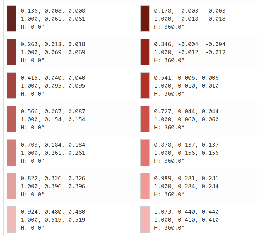
If you examine the table below the charts, you’ll see that even if shifted up by 6 EV, the output is just red:

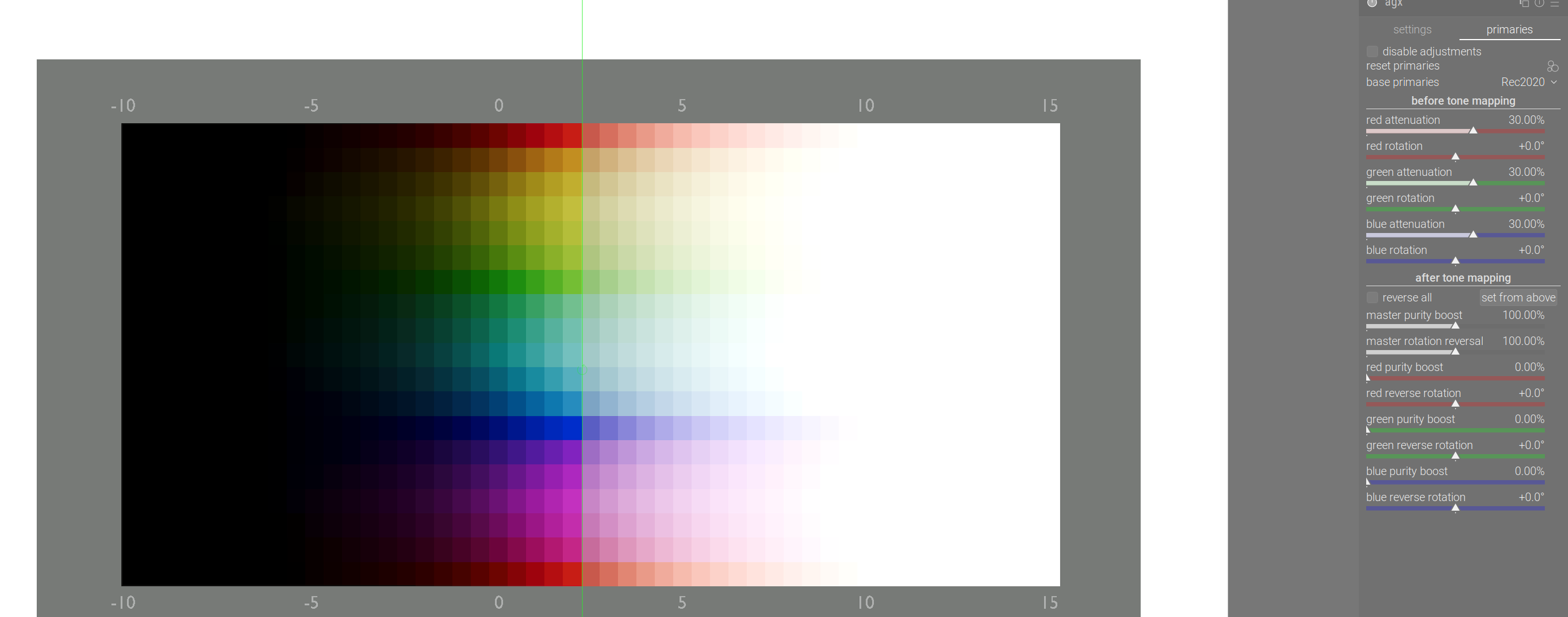
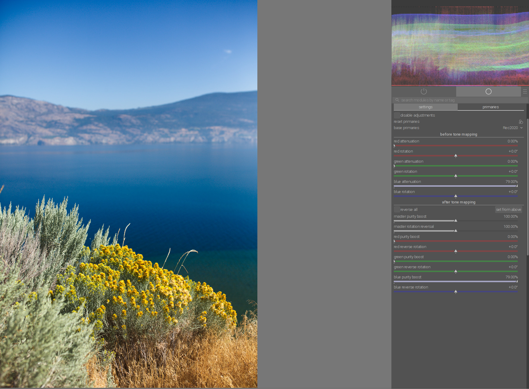
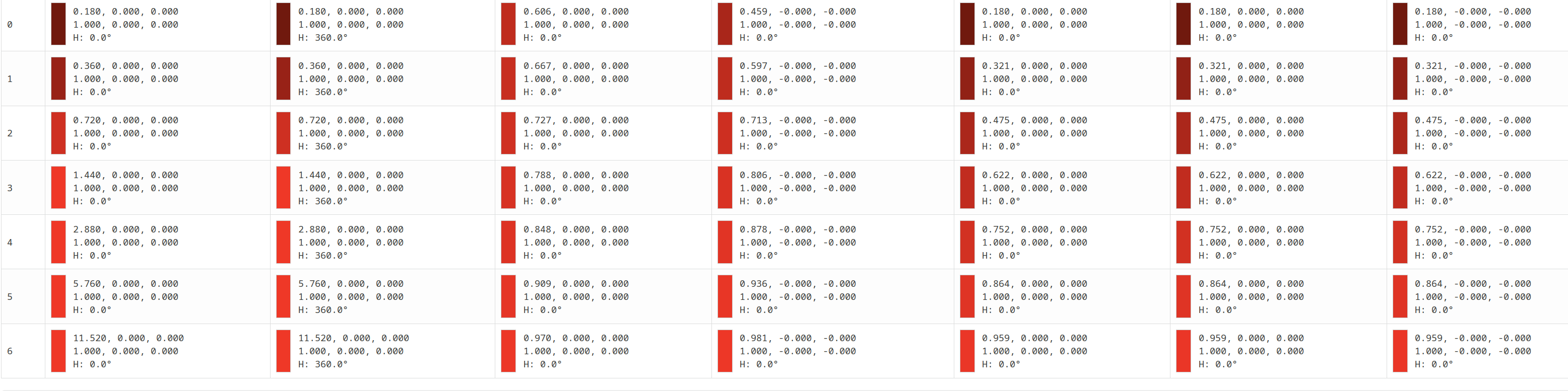
Now, let’s set all the insets to 30%. On the log → linear chart, we can now see blue (green is also there, but is covered by the blue dot):

And if we check the table (first column: original, second: with inset applied), we can see that now we have values in the green and blue channels! That’s because of desaturation – remember that R = G = B means black, grey or white: neutral, achromatic.

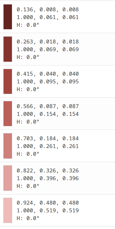
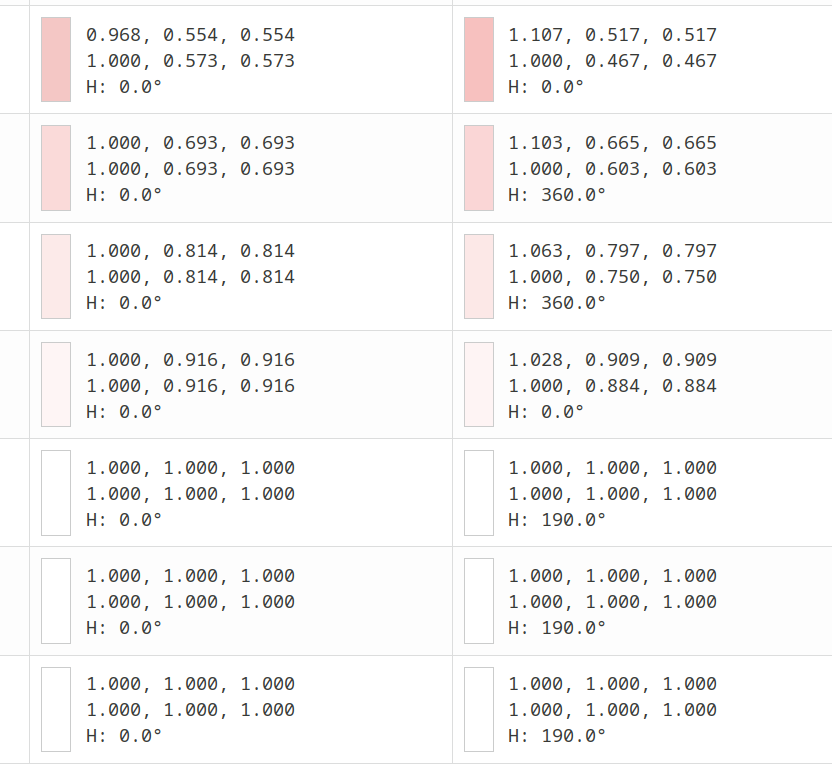
If we check the other end of the table:


As exposure increases, the ratio of red to green (blue) increases. In the last row, +6 EV, we have more than 50% of the red value in the green and blue channels – we are no longer stuck with red = 1, green = blue = 0 (red), we are going towards white!

Why is that?
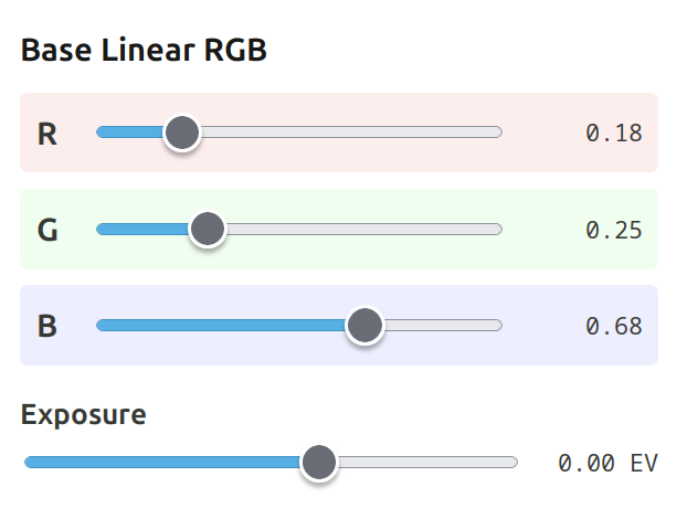
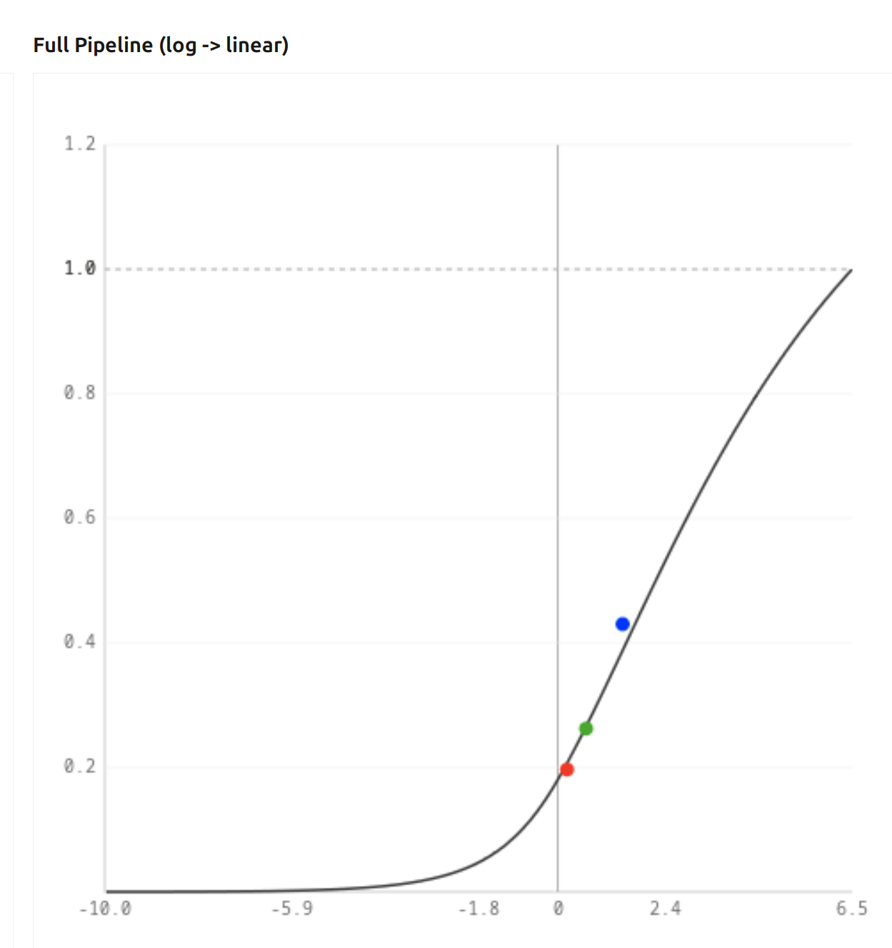
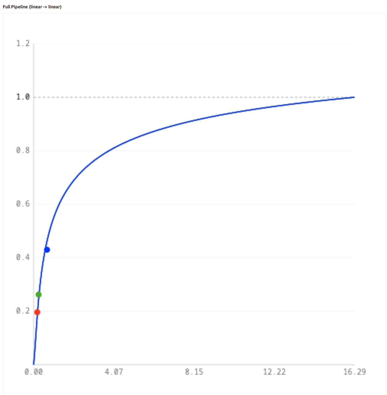
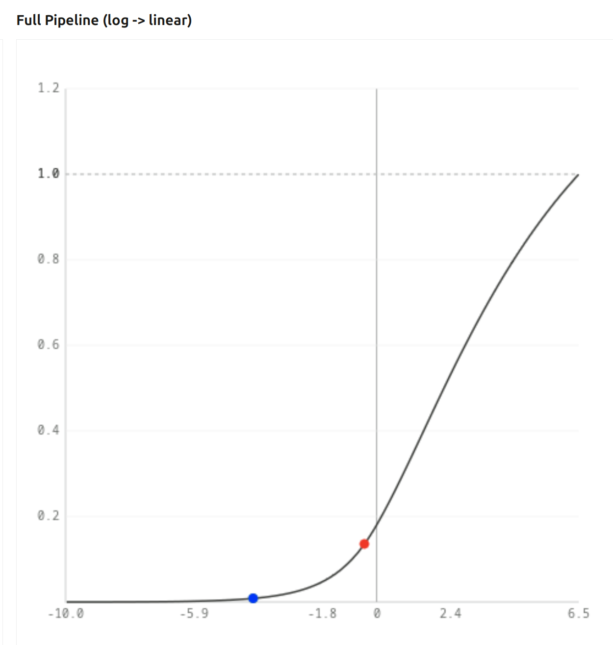
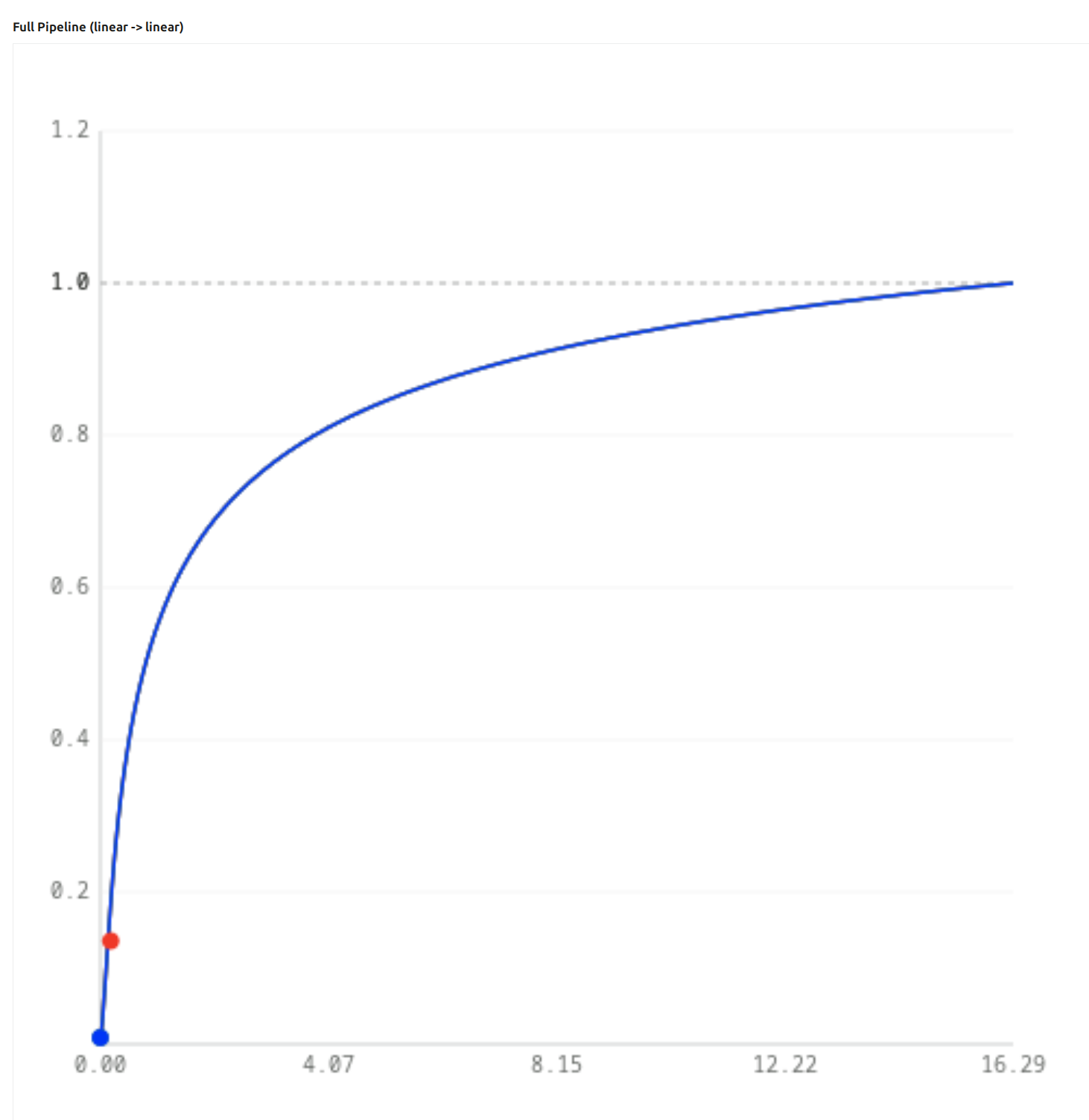
Let’s have a look at the “Full pipe (linear to linear)” chart. I told you it is very important that it starts out steep, and then flattens. With the previously mentioned 30% insets, at 0 EV, our (0.18, 0, 0) gets mapped like this - green and blue are very low, red is more or less unaffected:

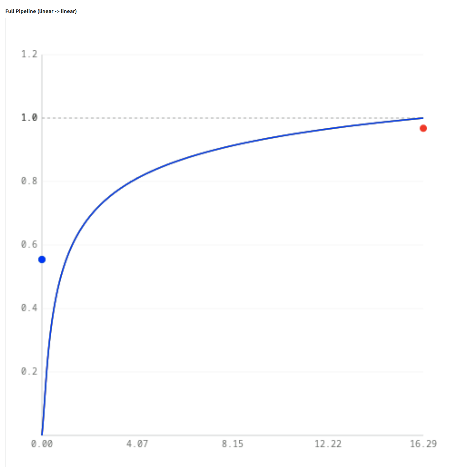
At +6.5 EV exposure:

Why is blue floating above the curve (and why is red below it)? Because the inset, as we have seen above, has “pushed some of the energy from red into blue” (and green). Our initial blue was 0, but with the inset, the RGB triplet was pushed from (16.292, 0.000, 0.000) to (12.428, 1.040, 1.040) – and the overall curve (log mapping + tone curve + linearisation) pushes that blue = 1.040 to 0.554 (but the blue dot is plotted with x = original blue = 0). At the same time, red already had a high value, it was on the flat part of the curve. No matter, how high we raise the exposure, red cannot exceed 1, while green and blue, still being on the steep part, can increase rapidly.

OK, so we have desaturation and go towards white in the highlights. That’s desirable, but what about midtones? After all, the insetting (desaturation) affects all colours.
That is true, but the desaturation is increased by the curve pushing small values up by a lot, and limiting high values (they slowly increase towards 1).
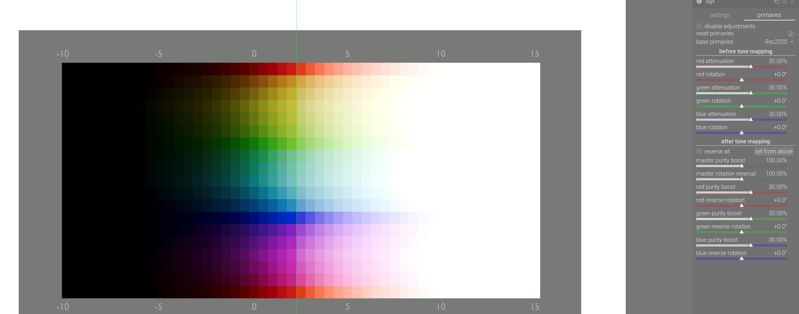
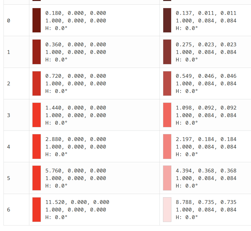
Now, if we use 30% for all the outset values (which does the inverse, going from the small triangle to the big triangle), we’ll resaturate colours (boosting purity), and that means increasing the difference between the components.
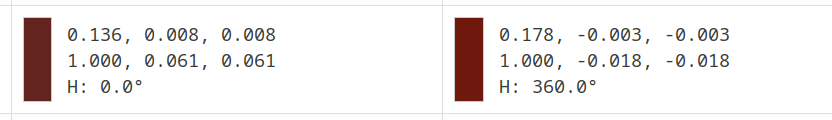
This is the end result of mapping (0.18, 0, 0), first before, then after the outset:

Our red has been darkened a bit, the negative blue and green (results of the saturation boost) will be clipped, we get a red pixel back.

But for high brightness values, the curve has greatly reduced the distance between red, green and blue, and that is not reversed by the purity boost. Check how the values change with exposure (before and after the outset):


Pushing even higher:

So, this is how the outset resaturates midtones and shadows, but not highlights: it’s helped by the very flat section of the overall curve already squishing the output RGB components close together for bright colours, but keeping the contrast between components of darker pixels.

To be continued with rotations. Let me know if you have questions. Was this helpful / readable at all?

10 Likes