Agx terminology (UI)

Thanks for the write up. Yes, it is helpful, it is important to understand what the tool is doing. And I like what it is doing very much, to the point I have switched to AgX completely already, without waiting for DT 5.4.

As for the Primaries tab, the configuration is currently defined in terms of the underlying knobs and not user goals. That is good for debugging but not very helpful for the users. I needed a test chart to set primaries sensibly and even then I wouldn’t call the result better than the “smooth” preset. So far the following settings were identified as useful:

  • Select a preset (mainly “smooth” one) + reverse all
  • Select a preset + click “set from above” + adjust boosts (master - Todd, or one of RGB - Boris). This gives a tradeoff between hue accuracy and saturation.

I would suggest:

  • Making the “smooth” preset (or whatever preset is correct from the human color perception point of view) the default config for RGB primaries, so that the user doesn’t have to (but still can) touch primaries.
  • Adding a new “hue accuracy ↔ saturation” slider in the Look section.
    • If needed, this can control multiple variables together (attenuation, boost)
    • Perhaps it could be combined with (or differentiated from) the existing “saturation” and “preserve hue” sliders - their functions overlap here in non-obvious ways.

Super helpful, maybe these posts could be published on pixls.us (not discuss.) towards the release? Or maybe you could post these explanations in a separate thread? I find them to be too valuable to get buried here…

Question: in your post “inset” came a bit out of nowhere to me. Does inset mean the combination of the first Rotations and attenuations?

1 Like

or simply in docs, as advanced documentation? :grin:

2 Likes

I’m sorry, I used them a somewhat interchangeably. Sometimes as reducing the purity, attenuation:

However, the rotations and the attenuation are implemented using a single operation (multiplying the original RGB vector with an ‘insetting’ matrix), so at least once I used in that combined sense, too:

1 Like

Such presets are already provided. If you set agx as your default tonemapper (preferences → processing → auto-apply pixel workflow defaults), you get the agx (scene-referred default) preset automatically applied. If you don’t, you still have access to the blender-like presets (which share the primaries settings with agx (scene-referred default), only the contrasts are different). Those mostly restore purity, but not rotations:

And you have the smooth preset, which you already mentioned. It takes the opposite approach: it completely reverses rotations, but not purity (the individual sliders are set for complete reversal, the master purity boost slider is set to 0, so you can turn it up gradually if you wish):

Come to think of it, maybe we should set the blender-like and scene-referred defaults also to completely reverse the rotations, but turning it off by default, setting the master control to 0, allowing gradual reversal via a single slider. :slight_smile:

I have no idea how I would implement that, how hue accuracy and saturation can be traded for each other.
And, as I have already explained, saturation and preserve hue are in the “rendering” space. The preserve hue counteracts the “Notorious 6” of the “internal” tone mapping operations (those done in the rendering space), and not the hue shifts introduced using the rotation sliders.

I’ll write about that later (including the N6).

1 Like

I am not in the software but one things that just looking at it strikes me funny is the rotation…I can see that the purity sliders are attenuation and boost so a similar value is the opponent adjustment but the rotation I would naturally think would be neutral and so + or negative in the preTM and then the reverse polarity in the postTM… not sure if I am the only one or its early morning and no coffee yet :slight_smile:

1 Like

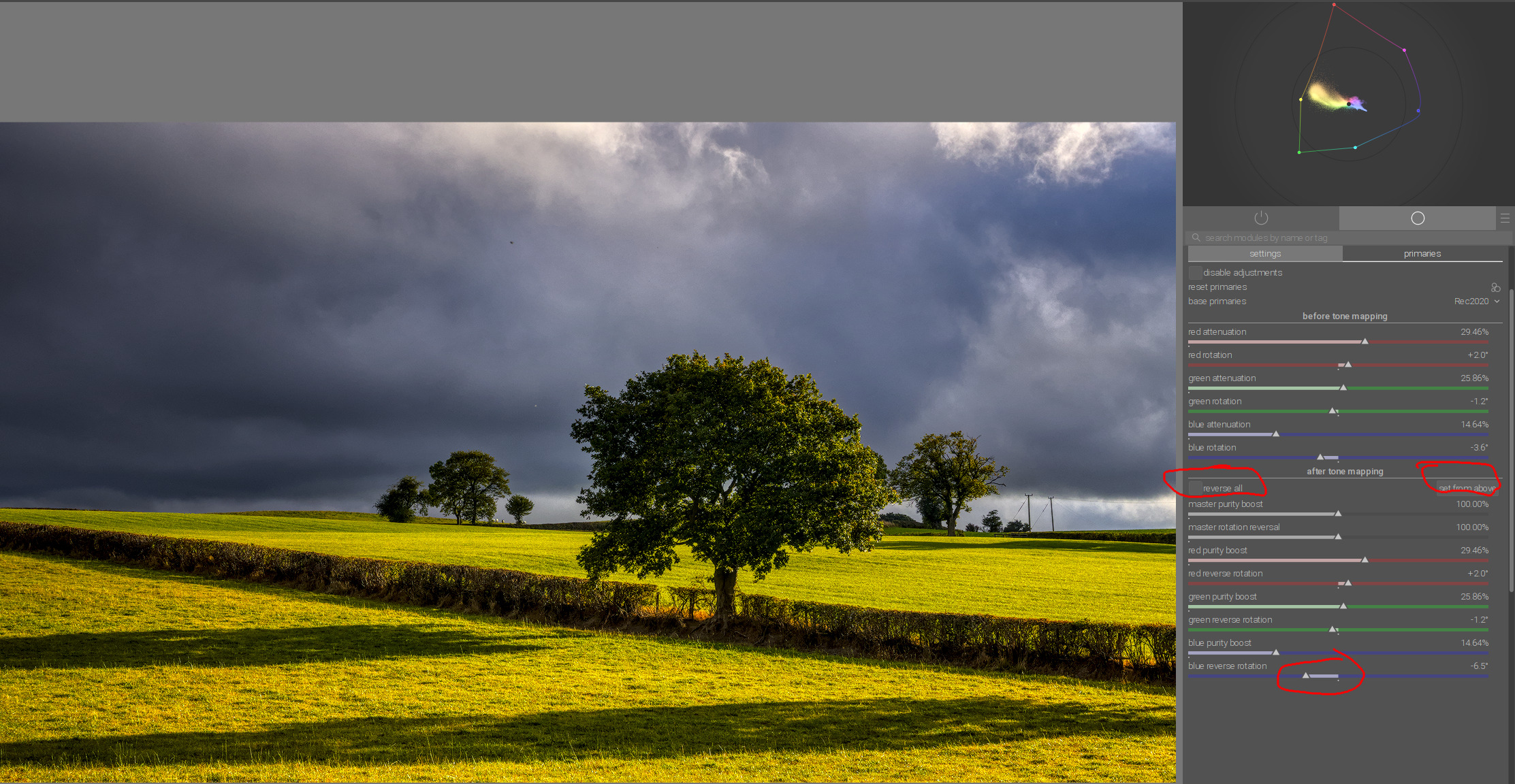
So, before we get started with the rotations, a bit about the “Notorious 6” (for their friends, just “N6”) and hue preservation.

The term “Notorious 6” is used to describe the phenomenon that per-channel application of (monotonically increasing) curves leads to all colours tending to one of the 3 primaries or 3 secondaries, causing unnaturally yellow sunsets etc.

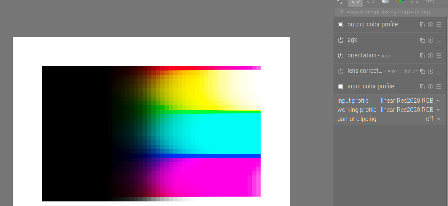
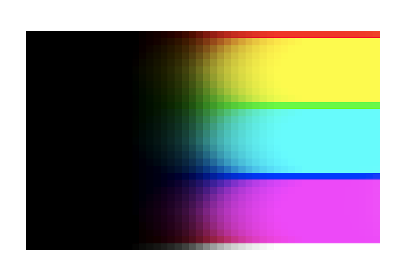
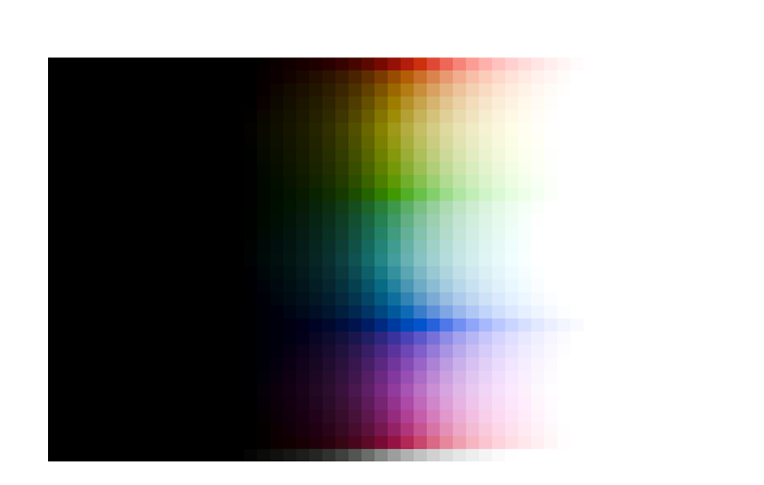
Download this image, and open it in darktable: Testing_Imagery/RGB_sweep_smooth_31x50.exr at main · sobotka/Testing_Imagery · GitHub

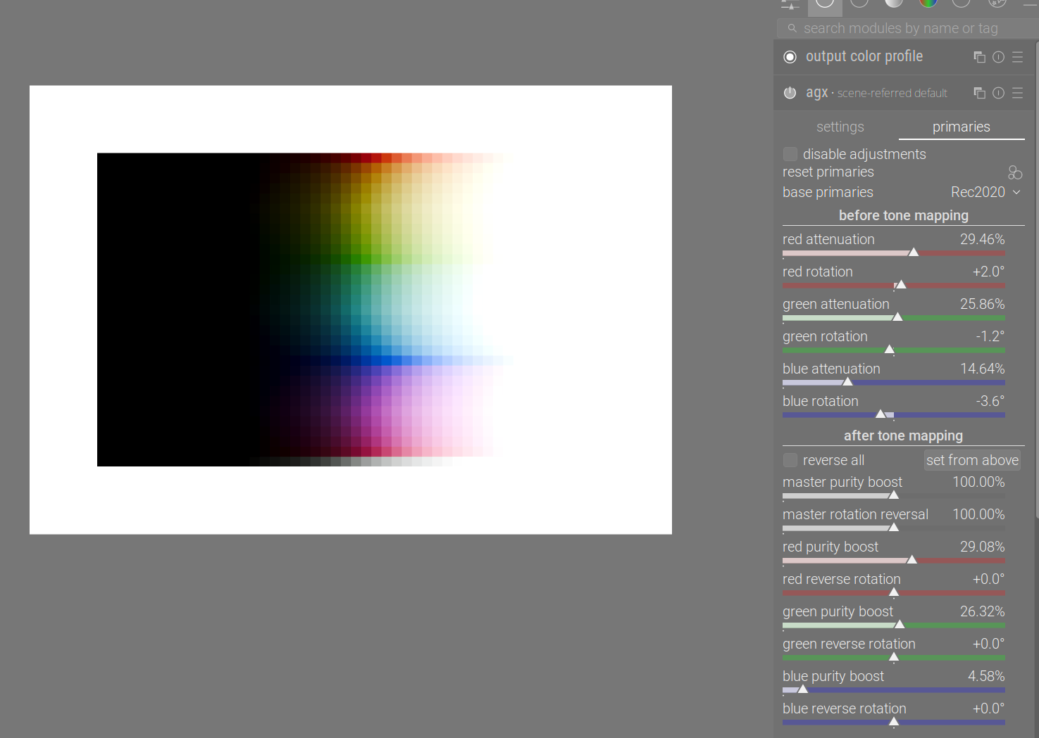
Once opened in darktable, with agx using the scene-referred default, blender-like or smooth preset (each gives a different, but fundamentally similar result):

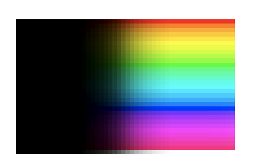
So where are the N6?

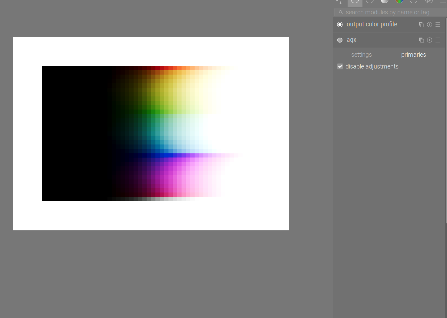
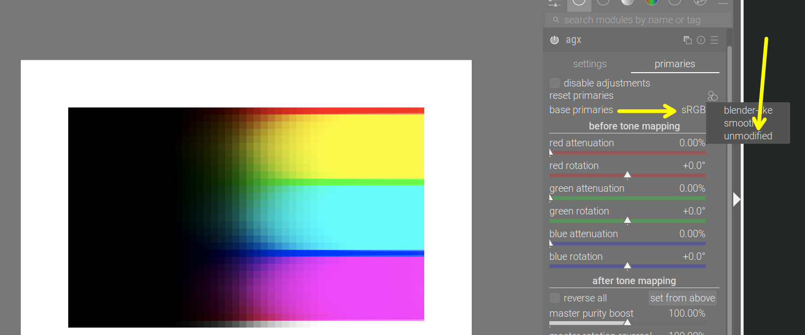
Well, disable the primaries altogether:


We can now start to see there’s only a red row, with most of the area under it turning yellow, then a bit of red, then some cyan, then a blue, and then quite a bit of magenta.

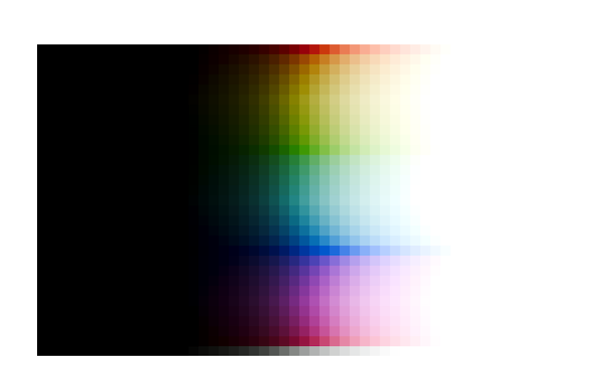
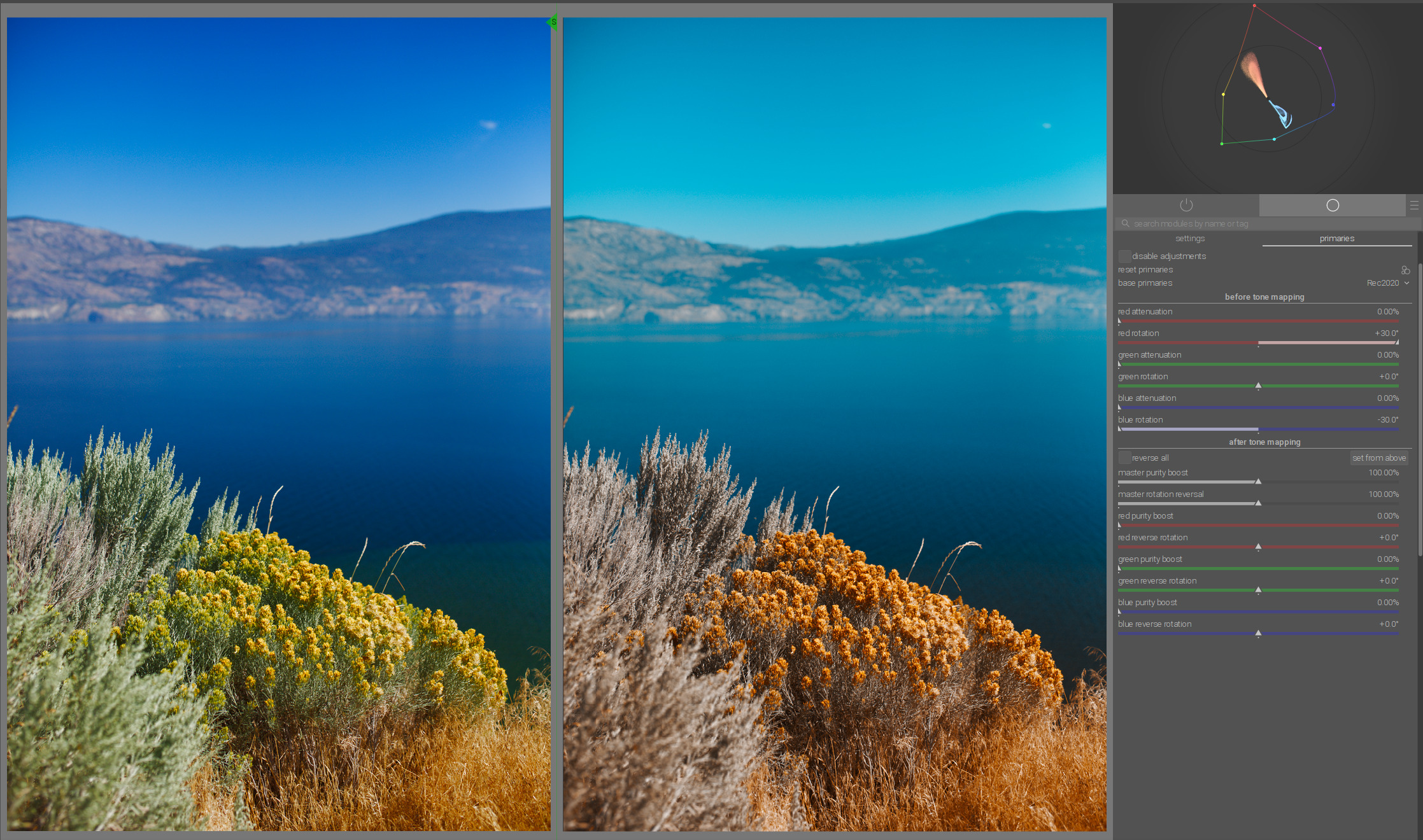
But the actual horror is yet to come. The input image is in linear Rec 709. Processing in Rec 2020, a larger space, means the colours, as far as Rec 2020 is concerned, are not fully saturated (in a way, it’s as if some desaturation had been performed via attenuation of the primaries – consult the Rec 2020 to sRGB example in the previous post). So, either set the input profile manually to Rec 2020:

Or leave it as embedded matrix, and load the unmodified primaries, and set the base space to sRGB:

The six horsemen have just arrived. No nice path to white, and most bright colours have collapsed into the secondaries, save for the pure primaries.

What’s going on?

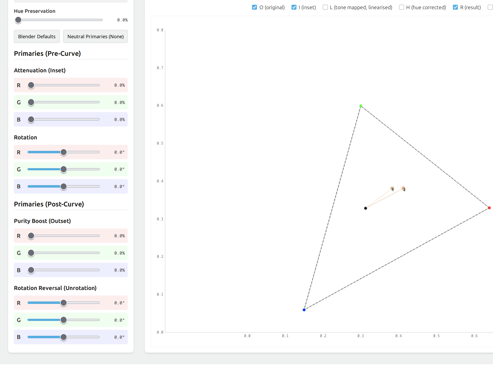
Let’s fire up the tool again (I’ve enhanced it with more direct RGB and hue display).
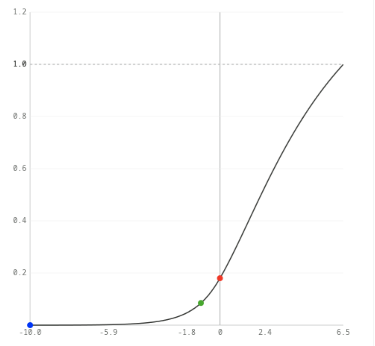
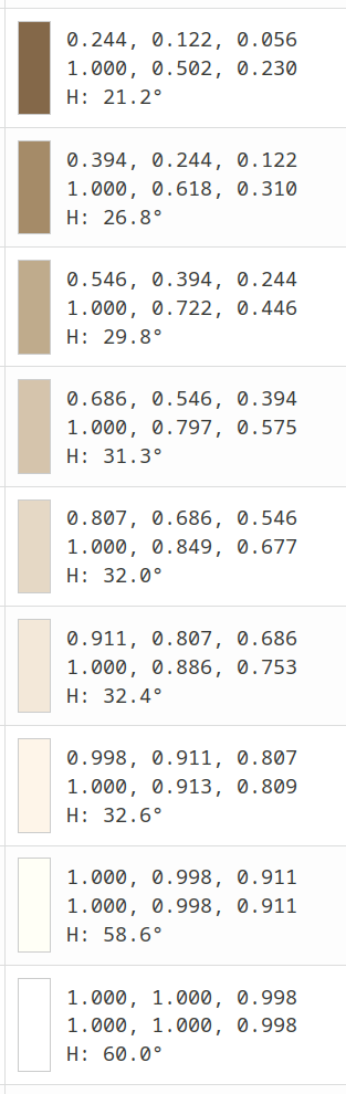
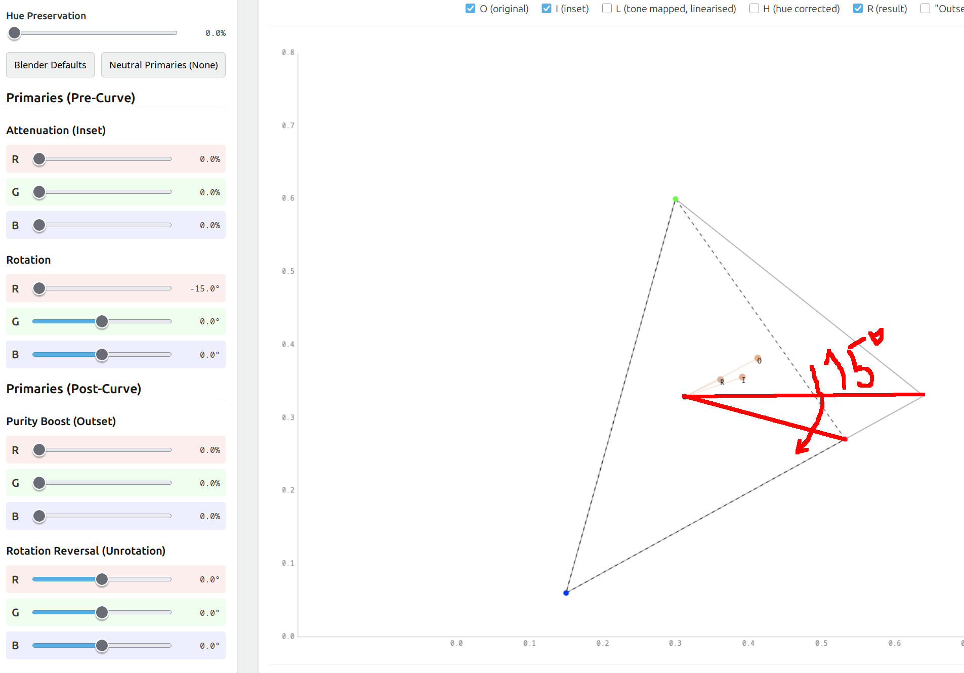
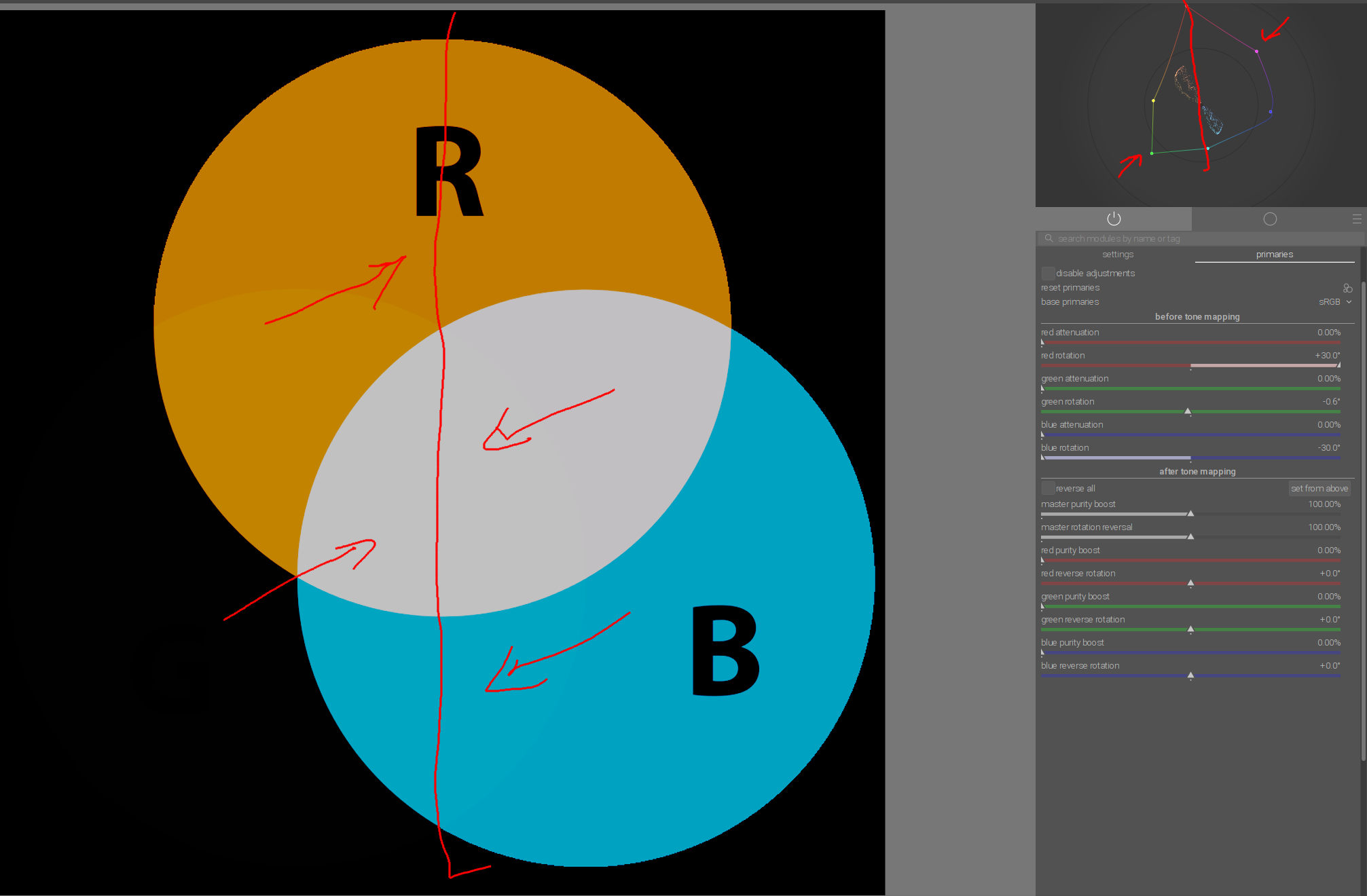
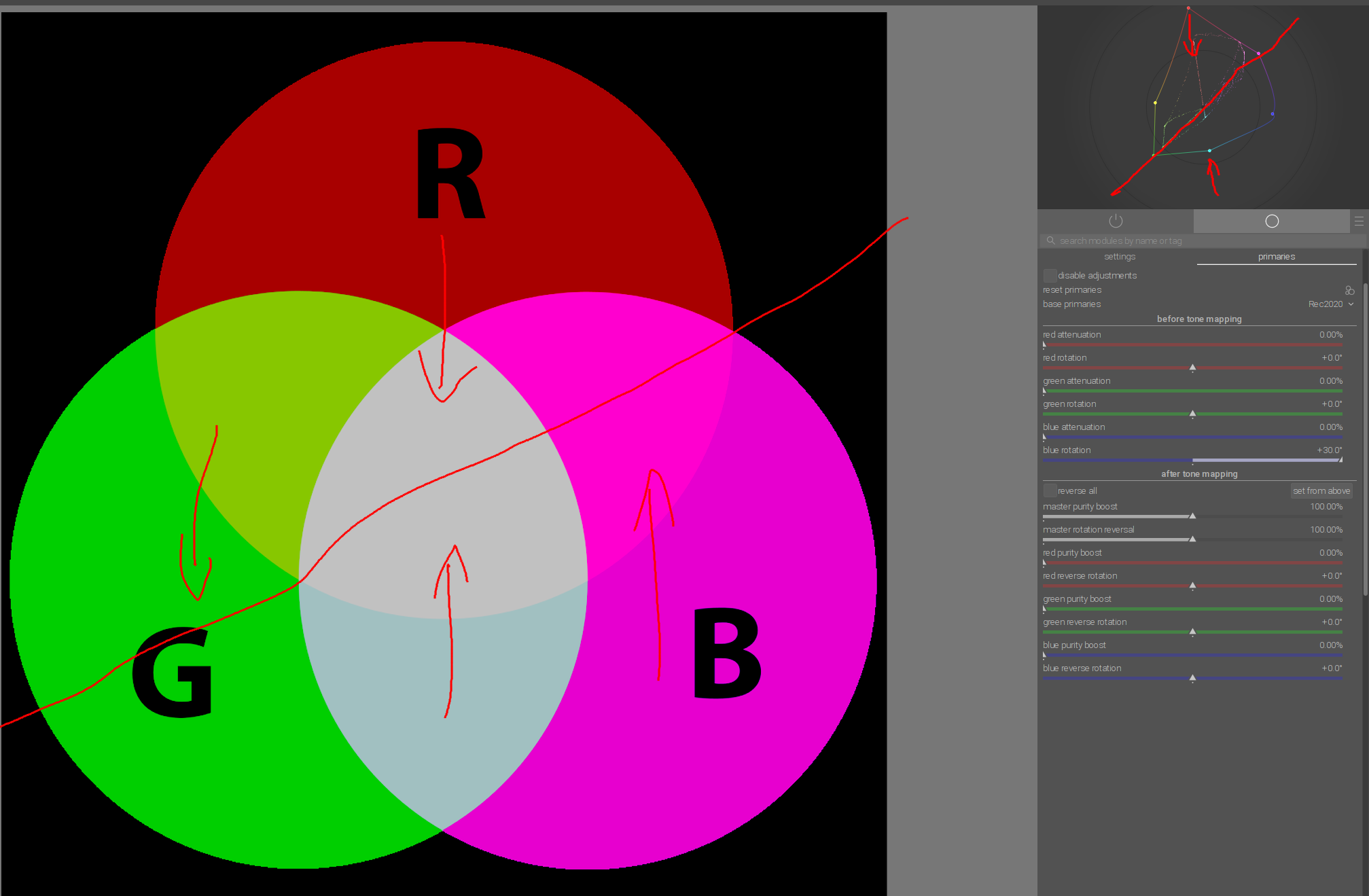
We’ll start with a fully saturated colour. Again, ‘fully saturated’ means ‘at least one component is 0’. We’ve already seen that without primaries adjustments, primaries just remain primaries, so we’ll use the colour (0.18, 0.09, 0). This will give us a starting hue angle of 30°, orange (red is 0°, yellow is 60˚, green is 120°, cyan is 180°, blue is 240°, magenta is 300°).
This will be more or less preserved. Using the new hue outputs displayed above the chart:

Tone curve (log → gamma encoded)

Inset Applied (curve input): RGB: (0.180, 0.090, 0.000), Hue: 30.0°
Log Mapped: RGB: (0.606, 0.545, 0.000), Hue: 54.0°
Curve Output (Pre-Gamma): RGB: (0.459, 0.326, -0.000), Hue: 42.6°

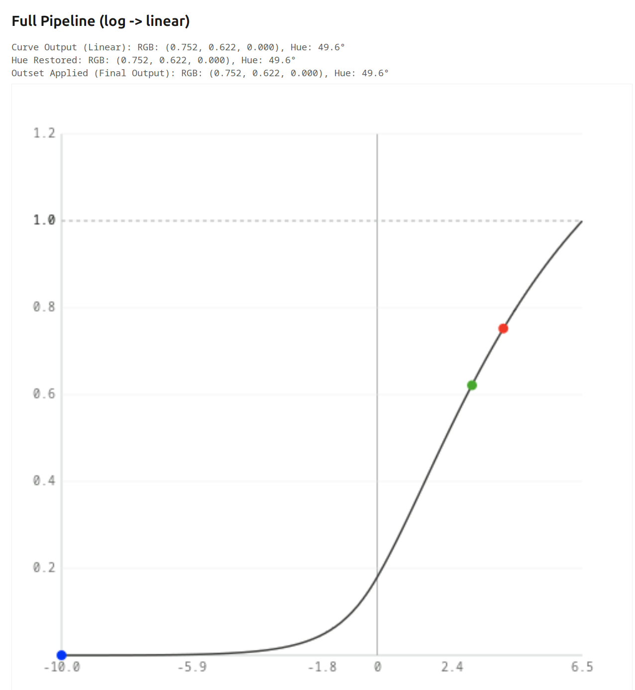
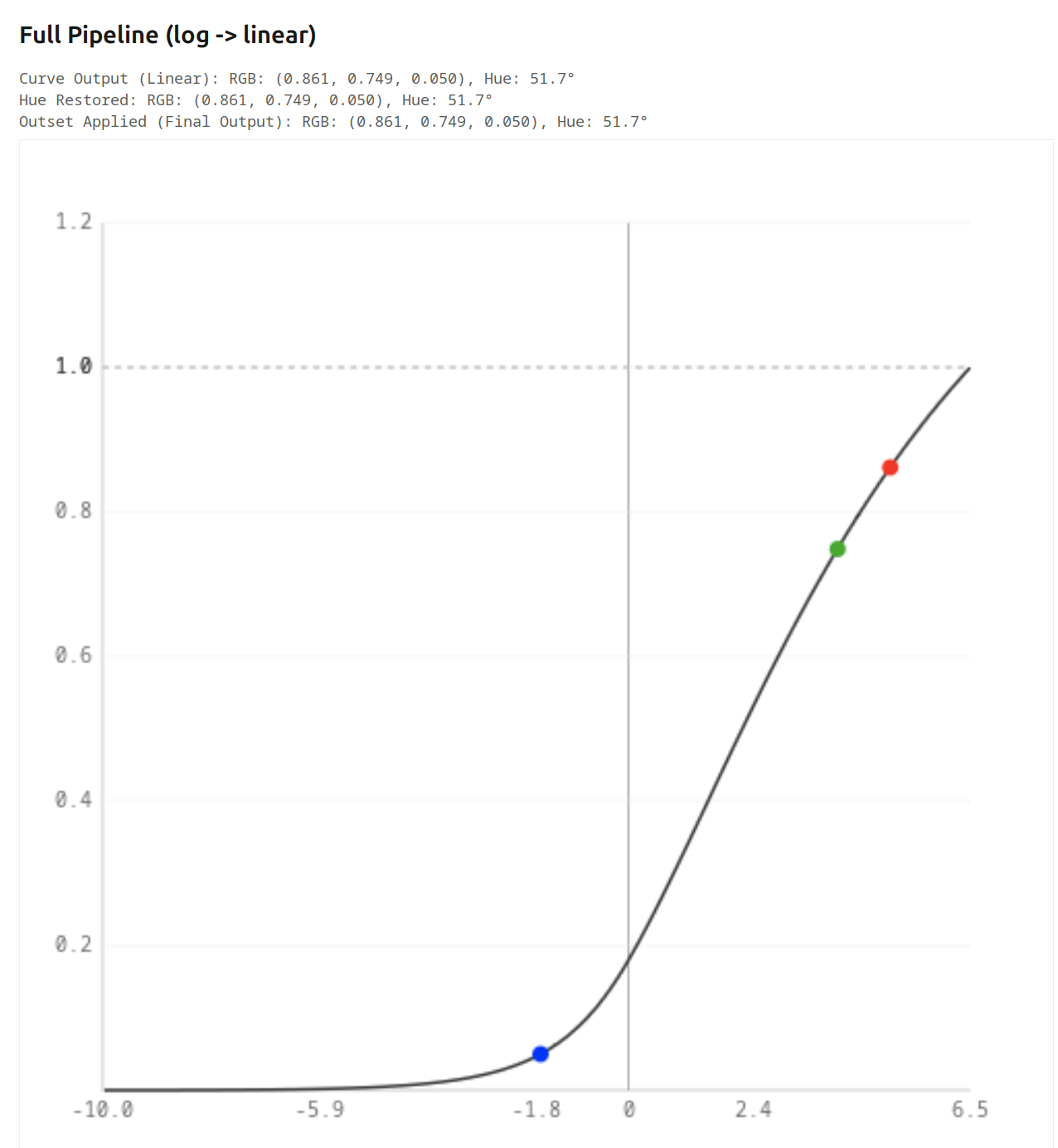
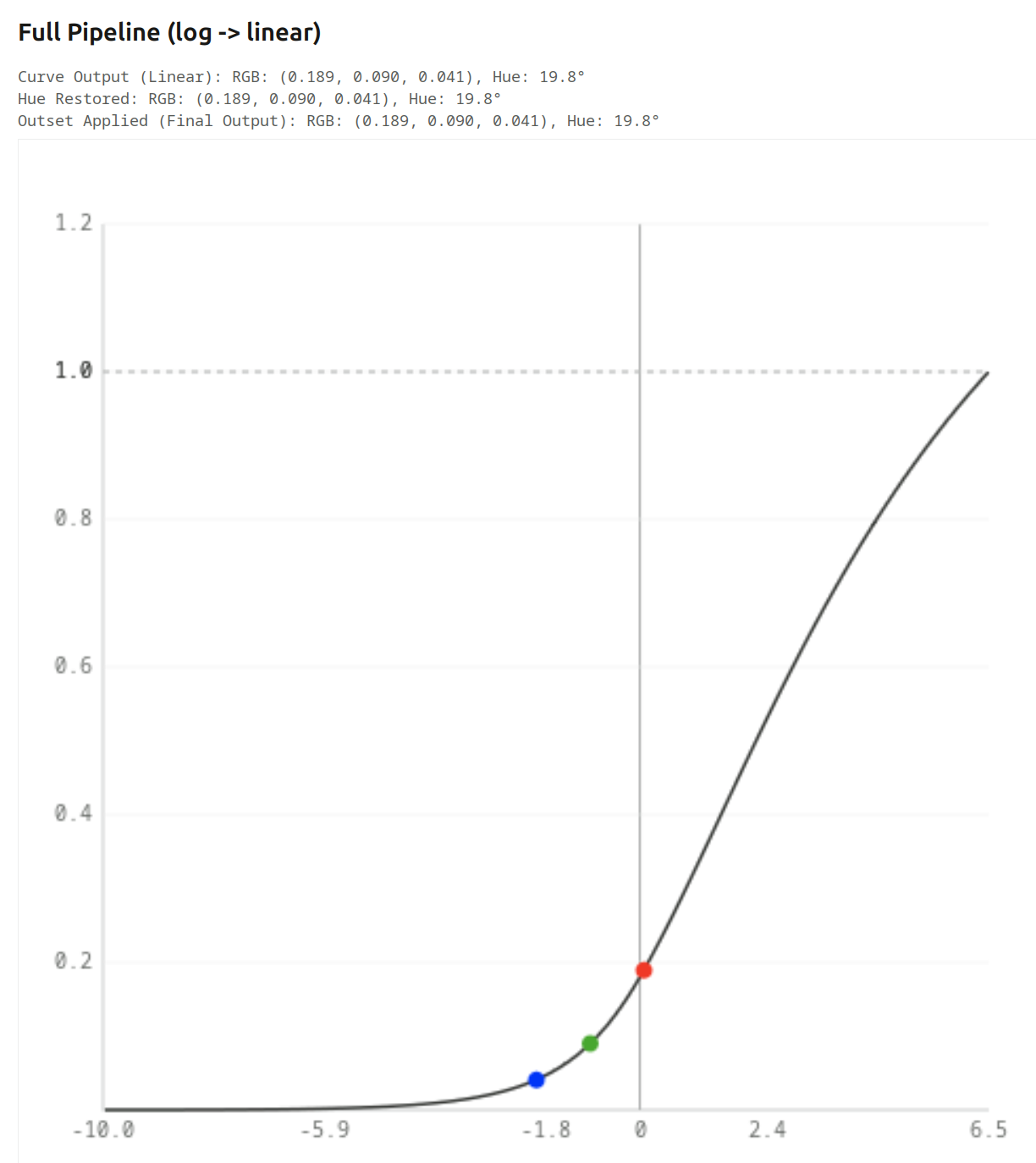
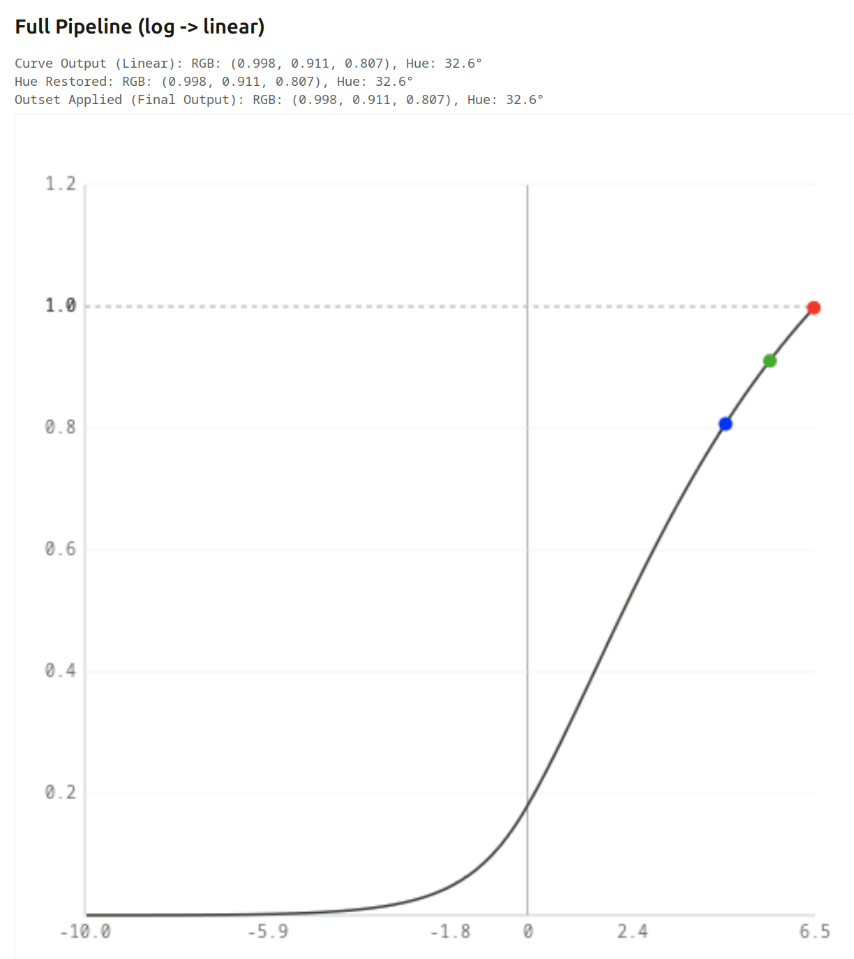
Full Pipeline (log → linear)

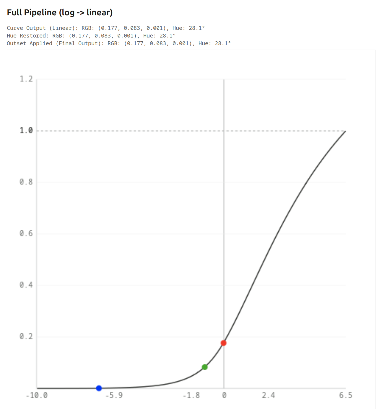
Curve Output (Linear): RGB: (0.180, 0.085, 0.000), Hue: 28.3°
Hue Restored: RGB: (0.180, 0.085, 0.000), Hue: 28.3°
Outset Applied (Final Output): RGB: (0.180, 0.085, 0.000), Hue: 28.3°

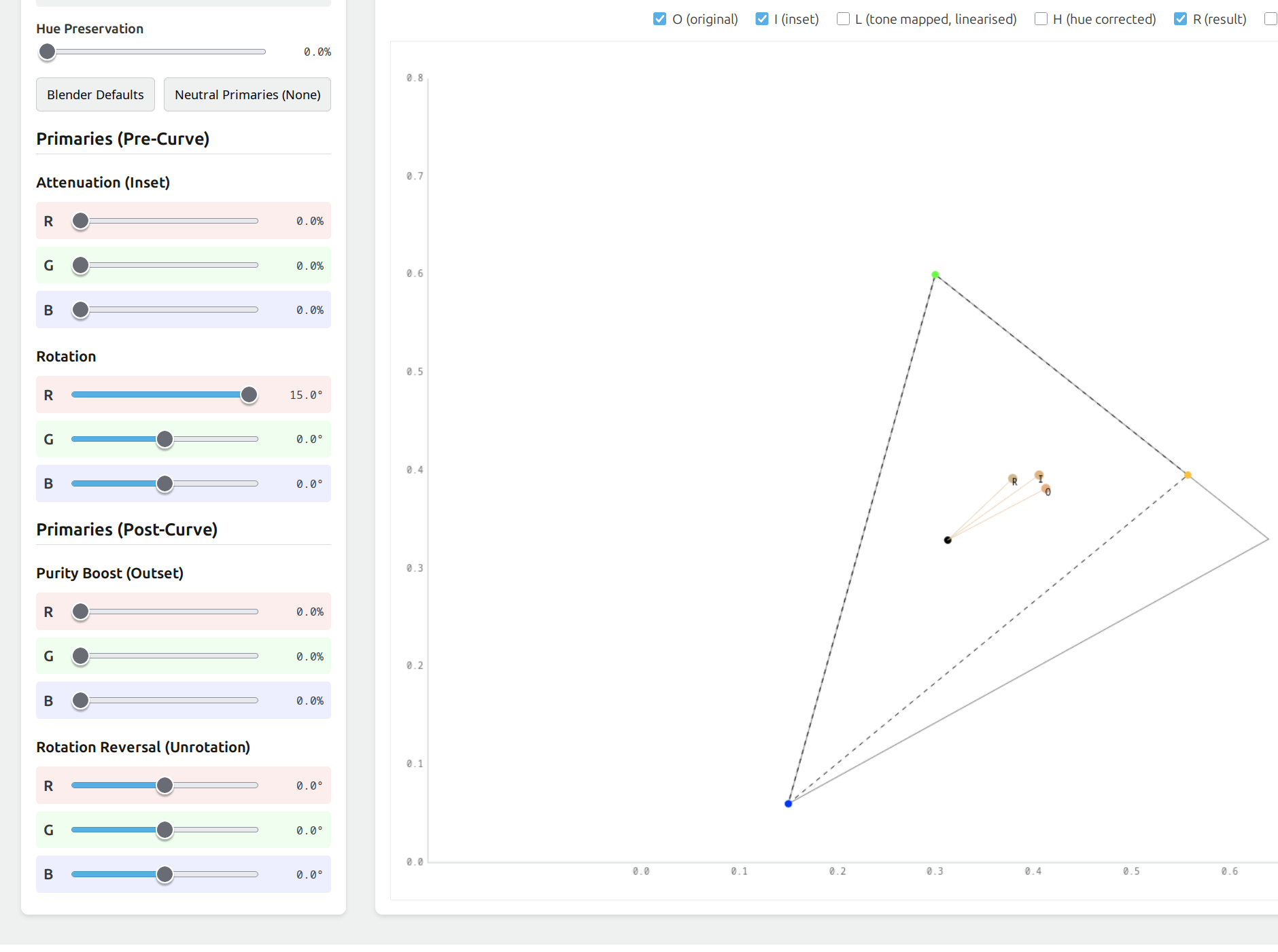
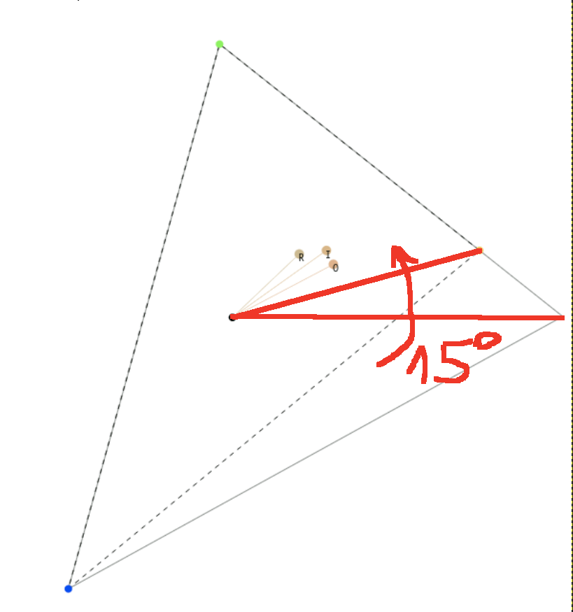
We don’t use an inset, so of course Inset Applied still shows 30°, but what happens afterwards?
Log strongly compresses values. From a ratio of 2:1 (18% red, 9% green), we go to 2:1.8 (60.6% red,54.5% green), and the hue shifts almost to yellow (54.0°, yellow is at 60°).
Then, we have the tone curve, which adds contrast, and pulls those a bit apart, red at 45.9%, green at 32.6%, hue at 42.6°. (You can read the radios from the table, I did not add them above the charts.)
Then, we get the linearisation, which pulls the values further apart; we have no hue restoration or outset, so the final result is red: 18%, green: 8.5%, hue: 28.3°.

The log → linear graph looks like this:

However, increasing the the exposure slider will push the x-coordinates to the right. Initially, as we saw, the red component (in the output) is almost twice as large as the green (close to the original 2:1 ratio), as we push exposure, the linear y ratio drops quickly, and the hue shifts (look at the output (y) red to green ratio, not the difference!)
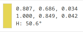
+2 EV

+4 EV

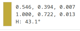
As we go higher, and the curve starts to lose contrast (slope is reduced), even the difference starts to drop, and the red:green ratio drops even quicker:
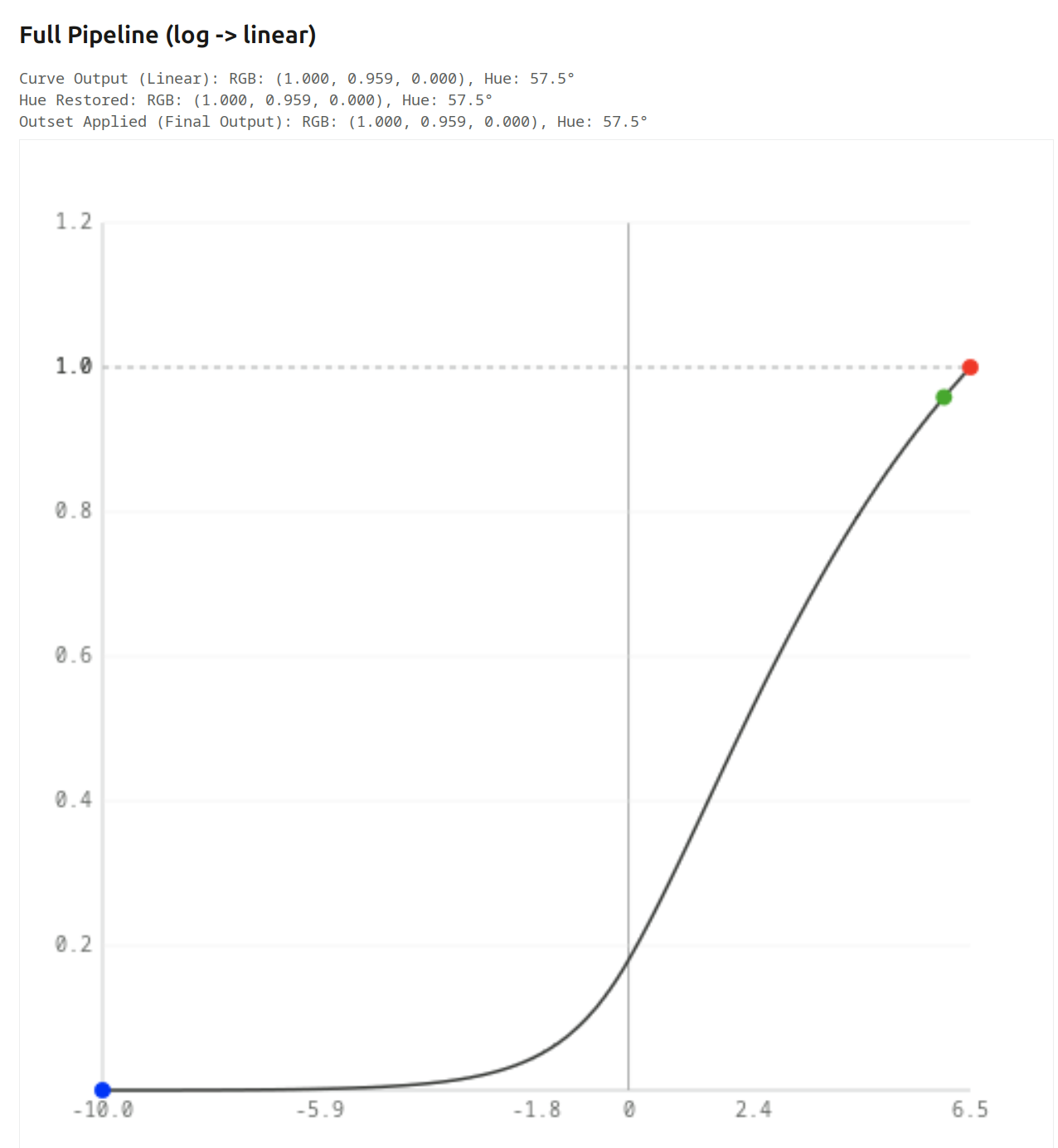
+6 EV

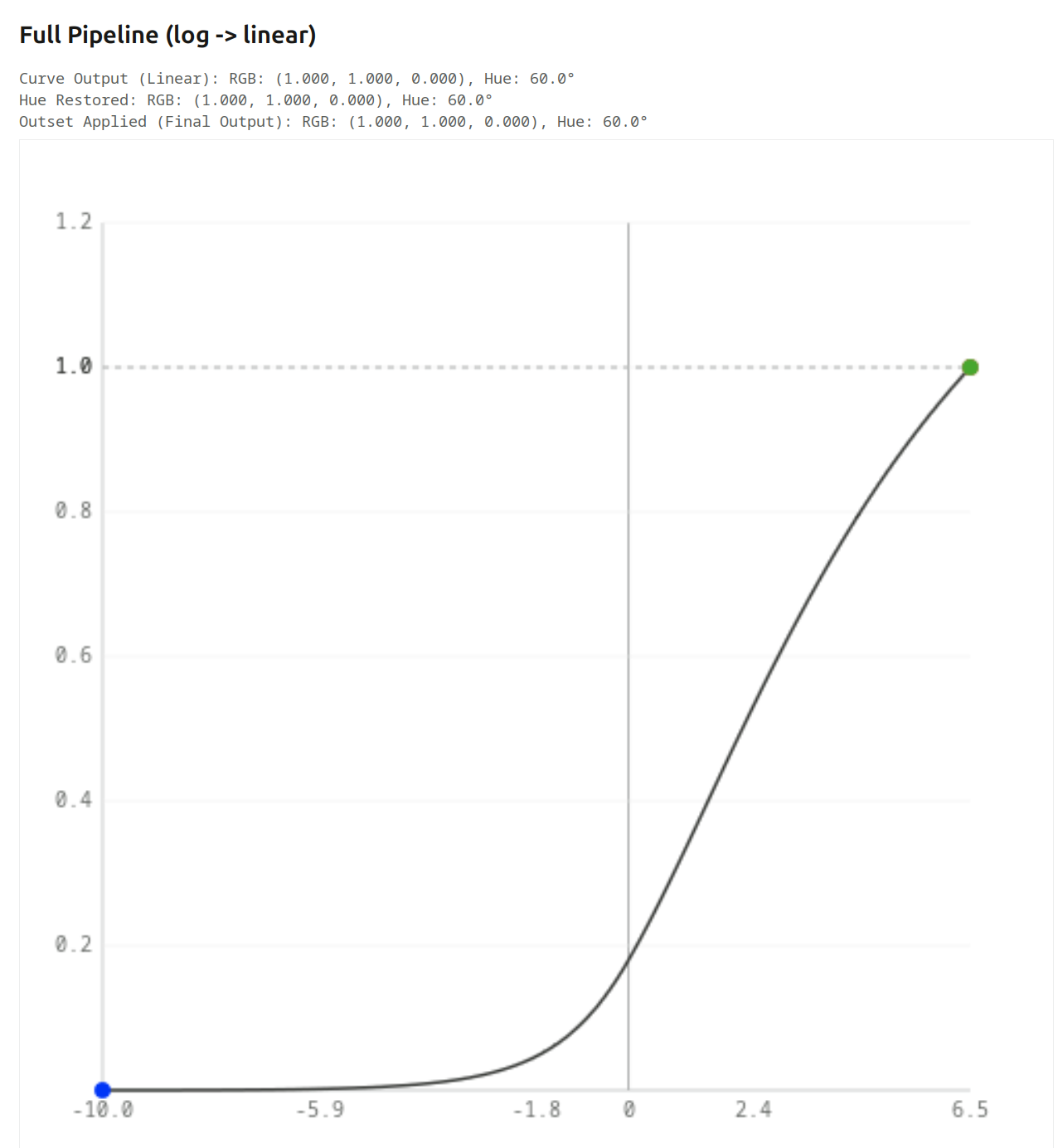
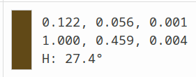
Finally, once red goes into saturation, increasing exposure only pushes green. +6.5 EV, 7 EV, 8 EV:


At that point, red = green, so we get yellow.

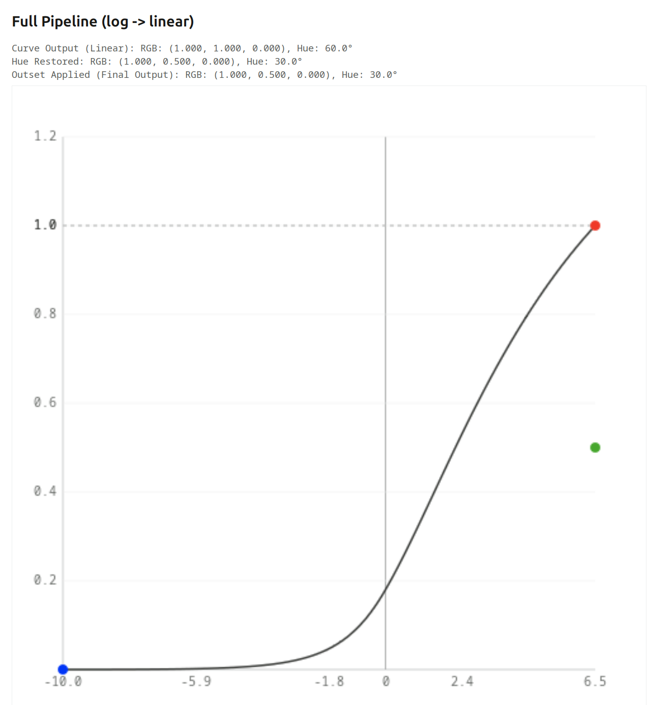
This is the kind of skew that hue preservation corrects: it records the hue angle after the initial primaries manipulations, and re-applies it before the final primaries changes. It is only designed to counter the skew caused by the log mapping + tone curve + linearisation.

Turning it on full-force for the final image, we can see green gets pushed down to 0.5, restoring the original 2:1 ratio (it works the same at the other exposure levels, too):

What happens if the colour is not fully saturated?
As long as the 3rd component is much lower than the other two (so the colour is quite saturated), we get more or less the same (this is without hue preservation, again):


We get a mixture of desaturation and hue shift. Output samples at some exposure levels:


And if the 3rd component is similar in value to the other two (initial hue angle: 20°)):


Table (final output):

Note that without attenuation you lose the path to white, and hue preservation will of course not correct that.
No attenuation without / with hue preservation:


Brightness is also affected, that’s due to the simple HSV algorithm. I can try replacing it with something more sophisticated, but since agx is normally used with proper primaries, it may not be important.

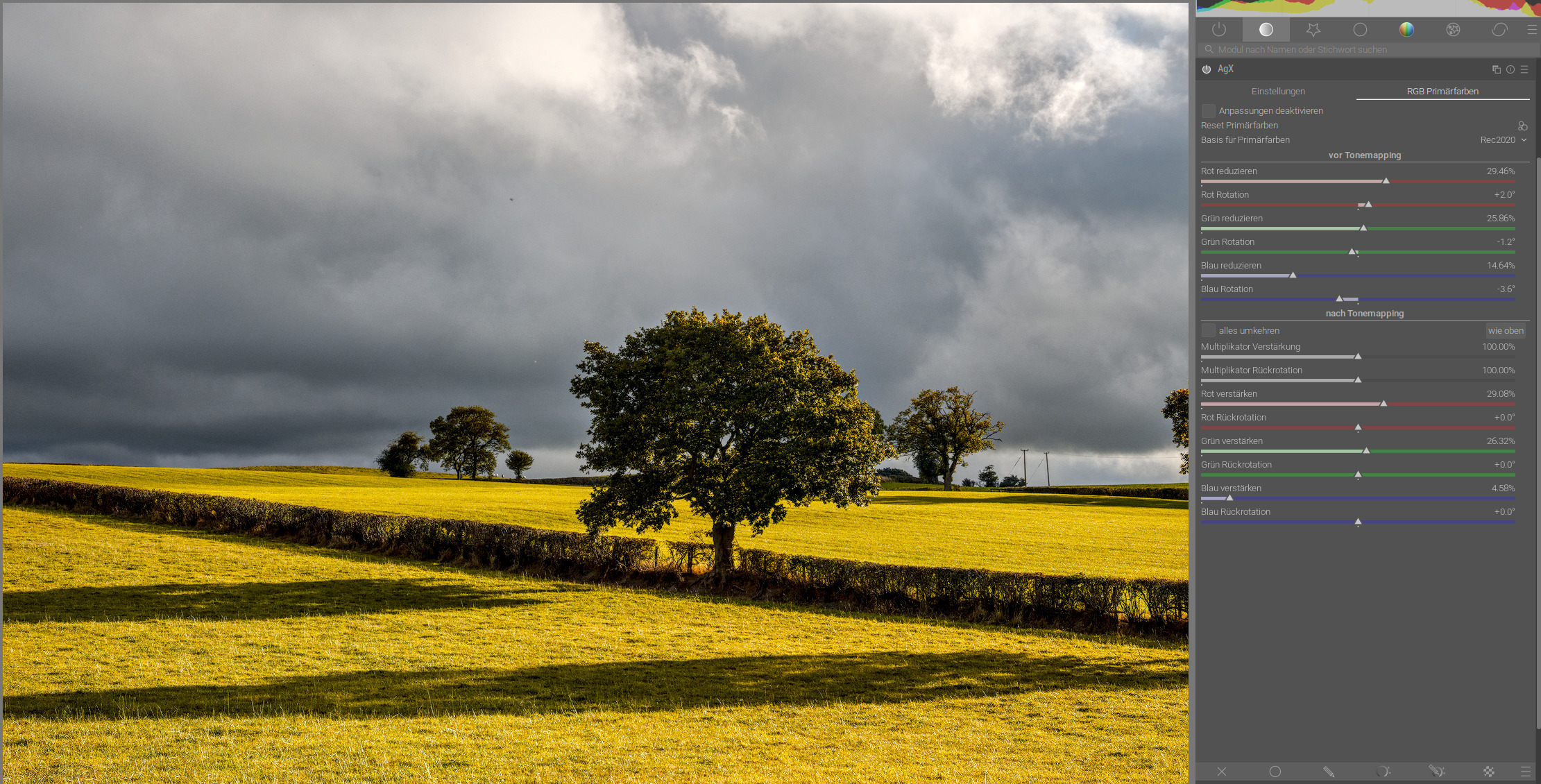
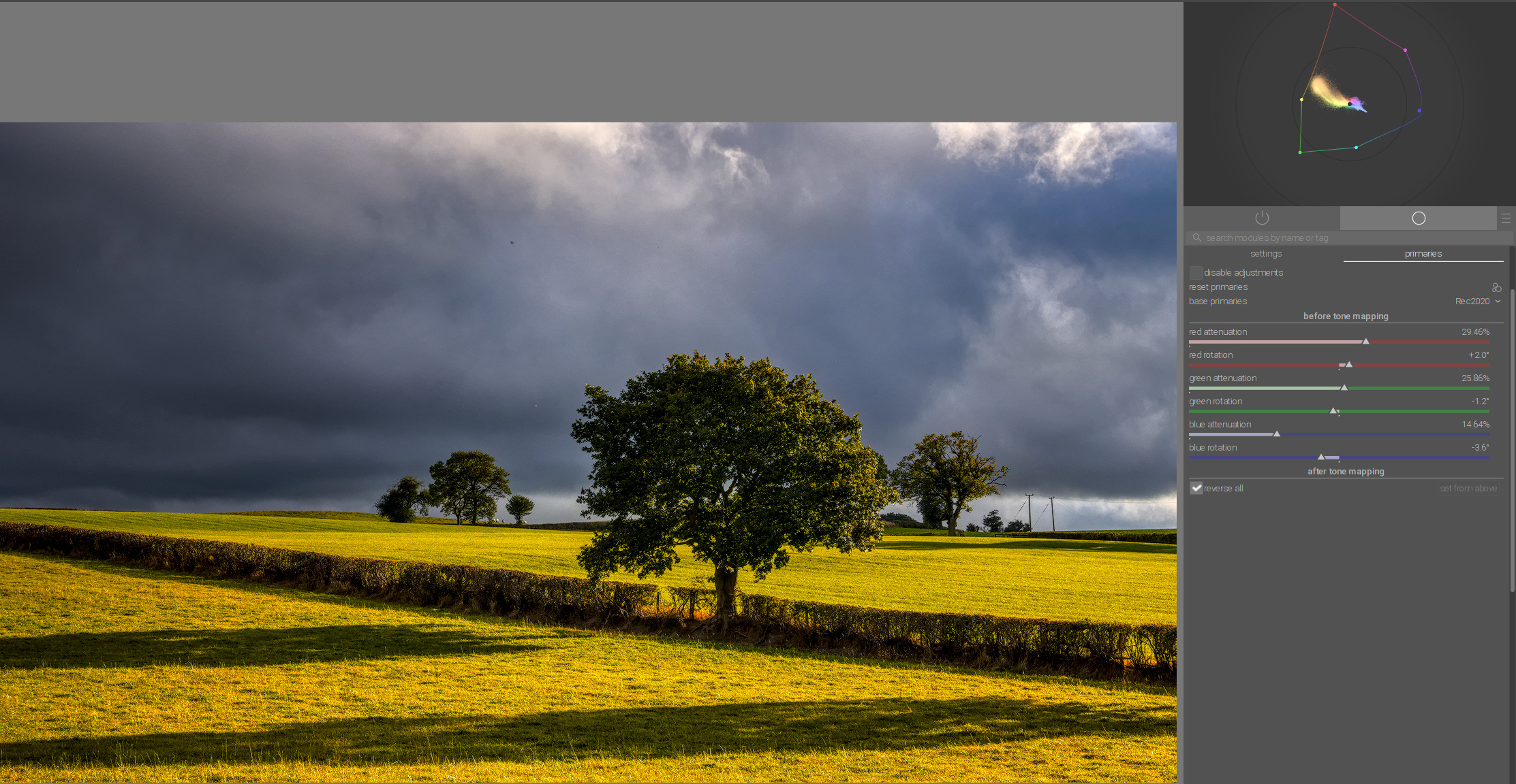
The scene-referred default preset, without/with hue preservation:


2 Likes

Well, those are labelled as red/green/blue reverse rotation sliders. It’s a bit of the underlying maths shining through, as the purity boost / rotation reversal uses the same mechanism as the pre-curve adjustments, just the roles of the base and the derived space are reversed.

Ya on one hand I get it and it’s easy to see in the vector scope that say + pre rotation is opposite in effect to + reversal but it still seems weird looking at it I expect to be reversing rotation not using a term “reverse rotation” and using a positive number…

1 Like

The trouble is, the slider can have both positive and negative values. The purity boost can only be positive, of course, and an attenuation of x% is reversed by a boost of x%. If the rotation sliders behaved the opposite way, x° reversed by -x°, then I think it would be even more confusing.

OK, so the last one: rotations. I have to admit, it’s too complicated for me to properly understand, there are just too many factors at play. Here is what I have understood so far.

Moving the red rotation slider changes either the green or the blue channel. The modified channel’s value always moves towards the primary we are controlling (so setting a positive red rotation influences the green in a way that brings the green value closer to red: increasing it, if it is currently below, decreasing it, if currently above the red; setting a negative red rotation does the same to blue). And of course each channel can be drawn towards two other primaries, which may both be larger (or smaller) than this channel, or one smaller, one higher. It’s hard to explain; open the tool, set some arbitrary RGB values like 0.1, 0.2, 0.4, and start rotating the primaries.

Again, we start with a red primary, and set red rotation to 10°. This seems to “generate energy from nothing”, as the red value does not decrease, but green is no longer 0:
Inset Applied: RGB: (1.000, 0.114, 0.000), Hue: 6.9°

This then goes through the usual steps, the log mapping decreasing the relative difference and increasing the hue angle, then the curve’s contrast and the linearisation increasing the difference and decreasing the hue angle back to 12.2°.

Since we now have energy in the green channel, the N6 kick in, skewing the result towards yellow. This explains the increased shift.

Setting red unrotation also to 10° just rotates the N6-skewed 12.2° to 6°.

Hue preservation and unrotation are both needed to restore the original hue.

If we turn off hue preservation, then of course the N6 increases with exposure value. Using the same 10° rotation and unrotation, the final hue angle is 38.4° when red output reaches 1 (at exposure +4.1 EV, given initial red = 0.18).

However, as our output is no longer pure red, the green and blue unrotation also play a role.

All I can say for sure is that without hue preservation, for high brightness, the hue shift is dominated by the N6, even if rotation and unrotation parameters are the same. With hue preservation at 100%, the result is determined by the rotation and unrotation, and does not depend on exposure, until at least one output channel starts clipping (relative white exposure being too low).

It’s probably best to explore this using the colour chart, instead of playing with RGB values, starting with no unrotation (as it is set in the blender-like and scene-referred default presets). smooth completely reverses rotations (but not the attenuation). Playing with the hue preservation slider is a further parameter in the mix.

Attenuation probably does not influence this, as increasing it reduces the value of the specified channel, symmetrically increasing the other two (but if you have rotations present, then those do mix take that decreased/increased value into account – and that’s more or less when my poor brain gives up).

2 Likes

Ya it’s fine… it’s just likely me and how I naturally think about it… don’t give it any further concern…

And after your follow-up my brain gives up way before yours…

1 Like

I’ve updated the tool to show how the CIE coordinates are altered. I must say, some of the rotation effects don’t look like rotations at all.

This is a random RGB colour, (0.4, 0.2, 0.1), no primaries adjustment. O, the original colour, therefore coincides with I, the inset colour. R (the final result) is slightly shifted by the curve (no hue restoration).

I’ll now inset the red primary. This will draw the inset gamut triangle, and reposition I (which is dragged along, as the gamut is “deformed”, and also R (because we don’t apply unrotation):

You can now see that O (original) and I (inset) have separated, and there is an angle between the lines white-point → O and white point → I. The length of the line did not change much. The angle is not 15˚, because that angle is between the white point → original red primary and white point → new primary:

However, rotating in the other direction, the rotation was still 15° for the primary, but now the inset colour was pushed much closer to the white point. It is correct, mathematically, but was still surprising to see. Rotating green towards blue would have a very similar effect, as the green-red side of the triangle gets closer to the white point, just like it did when rotating red towards blue.

You can also see this in darktable.
Showing red only; red rotated towards blue; no rotation; green towards blue:
image
image
image

4 Likes

For me, the best way to understand rotation was this simple diagram of additive color mixing, where you can see primary and secondary colors:

If we now want to shift red towards yellow, the shift runs parallel to the magenta-green axis in the direction of the yellow-blue axis:

Red moves towards yellow, magenta towards white, cyan towards blue, and green towards black. Yellow and blue remain unchanged:

Here is the rotation of red towards magenta:

Blue towards cyan:

If we now want to have teal and orange, for example, we first shift red towards yellow…

…and then additionally blue towards cyan:

10 Likes

I’ll have to check this in detail. Anything going black via rotation is… well, unintuitive.

I’m always a little bit torn with the Blender like primaries.
Most of the times I like the results. Anyway I struggle with the colour shift in the greens. I find it somehow unpredictable and sometimes too strong.

A good example:

On this picture the shift is quite huge:
without using primaries:

With Blender like primaries:

The greens shift towards red. While I think desaturating the highlights, most of the time, makes sense. But I’m not sure if I like this colour shift.

For now, I have deactivated the primaries and just use them when something is oversaturated. Maybe I try to setup my own standard primaries later on. Not decided yet.

1 Like

Maybe off topic, I love the lines and tension in this image. :clap:

3 Likes

You can try reverse all option…

…or set from above and in output primaries only move blue little bit to magenta:

1 Like

That’s just weird to me. It’s not that I don’t like the result: I don’t understand the solution. The issue was that greens shift towards red. Instead of fixing that with the green slider, you used the blue one. I suspect this may have something to do with rotating blue towards magenta (green’s complementary), but…

Edit: Oh, I’ve just realised there was also the green unrotation (using set from above). Still, the decisive fix seems to be the blue unrotation. And that’s actually applied in reverse (since it’s unrotation). Red positive rotation is towards green (yellow), green positive is towards blue (cyan), blue positive is towards red (magenta). Blue negative is towards green (cyan), and so as an unrotation that would be moving cyan towards blue, unless I’m mistaken.

1 Like

Here is the shema of the rotation from blue to magenta:

Green and magenta remain unchanged, and yellow shifts toward green.
Blue shifts toward magenta, and red and cyan shift toward the achromatic center, with brightness being affected in both cases.

5 Likes