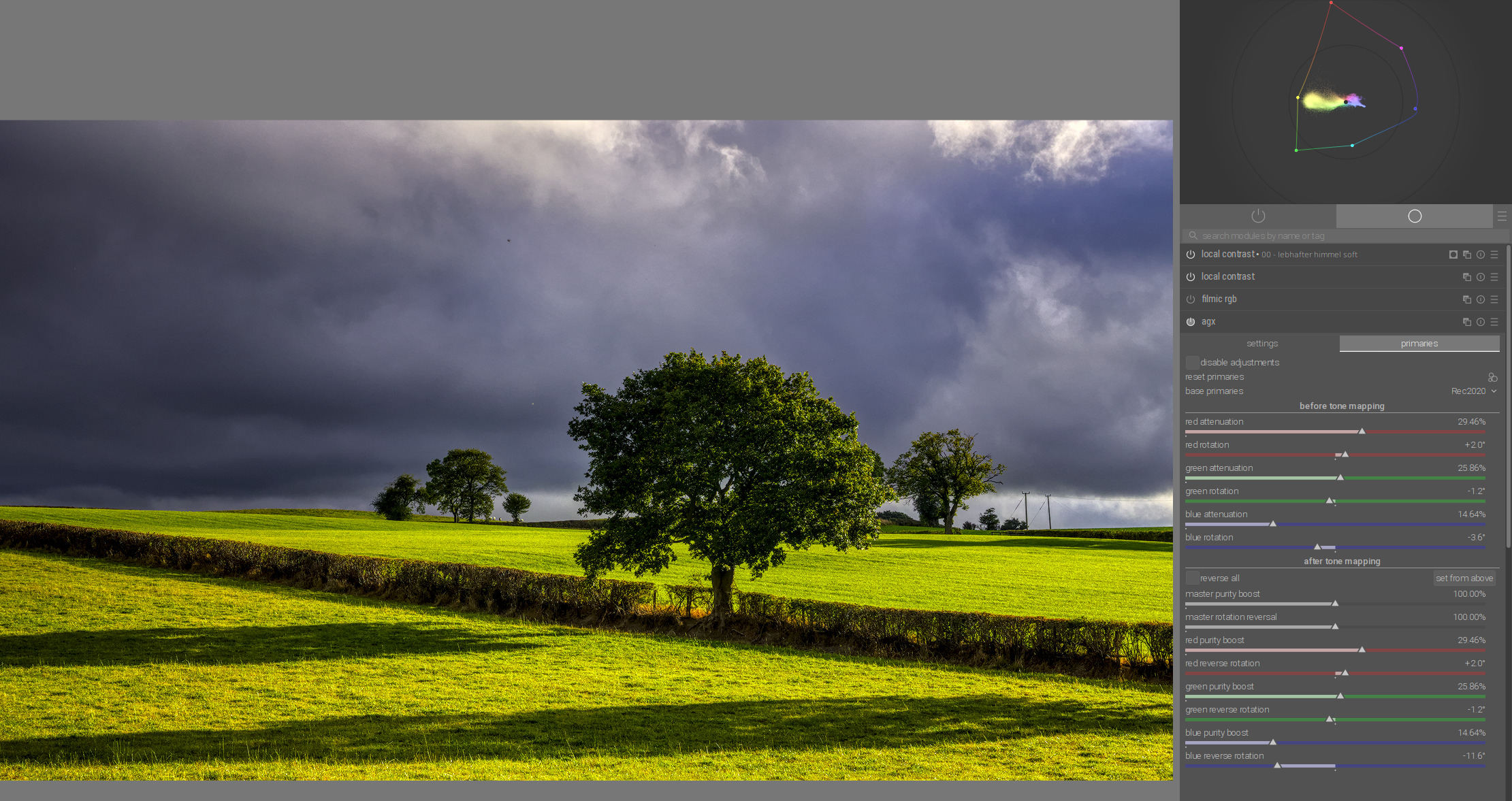
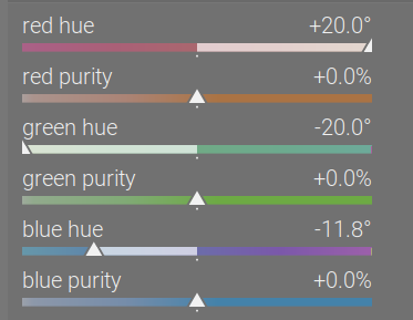
When we rotate and scale those primaries, what happens is, we create a new colour space, an reinterpret the meanings (the actual colours) of the RGB values according to it.
Below, the red, green and blue dots represent the rotated primaries. They reflect the hue, but not the luminance. This will be important in the case of our poor green primary.
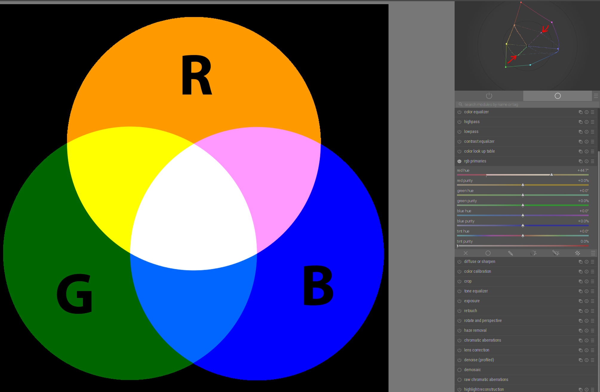
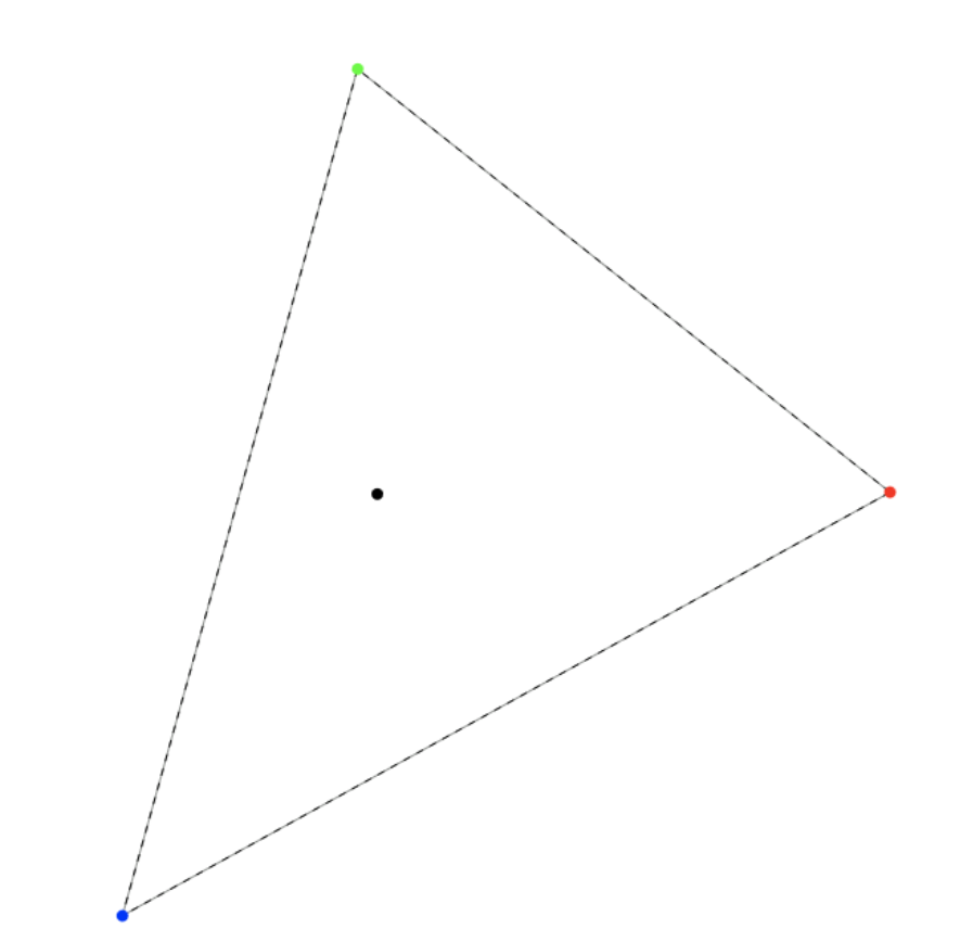
No rotations, no insets, starting from Rec 709:
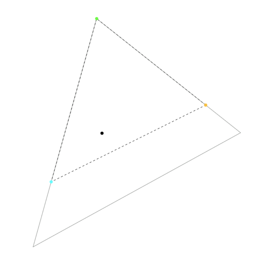
15° rotation of red:
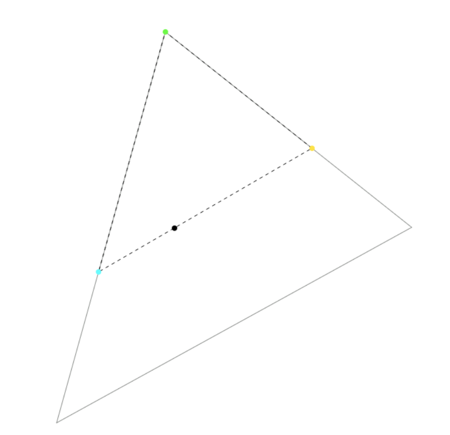
And then -15% of blue:
We are pushing the red - blue side closer to the achromatic. The white point has the xy coordinates of the achromatic, and a fixed luminance, Y = 1 (that’s why it’s the white point).
As the relative distances change, the significance of red and blue grows; that of green diminishes. The Y coordinates (luminances) of the original red, green and blue primaries are 0.2126, 0.7152, 0.0722; green is the brightest primary, by far, almost 10 times as bright as blue.
By the time we rotated the red by 15° and the blue by -15°, the Y values have changed drastically: 0.336286, 0.303979, 0.359735 - now blue is the brightest.
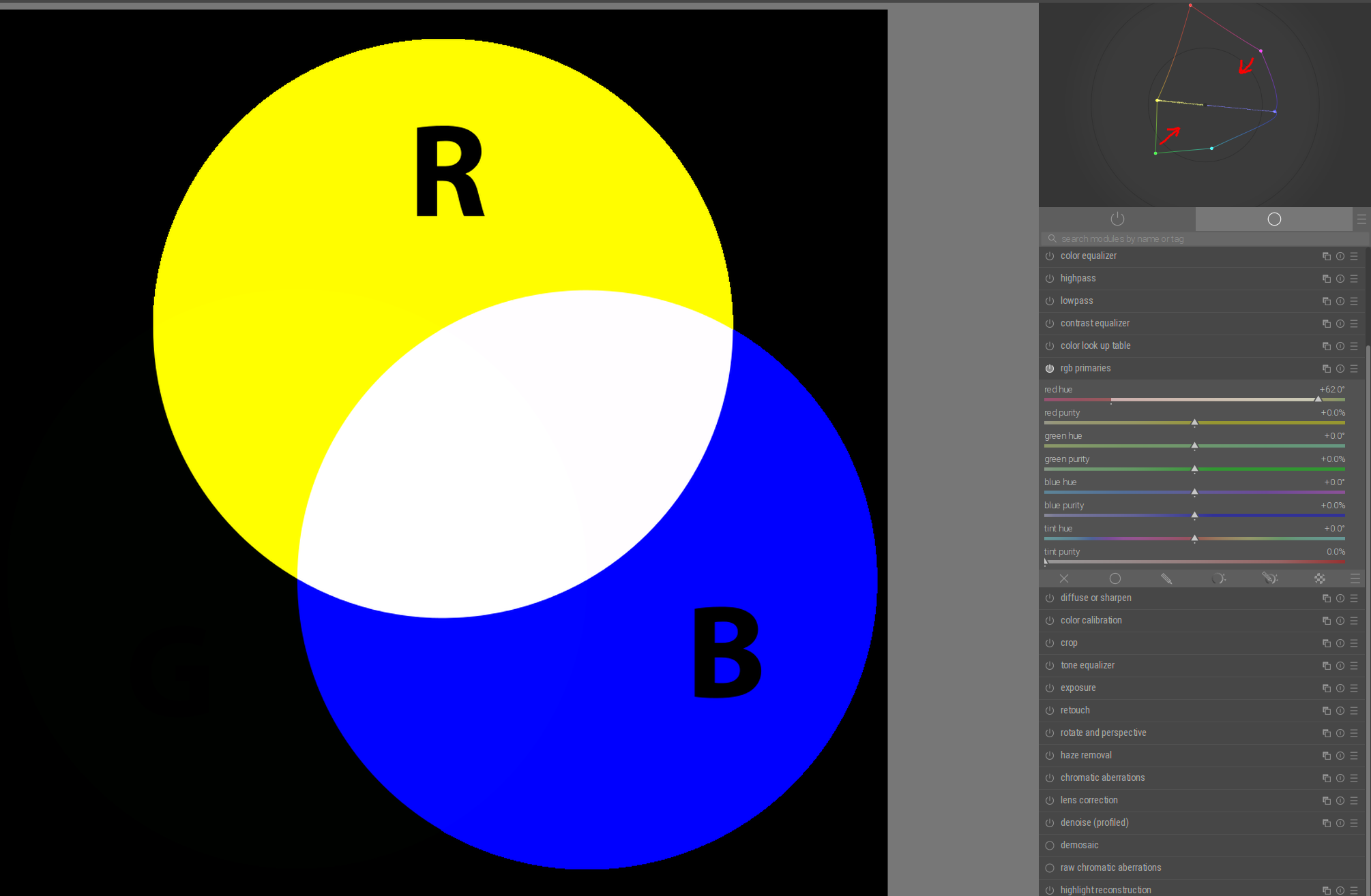
As we keep pushing red to 30°, and also blue towards -30°, there comes a point (at about blue = -28.8°) when the red - blue line crosses the achromatic:
We reached the point where ‘red’ + ‘blue’ (that is, yellow and cyan) add up to white. The Y coordinates are about [0.4758, 0, 0.5242] - green is basically black, it has no luminance left. And rotating blue further actually creates a space that cannot represent neutrals, as the white point’s chromaticity coordinates are out of gamut for that space. This is fun. 
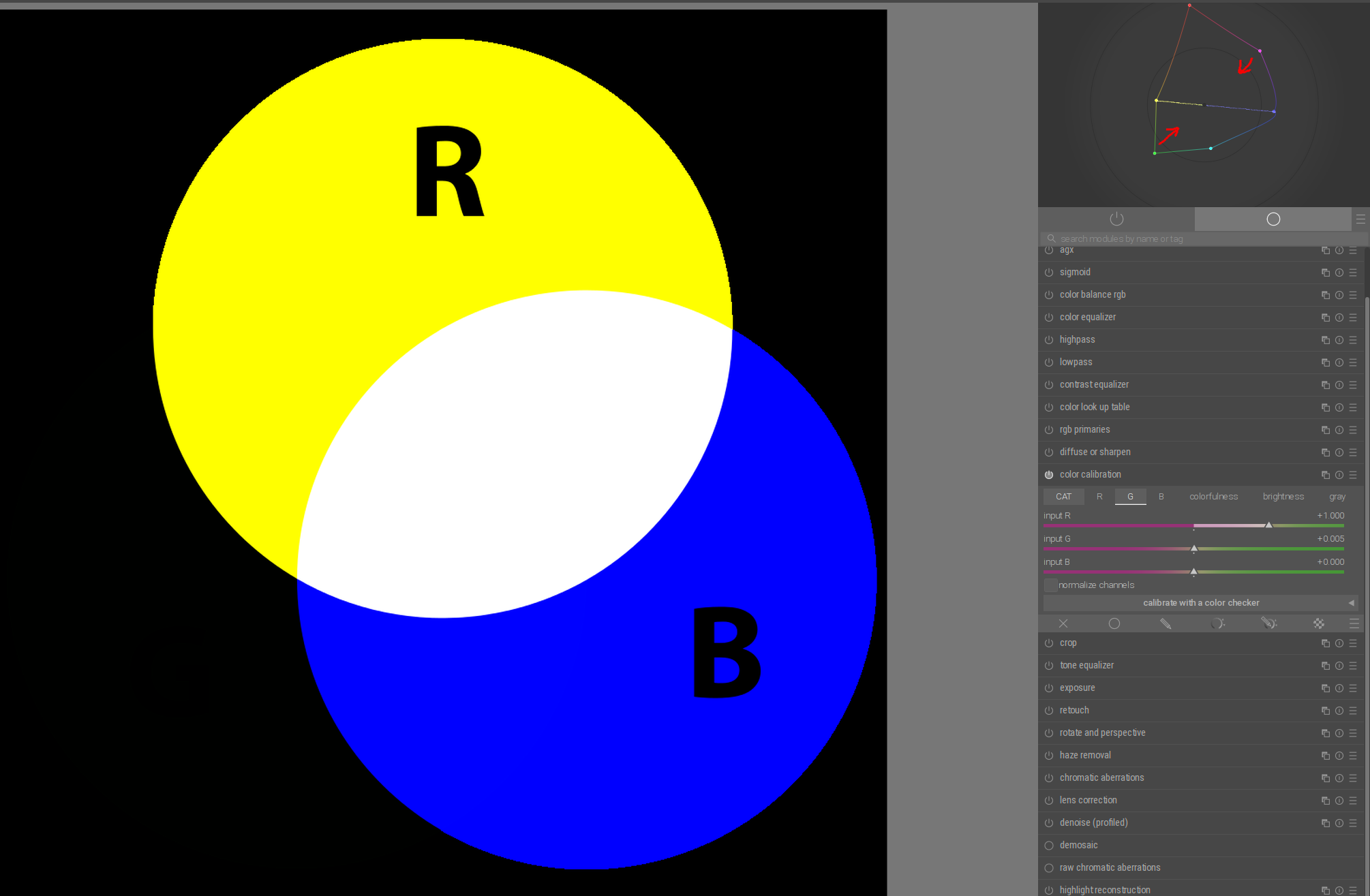
At least now I understand why green turns black. The rest, the ‘intuitive’ part, I still don’t get.