Do you want a straight out of camera JPEG style in darktable? Here we help each other

Agree…I suppose there is a place esp if you are doing mass edits

1 Like

@priort, The orange snow seems to be an interaction between 3 modules: Input Profile, White Balance, Color Calibration. I found a fix for the orange snow problem. If I change White Balance from Camera Reference to As Shot, DT complains that white balance is applied twice. If I turn off Color Calibration, the orange goes away.

vs. my previous edit, this tweak to the white balance handling ends up very close to SOOC JPEG for tone, hue, and saturation. Filmic (?) crushes the details in the snow and the white whiskers on his face don’t stand out as much. But this is getting very close to a JPEG-matching recipe.

Here is the edit and the ICC I created from the above workflow from the Imaging Edge sample
Imaging Edge Sony ILCE-6400.icc (211.1 KB)
DSC06918.ARW From Imaging Edge.xmp (7.2 KB)

The xrite version I installed needs a DNG input and only gives DCC output. I had to fill in the blanks.

Many thanks. The Adobe DNG Converter’s DCP are hard to find in Windows, but I made ICC from them. Using DT “modern” white balance handling, the snow has a color cast in all of them. Turning off Color Calibration and changing White Balance to as-shot gets rid of it. Adobe Camera Standard and Adobe Camera Neutral get kind of close to SOOC JPEG, but not as close in hue and saturation as the ICC I originally made. Also, as convoluted as my ICC process was, it ended up being the closest match in tone, hue, and saturation to the JPEG (i.e. without requiring image-specific corrections).

Below are with DT default import plus Color correction off, White Balance as-shot, +0.5 eV Exposure, Local Contrast enabled, Color Balance Add Basic Colurfulness Preset

Adobe Camera Standard

Adobe Camera Neutral

Adobe Camera Vivid

Raw Therapee also installs with DCP. They don’t have the A6400, but I tried the A6300. Kind of in the same ball-park as the Adobe ones.

I mostly shoot JPEG only, but I do have some JPEG+RAW. I’ll try some other samples with this method.

2 Likes

I really don’t see much problem with the snow or WB curiously enough…taking a sample with the old wb… 117, 116, 124… as shot…only assessing WB and getting all other modules out of the picture…

Camera reference and CC module
123 122 129

So not identical but also pretty much the same channel ratios…

This is done with the standard matrix provided by DT…

Interesting approach and really good results! Leads to a very lean use of modules. Thanks for sharing. Would be interested if it works for other images too.

I am using an


DSC06918.ARW.xmp (7.1 KB)
Argyle profile created for my A6300, the profile according to me is suited for A6400 as the sensor is the same.

I have added
color balance rgb - basic colorfulness
diffuse or sharpen - fast sharpen
exposur 1.00

1 Like

I have created some Fuji-like styles using darktable-chart.
The special feature is that they use also the scene-referred workflow and filmic RGB.

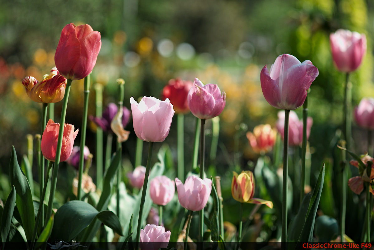
Here is the jpg-ooc in Classic Chrome:

and here the jpeg developed from the RAW:

There is a style that creates the conditions:

Fuji F49__BASE.dtstyle (4.6 KB)

and one style (ore more in the package), that creates the colors:

Fuji F49_ClassicChrome-like.dtstyle (3.0 KB)

If you want to play with the Image (CC BY-SA 4.0 License):
160506-DSCF9048-T10.RAF (32.0 MB)
160506-DSCF9048-T10.RAF.xmp (12.8 KB)

Here are the packages with all styles - one with 24 patches and one with 49 patches.

Styles_F24.zip (18.1 KB)

Styles_F49.zip (22.7 KB)

If you want to know more about my experiments with styles, you will find an article on my website - unfortunately only in German. But google translate helps.

8 Likes

How did you get this in styles? http://foto.zenz-home.de/wp-content/uploads/2022/02/Auswahl_014.png

Two groups of styles.

I haven’t done it in a while as I stopped using styles for the most part but I think you use a vertical pipe symbol in the name |

Thanks

Yes!

Thanks for sharing your article and your styles…I recall Harry Durgin doing something similar back in the day with DT chart…leaving the basecurve enabled rather than disabled and finding that he got a better match when the goal was to match the jpg rather than the reference file of the color card…

Hi!

I don’t know if this thread is still active, but I need help with the RAW images from my EOS 6D Mark II. Even though I am using the “color balance rgb” module with different presets, my images look dull and as if viewed though a grey filter. I do understand that the reason for shooting RAW is not to reproduce OOC, but my RAW images certainly should not look worse than JPG. So I would be grateful if someone could help me with a set of modules and settings I could learn from.
I keep thinking that the problem starts with the input color profile, but I have not been able to find a profile specific to the 6D Mark II.

Thank you - Matthias
IMG_1617.CR2 (29.4 MB)

1 Like

@matthias1 Welcome to the forum.

Not really a DT user here, but typically the solution for “dull” RAW colors (compared to a camera-produced jpg) has much to due with these settings:

  • Exposure (usually need to boost, finding your preferred midtone choice)
  • Saturation/vibrance boost(s), without overdoing it
  • Tugging on the extremes (brightest and darkest zones) on the curve, in order to boost the dynamic range.

Some combination of these treatments, depending on the image and the intended result, would usually go a long way in bringing a seemingly uninspiring dull RAW starting point to something closer to what a camera-generated jpg would look like.

HTH.

Thank you for the quick reply!

I usually set the exposure to at least 2 or even 2.5, otherwise the image will be really dark. I have read that others routinely do the same with different cameras, but I keep wondering if another input profile might help here. I am currently traveling and have only limited resources, but I will try to install the original Canon RAW-software in a virtual machine, hoping that it does come with an ICC profile for my camera.
The saturation and vibrance should be dealt with (correct me, if I am wrong) in the “color balance rgb” module where I routinely choose “vibrant colors”. This improves things a bit, but not enough in my opinion.
I use “filmic rgb” to adjust the dynamic range; I have watched Auréliens videos and although I cannot claim that I understood every detail, I believe that I apply correct parameters.
Something is still missing, though…

You can also try adding local contrast, or an extra correction with the color balance (e.g. extra chroma).

Because you use HTP.

Skärmbild från 2022-10-01 19-34-10

Hi @matthias1, and welcome!

Something is still missing, though…

What is missing? :-)))

It is very easy to oompf up an image.
Here is one way of doing it:


IMG_1617.CR2.xmp (14.8 KB)

The question is what you are after.
And since there are about 473 675 ways to develop an image,
it all depends on what you want to convey.

Have fun!
Claes in Lund, Sweden

Thank you very much @Peter (I have downloaded the video and will watch it) and @Claes (this is really vibrant :wink: The white balance and the color calibration module show warnings that white balance was applied twice. This is something I have avoided in the past, setting the white balance only in the color calibration module. Do you recommend to ignore the warning instead?

Use the forum’s search facility :slight_smile: and you will see why.

Have fun!
Claes in Lund, Sweden

Hi Matthias!
I echo the welcome from the others.
What do you think of this one:


IMG_1617.CR2.xmp (14.8 KB)

I haven’t applied any sharpening, which should produce a bit more crispness, but to me it looks fairly close. I made a style out of this, but haven’t been able to try on any other images from your camera obviously. I’m looking forward to hearing your thoughts!
Style for 6D MkII 1st try.dtstyle (3.9 KB)
You should probably hit the eyedropper on the filmic white relative exposure slider after applying the style, as the contrast curve in the tone equalizer pushes the highlights a bit. This was one of the main thing that got me closer to your jpg. The color zones module just shifts some hues a little, but might not be right for all images.
Edit: I used dt 4.0, the style may not work properly on 3.8 or older. Let me know if it’s a problem.
Edit No2: You can import the style to dt via the ‘styles’ panel on the right side of the lighttable view, then apply it there or in at the lower left of the darkroom view. Just in case this is useful!