Thanks for the feedback.
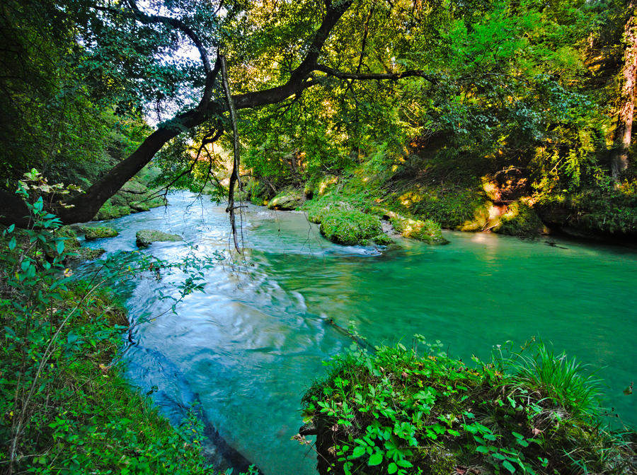
It’s interesting that most of you reduce or do not increase saturation. I think what makes this photo difficult is (among other things) the fact that the yellowish green and the blueish green somehow do not look good together. So what can one make of this?
Edit: maybe make everything but the river black and white?
Thanks. Mine pops a little more, but I really like the colour and tonal balance of yours - slightly muted, but not dull. Yours feels more to my taste than mine haha.
I tend to rely on the colorimetric performance of the camera profiles first, then maybe, just maybe, put in a smidge of HSL saturation to taste. That decision is mainly based on my notion of color contrast; in the case of your image I thought there was enough of that. Any sort of arbitrary color saturation is going to, by definition, change the colors, sometimes in garish ways.
Some scenes are just not ‘colorful’. And, as I mess with camera profiles, I’m finding the cameras generally do faithful color recording, and our recollections are much less so…
@Soupy: Just started looking at your sidecar. In contrast equalizer you set both the output and input L channel sliders. What does using both do for processing?
In most images I find neither the highlights nor deepest shadows need (or look best with) sharpening. That is why I mask the input L slider, to just get the midtones. I have presets made and use them when trying to work fast, but optimal values vary slightly by image, and sometimes sharpening in the deepest shadows is required working in linear.
The masking on output slider is a little trick carried over from Photoshop (blend if, ‘this layer’) to try and reduce halos caused by sharpening. If the contrast equalizer doesn’t produce halos it isn’t necessary. You need to zoom in at 200%+ for close inspection. Again, sometimes if I’m lazy I’ll just leave the presets on. I think it is more important on the ‘sharpen’ module than the ‘contrast equalizer’.