As I was saying, the trend seems to be more colour/local contrast with filmic in the pipeline. I say “pipeline” because other modules may influence the outcome (whether due to module interaction, user workflow or user decision tree).
Besides having lower colour/local contrast, which I care about, sigmoid appears to be less saturated, which is subjective based on the look the user likes and the type of photography they are aiming to achieve. Personally, I like the less saturated look with higher colour/local contrast/lines/detail. So a combination of the two methods, if I could have best of both worlds.
The colour/local contrast of filmic could be due to the nice edge preservation that AP developed, but it was probably for something else. I am not sure. Someone could let me know where that was implemented. But if it is that, then sigmoid could borrow for it, or whatever is contributing to that outcome. I think that is what sigmoid is lacking at the moment.
This is interesting… I agree about the loss of detail using sigmoid, however by introducing tone eq and shifting the skew, I found it pretty easy to bring it back.
Below is filmic:
Fixed it now… sorry I’ve lost the .xmp for the filmic but it’s pretty close default settings.
Again, I agree with this image, but with quite a few of mine the initial impression I get is almost the opposite… but thinking about it, maybe that’s due to my willingness to use tone eq. Which I don’t seem to find the need for as often with filmic. I think all this might be more about my perception/habits than I think!
I’ll try to find an image where I think sigmoid works better and post it here for perusal.
After trying to find an image where I thought sigmoid worked better, I seem to have reached the conclusion that there’s not much in it. Somehow the simplicity and limited controls of sigmoid seem to guide me to a result I’m happy with noticeably quicker than using filmic with the extra controls.
But, that result can be got using filmic too.
In fact, I think with some images I might not have hit on the ‘look’ I get with sigmoid, if I was only using filmic. Not because filmic can’t do it - it can - but because I wouldn’t have ‘thought of it’.
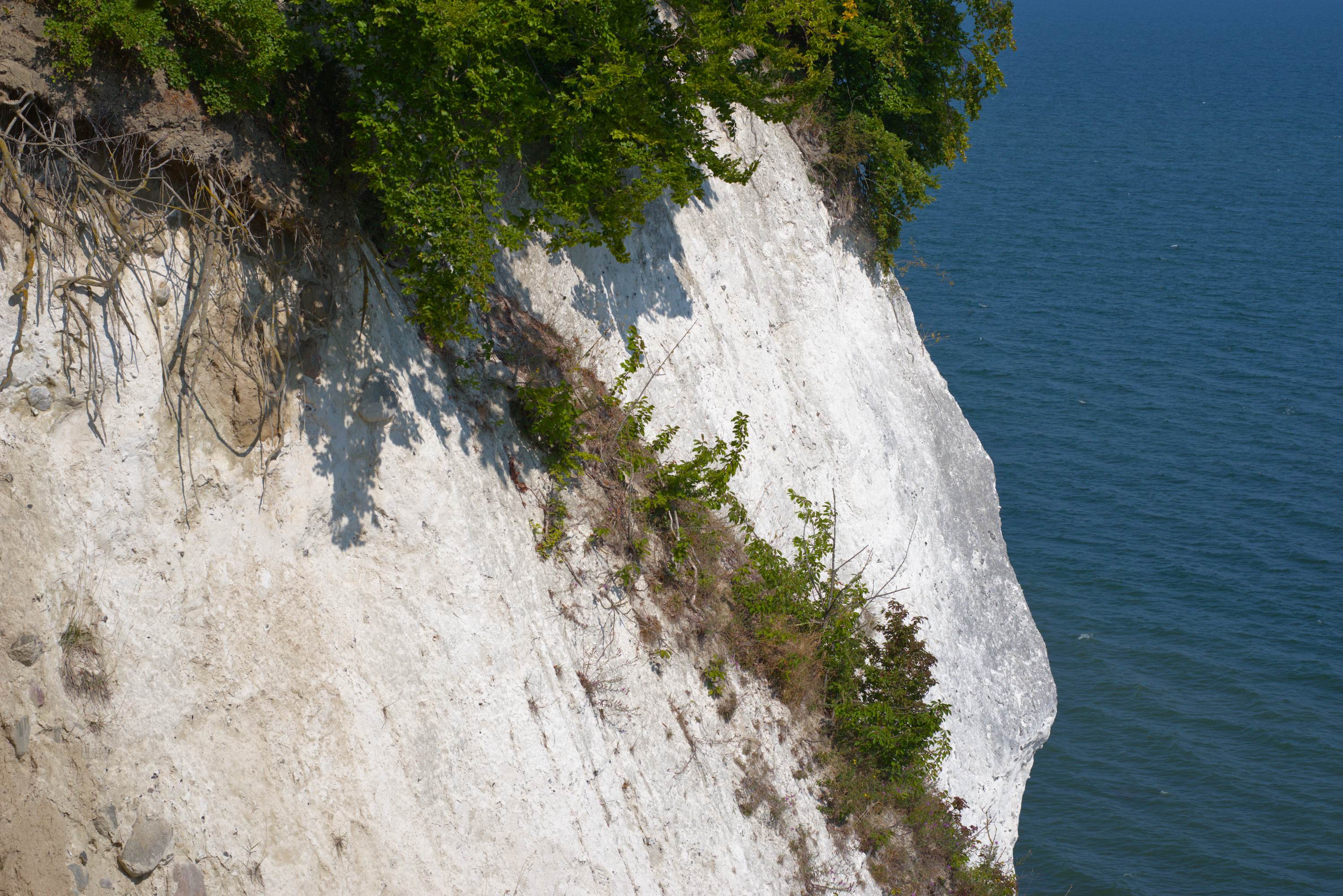
For me using only tone eq and exposure… I got these images when trying to match them up on the face of the stone. I did go back and use extreme settings in sigmoid and went to rgb ratio to desaturate the color cast in the highlights of the stone… i ended up with them being pretty close … Initially I had taken a different approach and not pushed the skew so hard…
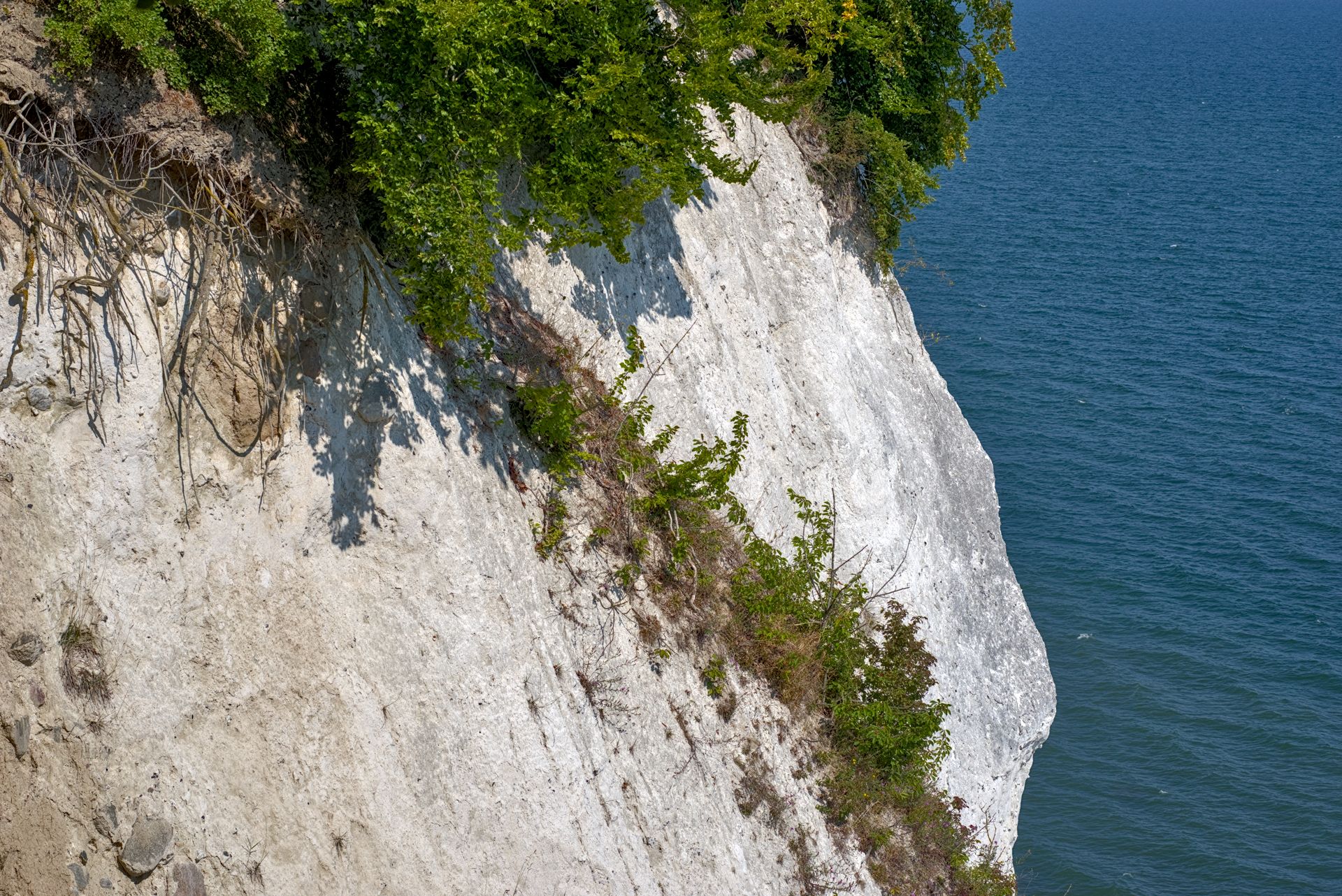
xmp is filmic version …turn off and use sigmoid settings above…
So this would not be a final edit but sort of a base comparison… I try to keep all the modules and settings the same …in the end this might not be 100% the be way as the secret sauce for each might be a bit different…
To me where I ended up the deep shadows in the shrubs is better in sigmoid but the rock face and water look better too me… This would be where you could start to target those areas for each different edit to compensate… A new image might offer something different
Edit…
I actually started to do an edit with filmic and added some modules as I would do… turning filmic on and off really didn’t help nor did sigmoid… I have found this on many edits before esp those where you are trying to examine detail… and I often can actually get a very nice edit without filmic or sigmoid…
Yes! I like it. I’ve tried this, but usually I give up… I’m a bit prone to relying on a tonemapper to pull things in line in terms of highlights and so on. Maybe I could try harder!
In the case of this edit it was funny. I set exposure reasonably high for the trees…Then went on to adjust filmic and then then the usual intervention with some tone eq. I often use a few. I find using them with blend modes in color channels is really useful at time for skies, water, foliage tweaks… in the end I was just turning off filmic to sub in sigmoid and I noticed it really didn’t do much and adding sigmoid with this combination of modules was not helpful really either so I just thought well both compress fine detail and the rock is looking okay so I just left them both off… its still not a great edit or anything but it works nicely with my favourite D&S preset “dehaze”
Neither of your sigmoid renders removes its flatness compared to filmic. Try flipping between the two in the lightbox or browser tabs. There is a “grey haze” or “less clarity” in sigmoid compared to filmic. Quotations for the loose/imprecise terms.
Attempts to boost details afterward still doesn’t address #1.
The closest analogy I can think of is the difference between on vs off RT capture sharpening, though this isn’t a sharpening problem.
I did the flick, in lightbox and between 100% zoom tabs. The difference I see is contrast. Filmic defaults has a more agressive toe resulting more contrast near black/less detail in shadows. Are you seeing something else?
I would agree I think… basically both can be made to be similar in many edits. I find as you say if we are talking just the defaults that filmic will be darker and more contrasted in the shadows with less detail revealed in the darkest parts and sigmoid is the opposite when it comes to the highlights as it tends to compress more … to get close to flimic it has been my experience that you have to crank up the skew and then tweak contrast. Those observations are comparing at the same exposure, for the shadows you can use more exposure with filmic and offset that aspect of filmic’s dark shadows .
SIgmoid can often be more colorful/saturated out of the gate esp if we are talking v6 filmic…with v5 this is easy to match and control I find. I use the dehaze preset of D&S and it is amazing but the odd time can be a bit too much introducing too much grain/noise but this is less often the case with sigmoid with its softer highlights so its a good match…
We do need to be careful as well with all these comparisons as filmic has choices for the shoulders that impact this quite a bit… I actually use hard for highlight unless they are severe already and safe for the shadows many times… I think the sigmoid look would be more like filmic with both of these set to safe… I think the default in v5 introduced safe as the default and now it is back to hard which is more like older versions of filmic… I think any way…
Lets face it pixels are pushed all over the place with each module and slider added. For sure efforts should be made to avoid unwanted side effects. If I have a hazy image that needs more contrast or saturation then I will apply the dehaze filter… if it gives a nice pleasing result or a visual improvement I will use it…no way I am going to edit thinking about rgb ratio’s. I know the math is there and I know there are things that can introduce potential issues but even one of the most math anal guys, ie Aurelien says over and over in many video’s… just use your eyes… in the end I am not creating reproduction renders and I am not going out of my way to distort things but I never think twice about rgb ratios when using dehaze. I will use the default, if I like it keep it and if not I try my presets blended in lightness to see if I get the contrast bump with less change in saturation… if neither works I have a varitey of local contrast presets, a couple of tone curve presets in subtract mode and some D&S presets that I will try to hit the sweet spot… In the end for me its a pleasing blend of contrast and color that dictate what I will do and not rgb ratio’s… The good thing is that there are tools to help manage that sort of thing for those that might be or need to be that precise…
Some more image evaluations, this time with module settings. Sigmoid continues to impress. I need to get my color checker out and do some more quantitative comparisons but for now qualitative will have to do. There are times where it feels like I spend an inordinate amount of time bouncing from Filmic to Color Balance RGB to Tone Equalizer on those edits as once I change one setting I have to tweak another, Sigmoid seems simpler in that regard. I’ve also done some comparisons with Filmic v5 and Filmic v6. These are also Nikon NEF files instead of Fuji RAF files like from the post above. I find I like the way Sigmoid handles reds and more gracefully goes to white with blown out backgrounds with less tweaking than Filmic needs.
I find for me the reason I am using v5 is for the look I can get with no for preservation, some amount of latitude and mid tone sat with v5 as the added control or benefit to using it instead of v6 and of course it doesn’t have the gamut clamping so I think its not surprising at least at first glance that there is not a lot to choose between those in these particular examples since you kept the settings pretty similar for the two…
Is the girl masked… the border between background and her outline is quite different … I was wondering if that was down to the tone mappers or a slight difference in processing or exposure?? You can see it on for example her hair or arm when you toggle through the images…
Good catch! No masking, just fly away hairs on a blown out background. In Filmic I trimmed in the white exposure point along with some Tone Equalizer to have them disappear. If you bring the skew in Sigmoid over more to the right and tweak Tone Equalizer a bit the ghost effect disappears. Still learning Sigmoid workflow. If I were shipping these out again (these images are several years old) I’d remove those with the GIMP or Krita. What’s funny is they aren’t near as visible in darktable with the RAW just on the resized output JPG. Intentionally blown out backgrounds seem to be a struggle point for a few tone mappers.
Could you share the portrait image (or any other intentionally “blown out image”) here or with me? It’s a good case for when the design of converging to white doesn’t perfectly align with the intention of the artist! I would like to do some tests to see if I can make a recommendation for this thread and later the manual.


 Dehaze is one strategy but as you note it causes artifacts (and colour shifts).