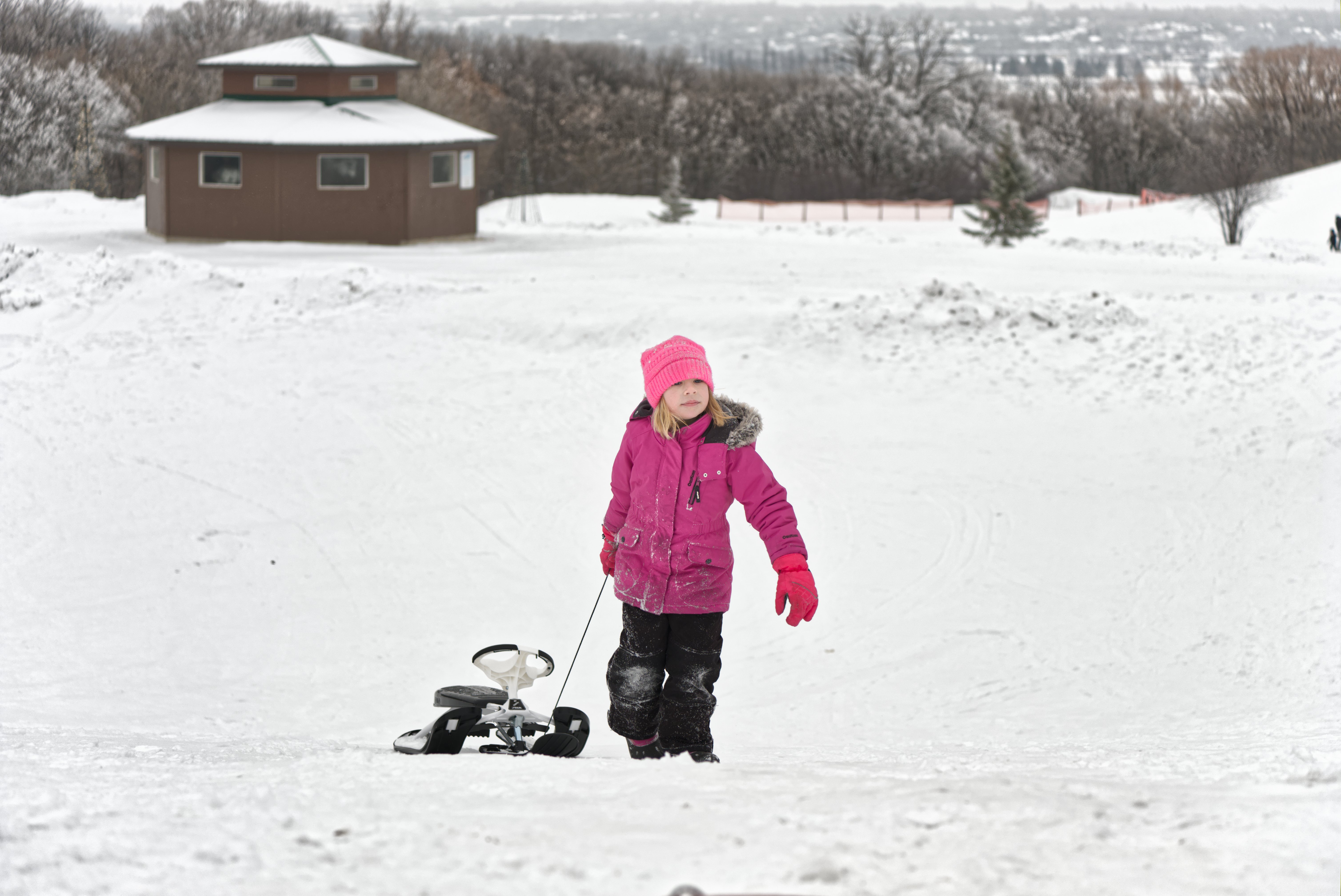
Does the version on the right have a slight noticeable halo, or am I just seeing things?
Thanks @Christian-B for the implementation! Love to see how we can now try all those variants out and gather real-world experience!
I’ve added the links to your and my recent version to the entry post so that new visitors see the relevant versions directly.
I have now played around with an implementation of option 3 from my post Experiments with a scene-referred local contrast module - proof of concept - #114 by Wilecoyote
There are now 3 scales with individual settings and mask visualization. I tried to keep it general so that the number of scales can be altered easily (or even made user-changeable in the future).
I also removed the luminance estimator setting - L2-Norm is used for now.
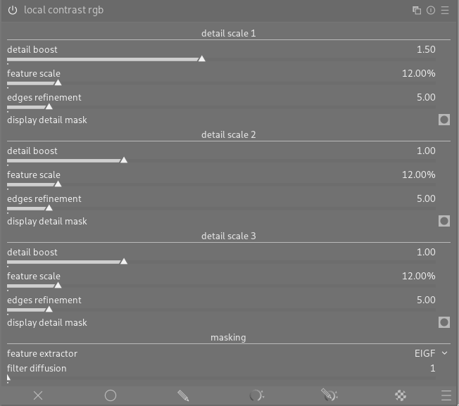
I guess it would be handy to default the scales to useful ones for fine, local and large-scale contrast.
8 Likes
Finally I got to try the pyramidal contrast.
- Wow. As you enable the module the photo comes to life.
- Mostly for pedagogical reasons, but also for finer control, It would be very nice to be able to disable / neutralize the contrast at different scales with a simple control, so that one can assess what each slider is affecting. Ideally, the module would be a no-op when it’s first enabled, and then one could dial in the contrast only at the desired granularities.
But hey, this is super, I am so much looking forward to it being merged in master 
7 Likes
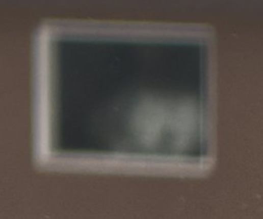
I think it’s not a halo, but there are sharpening artefacts:
And also dark outlines at the edges where mid-tones meet the snow:
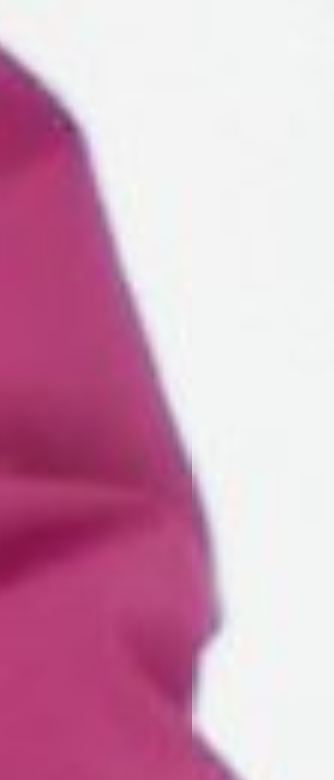
But I think those are hard to avoid.
@s7habo , could you upload a traditional sharpen (USM) and diffuse or sharpen version? And maybe contrast equalizer? Also, I wonder how ART’s Local contrast, RT’s Contrast by detail levels would treat this image.
2 Likes
Yes, there seem to be some artifacts indeed. But I’m quite happy that we have to look that closely to find them 
3 Likes
I think this one makes the most sense.
A checkbox to disable each one of the levels might make sense.
What’s the rationale for filter diffusion being a general setting and not replicated for each detail level?
2 Likes
I left this out for simplicity as a factor of 1. means that the scale has no effect (and is also not computed by the way to keep performance good). You can simply double click on a slider (except first scale because it’s default is 1.5) to set it to 1 and hence disable the scale
- Laziness
- keeping the individual controls simple. Working assumption is that the diffusion parameter is not used often. But this can be changed of course if most users need it for each scale.
Wow the work you are doing is amazing! I know you are work is POC, but maybe as a suggestion: a more descriptive label from the ‘details scale’ will help
5 Likes
Thanks! I don’t know if it is possible with the underlying maths but detail boost 0 would make more sense to me if was the neutral setting.
I think a checkbox to disable individual modules for finer and targeted adjustments as @masterpiga suggested would still make sense :-).
Thanks for your work. I really look forward to what becomes of this endeavour and as with AgX it is a joy to follow along on your/our journey in this thread :-)!
2 Likes
No, those are not sharpening artifacts.
Without pyramidal contrast:
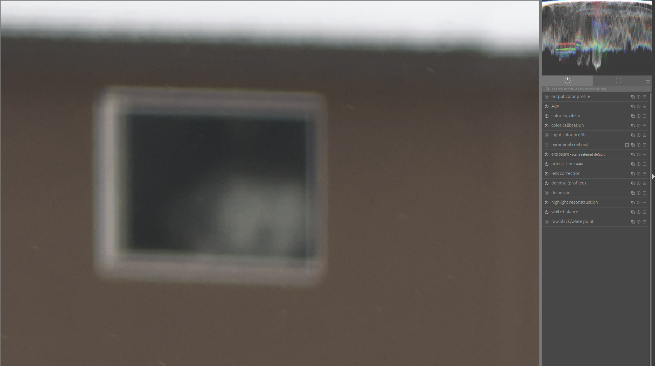
With pyramidal contrast. Here, the noise is only slightly amplified, but that is to be expected:

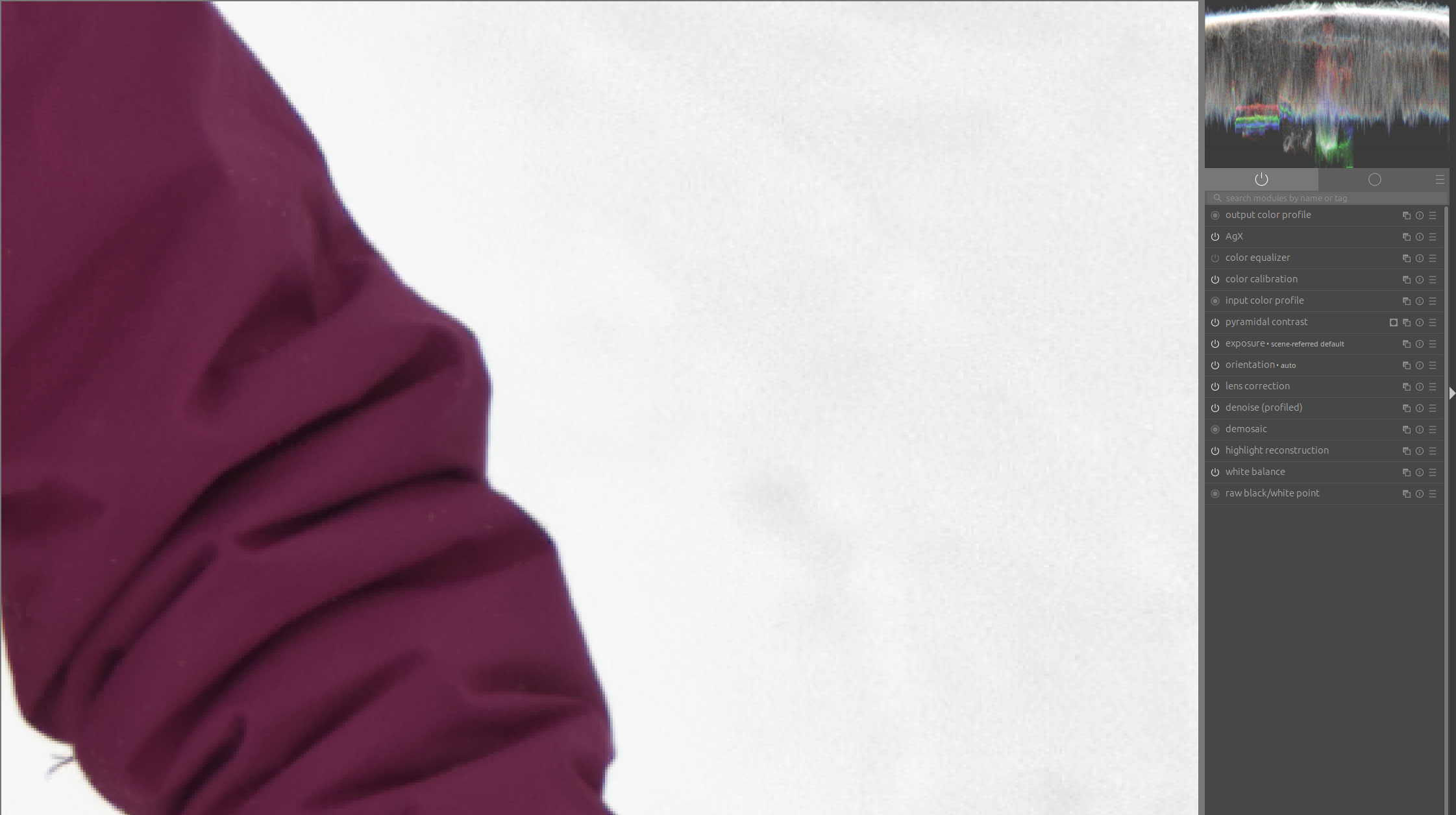
This artifact is caused by color equalizer:
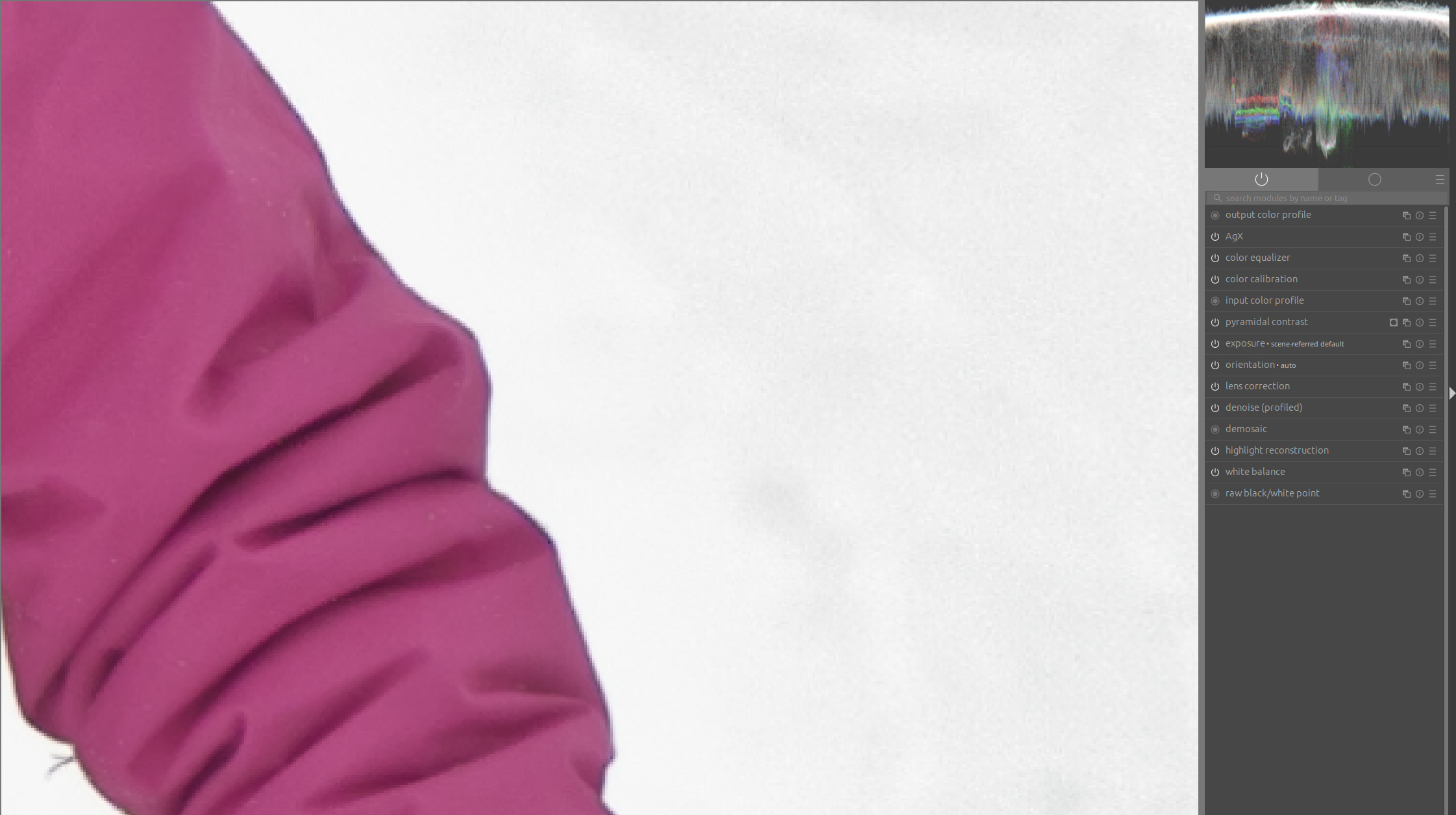
Here, the color equalizer is turned off:
5 Likes
I think what I might be seeing is a slight and progressive loss of detail around the arm and the beanie (essentially in an outline around the subject). There is visible detail in the snow, but it fizzles out around 100px away from the jacket or the pants. In the LR edit of the thread you linked, the detail is visible right up to body (though it has other artifacts, obviously!).
I also perceive there to be a slight white gradient around the jacket that is more visible to me when I make the image smaller. Double-checking with the GIMP color picker, it seems to agree with my eyes
Admittedly, this is an absolute worst-case image.
1 Like
And after using quite strong settings…
Very good point! I agree that this would be much more intuitive.
It’s a different approach from the old local contrast module (where 100% were no change).
What do the others say? Would a percentage slider like local contrast rgb (100% = no change, 0% = feature removed) be more intuitive or dimensionless like now, but with 0 = no change, -1 = feature removed (i guess that would be confusing) and positive numbers for increase be better?
I must say that I disagree here because an additional tickbox would make it confusing that the disabling via tickbox is the same as setting the boost to neutral. But maybe a small button to reset to neutral and / or greying part of the ui of the scale out when in neutral to indicate it does not have an effect? But it is not that easy to find a good and clean indication…
Thanks! And thanks to everyone else who participates, be it in coding or discussing!
1 Like
I see the slight large-scale halo, too. You may also spot it in the feature mask!
This is a consequence of the properties of the EIGF feature extractor, where the guiding does not suppress that large-scale blur on the sharp edges completely.
So the bad news: It is not a consequence of the local contrast rgb logic and can hence only be handled with a better / updated feature extractor.
Good news: It is not a consequence of the local contrast rgb logic and can hence only be handled with a better / updated feature extractor → Means that maybe in the feature better feature extractors can be developed or the EIGF can be further improved as a new version (and also used for tone eq), independently of the local contrast rgb module development
Yes! I am very open for good suggestions that make it clear that there are independent, configurable feature sizes that can be boosted.
3 Likes
Maybe combined with collapsing/expanding the next scale. One does not always need more than one level.
This new version of local contrast rgb also produces excellent results!
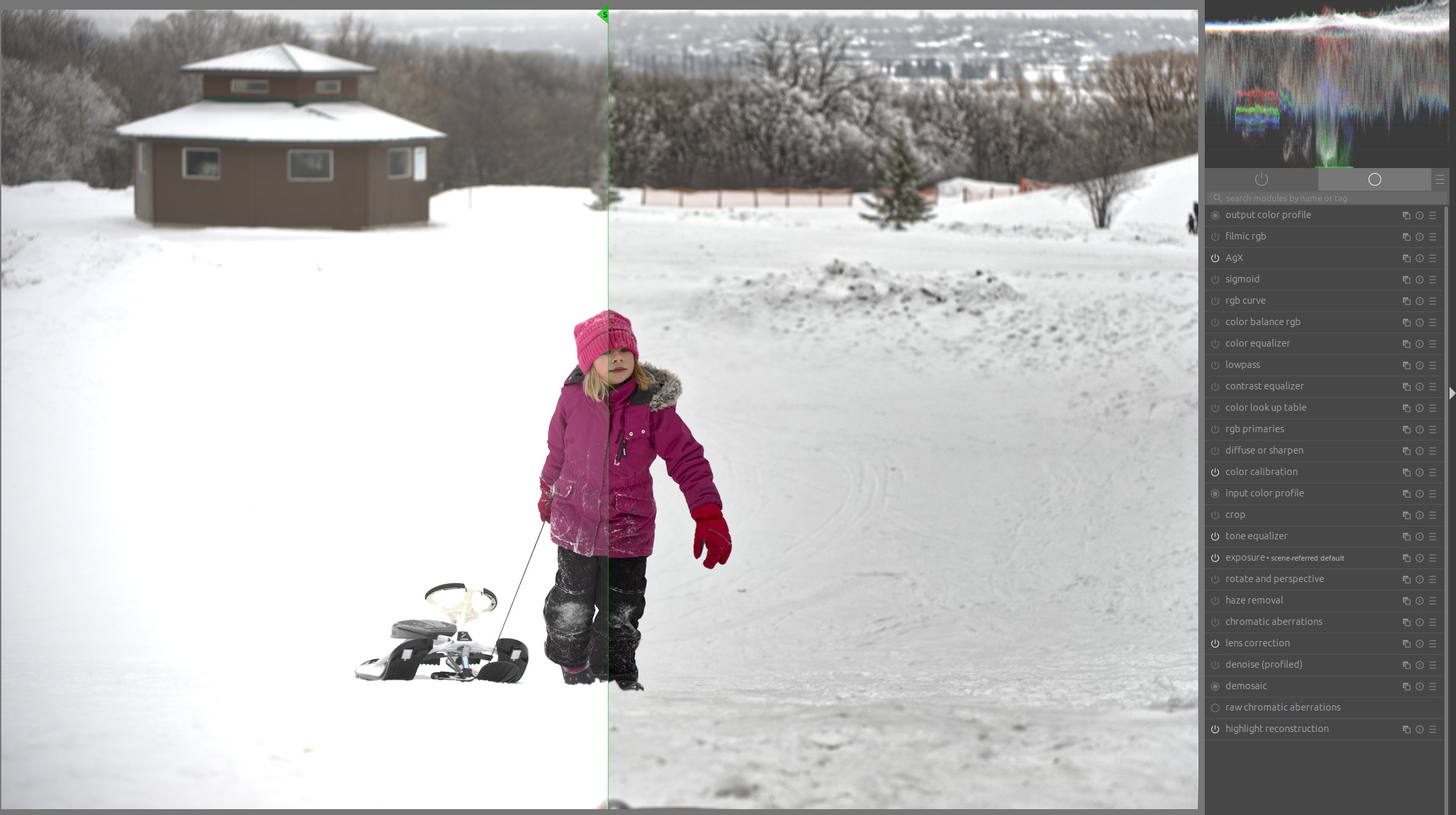
I’ll have to play around with it for a while now. 
7 Likes
As mentioned above I would prefer that the default (double click) position at each scale disabled the effect at that scale. I think it makes sense for this value to be in the middle of the slider.
In this respect, a default of 0 (as in “no effect applied”) would seem more intuitive to me than 100%.
I would also like the module to be a no-op when initially enabled (i.e., all scales at neutral position).
2 Likes
I’m just leaving work now but I just wanted to ask to see if I understand things…In Christian’s version there is a sort of base scale and then the two on either side are some percentage of that value to determine the scale that is impacted…
In @Wilecoyote 's latest version you work on 3 distinct scales that you select with access to the masking for that scale…
Is that generally or at all correct??
EDIT: okay not on either side…I went back a bit but all sliders are based on a single value as selecte in the feature scale??
This is a sort of philosophical one. If you give the new user a sort of small starting point that happens when you apply the module it is often recieved better than one that does nothing others will maybe feel the opposite but also in such a module its very easy to create an inactive version with no-op settings so that went you do use it or activate it it will be neutral.
I think there are a mix of behaviours in DT, ie some default adjustment vs none…
1 Like