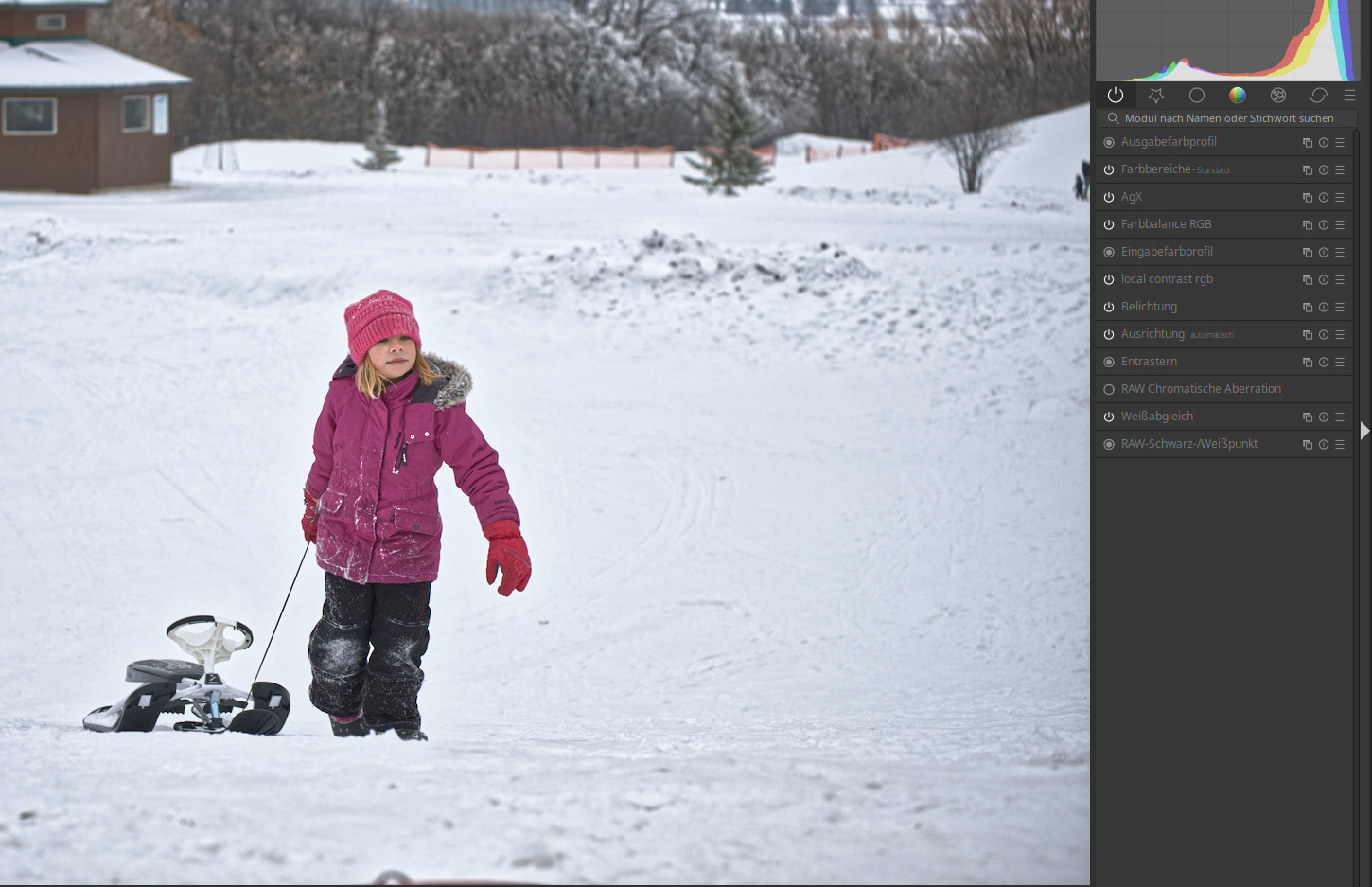
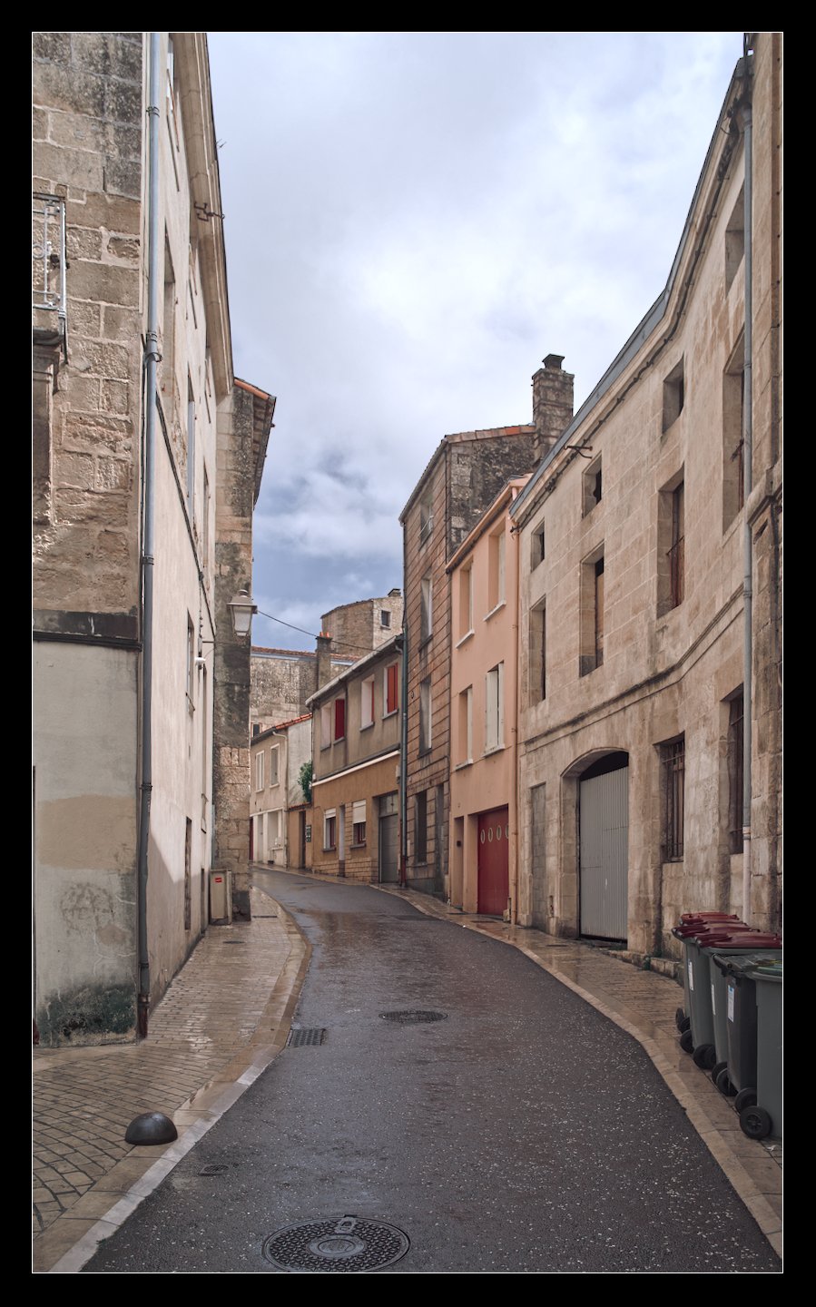
With @Wilecoyote I come as well to a quite pleasing result with this picture with just using very few modules and without any mask (same counts for the equalizer variant):
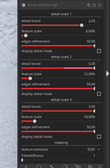
What I found a bit unsexy was that I had to place on this edit the three scales very close together to get a broader (and probably more intense) effect range.
It would be great if we just could make the areas where the effect is taking place wider.
@hannoschwalm isn’t color equalizer a per-pixel adjustment? I know there’s a radius involved, but I’m not sure if it’s only about analysis or about application. I’m wondering if it’s causing or merely amplifying the artefact.
There is a guided filter so effects “propagate”. I will have a look again but this situation exactly - very bright colorless whites agains dark colors in a sharp transition - was the main problem in CE work after resolving color maths issues. It took some extra care to keep that “under control” here it’s out-of-control. (you will find the scharr mask stuff in CE code easily …)
Reset to neutral/no effect seems to always be done by double clicking in other modules. Therefore I propose this module should have no effect out of the box, but a preset saved that has a fine, medium and coarse scale for the three levels. That way you wouldn’t need checkboxes, the double click would work.
Thank you very much, I’m happy to have contributed in some small way. Thanks to you, I’ve learned a lot in just a few days. This is the first time I’ve delved into the darktable code.
I see that the project has really picked up speed. I’ll try to read everything tomorrow, it’s getting late
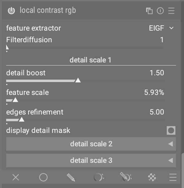
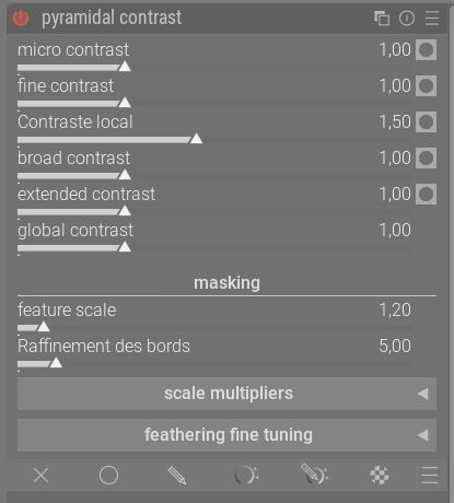
Here is my latest version, I’ve added the option to customize the “featuring scale.”
FYI, when a contrast slider is set to 1, no calculation is performed on it, so the mask can be white. It will be displayed as soon as we move the slider.
I missed about 5 days of discussions, as I was reading the whole thread I had the idea for a config screen in a menu as someone else suggested, so you want 20 levels?, no problem, then I thought that other modules could also be configurable like this, so people could create their own permanent (but flexible) abstractions, I guess similar functionality is already available, if modules can be exposed with only one or two sliders, and a custom workspace can be created, I have a bit of a one-size fits all workflow where i mostly do the same operations on most images, I’ve played with the node based editing in davinci resolve and like that approach as well.
in the specific case of this module instead of a separate config section maybe a “levels” box is enough, so you type the number of instances you want then the module magically expands, extra sliders appear
Im not sure about 20 levels but one time I did bring up the possibilty of having multiple quick access panels so that you could have more room to create a custom workflow taking all the best bits or most used features from modules… I forget the counter argument but likely its not as easy as it sounds to just throw something in to the existing structure of the DT pipeline…
yes, I don’t know if you’re familar with “pure data”, a graphical workflow language, they use a construct called “abstractions”, you connect your little boxes (modules) together onscreen, then your abstraction is a set of sliders from each in a custom box, this hides the complexity away and makes patching programs together easier/cleaner
I’m imagining an extension to the existing idea of curating sets of modules with only selected sliders showing, so people could do that but put them in a box with one on/off switch, then a custom module order could also be implemented if desired, I’m guessing it’s like a “group” function in effect
this might be a bit of a solution in search of a problem, I’m wondering if there is value in being able to transform masks in a more flexible way for instance, so you want to apply a bit of local contrast to your mask or whatever, but that is more into the realms of fully node based editing than grouping modules together.
I’m just lurking so far, but I notice @s7habo adjusted two sliders for the contrast decrease and two for the contrast increase. Is this inevitable because of how the algorithm works or can you do it with two sliders when each slider has it’s own scale, refinement, edges, etc.?
Because in the usage with 5 levels it’s very much like an equalizer. Not that equalizers are bad per se, but can a simpler version accomplish the same operation (in this case, with two adjustments)?
(I like the design of the three-part module with two parts hidden, or of the one-part module where you can click “+” or “x” to add or remove a section. But I’m a newbie so don’t take this preference too seriously.)
Hello, I’ve done some developing with the latest ‘pyramidal contrast’ versions (yesterdays and today’s).
Must say I’m pleased a great lot just as others before me using this ‘experiment’.
I’m not an experience developer, nor do I have the experience to technically comment very much.
But the ease of use and the nice results speak for them selves. A joy to use! I reach with some simple tweaks of the sliders very nice results, very swift. It ‘invites’ me to improve on my development thus strengthening my dt experience being already quite positive.
What’s also really nice is that when you combine the texture softening feature with other diffusion modules, it’s now much easier to create picturesque, fairy-tale scenes like this one from nice photo made by @AtaraxicShrug :
This time, I think everything is in sync, and this version also includes @wilecoyote’s version. I ran some tests today with both versions and the results are fantastic. It would be great if, at the end of development, we could merge the two versions into a module with two independent tabs: a local contrast expert tab and a pyramidal contrast tab. For now, it’s just an idea to think about.
For your information, I will be a little less active as I am moving back to Belgium, to my hometown of Brussels, where I will be trading my computer for a building maintenance job. I will be doing some DIY at my son’s house.
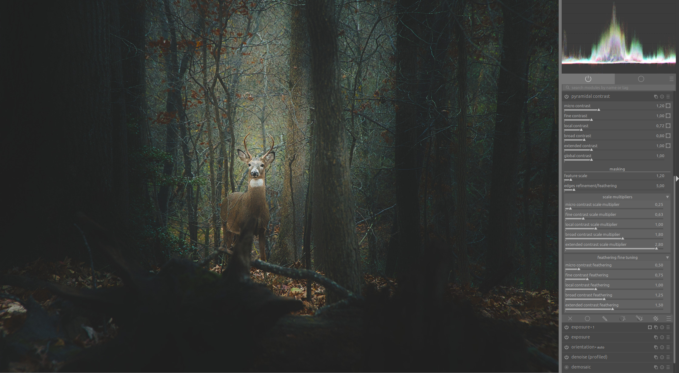
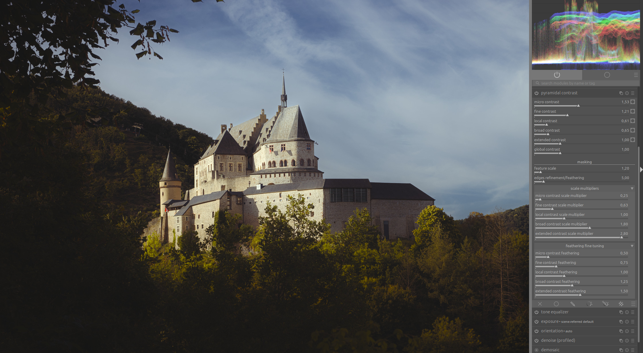
Look at the amount of details that it brings out! Could the same result be achieved with other sharpening/contrast tools? Maybe, but here all it takes is to move a couple of sliders, it does what you expect and it responds so quickly that it’s a joy to use.
I am finding the local contrast rgb multi-scale version more ergonomic, as all the controls for each scale are grouped together.
Minor comment on LCrgb-MultiScale: it would probably make sense to set the three “detail scale” sliders to different values by default. It’s a bit confusing that they all start at 12% and if you change the “boost” of any of them you are actually always affecting details at the same scale. I would do 6-12-18%, or something along those lines.
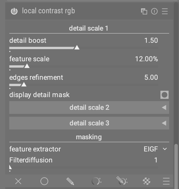
I like the pyramidal contrast UI a lot. It chooses reasonable defaults and puts the main controls that I’m interested in on top of those defaults front-and-center.
(In the other UI, I initially felt a little confused about how to choose feature scale and edge refinement, e.g. in which order to use the sliders and how one should be chosen dependent on the other one, even when looking at the mask. The pyramidal UI makes some nice default suggestions that remove this initial confusion and still allow me to tune things if I have to.)
The only thing I am wondering is whether the mask view can somehow be made more readable. For example, when using the contrast sharpening contrast sensitivity mask view, I find it very easy to understand which parts of the image are being affected. With the grayscale mask of pyramidal contrast, this feels trickier to me.
Is there some way that we can implement a UI that’s not a stack of sliders?
In the idea phase a stack of sliders makes sense because they are easy to code and tie to just one thing so while you’re developing only one thing is changing at a time.
But in the UI, they take a TON of space and they are not the easiest to look at and understand. For instance tone equalizer has an simple tab with sliders and an advanced tab with a waveform. My guess is that almost everyone uses the waveform because it’s easier (simpler?) to get an idea of what you’re doing.
The current contrast equalizer UI provides a ton of function in a small UI space. You can select bands, increase or decrease the width of the bands and increase or decrease the effect of band.
This nice thing about that UI is that it’s already built. If the controls could be “wired” to the applicable functions in the new local contrast module and that would, IMO, be easier to use while not being quite as exact as a slider. But do I need exactness down to some small value?.
 :
:
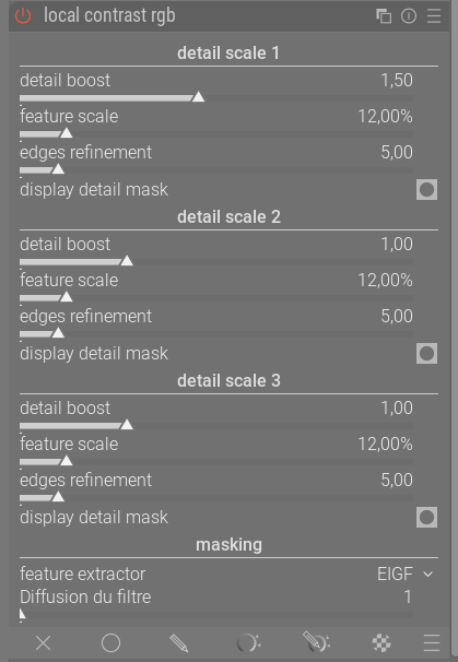
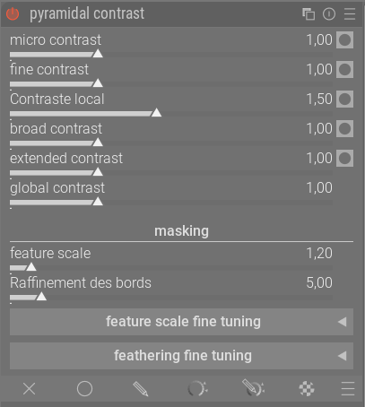
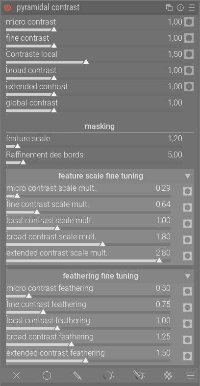
 ):
):