I am not able to experiment with new-module propositions at this time, and particularly don’t want to run more than one instance of darktable.
But add my name to those who will be delighted to see this eventually become part of the master distribution. Thanks to all who are putting in the footwork at this early stage in its life.
edit: footwork? Maybe I mean groundwork? Or, hey, both
I am a bit curious if the global edge refinement and feature scale sliders are still needed in your version? In the end, the feathering and feature scale for each scale are now controllable independently. Isn’t having a global value for those and then defining the individual scales’ sliders relative to this more complicated than necessary?
I understand that it provides the opportunity to change the absolute values of all scales at once while keeping the proportions, but is this used in practice?
Otherwise, you could remove the global feathering and feature scale sliders and and directly use the scale-specific sliders to set the values independently. With defaults corresponding to the absolute values that result from the current relative default values, effect would be exactly the same, but there would be 2 sliders less.
Then, the module would in fact be almost equivalent to my version - just with another arrangement and a fixed number of scales.
Well imho, I prefer sliders as the UI rather then the contrast equalizer. On a smaller screen (laptop), the contrast equalizer is a bit too small… and I find the contrast equalizer not so easy to work with as this prototype.
The contrast equalizer UI suggests that the local contrast between two feature scales is interpolated between two scales according to the displayed curve (as do the other equalizer UIs). Is that the case here, too?
Also, dragging one of the points in both tone equalizer and contrast equalizer moves the other points. Should this be the case here, too, or does the module function perfectly fine without the UI attempting to enforce some kind of smoothness across scales?
(Both of these questions could indicate whether scales or an equalizer UI is more fitting here)
Hello,
First of all, I want to sincerely thank you for your openness and for the quality of our exchanges. It is a real pleasure and a privilege for me to work with you and to build upon the incredible foundation you have created.
I asked myself the same questions. Until now, I hadn’t dared to change your default settings, which work extremely well. You’re right: the two interfaces don’t necessarily have to share the same settings. We can keep your optimal values ‘hard-coded’ for the overall approach and use the sliders to adjust the intensity of each frequency.
As we can see in the comments, the difference between our two approaches lies not only in the mathematics, but also in the interface philosophy (UI) and user experience (UX). The strength of your algorithm allows for this duality:
1. Exploration and precision (Expert Mode): Your interface encourages an analytical approach. By isolating a scale of detail, we force the eye to focus on a specific structure (skin, rock, foliage). It is a tactile approach where we seek the ‘point of resonance’.
2. Global vision and pragmatism (Global Mode): The pyramidal approach is ‘sculptural’. Like an audio equalizer, we see how frequencies coexist. This is ideal for fast work or with a MIDI console.
It’s a question of mood: the ‘Surgical’ moment for technical perfection, or the ‘Painter’ moment for balance of masses.
I am convinced that we can combine the power of the algorithm with effective ergonomics by creating a ‘Chameleon’ module with two tabs: ‘Expert’ for total frequency control, and ‘Global’ for multi-scale modeling. What do you think?
Edit 22/01: In the above analysis, I forgot to mention @MStraeten 's post.
I also find the idea of using “drawers” (collapsible sections) very interesting, as suggested. This UI proposal encourages reflection: “Do I really need another frequency scale here?” It keeps the user interface clear while allowing for complex adjustments when necessary.
I almost always use the graph for Tone Equalizer because I want to see the mask, and because this module is all about smooth curves rather than individual adjustments.
On the other hand, I prefer to use sliders for Color Equalizer, even though the graph is the default. While this module also tries to retain smooth transitions, the goal isn’t always to create a smooth curve from one side to the next. You can make individual adjustments to one colour, and I find sliders much better for precise adjustments. I also prefer horizontal adjustments to vertical adjustments on the whole.
What I don’t like about Tone Equalizer and Contrast Equalizer is the situation where you make an adjustment, and another node moves to a position you don’t want it to. Then you have to tweak that one, and then another one, and so on… I know why it happens, but it can be frustrating. Both Tone Equalizer and Contrast Equalizer have ways to mitigate this, with “curve smoothing” and “circle of influence” respectively, but they have limits.
If opinions remain split on this aspect of the UI, which I think they will, then maybe there is the possibility of having both, like with Colour Equalizer. But my first impressions are that the sliders already implemented work well enough. For me, the key to a module like this (as well as the algorithm) is the visualization, which brings me to:
I agree with this and made a similar comment in an earlier post. In that comment, I mentioned how the visualization in the Retouch module gave a clearer view of detail levels. @sqrooty is talking about the capture sharpening mask view I think, which is the same or similar to the viewing the “details threshold” slider in every module’s mask view. I agree that the yellow on grey is much clearer than just greyscale. I also suggested false colour if that’s an option.
Have had a chance to play around with both versions now. They are both excellent and either would be a good addition! If I had to pick, I would choose the one by @Wilecoyote with the three detail scales. Somehow with it I was always able to get slightly preferable results, perhaps due to the extra control for each scale. But both are good and I found the time working on each about the same.
My defaults for the feature scales would be 6-8%, 12-14% and 40% (with the latter usually used to reduce contrast), though it may vary slightly by image.
I’ve been following this thread with great interest but have only now had a chance to install the latest Windows build (thanks @priort ) and have given both versions a try.
Rather to my surprise I haven’t been blown away, but quickly realised that I very rarely set out use any kind of local contrast enhancement anyway… so kind of obviously I shouldn’t expect to instantly find it really useful!
More learning required.
I do have a question - a ‘technique’ I’ve used consistently in darktable is to really punch up the contrast in the tonemapper (sigmoid or more recently AgX), then use the tone eq, with the masking set to one of the compress dynamic range presets (gf medium usually) to pull back my shadows and highlights.
This (in direct contradiction to my statement above!) obviously does increase local contrast, due to the masking in tone eq.
So. It occurred to me that perhaps I could mimic this process using the new module+saturation boost in color bal rgb, instead of slightly abusing the tone mapper as I do at present…
Not succeeding yet - is my thought process valid? Or am I missing the obvious…
They won’t automatically show up in your module panel.
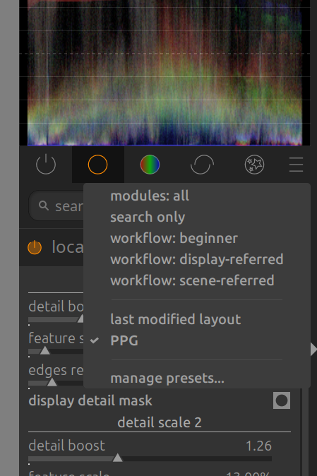
Make sure you have added the new modules to your module panel by selecting “manage presets” from the “hamburger” menu on the right side of the module panel.
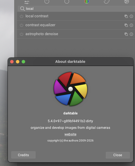
They should be searchable anyway, which they are not in this Mac version. I also have the latest Appimage from Christian on my Linux laptop, both modules are searchable there. No need to go to the preset manager.
From the images that I have seen here and in the other thread, it seems to me that with this module it will be quite easy to replicate in dt the quality of black and white conversion of Nik Silver Efex (probably the standard for B&W conversion), something I was never able to do before.
Hi Martin … thx for putting this up , sorry but I can´t find the " local contrast RGB multi scale " module ?!
Maybe there is a " trick " involved to make this visible .
WOW folks … and specially the developer , this would be really cool to have this module in DT and working well for all of us ( for those who find this useful ) .
Looking forward to test this soon …
Not sure if anybody else remember a PS plugin called " WOW frequency equalizer " … I loved it , but the developer stopped working on all of his plugins for whatever reason .
I can still use it … but I have to run PS in " Rosetta " , which is not good at all . So I stopped using the plugin .
And maybe I get the option soon to make this happening in a " raw converter " would be really really nice if not awesome. Just saw some good examples above … and I do see a lot of potential use in my nature /bird photography coming up with the module .
Just open and image in the default state don’t change anything maybe just exposure and then enable each and see just even the default effect…
These things can be obvious zoomed out but maybe even better as with capture sharpening looking at 100% is better and or for sure many of these modules, DorS for example is notorious need to really be viewed using the high quality preview…it can be really slow but it also will give you a far better impression of the actual changes introduced by the module…
As for your approach in a similar situation I would work within AGX mostly to try and get a good overall setup for highlights and shadows and then when I use the tone eq I will customize it for the range I am interested in and I almost always use multiple instances for example one for the HL and one to target any darker areas… in each instance I can often still tweak brighter or darker than what I am targeting but I just find it better in my head and what I end up with to use more than one instance rather than to try and use one. As for compression I am usually happy with the balance of compress and then reintroducing contrast within the tone mapper so for me all that is left generally is some application of local contrast and/or sharpening to the desired extent…
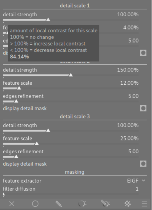
I’ve decided to use a percentage for the detail boost parameter and renamed it to “detail strength” so that it is maybe a bit more intuitive that 100% means vanilla strength of the detail and 0% means it is muted. The primary reason to not chose [-1, …] scale is because although having 0 as neutral is beneficial, having -1 as bound for muted detail is counterintuitive, especially as the possible positive values can be almost arbitrarily high.
There are now useful default feature scale values. Scale 2 still has default 150% detail strength because this provides a nice clarity-like effect that immediately pops out when activating the module.