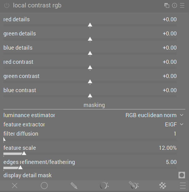
Experiments with a scene-referred local contrast module - proof of concept

D&S controls are quite cryptic indeed. The focus on the physics of the diffusion process is a bit removed from what one is trying to achieve with it.

But regardless, for me the main limitation of D&S is the computational overhead that it introduces. Contrast equalizer (and the variants in this thread) respond almost instantly. With D&S, this is not the case (for my M4 pro, at least, which anyways is a very performant platform).

[Edit: @s7habo beat me to it]

5 Likes

Hey Hans 

did you get it working on your machine ?
If so 
 what did you do !!

Cheers Andreas

Thanks for clarifying.

True. Works well on my desktop workstation with a meaty GPU, but less well on my laptop.

1 Like

And another important factor keeping me from using D&S for local contrast is the fact that you always need the high quality preview enabled to get an accurate preview of the results for almost all settings / presets that modify local contrast.

11 Likes

new module

local contrast, d&s, contrast eq etc


i made some other changes

No, I did not. It was the same file as the first time. I just didn’t bother anymore since the mac isn’t an important machine. I have it on my Linux laptop.

At least in the gull example, the problem is that the local contrast stops being increased in a halo around the subject (the difference mask displays a black halo), not that we add a halo around the subject to boost local contrast (the difference mask displays a non-black gradient halo).

I think that using the slider value as a exponent, 2^{slider}, would do the trick for centering the UI around zero. -1 would map to 0.5 and +1 to 2 in that case so we half och double the effect with the same step size in both directions. Easy to make a percentage as well.


I would also like to make a counter proposition to the internal module duplication by instead testing color based control of the detail/contrast effect. I think its important to remember that complexity can grow over time with new perspectives and its therefore better to keep a module as simple as possible. Take into account that edits has to be possible to open years from now!

I made a quick implementation based on earlier experiments I haven’t shared before where the effect is calculated from the normalized weighted sum based on those sliders. Imagine a plane being held by three pillars of the sliders value as their heights. Code here: GitHub - jandren/darktable at local_contrast_rgb

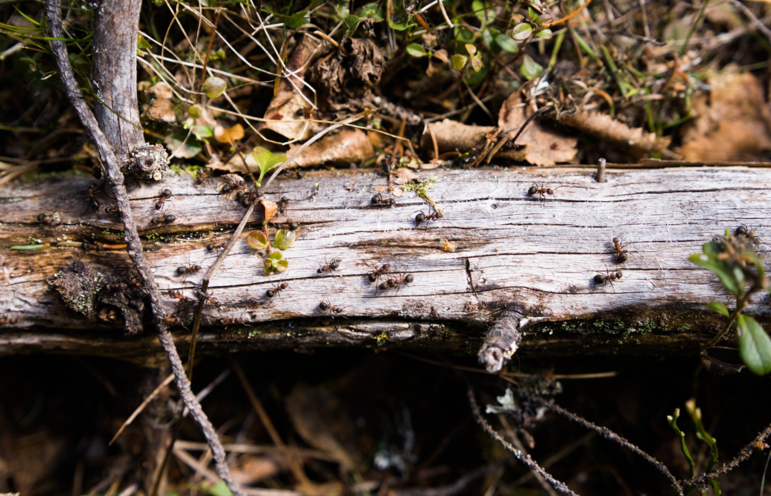
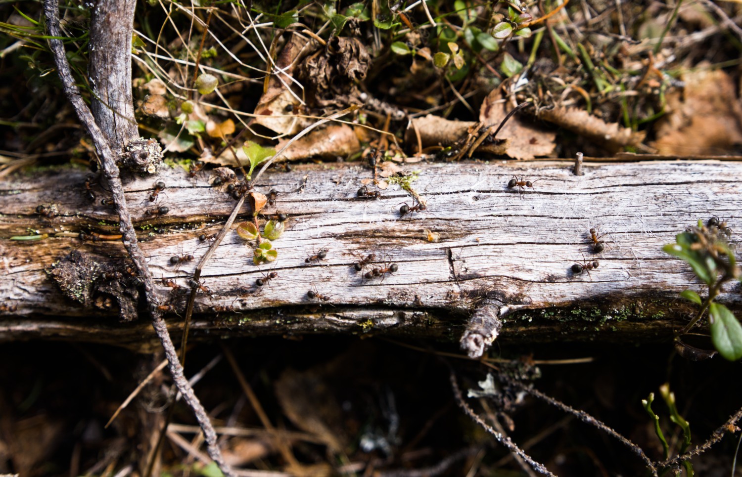
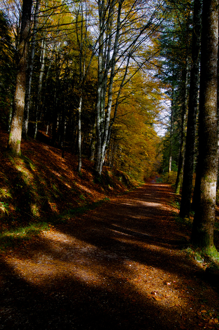
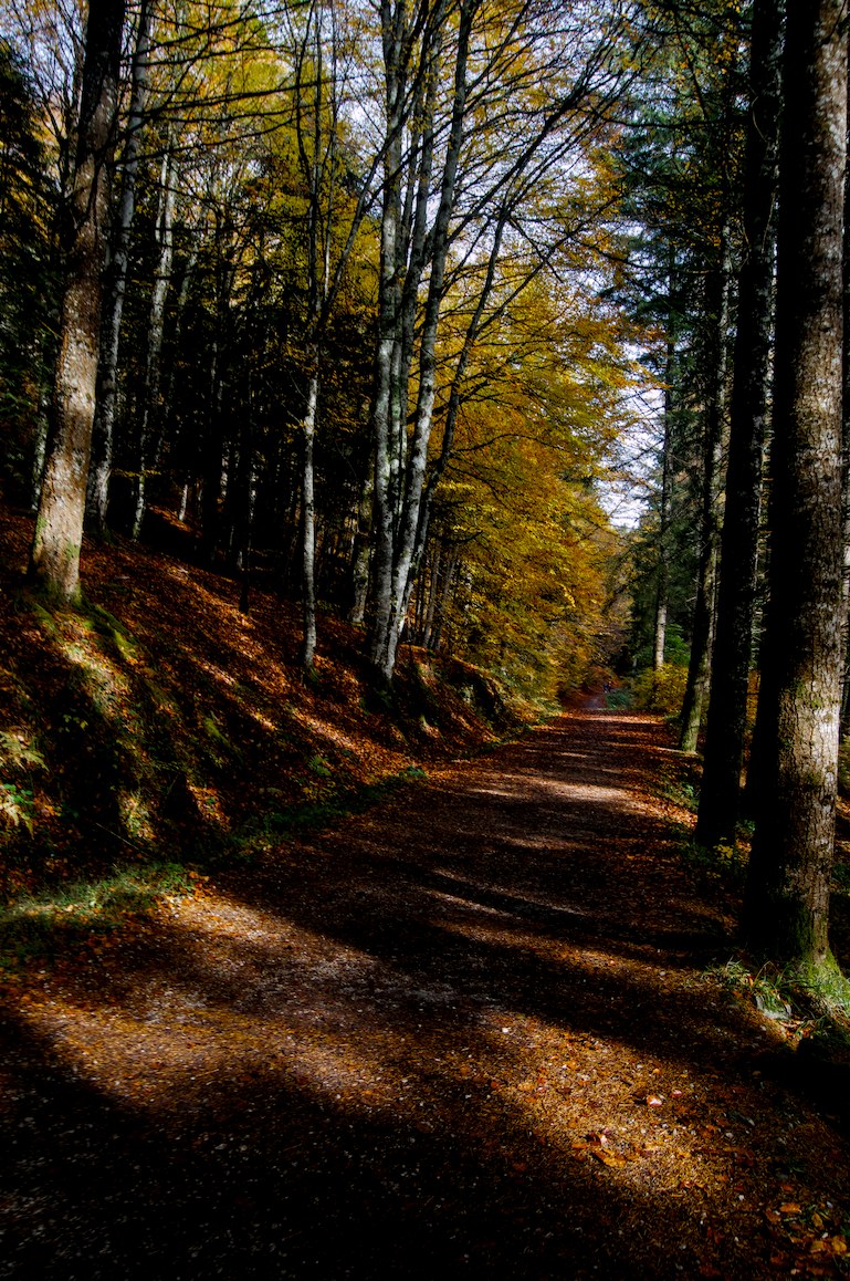
Here are some example images with my version of the local contrast rgb on/off.

Ants: Increase blue details, decrease green.
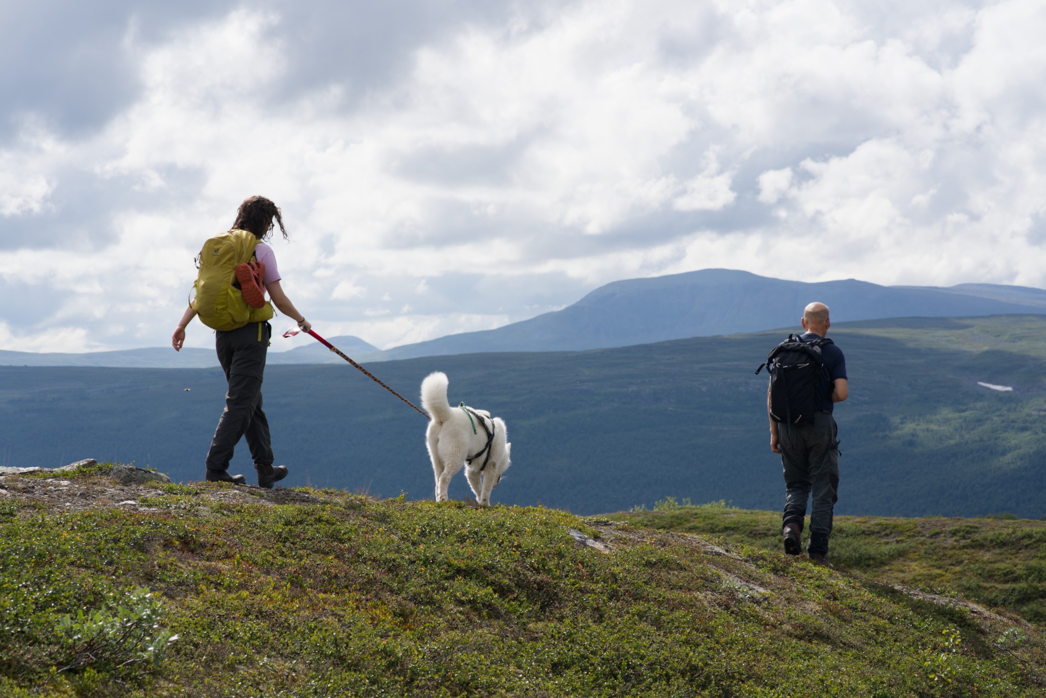
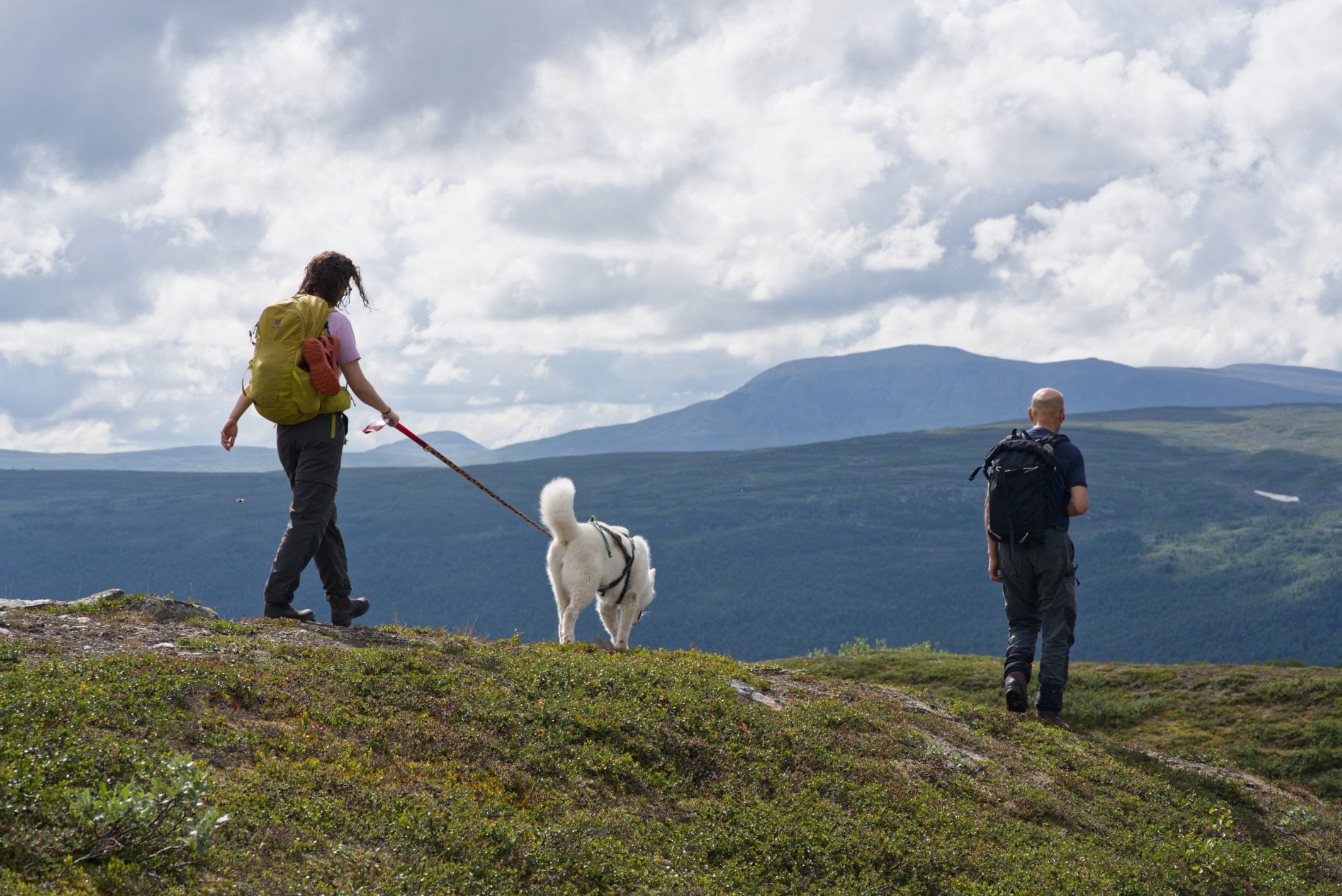
Hike: “HDR” on blues i.e. reduce contrast and increase details. Compensate green to stay untouched.
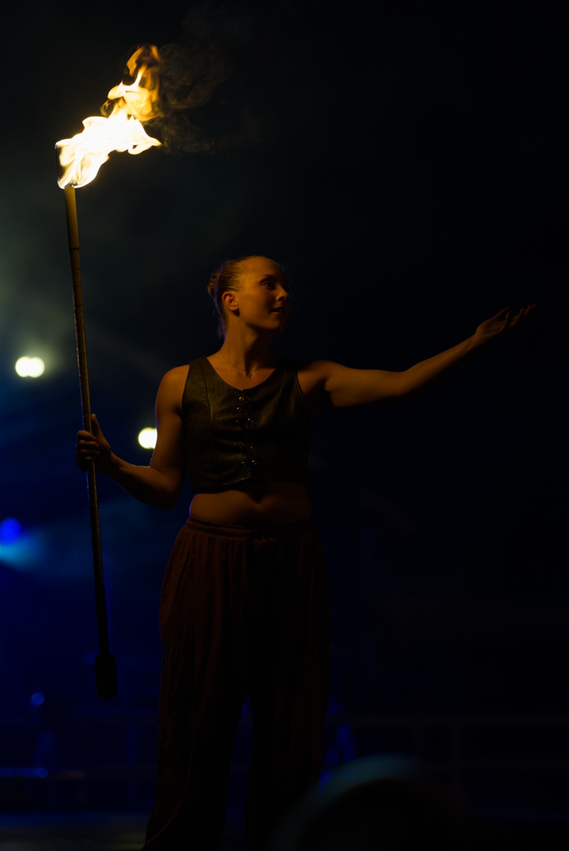
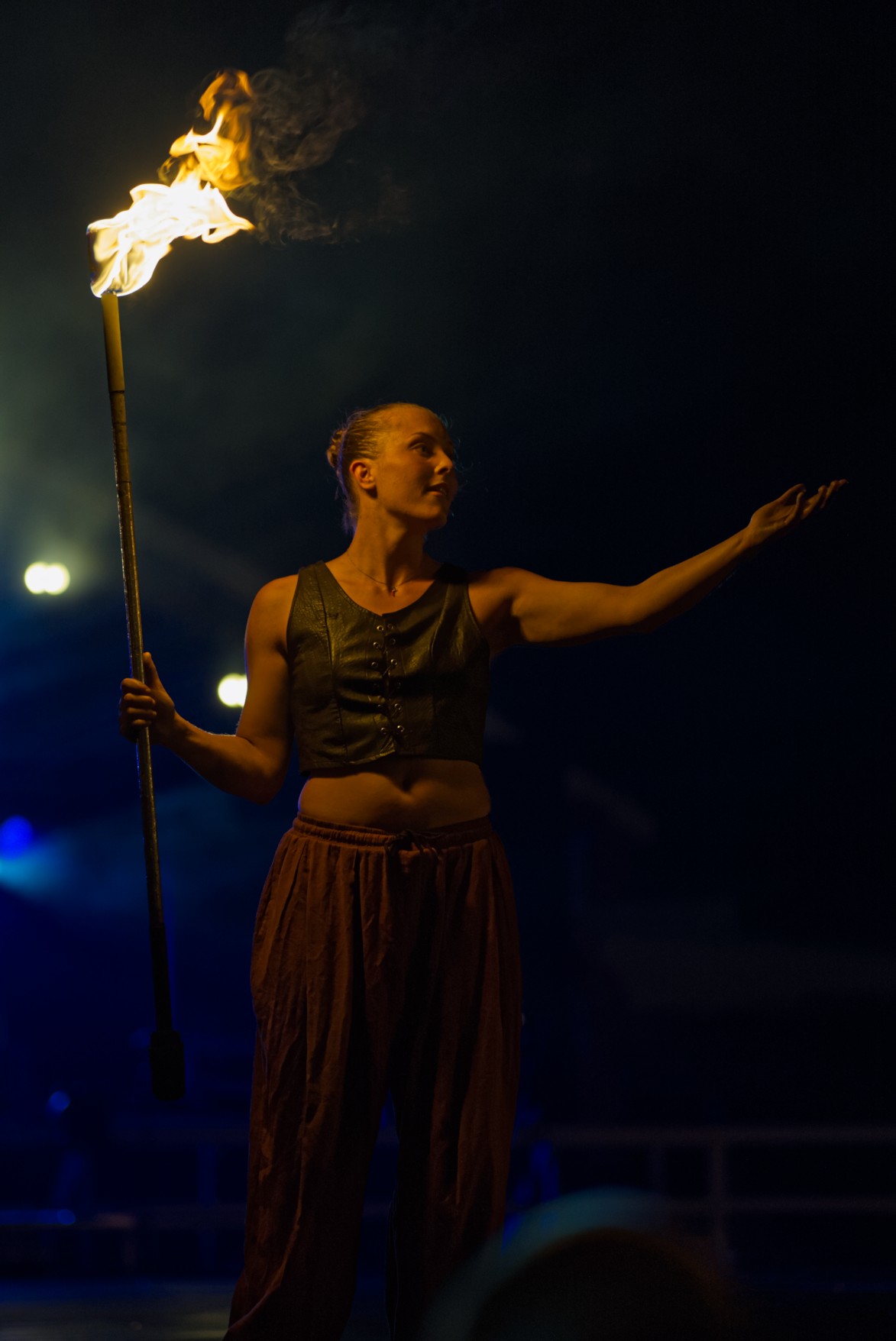
Fire: “HDR” on red, keep blues!
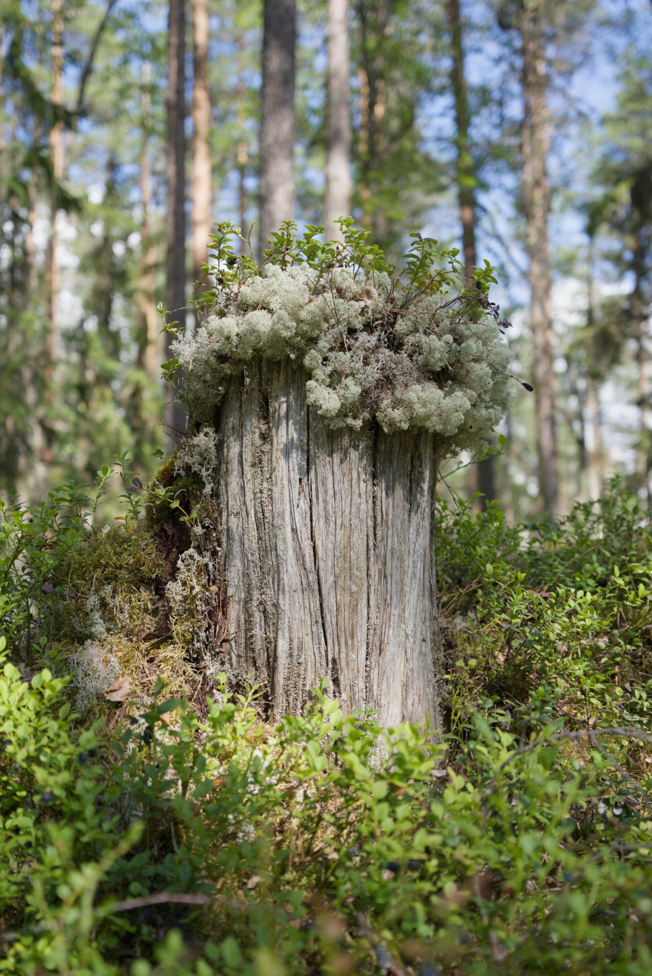
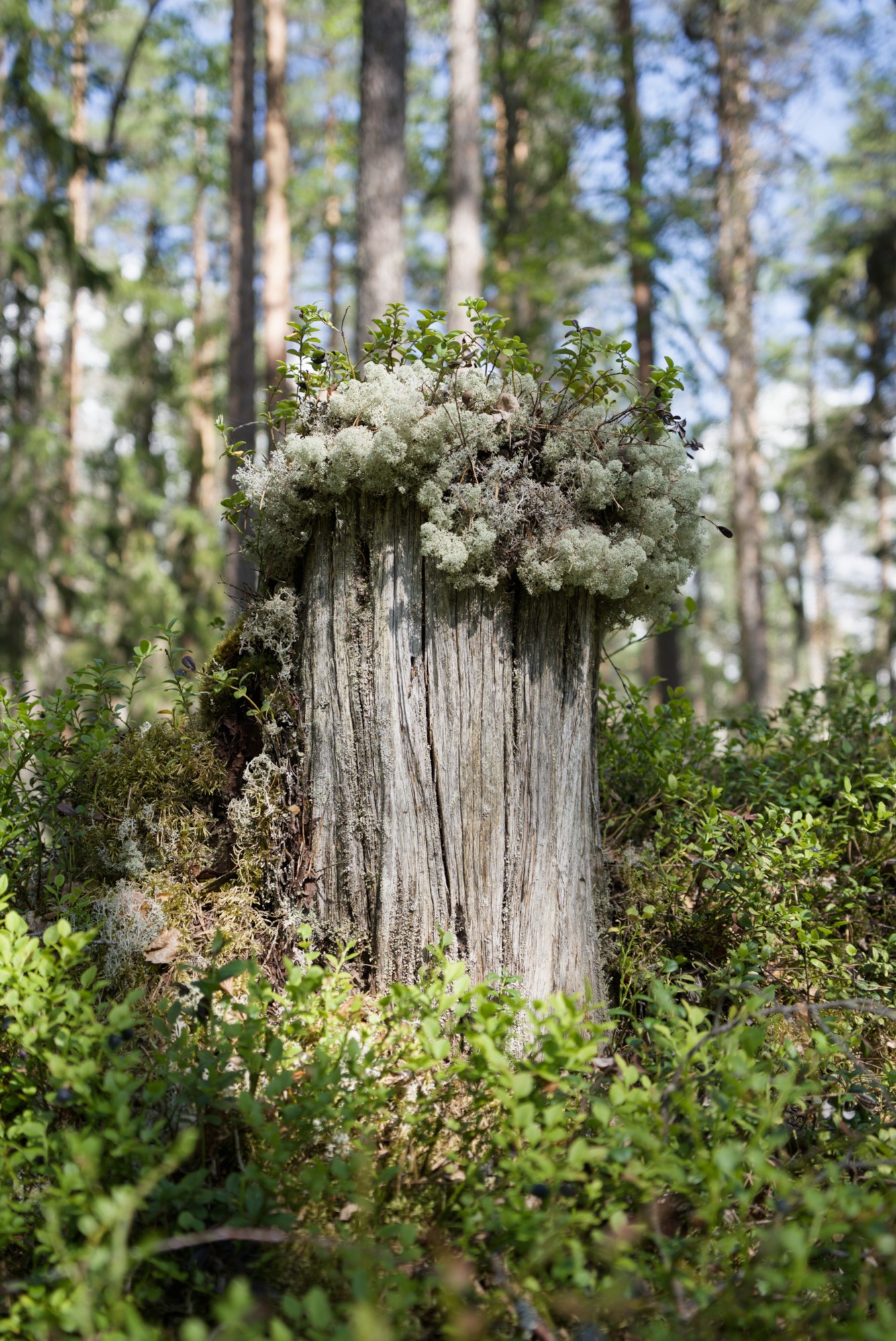
Tree stub: Mute contrast and details in greens, push the rest.
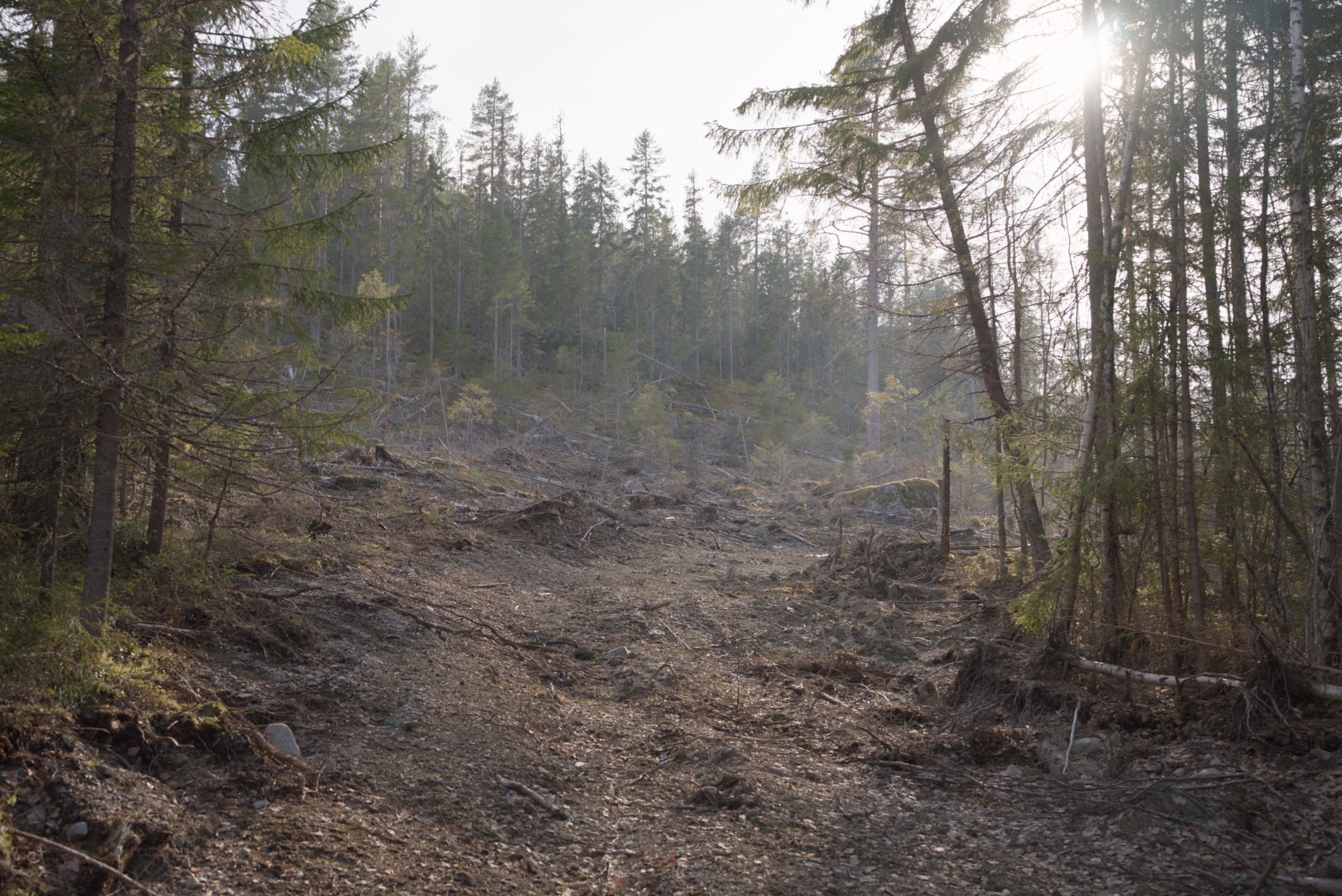
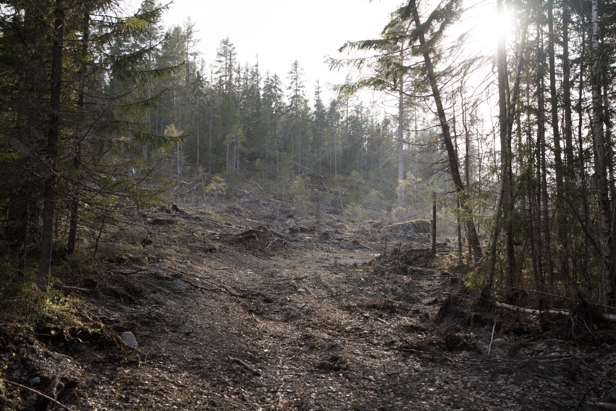
Clear cut: Push reds more than the rest.

I rely on the contrast/saturation trick by adjusting my per channel tone mapper (sigmoid/agx) to a saturation I like and then use this module to tune in the contrast. Its a surprisingly pleasant way of both increasing and decreasing saturation!


Can’t say I’m 100% sure about having to adjust R + G + B to just get a normal effect but its also a fun type of control when possible to exploit. Mostly wanted to give a hands on reason to keep the module simple to begin with so that new things like this may be added in the future!

11 Likes

That’s an interesting approach.

Any chance of appimage to test it?

1 Like

Is this a sort of reverse gradient. The kind the edges adjustments are used to correct on the contrast eq??

With local contrast I feel the goal is often to further separate the foreground and background. Since the foreground typically has finer details, the wavelet/level approach works quite well for this. But I can see the contrast by colour approach working very well when there are distinct colours in foreground and background. Eg. The hike and fire images.

Might it be possible for the final implementation to incorporate both? An option at the top of the module to select either contrast by colour, or contrast by wavelet/level. Then the user could use either, pending what worked best for the scene.

Hello,

There you go, I’ve finalized the customization and merging of the two approaches.

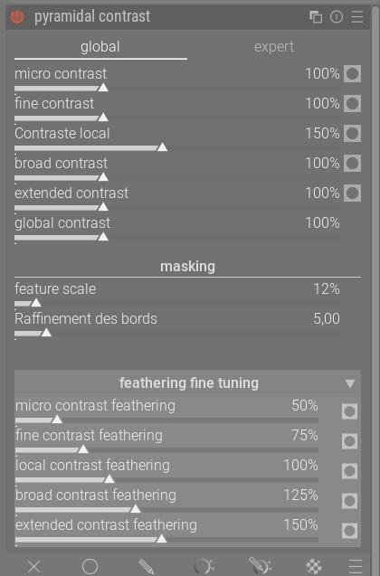
To ensure long-term maintainability and absolute code clarity, parameters are divided into two logical “namespaces”:

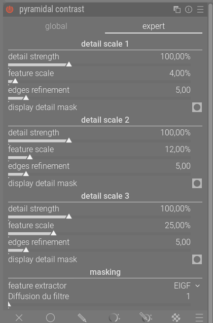
pyr_ = Global (pyramidal)
exp_ = Expert

I believe this configuration allows for a clear separation between signal processing logic (pyr_) and user-defined adjustments (exp_). By isolating these two layers, the module becomes more robust: any future updates to the expert controls can be implemented without risk of regression in the pyramidal decomposition.

For now, I’ve kept the module name, but I don’t think it’s the best way to describe this module.
@wilecoyote, we also need to define the default values when the module opens and the order of the tabs.

EDIT:

Here is the latest appimage, I’ve also incorporated the latest version from @jandren and GitHub is synchronized with both versions

https://drive.google.com/drive/folders/1zahcvlAyaN03L1VmX5esOOyhBkO8jiko?usp=sharing

Have a nice day,
Christian

3 Likes

Thanks a lot, @Christian-B and @Wilecoyote!

My 2 cents about the merging of these modules :slight_smile:

  1. I would name the module just “contrast RGB” as it what both variants do
  2. I would rename the tabs to “pyramidal” (or global) and “per-scale”, cause the main difference is whether some of the controls affect all the scales or just one.

Besides, maybe we can do without the tabs and still have the best of both worlds.

IIUC at the moment the only differences between the two implementations are:

  1. The layout of the controls
  2. Pyramidal has global scale/refinement controls, whereas per-scale has it per scale
  3. Pyramidal has per-scale feathering, whereas per-scale doesn’t.
  4. Pyramidal does not expose the feature extractor, whereas per-scale does

While (1) is a matter of preferences, I would say that (3) is a win for Pyramidal, and (2) and (4) are wins for multi-scale. A win in this case is the ability to have more control over the results when this control is needed.

I thought a bit whether there is a better way to unify the UIs while leaving maximum flexibility instead of going the tabs way, and this is my proposal.

  1. Add a combobox or a slider to specify the number of detail levels (e.g., 1-5). Let’s call this N (it could default to 1, for simplicity).
  2. Add a checkbox (titled per-scale controls) to select between global (unchecked and default, because it is simpler) and per-scale (checked). Ideally, the checkbox would show up only if N > 1.
  3. If global is selected, then you have N strength sliders, and a unique panel at the bottom to set scale, feathering and refinement for all scales at once.
  4. If per-scale is selected, then you have N groups of 4 sliders, i.e., (scale, strength, feathering, refinement) for each detail level.
  5. At the bottom of the panel, you have the option to configure the feature extractor.

With this setup, with N=5 and global the controls would look like Pyramidal.
With N=3 and per-scale they would look like per-scale (i.e., currently the expert tab).

As an example, for N=2 and global, the controls would be:

  • strength1 [mask]
  • strength2 [mask]
  • –
  • (global) scale
  • (global) edge refinement
  • (global) feathering
  • –
  • (global) feature extractor

Instead, with per-scale enabled the controls would be:

  • strength1 [mask]
  • scale1
  • edge refinement1
  • feathering1
  • –
  • strength2 [mask]
  • scale2
  • edge refinement2
  • feathering2
  • –
  • (global) feature extractor

Actually, the feature extractor could also be modified per-scale. So, another possibility would be to include it at a per-scale level when the “per-scale” checkbox is selected.

In terms of implementation, one could always have N_{max} * num\_controls logical values. Toggling the checkbox or changing the value of N would just affect how the UI is rendered and how their values are computed from the visible controls.

A nice thing of this approach is that the complexity of the UI is proportional to the complexity of what one is trying to do, and for N=1 the interface would be very simple.

WDYT?

Edit: I had written the post above before considering also @jandren’s version. There could be another control switching between wavelets and color channels, or it could go in another tab. However, I find this interpretation different enough from the other two to be better suited for a different module (e.g., color contrast rgb).
3 Likes

My feedback on trying the local contrast rgb and pyramidal contrast. Both work really well, I would be happy with either. Pluses and minuses for both. The pyramidal contrast looks a neater solution and is immediately obvious to the new user, I would probably prefer this approach.

1 Like

Hello,

This is indeed an excellent approach, and one that I find complementary to the previous ones.
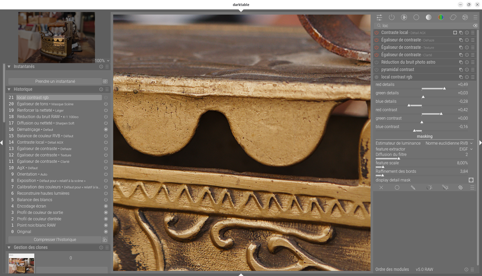
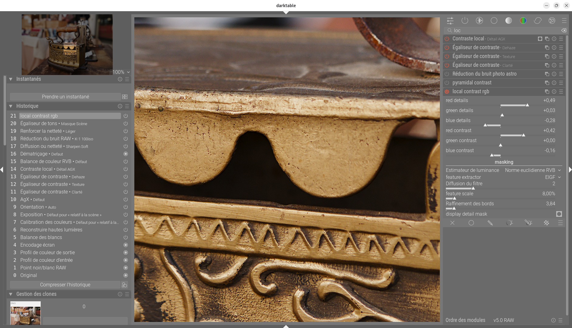
Here is a first attempt to highlight the texture of the old iron. I feel like I’m going to have some more fun with this.

Here is a 100% zoom without and with your suggestion.


@wilecoyote, @Jandren, a third tab, or am I starting to overdo it?

Greetings from Brussels.
Christian

2 Likes

Thoughts on the tabs: “pyramidal” and “scaled” feel more descriptive to me. “expert” suggests a more detailed version of the same settings from the first tab, like in tone Equalizer, which it is not.

A third tab by colour sounds fascinating but also a bit feature-creepy
?

2 Likes

it would be similar to a module like contrast eq which has luma and chroma tabs (plus a third)

alternatively a module could work on all 3 channels or have the option to work on one, then 3 instances could be used for R,G,B

1 Like

I agree with you, it’s more meaningful and you understand the function immediately. To be discussed.

2 Likes

Hello,

Thank you very much for your very constructive suggestions, which give us food for thought! Your proposal for a dynamic user interface is very interesting and certainly deserves consideration :-).
For now, and this is very subjective, I would prefer to follow an organization closer to Martin’s suggestion #204 in the “expert” tab, as it offers a clear and very ergonomic layout.
This solution would also leave the door open for integration if @wilecoyote and @Jandren wish to do so.
Have a nice day,
Christian

2 Likes

2025-11-11 215049-7746.rw2.xmp (38.7 KB)

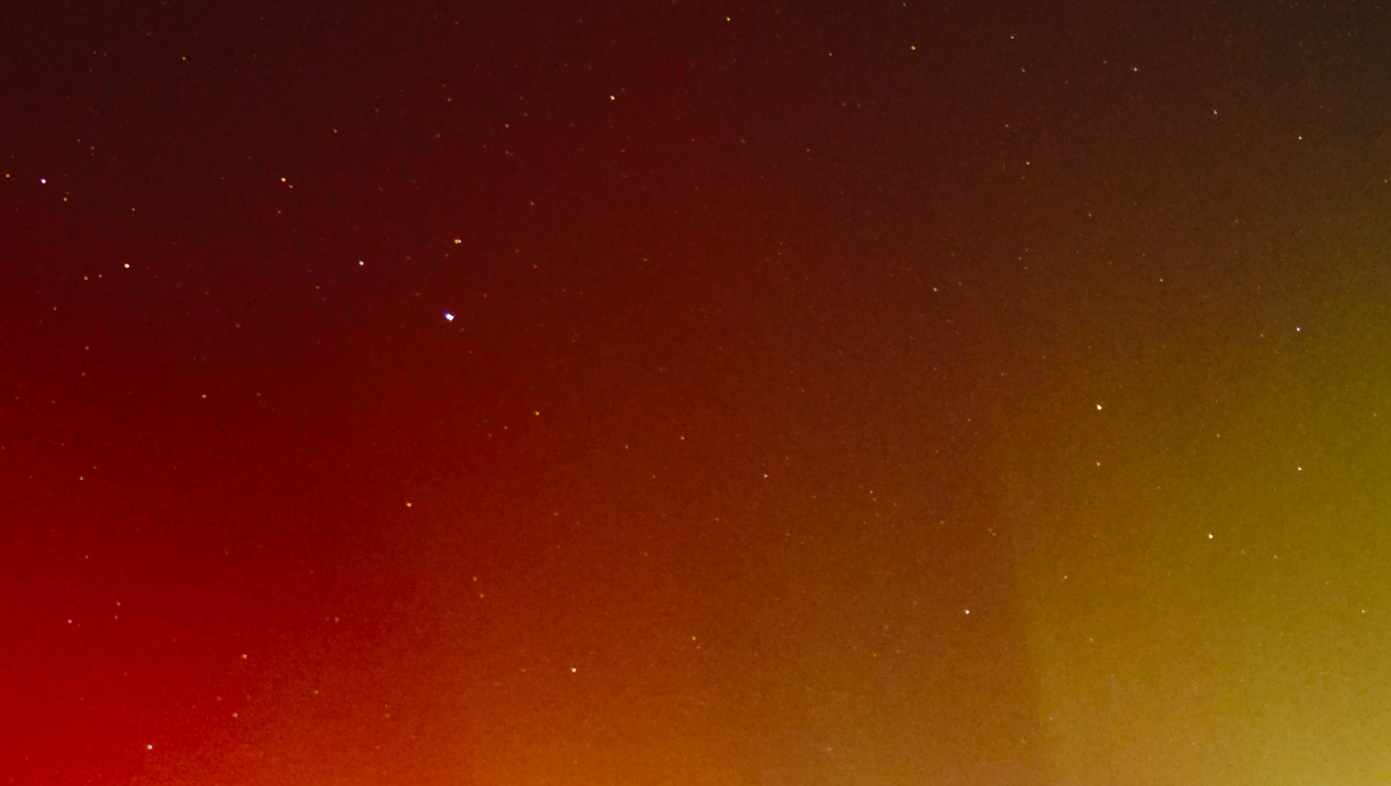
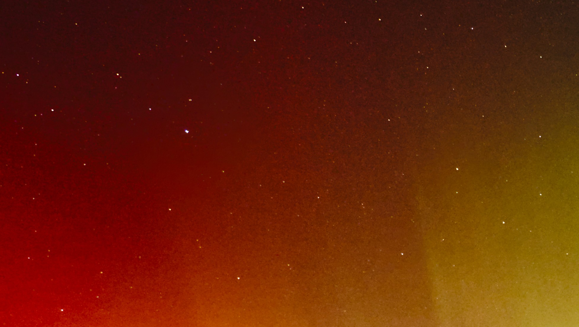
This one is quite hard to process, or at least for me. The EIGF makes visible rings around the brightest stars.

Stronger denoising creates other artifacts.

Is there a way to eliminate the smooth rings?

Without contrast enhancing:

With contrast enhancing:

1 Like