I would have to agree that the UI is complex. But I’m just a user, and not a particularly advanced one. I’ll leave UI discussion to others.
In my experience, temp and tint work best under natural lighting conditions. Indoor lighting is tricky.
My example from Lot of colour inside the Prince-Abbot's Residence in Kempten
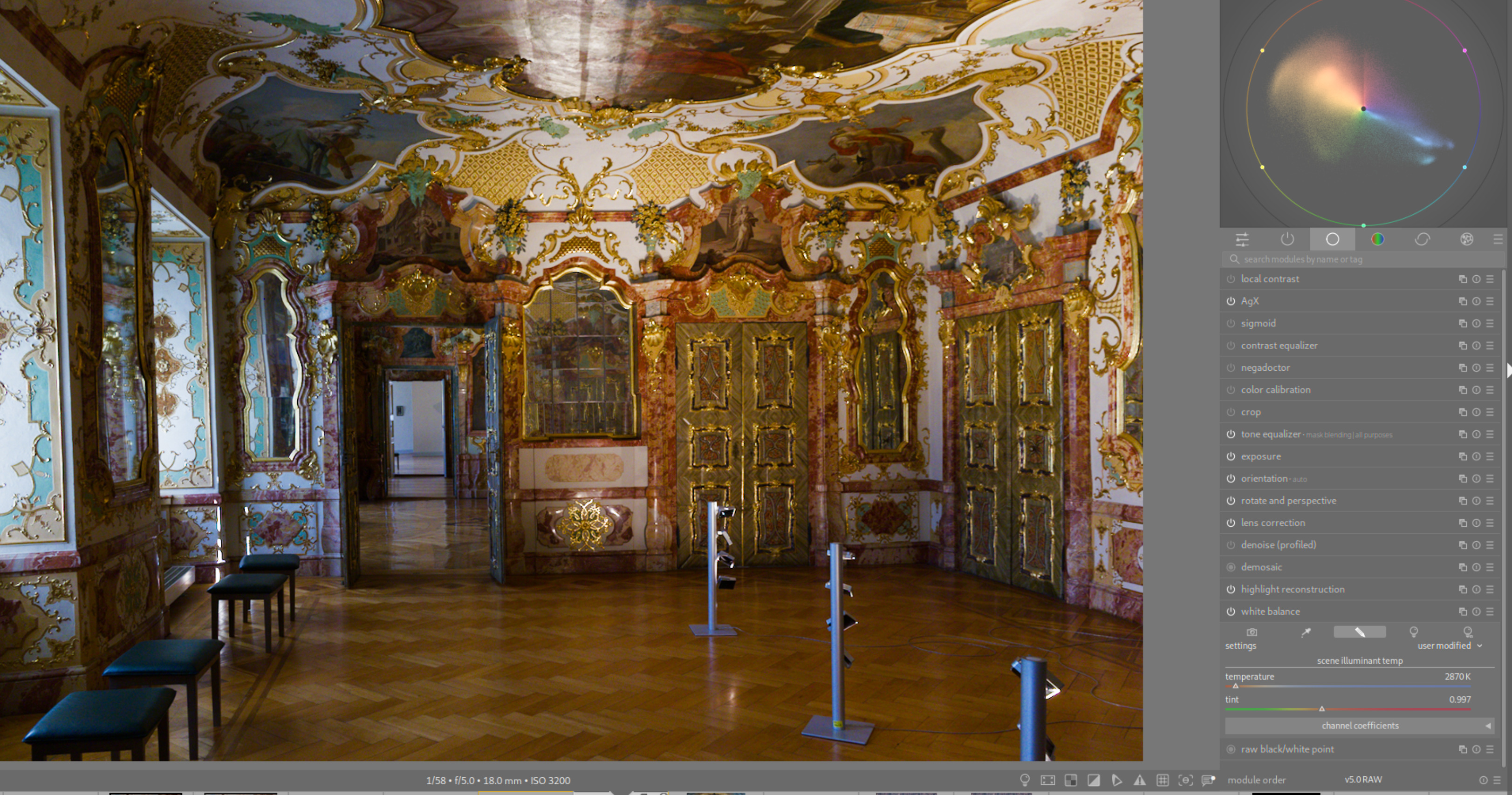
Custom WB, no CAT. “Best effort” prior to comparing to CC module output.
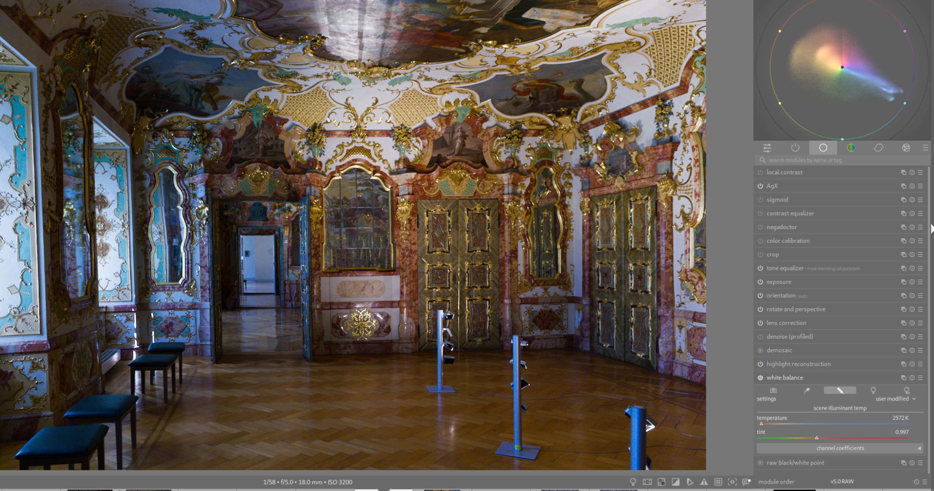
Move temp illuminant slider toward red. Pushes vectorscope diagonally. Toward blue moves color diagonally the other way.
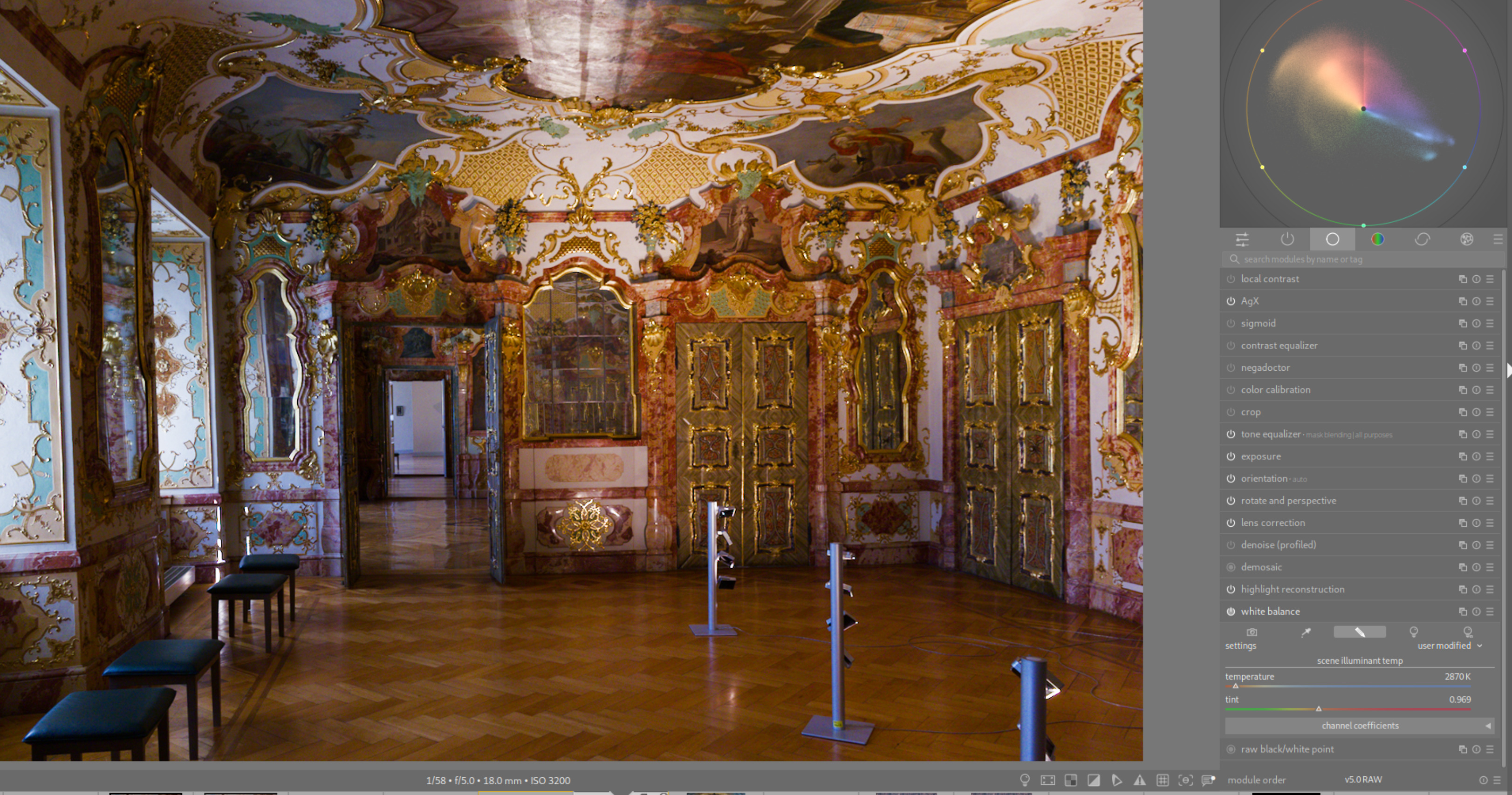
Reset color temp, move illuminant tint toward green. Small changes move vectorscope approx 90 deg to temp.
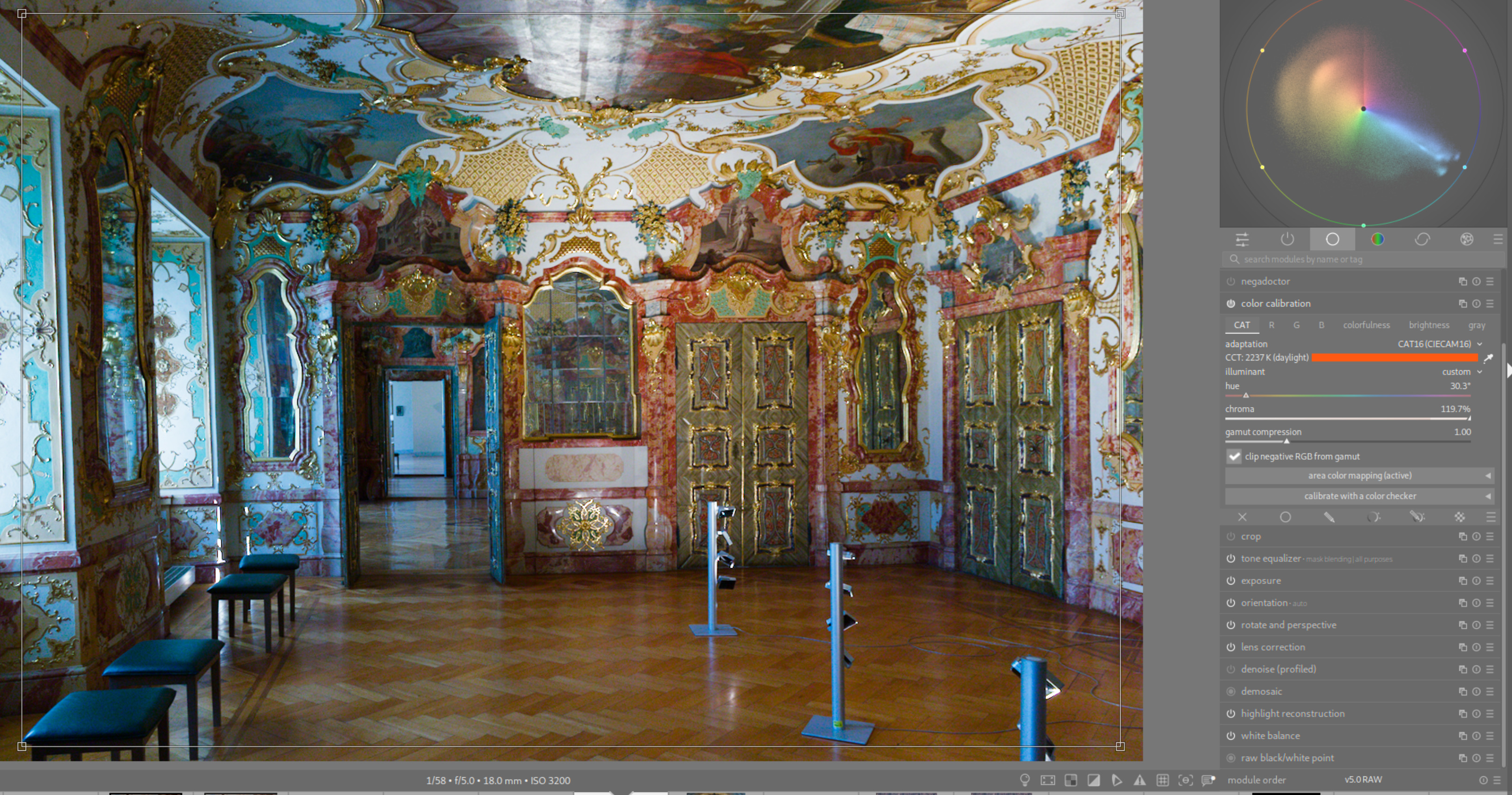
Now WB to “as shot to reference,” CC to custom using the picker. More color appears in the image and vectorscope. Note high chroma.
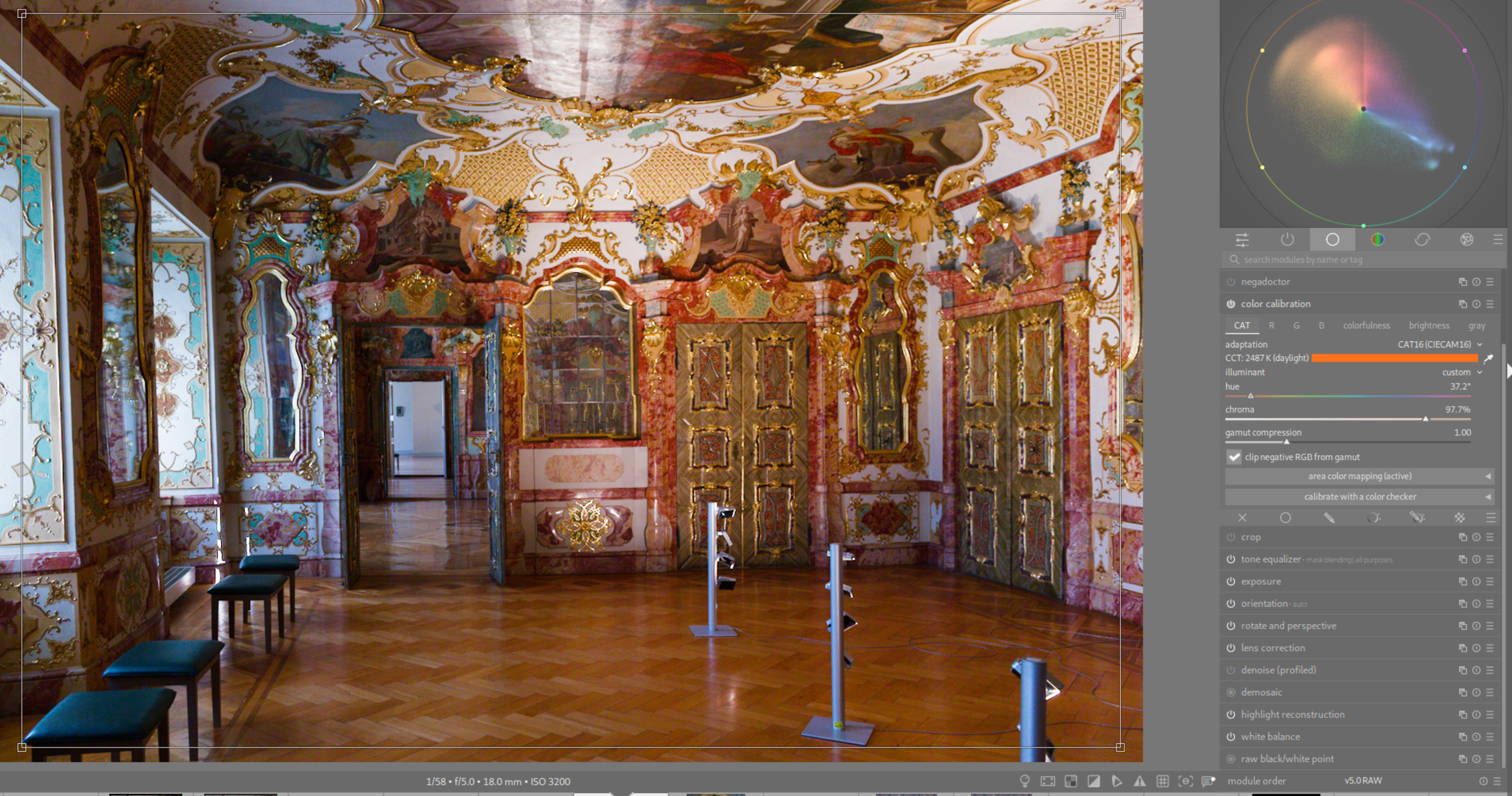
Warm things up a bit – moved chroma down, hue toward blue (moves vectorscope similarly to tint in this case).
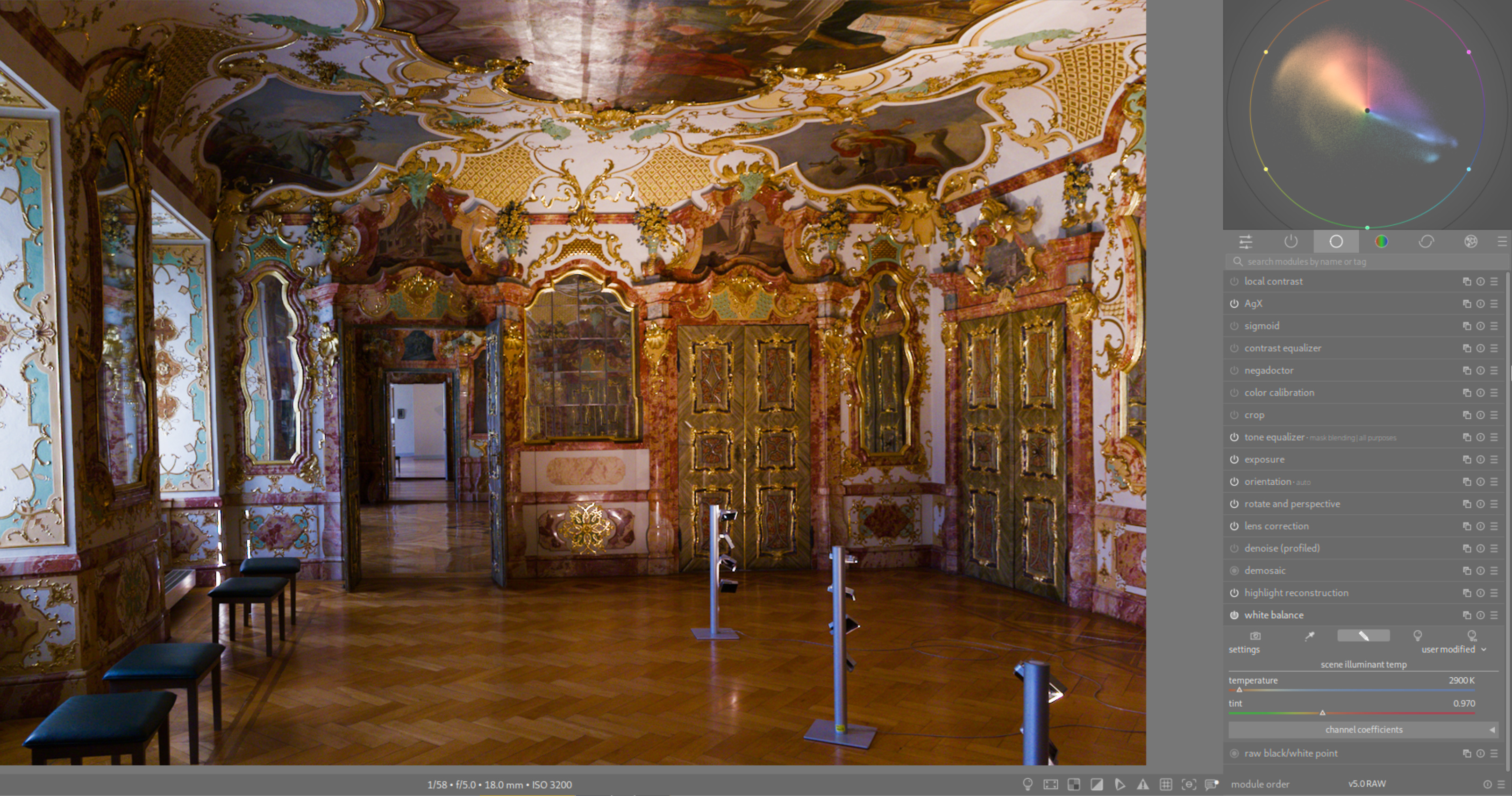
My attempt to match using only WB. Colors on scope are “tighter.”
Of course, there are other color tools in dt, and one can start here and make a number of changes to colors. My preference is to select what I think is a balanced and “natural” image (unless there is a good reference in the image), then move on to more creative edits.
If you prefer things another way, that’s fine. There is more than one way to a good edit. 