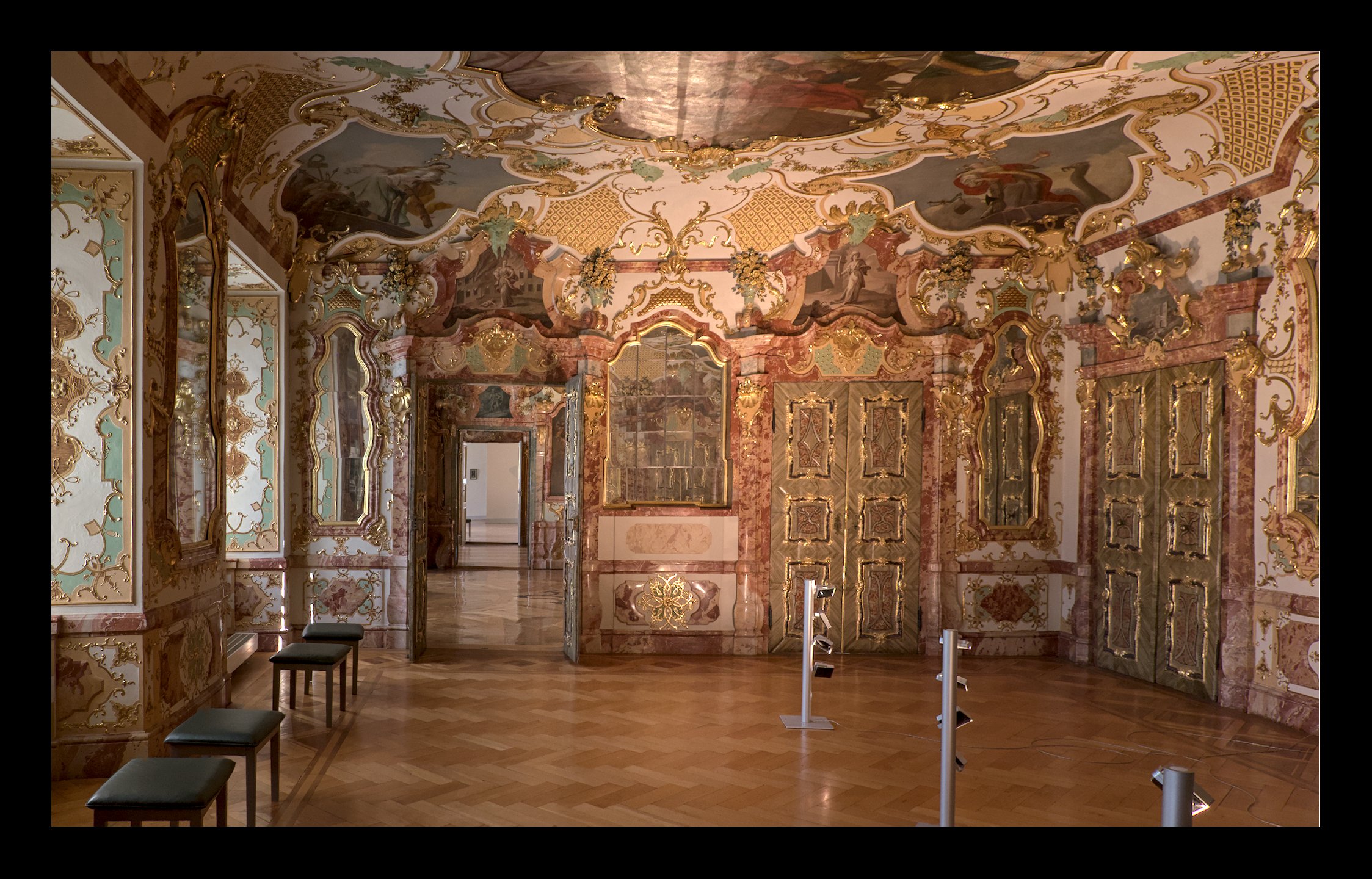
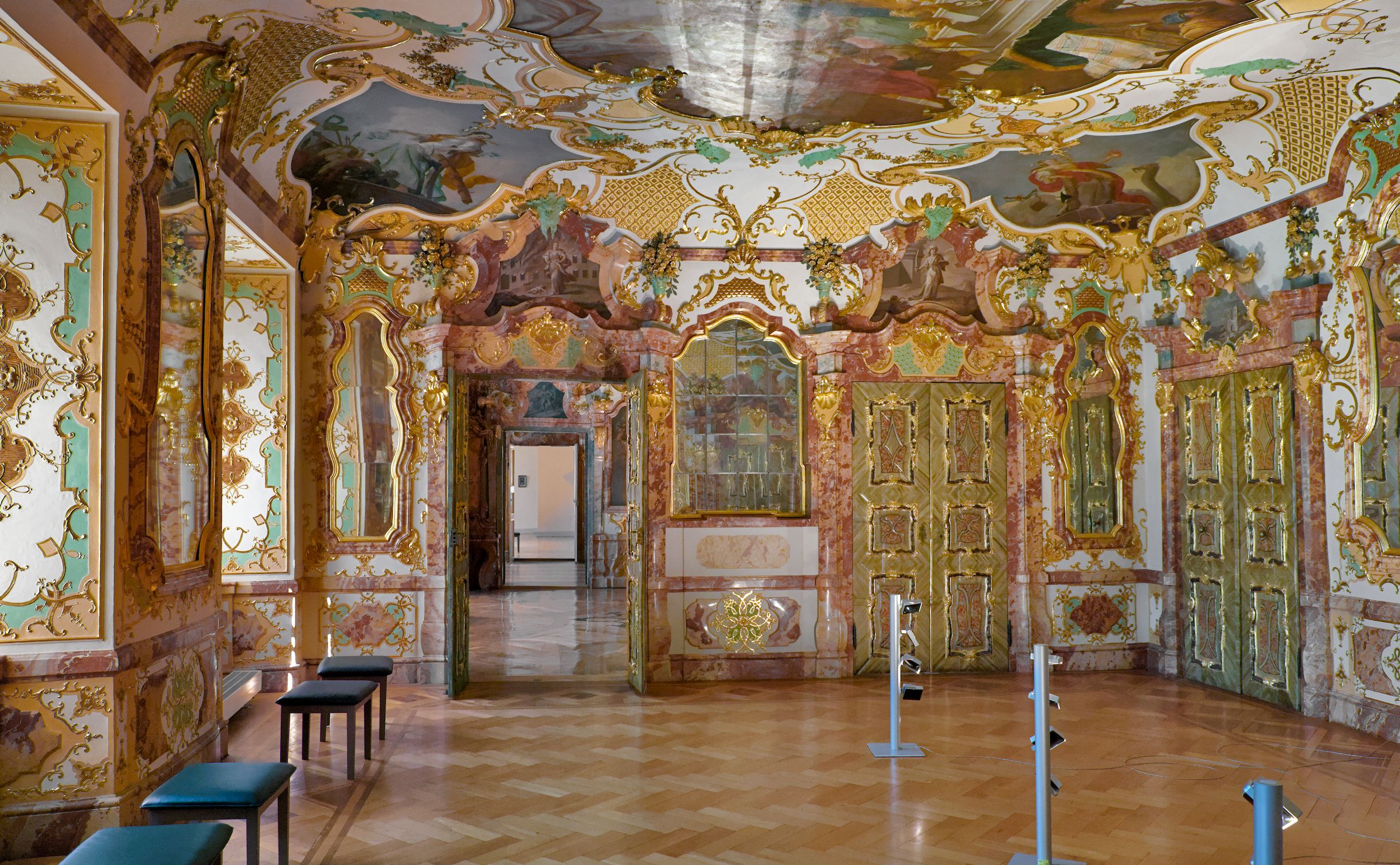
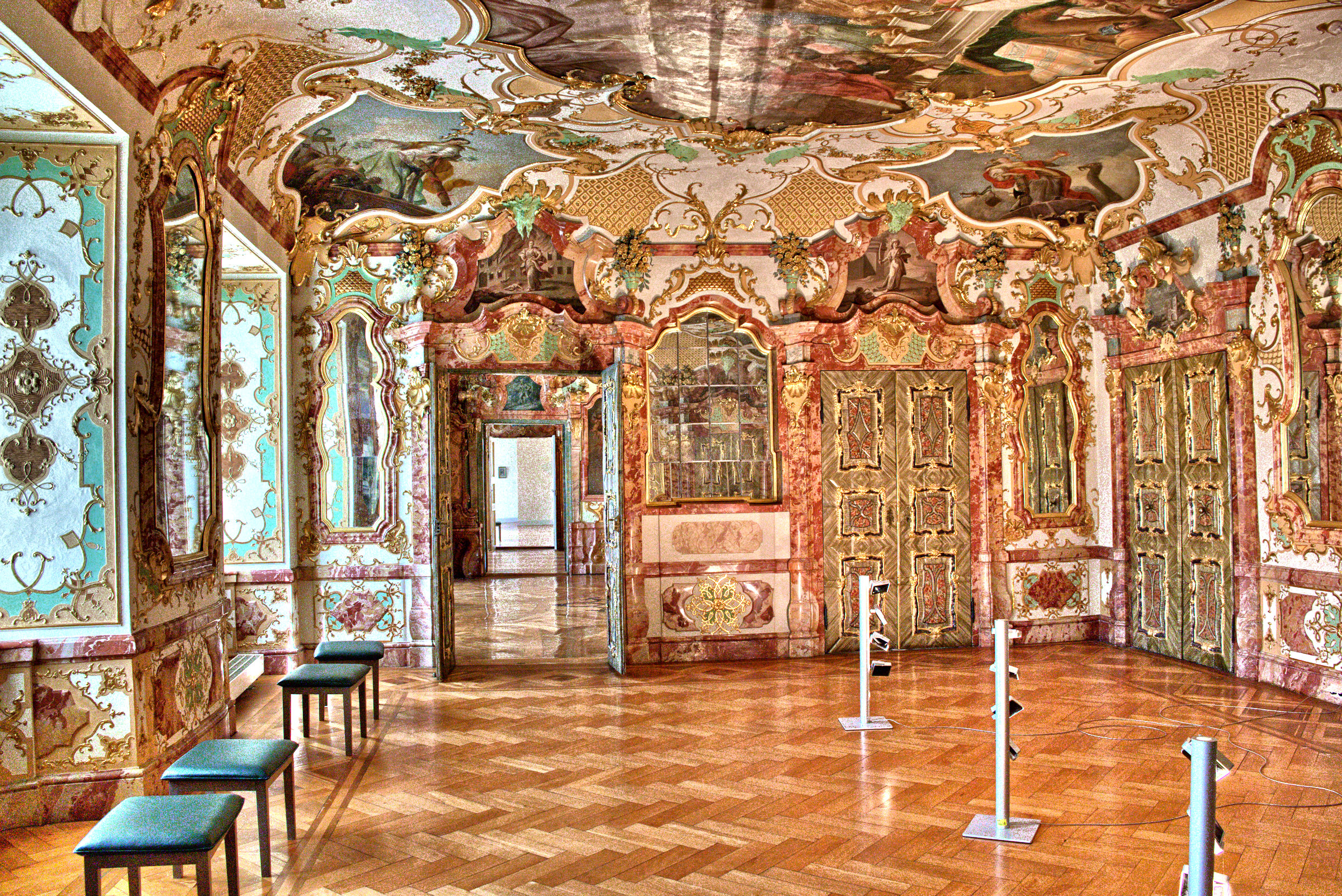
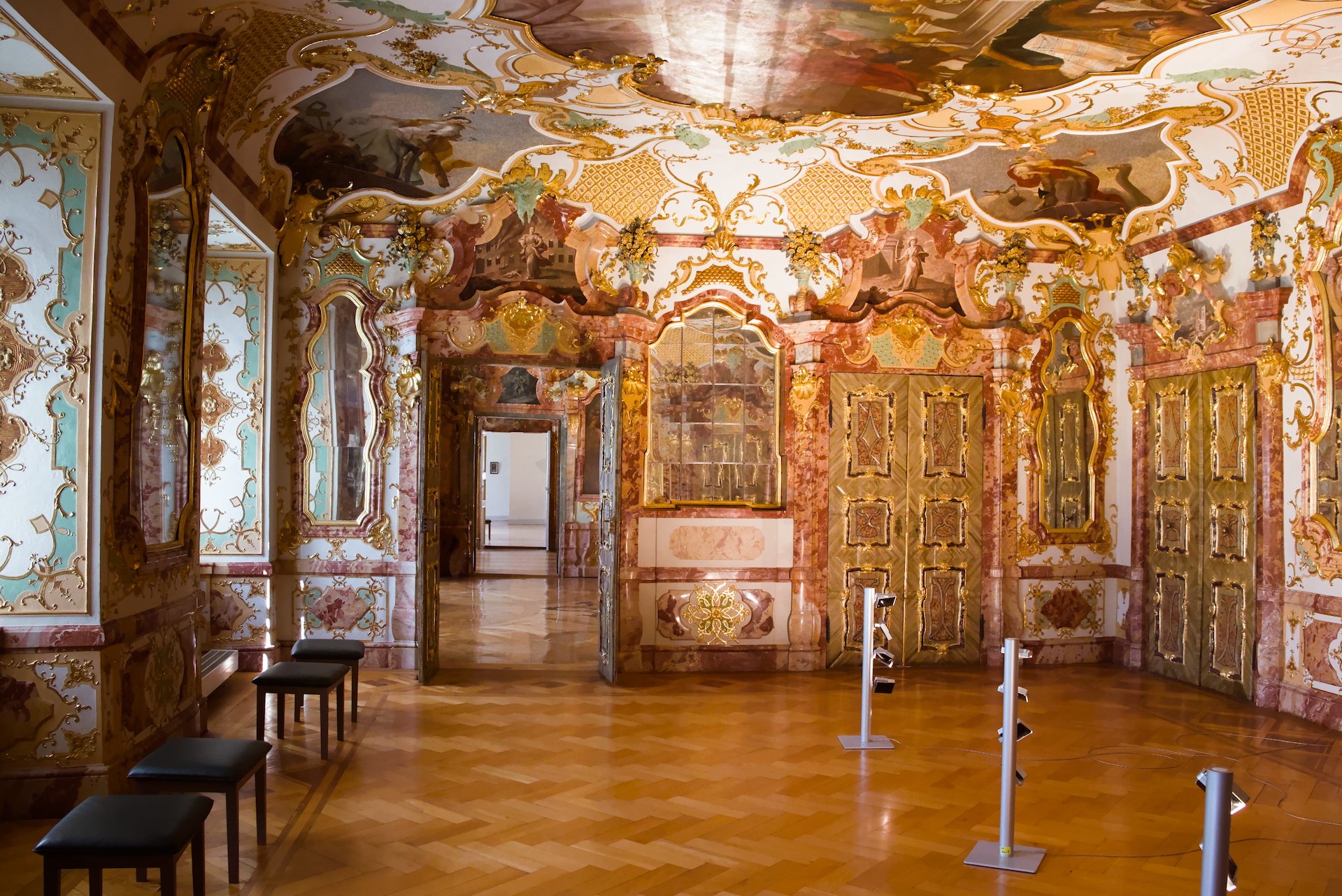
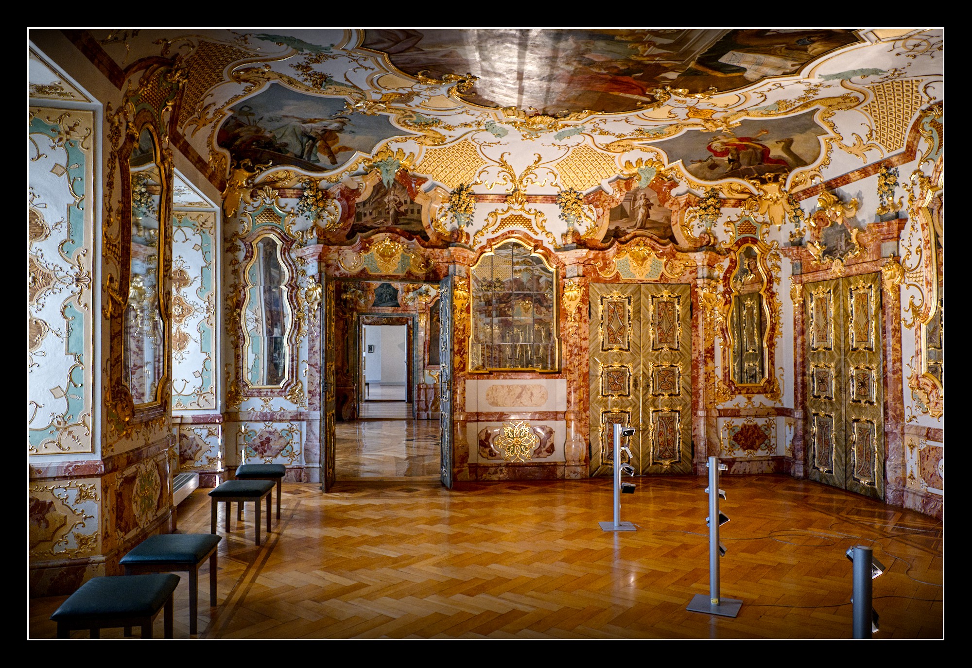
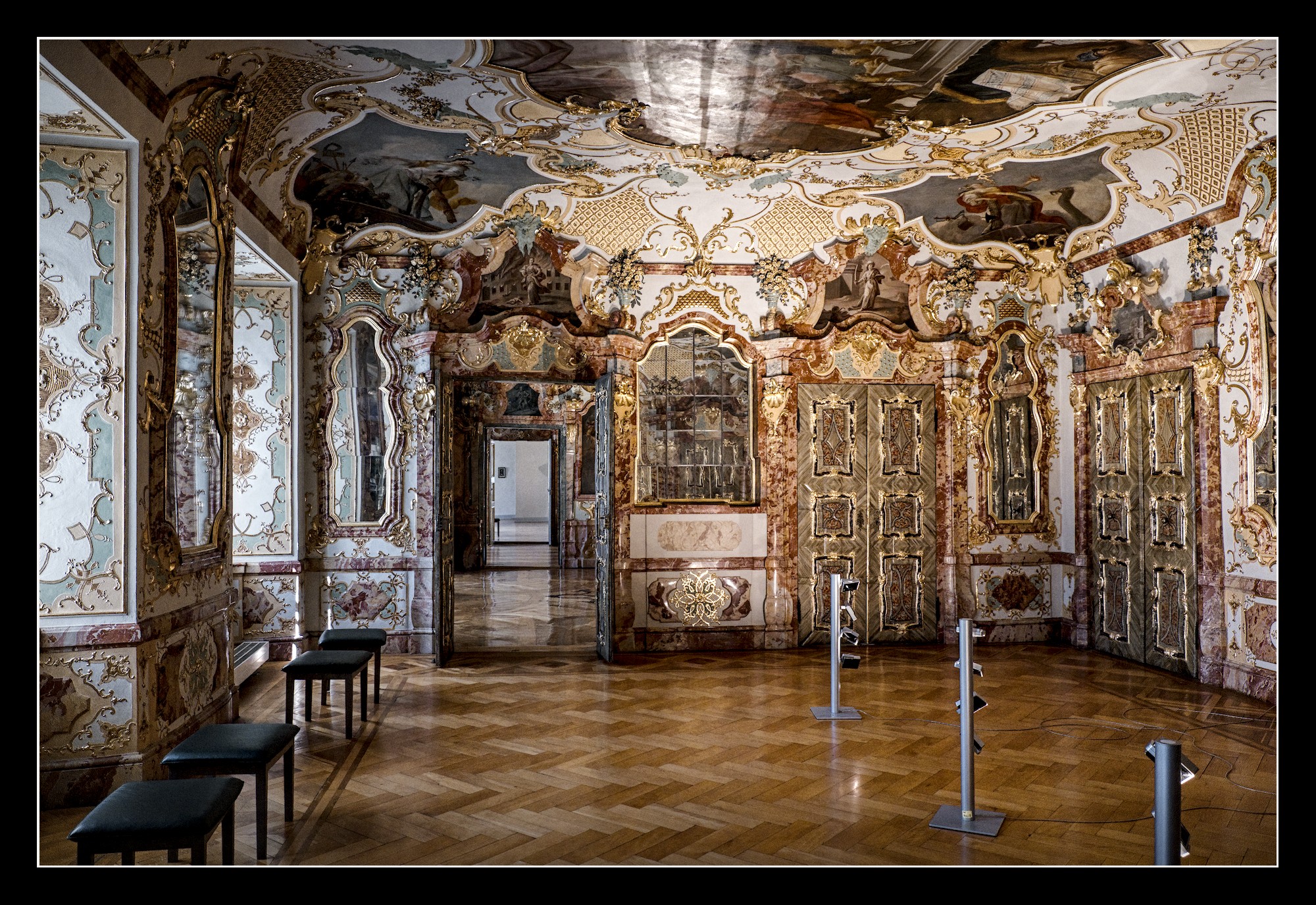
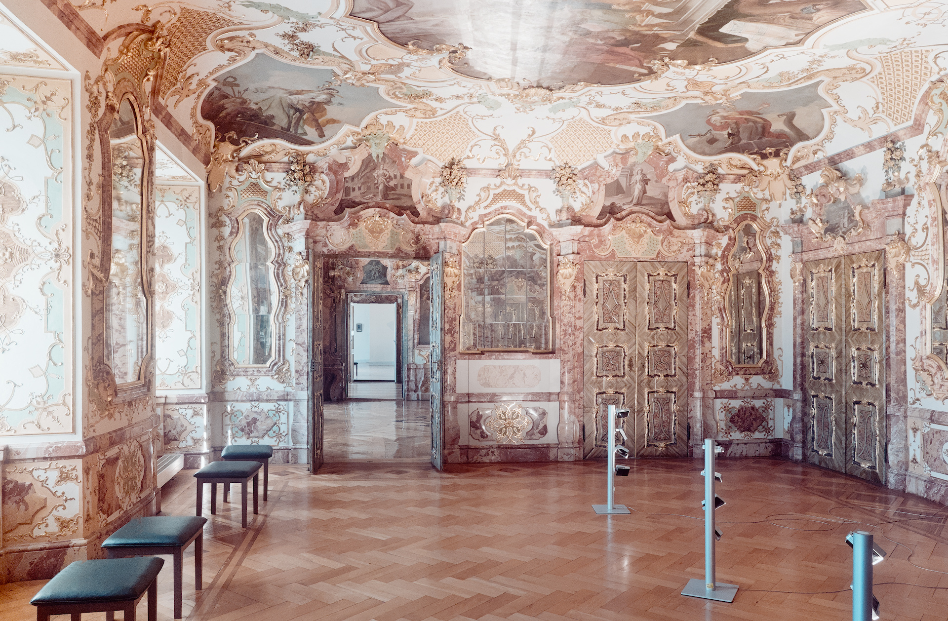
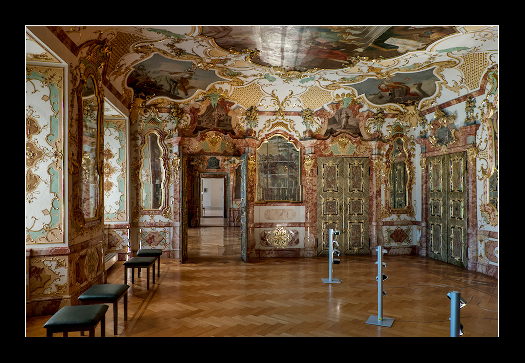
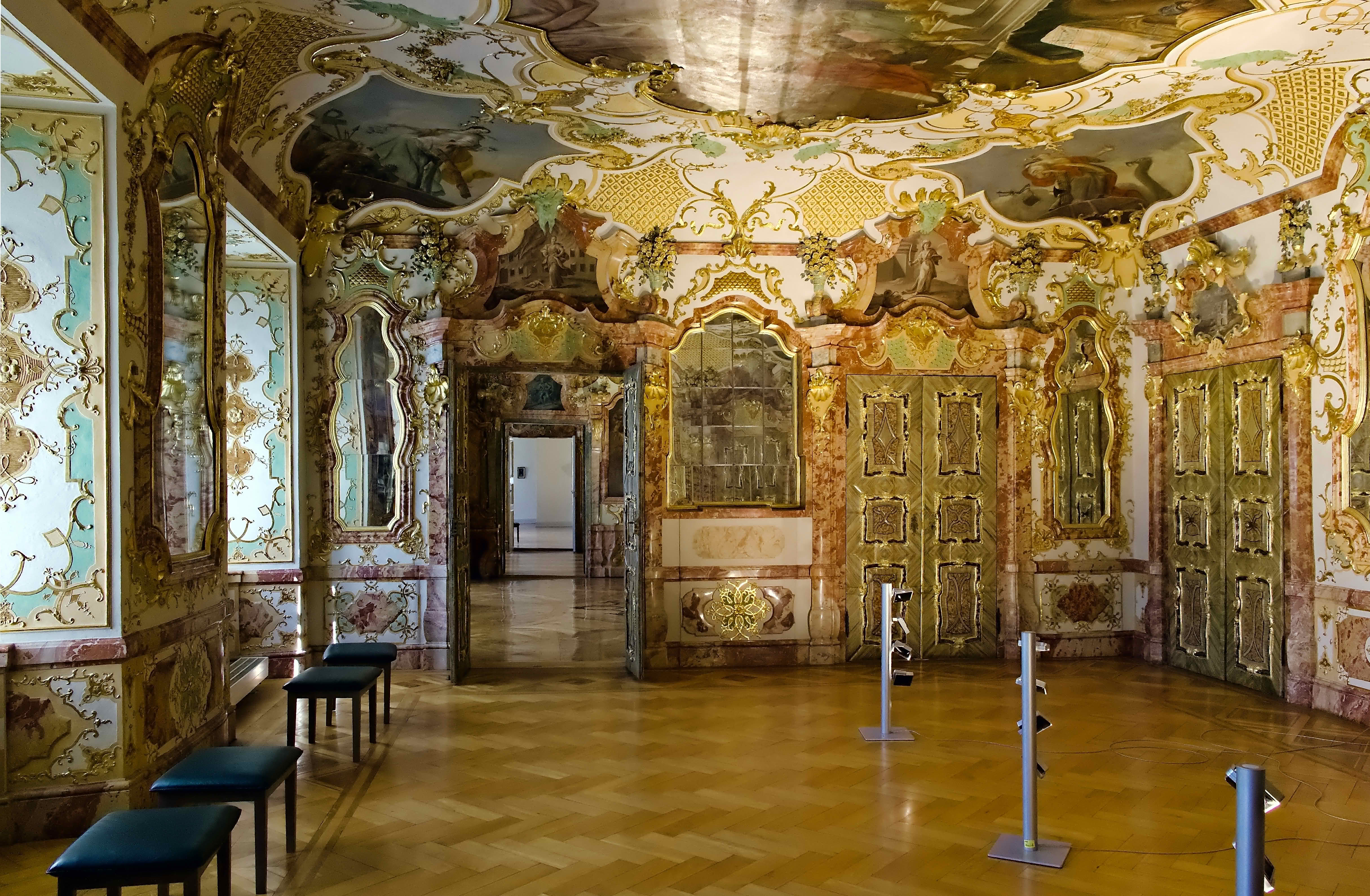
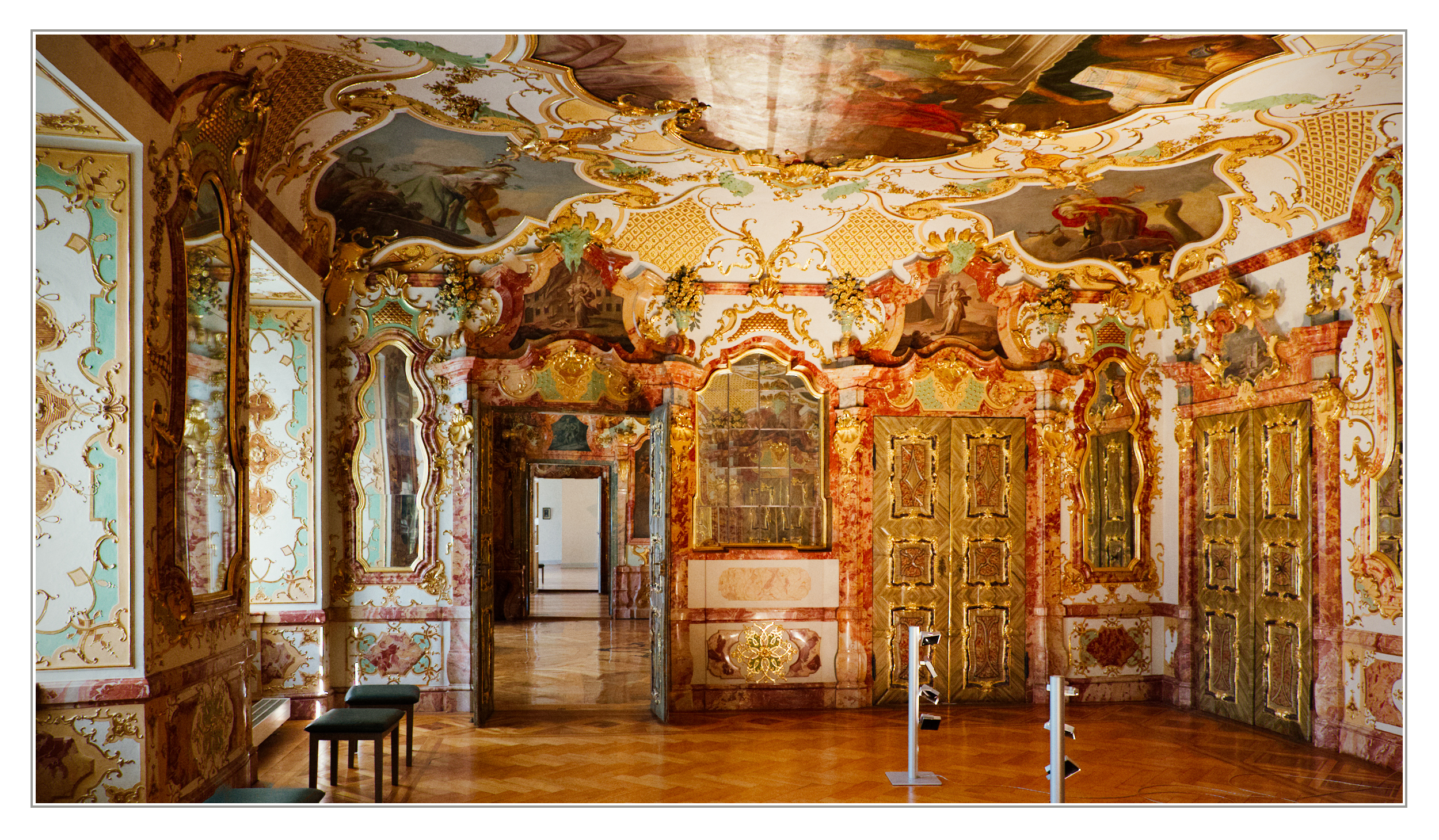
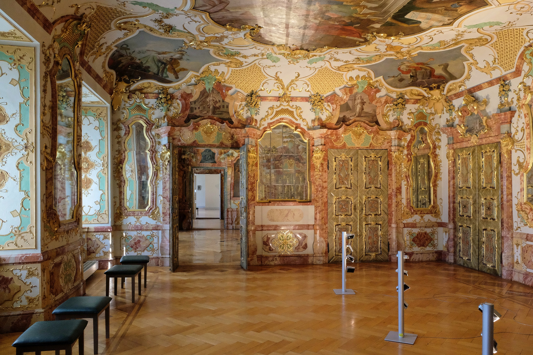
Inspired by @alex768 , here is a photo from Kempten, only some 30 km away from Ottobeuren. The Prince-Abbot’s Residence there is well worth a visit!
DSCF6495.RAF (32.2 MB)
This file is licensed Creative Commons, By-Attribution, Share-Alike.
Inspired by @alex768 , here is a photo from Kempten, only some 30 km away from Ottobeuren. The Prince-Abbot’s Residence there is well worth a visit!
DSCF6495.RAF (32.2 MB)
This file is licensed Creative Commons, By-Attribution, Share-Alike.
Whow, how much baroque a man can take… 
Not meant for Calvinists 
How did you know…
But seriously I prefer the music style far over the room decoration…
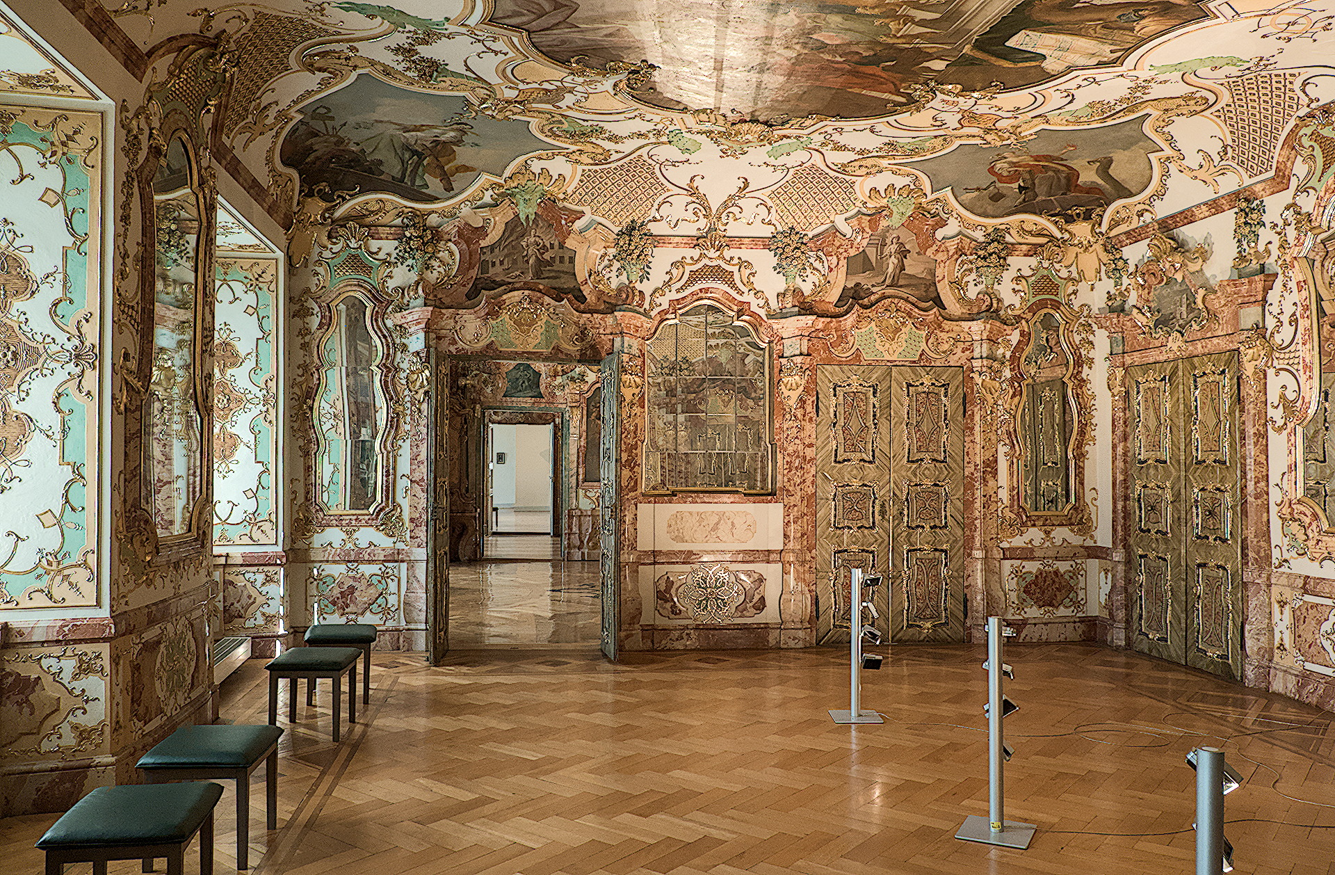
Two Colour Calibrations again, to deal with direct outside light, and the very red bounce light. And then two more for the open doors! And another for reducing red saturation!
Still difficult to get the walls’ colour even over the whole image.
Now hopefully the gold and green stand out against the red marble (and brown floor).
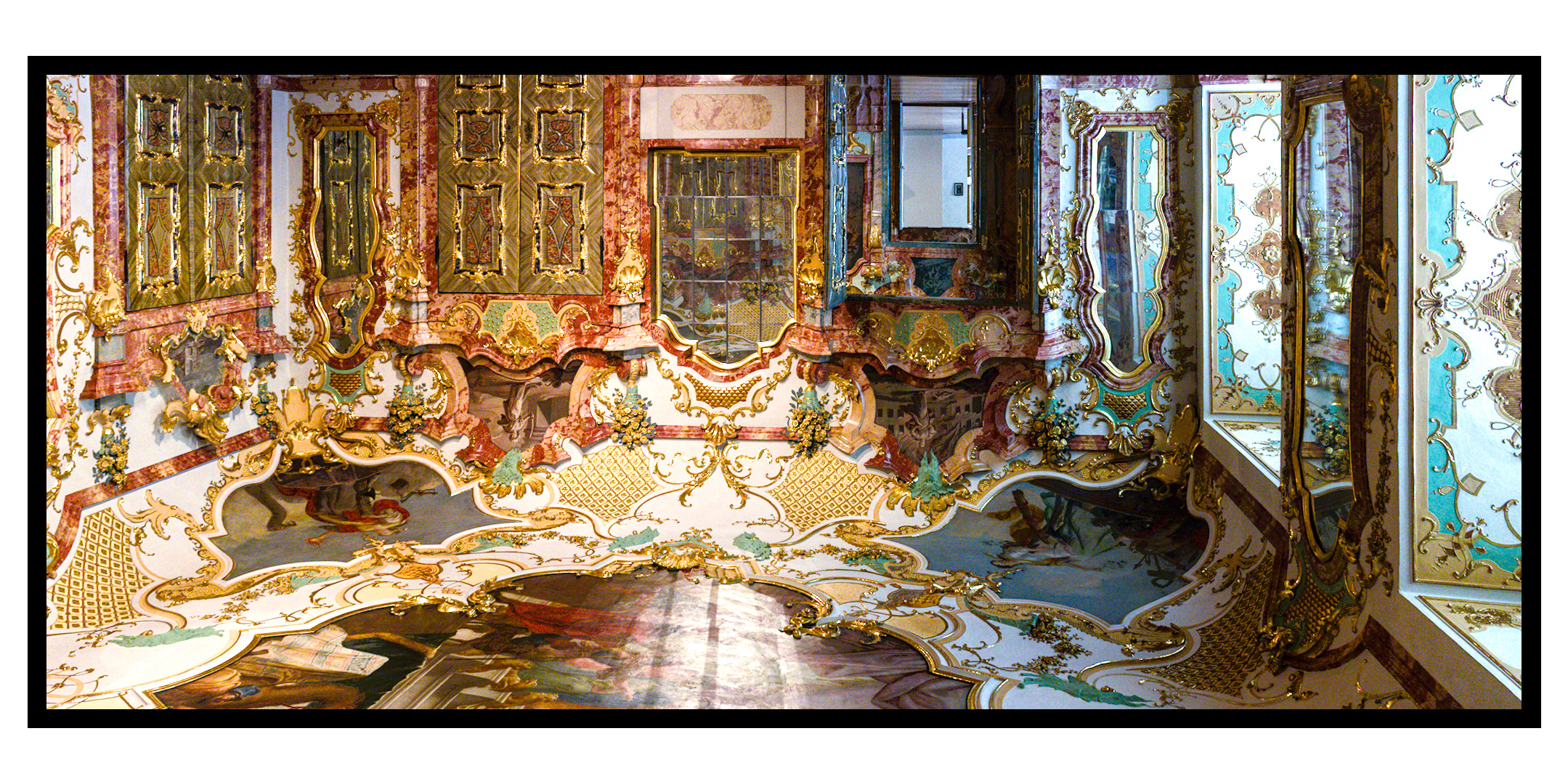
Faking an HDR. Used a variety of tools (lucis, g’mic, and the GIMP of course) to achieve the result.
DSCF6495_01.RAF.xmp (74.4 KB)
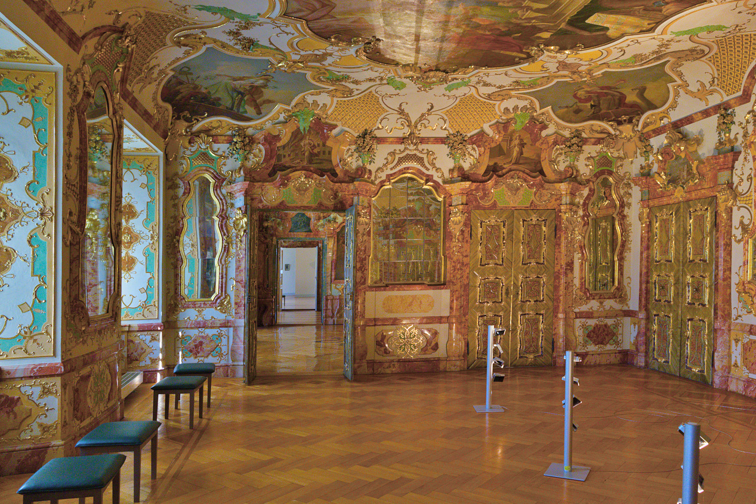
It was brighter. Then I accidentally nudged the Tone Equaliser curve and the high end fell over. And I thought… Oh! I prefer it like this 
Two different versions. Some will probably be horrified by colours and contrasts of the first one. Therefore, there is a second one where at least saturation isn’t that irritating unfortunately the contrasts are even more intrusive.
I prefer the first one, but the floor looks beautiful in the second one. I have no idea what it really looked like.
Tim, your edit comes very close to what it looks.
When it came to the interior decoration, the craftsmen were not overly restrained in their use of vibrant colours
Wow, now I know an interior decorator I don’t want to use.
DSCF6495.RAF.xmp (16.9 KB)
DSCF6495.RAF.xmp (21,6 KB)
Ach! This looks a little bit unusual
I really like how you have captured the gold highlights without making the picture too busy. Nice!