general questions

I have a couple of reasonably generic questions about darktable - I’m not sure how specific these are to version 5.6. I also have what I think is a bug report.

  1. I don’t like the color calibration module, because it effectively prevents me from using the white balance modules two sliders that I am comfortable with to adjust the colour of my image. So I tend to disable color calibration early in my edits, but then the image colour changes substantially. HOWEVER, if I then touch very slightly either of the white balance temperature or tint sliders, the image goes back to look very similar to before disabling the color calibration.

Illustrations:

virgin image

color calibration disabled

WB temperature manually changed from 4872 to 4873K

WB temperature manually changed back to 4872

In my opinion, the second image should look similar to the first, and identical to the third and definitely to the fourth. The fact that it does not, makes me think something is broken. Is that right, or do I misunderstand something?

  1. Is there a way to have the temperature and tint sliders in the white balance module show underlying blue-yellow and green-magenta spectra (either in reference to image colour or illuminant colour, I don’t mind which one)? I am almost certain I have seen this somewhere, but can’t remember where.

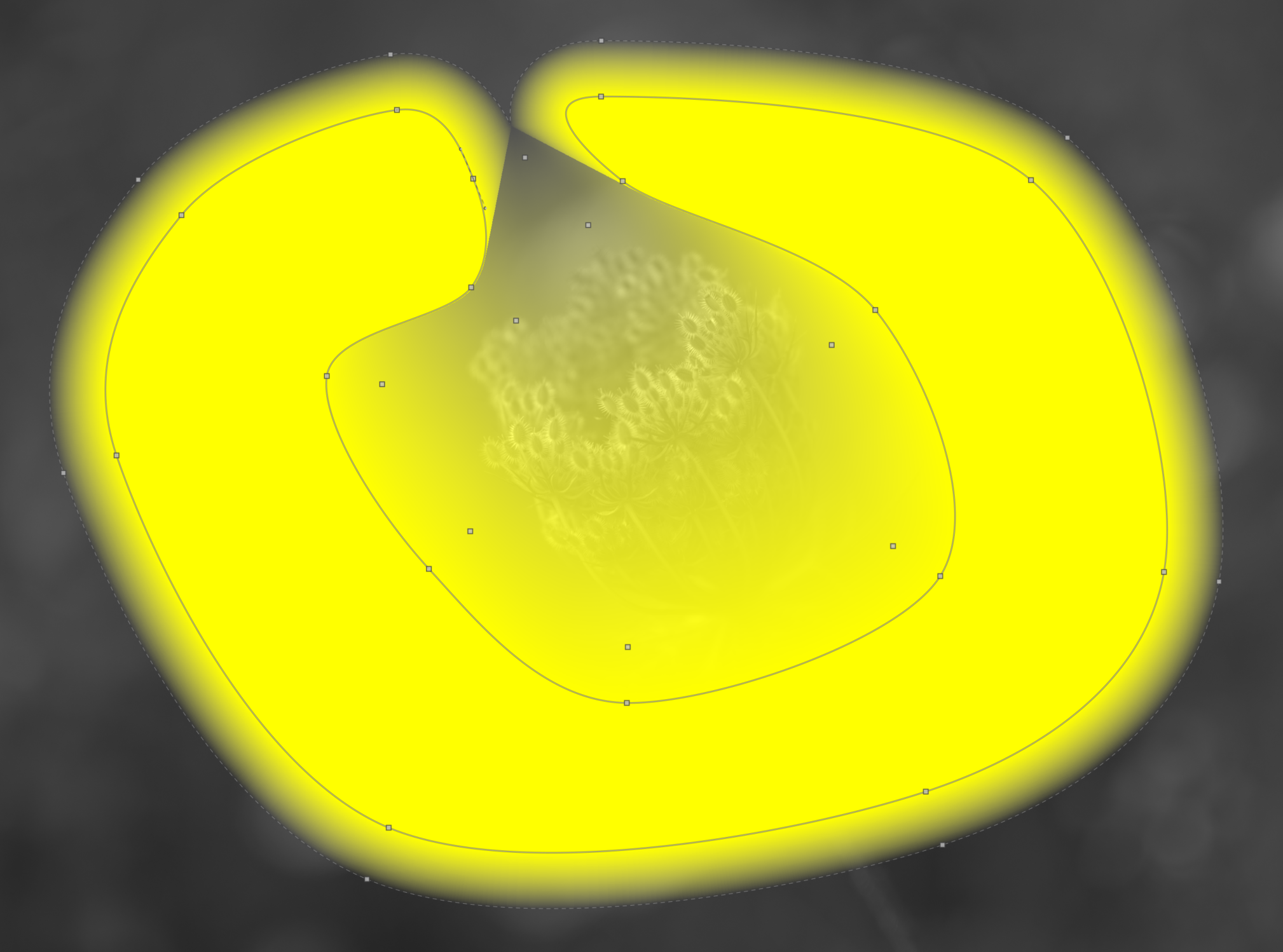
  2. I think I have found a bug in drawn mask behaviour. If I draw a shape that can only be reasonable described as toilet seat, the mask goes all wonky if its tips touch. See what happens when I move the node circled in red…
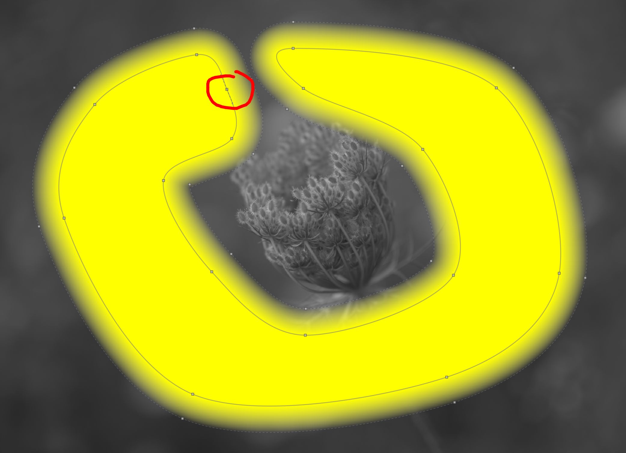
…a bit to the right…
Edit - all my headaches have been addressed, quick answers to all 3 points summarised here:

the original questions:

No, nothing is broken - just slightly unintuitive. Specifically, my manual change of temperature from 4872 to 4873 ALSO changes the WB module’s mode from “as shot to reference” to “user modified” (which the module also provides me visual feedback for that I ignored did not notice, because I am dense).

If someone, like me, wants to rawdog the whitebalance module and skip the color calibration one (which may or may not be a good idea), you want to a) disable the CC module b) manually select the “user modified” mode in the WB module. I imagine a preset can be set up for that, which I’ll try to do later.

Further, kofa reports he’s working to make it all even better somehow, but my original headache is completely solved now thanks to his explanation. Thank you.

Yeah, and it’s ridiculously simple to achieve. Just click on the “scene illuminant temp” module section header, as the manual says (which I ignored did not notice, because I am dense. Or maybe because it was updated in the last 24h :slight_smile:). Thank you @Christian_Pfister

Bug report filed.

3 Likes

@lkzk
1.) Color Calibration:

What you are experiencing is a quirk of the wb/cc pipeline.

The default setup is (the very right lightbulb button): Whitebalance set like the camera measured (we need some WB because that improves demosaicing), set a flag how WB was set, which is then undone within input color profile, to undo this WB and set it to reference D65.

What happens in your case is, that you are disabling CC, but WB is still at “as shot to reference”, which triggers the additional transformtion happening in input color profile. Once you move the slider WB pops over to “user modified” and the D65-transformation is disabled in the input color profile.

@kofa is currently working on making this fairly obtuse setup more palatable :slight_smile: .

3.) Toilet seat bug

Yeah that seems like a bug. But with some limited tries I could not replicate. I’d suggest opening a bug report INCLUDING a RAW+XMP which demonstrates the behaviour

4 Likes

I was like… ??? … and then I understood :joy:

1 Like

Regarding white balance:

Of course use the tools as you wish. Perhaps, though, you could consider the “modern” workflow using WB “as shot to reference” and color calibration.

From the manual:

White balance is not intended as a “creative” module – its primary goal is to technically correct the white balance of the image ensuring that neutral colored objects in the scene are rendered with neutral colors in the image. For creative color operations, it is usually better to use other modules such as color calibration or color balance rgb.


Note: The color calibration module now provides a more modern and flexible method of controlling white balance. The color calibration module can be enabled by default for new images by selecting “scene-referred” (filmic or sigmoid) in preferences > processing > auto-apply pixel workflow defaults. Some basic settings are still required (and applied automatically) in the white balance module, so that demosaicworks correctly.

In color calibration you have the option to select a daylight illuminant with a temp slider. The custom mode takes some getting used-to, but is more powerful than temp and tint. I tend to look at the vectorscope when making hue and chroma changes - I find it to be helpful.

1 Like

Sorry, can you expand on this please? As far as I can see, instead of two axes (blue-yellow, green-pink. sort of.) I get one: hue. How do I use this to be more powerful?

It is precisely because of the limitation of this custom mode - or my misunderstanding of it - that I gave up on this module and went back to the WB module which I knowingly use not as intended (meaning - I use it for creative colour interpretation, not just neutralising colour balance).

I also keep one eye on the vectorscope when doing my colour edits.

1 Like

You have chroma as well as hue.
I sometimes sruggle with this module but with Custom mode, suppose you have a blue cast over your image. Then you put the hue slider to blue and adjust the chroma to combat the blue until happy with the result.

It helps me to verbalize Color Calibration as this question: “Against which color cast do I want to correct?” - and then you dial in that colour cast. With the hue and chroma you get the whole visible spectrum while Temp+Tint are only an approximation. If you want to read up on it (and I think it is worth doing that) there are a couple of articles. See here under " New User Traps" (especially this one.

You can also stack multiple instances of Color Calibration: Say you have gotten the WB almost right but there is still a bit of a greenish tint: Create a duplicate instance of CC and correct for that!

2 Likes

@paperdigits

Thanks for splitting this out. I had thought to start a new thread but this is better. :grinning:

Will work on a reply.

1 Like

Thank you both @RawConvert and @mino. I think my issue is that even if I can accept that the modern CAT approach may be more physically correct or delivers more accurate calculations - I have no skills or knowledge to verify this, or even discuss in an informed way - the issue is that the temperature and tint model is easy to work with for me.

It is not unusual that I have an image which I think is “a bit too yellow greenish” and I know what to do with it with temp and tint sliders. But I cannot get the correction I want with a single hue slider.

Do you happen to have a digestible resource that would help me with this?

2 Likes

There is absolutely nothing wrong with ignoring color calibration and just using white balance. It doesn’t matter if a “physically/technically/objectively better” tool is available. Do what works for you and especially what is fun for you :slight_smile: !

2 Likes

Thanks, @mino

You are of course correct. Here I’m advocating learning how to use the color cal module as it is very capable.

In Nis’ document there is a link to this:

I think it establishes a justification for the “modern” approach. But it can be hard for a beginner to know what to do.

More later. :slightly_smiling_face:

2 Likes

Aurelien wrote the module and the one in Ansel is still fairly similar…he has written about it a few times but this updated one is a good overall read to get a grasp on using a CAT to make things scene neutral… This is a perceptual correction on the full rgb data of the pixels and not some set of 3 multipliers with tint and temp offsets…if you start to think of illuminant and not tint and temp you will pretty quickly get used to it…

Chromatic Adaptation explained.pdf (3.7 MB)

THe darktable manual also does a decent job and will be specific to the small nuances that are different from Ansel…

This link contains an example of what I am looking for as per my point (2) in the original post at the top. Any idea how can I get these coloured bars in the WB module?

You can’t - thats a (impressively high-res) screenshot of an old version of the WB module. So with the current version without changes to the code you can’t change those sliders.

In my opinion, the current white balance UI is really bad and confusing. Just my two cents:

  1. If no white balance module is present in the pipeline, some other module (RAW black white point?) should do the required basic white balance adjustment. This way the pixel-pipe would not need to show the confusing “don’t use me” white balance module by default.

  2. The white balance module should be renamed to something more technical, so users don’t gravitate to it for their white balance needs, if this is not the recommended way of doing it.

  3. Color Calibration has lots of problems regarding the UI.

    • It is much too unfriendly and confusing. Where the old white balance module had nice icons, Color Calibration makes the user go through pulldown menus for algorithm selection right on the first page, which is named CAT and at least I don’t even know, what this means. It says things like “CCT invalid”, where users don’t know, if they have done something wrong.
    • It forces the hue/chroma model on users. This may or may not be “better”, but basically any other RAW development software uses temperature and tint and therefore users are used to it.
    • Color Calibration still is a channel mixer as well. While this may make sense from a maths perspective, it is not a good UI decision. For a user, a white balance module (whatever it is called) and a channel mixer are two different things - they probably should be separate modules.
3 Likes

I agree with the general sentiment that the white-balancing-colour-calibratinig-UX is suboptimal for learning users (and lots of people agree, as far as I know @kofa has something in the pipe as he stated before).

But this:

Is a not a great argument IMHO. Being able to correct for any color cast is very powerful and I personally dont miss my temp/tint days of LR :wink: .

1 Like

Why can we have the same color correction as the rest of the raw converters ?

1 Like

I an not suggesting to completely remove the hue/chroma settings. A new friendlier Color Calibration UI could offer both options.

Eh, that’s unfortunate, I think these would be pretty helpful. I am wondering if the colours were removed specifically to nudge people away from the way I am trying to do things (which, let’s be honest, is the Lightroom way).

Anyhow, thank you for clearing that up for me, much appreciated.

1 Like

Erm, in my version of dt I do have those colored bars in the white balance module. Even color calibration has color gradients under the sliders.

Then again, it’s an older version: 5.6.0, under linux