How to use Darktable to acheive stylized image effects

I’m really impressed by all the helpful information I’ve found here and on Youtube for not only learning how to use darktable, but also to understand light and color theory, the relationship between the scene and display, etc. I’ve also found great information on how to acheive very specific effects with DT like display mapping, color manipulation, split toning, sharpening, contrast, spot healing, highlight recovery, masking, etc. At this point, I feel comfortable editing an image to get it looking better than the JPEGs than my camera gives me, though there is much room for improvement.

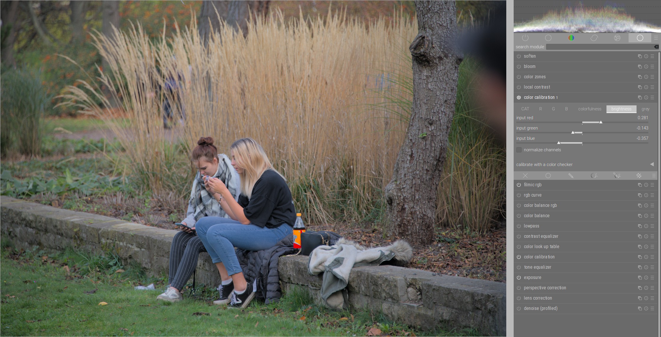
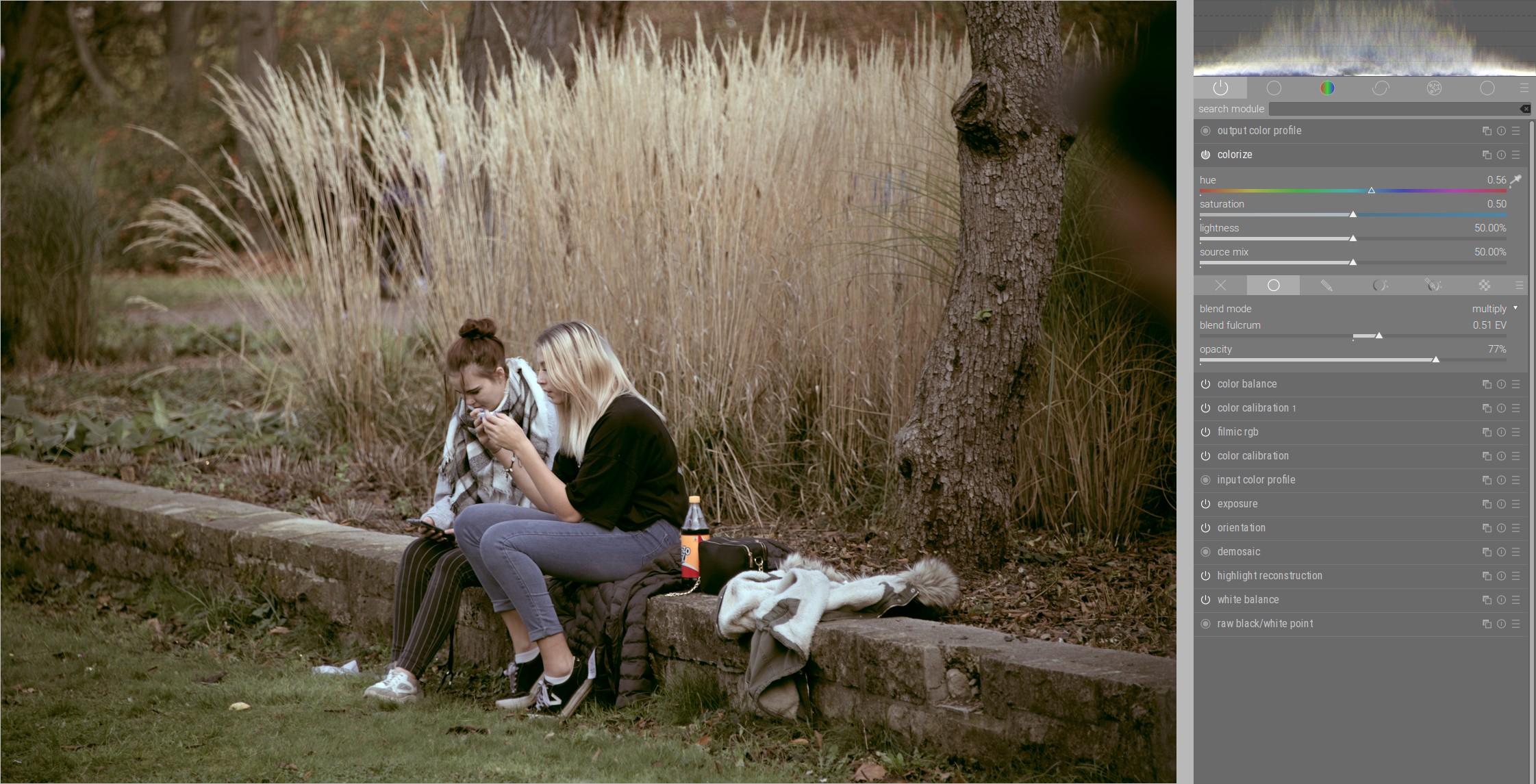
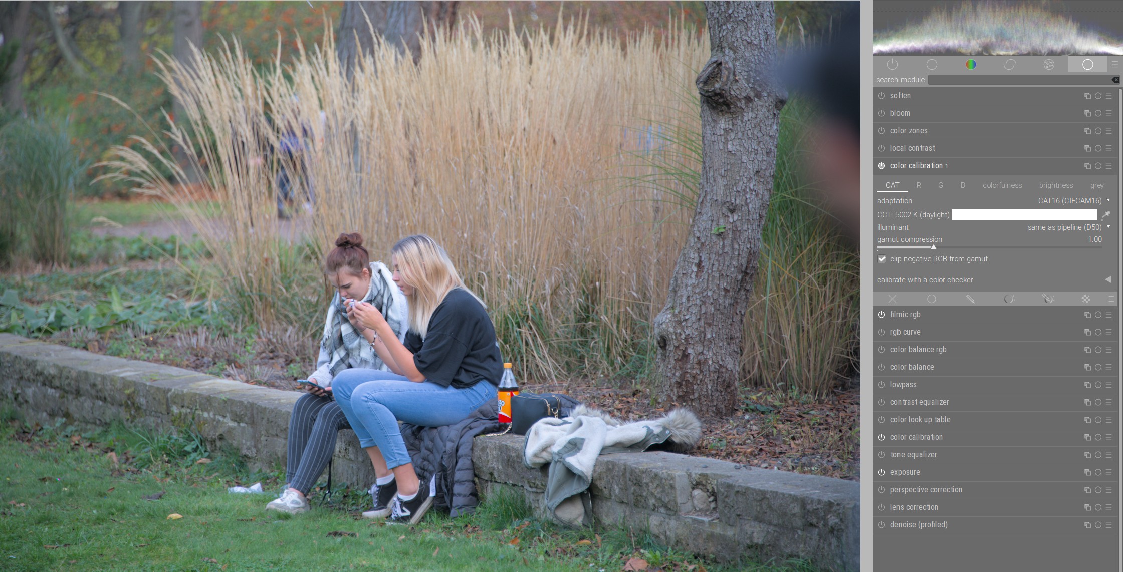
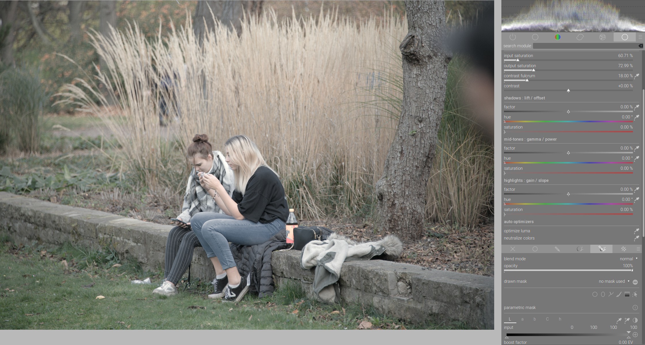
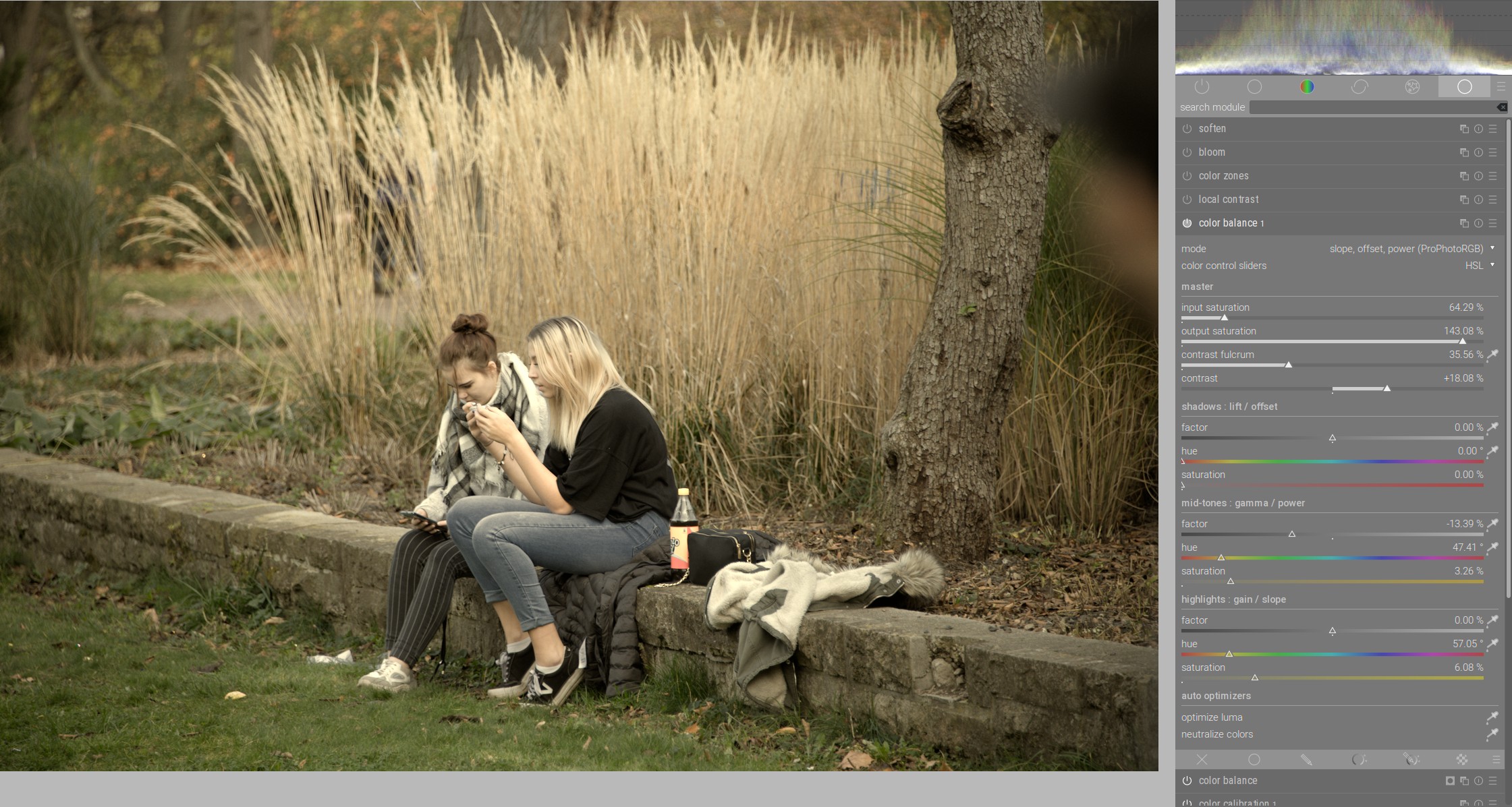
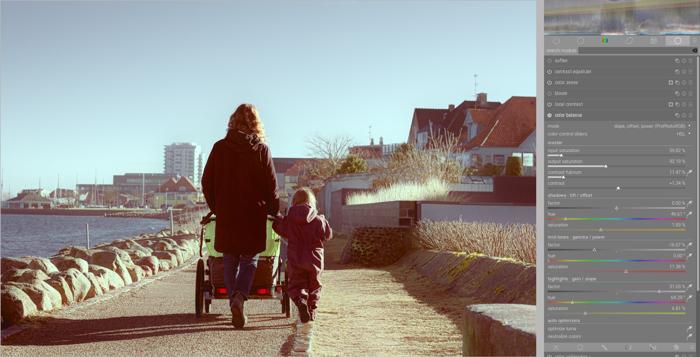
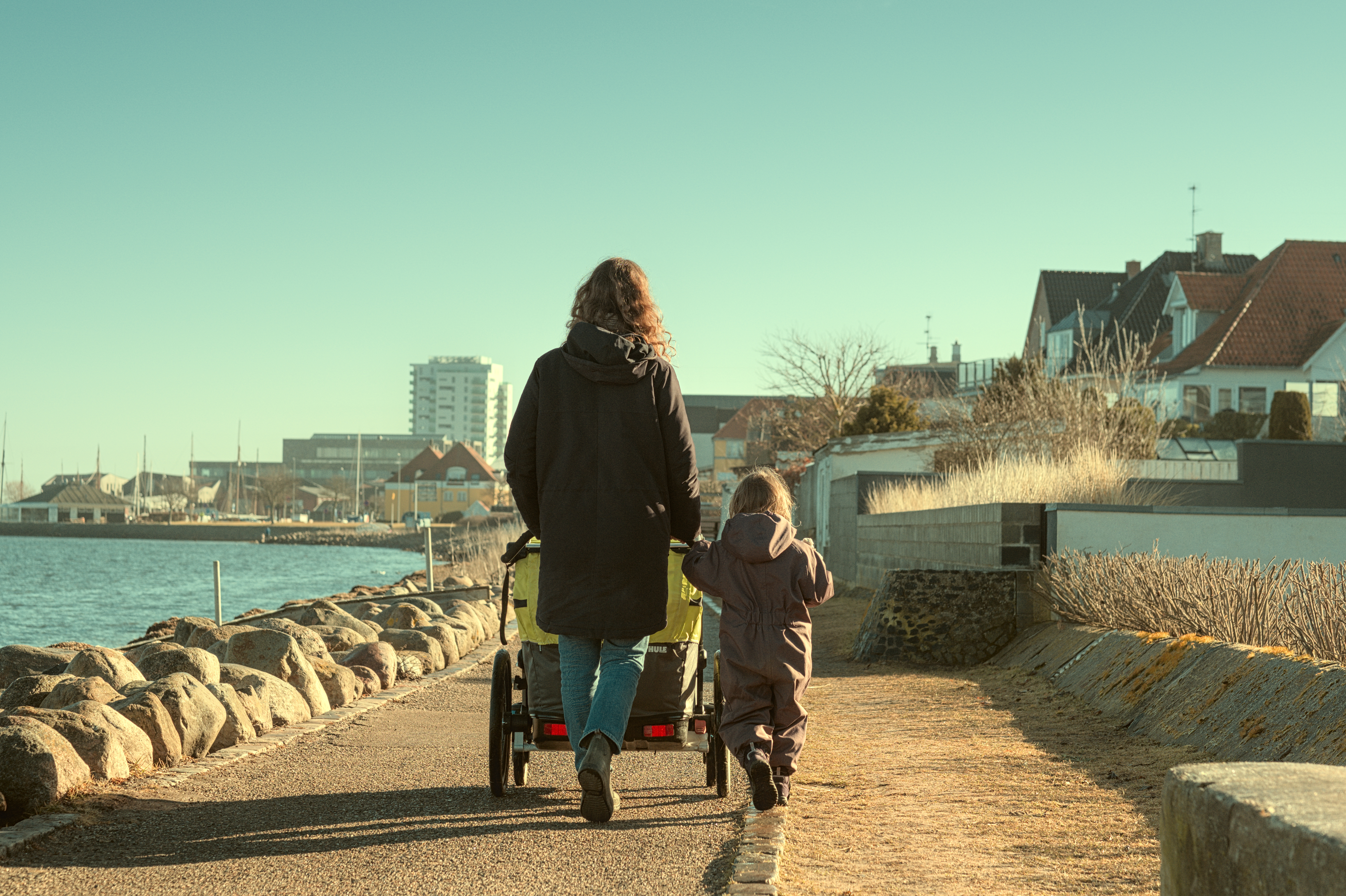
It seem like photo editing is taken to the next level when the artist is not only able to capture the subject, but artistically represent it. One way to do that, I think, is taking my “naturally” edited photos and applying more “creative” or “stylized” effects to my images to match a tone or mood. To be more specific, I’m thinking of the kinds of effects like Instagram filters or Lightroom presets (Here are some example lightroom preset effects as an example). However, I don’t want presets or Instagram filters; I would like to be able to acheive those effects myself using DT and its powerful modules. I’m having trouble finding resources using DT that teach how to acheieve these “mood” or “filter” effects.

Maybe there are other users interested in this kind of thing? Perhaps there are some of us that are using DT in this way willing to show off some ways to use DT software to acheive creative, stylized effects?

2 Likes

I did an episode on this some time ago:

The site you mentioned has a lot of different styles. If you pick a few favorites, I’ll be happy to try to recreate them with darktable. And I can explain you how I did it.

11 Likes

Very nice video! It looks like just using channel mixer (or color calibration) and color balance can achieve quite a lot, and maybe just spending time playing with them would be a good idea.

I’d really appreciate seeing you try to recreate some of them. From that particular lightroom preset collection, maybe a good variety would be “Clean & Classic”, “Moody”, and “Boho & Brown”?

3 Likes

Check here for some ideas…

https://dtstyle.net/

1 Like

Exactly! With these two powerful modules you can already achieve a lot.

Let’s start with “Clean & Classic” look:

https://shop.signatureedits.com/clean-and-classic

Since we don’t know how they did it, let’s analyze this style a bit.

As it looks, green colors contain a bit more yellow content, blues are greener and warm colors (red to yellow) are a bit more brown.

We will try to reproduce that. Note that the aim here is not to copy the style completely, but to create the basis for development of own style.

We now need a photo where all colors are present. It is also very important that - before we dare to color grade - white balance has been done so that there are no color shifts.

This is how the photo looks, and it is ready for color grading:

For the first part we will use channel mixer in the color calibration module. Since we are now dealing with the aesthetics of the photo, we will move a new instance of color calibration module above the filmic and in the CAT tab we select CAT16(CIECAM16) as illuminant adaptation.

Since in “C&C” style blue is more greenish we go to G tab (green color channel) and move a part of blue to green (input blue) and at the same time we decrease the green part (input green) so that the photo does not get a green cast:

You can see how blue has changed and how in the same time the yellow color have moved towards orange.

We will now increase the yellow part of the green and orange and for this we will go to the B tab and move the green part (input green) of the blue channel to yellow and the red part (Input red) to blue:

Now the green is a little more yellowish and the orange color is not so reddish.

Green and blue is already very similar to the “C&C” style and in the next step we need to make warmer colors a little more brownish.

For this you have several options, I will use here color balance module. We activate color balance module and move it above color calibration module:

Since we want to change only warm colors, we use parametric mask (hue value) and change the colors in the middle gray and highlights area until the warmer colors become more brownish:

With this we have imitated the color mood from the “C&C” style. I will now enhance contrast with a new instance of color balance and the processing is done:

We can now save the settings we made in color calibration and color balance modules as presets and/or make a style out of them in history and apply it to other photos.

Here are a few examples:

It is very important to know that these presets and styles still need to be adjusted when you apply them to other photos and that not every photo is suitable, but they can also serve as a foundation for new styles.
I highly recommend playing with them.

Since the work on this post has taken a long time, the other two styles that @person101x has mentioned I will soon make in new posts.

28 Likes

Thank you so much for these insights. This gives me exactly the information I am missing sometimes looking at the videos only:
What do we want to achieve and how can we reach the goal.

2 Likes

This is really awesome. From my perspective what I need to learn is how to analyze the traits of a given style to understand its difference from the starting point, and then know how to apply the module settings to translate the original to the finished product.

An ongoing thread along these lines could be very helpful

1 Like

Boris you are generating some great content lately…I am trying to share relevant bits to the fb page as many don’t make it over here…great work here and on the filmic thread…your vision translated to the software tools is an invaluable resource…Thanks…

EDIT one question when you move to use the cc module as a channel mixer why do you enable cat vs bypass. Does this alter how the channel mixer edits are applied…I always assumed the CAT was for WB back to D50 pipeline and otherwise you left it in bypass to do channel mixing…just wondering??

6 Likes

I must admit that I don’t understand why, but through experimentation I have found that with the CAT the channel mixer behaves most like I know it from before. So, the results are the most consistent. But maybe I’m doing something wrong. :wink:

Thanks for your reply…maybe @anon41087856 can comment when he gets a moment…

AP just wondering when using the CC module in a separate instance as the channel mixer I assumed to set it in bypass mode …Boris through some real world experience feels he gets better results setting it to CAT 16…would you have any comment on this…I am not sure that exact thing came up in your video…excuse me if I missed it…

Yes, but it is not important to know exactly all details but rather basic color mood and that is relatively easy to see.

The second reason not to worry too much is the fact that the styles are very much dependent on the motives.

And the third reason is that if a lot of people use the same or similar style, the photos will quickly become boring.

This is the most difficult part. I recommend to take a good look at a couple of modules and get to know them well. As far as color handling is concerned, color calibration and color balance modules are the most powerful tools for this.

They have fantastic, very well thought-out functionality and are a real " swiss knife" for color grading. Many find these modules very complex, but this “complexity” is very justified.

3 Likes

Now let’s look at the “Moody” style:

This low key style seems to be a kind of imitation of the technique used in analog film known as bleach bypass:

For example, Polish cinematographer Janusz Kamiński used this technique very effectively for the movie “Saving Private Ryan” by Steven Spielberg.

Bleach bypass is often reproduced digitally by using of multiply blend mode to combine a monochromatic version of the photo with very low saturated original.

So what are the characteristics of this style and how we can reproduce it in darktable?

As it looks, in shadows and mid-grey area darker greenish-brownish olive tones with low saturation prevail and the highlights look more grayish-bluish, also with a low saturation. The reds, however, seem to stand out both in contrast and saturation.

Let’s start from the point where we put the second instance of the color calibration module above filmic and selected CAT16(CIECAM16) illuminant adaptation in the CIE tab:

Since in the “Moody” style the colder colors are darker than warmer ones, in the “brigthness” tab we will darken green and blue channel and lighten red one:

In the next step we take color balance module above the second instance of color calibration and try to achieve a brownish basic mood, especially in middle gray area. And we also reduce the saturation of the photo with both input saturation and output saturation:

Now we mimic “bleach bypass” by applying multiply blend mode to a monochrome version of the photo using colorize module.

We turn on the colorize module, set it above the color balance module, select a colder color there and apply multiply blend mode. I recommend to select RGB (scene) in “blending options” and then multiply blend mode in the menu:

We are already pretty close to the basic mood of the style, we just need to increase the saturation a bit for warmer colors. For this we use color zones module and with the help of parametric mask we limit the effect of saturation only to darker middle gray area:

More examples:

17 Likes

Omg Boris. This is great!
Would love more posts on this subject with creative work in darktable.

Best regards

1 Like

My take on Moody style.
First is SOOC JPG and second my edit. Maybe too much olive green in the shadows?
Glad to receive CC.

DSCF6919.RAF.xmp (21.1 KB)

DSCF6919.RAF (55.0 MB)

1 Like

Last, we have “Boho & Brown” style on the list:

This preset actually includes two different styles, each with green and brown tone (and of course countless variations in between). I’ll use this illustration as a template:

All other versions in between you can then consider as an exercise. :upside_down_face:

What are the characteristics?

Green version seems to have some pastel green in foreground. All other colors are more desaturated. Highlights have a kind of pastel off-yellow to them.

Brown version is dominated by brown tone in all brightness areas except highlights and is a little darker/richer in contrast than green version. The saturation is also much stronger especially in the darker middle grays. The colder colors have less saturation here.

Let’s start with green version. As usual, we begin from here:

Because green is the dominant color, let’s move a little from green and blue to green from the red channel:

In the blue channel, let’s move a little red into yellow and thus we will strengthen green even more and red will not be so strong:

Because apart from green, red and blue should have less saturation, we decrease the red and blue channels in the colorfulnes tab:

In the brightness tab we darken the green and blue channels and lighten the red. This will make the warmer colors brighter:

We now need to desaturate the photo a little more to get the pastel colors. It is important that the lighter areas are desaturated more than the darker ones.

We do this with the color balance module, which we place above the second instance of color calibration. For desaturation we use parametric mask to protect darker areas more:

We use one more instance of color balance module to achieve this off-yellow pastel color tone. At the same time we also correct the contrast a bit:

The brown version is relatively simple.

We only need one more instance of color balance to achieve the brown tone of the photo. We amplify the red-orange tones in the shadows (offset) and mid-tones (power) and limit this saturation with parametric mask on shadows and mid-gray:

More examples:

10 Likes

Hi @Toand007,

Nice that you play with the styles!

If you offer us your raw file, please choose a license for it, so we can use your photo. Here is a hint for that:

Thank you,
Boris

So, we have now shown with a few examples how to imitate different color styles with darktable.

I would like to make a few comments in this regard:

Dealing with colors in photography has to be learned!

Blindly copying styles and applying them everywhere makes no sense. You don’t put ketchup and mayonnaise on every meal either.

Color mood is always dependent on the subject and must be very wisely considered, otherwise it becomes very quickly arbitrary and boring.

Also, applying or even buying presets from other people will not make your photos better. In fact, you are paying to stay unskilled. The only thing that makes sense is to study these presets and develop your own interpretations.

In this respect, this imitation of presets that I have presented above is only a preview of how to achieve this and in no way a recommendation on how to process your photos. I will never process my photos in this way.

Dealing with colors and countless color moods is a topic on its own and software independent. Even if you have a good mastery of software, that is by no means a guarantee that your photos will look good. This is often the case with beginners, that they attribute dissatisfaction with results to the functionality of the software.

That’s why there are so many “enhancement plugins” in commercial software that exploit this lack of knowledge and promise to enhance your photos with a few sliders.

P.S: I forgot to say that if someone wants to know what color mood might suit a particular photo, they can send their raw file here (or as Play Raw) and people can consider it. I will participate in any case. :wink:

13 Likes

Above files (DSCF6919.RAF and .XMP) are licensed Creative Commons, By-Attribution, Share-Alike.

1 Like

Moody look definitely makes your photo look pleasantly calm, because the colors are more subdued and they don’t fight with strong contrasts.

However, due to this darker mood coupled with strong contrasts of the scene, the main subject - woman with the child - gets lost in the shadows (due to the shadows of the houses on the right, the balance shifts in this direction).

I tried to make the photo a little brighter and wanted to know how it would have looked if the shadows and mid-gray areas were made warmer:

Besides the warmer atmosphere, the shadows of the houses are no longer so strong and the woman and child come out a little better. And it also looks a little bit like analog film from 70s. :grin:

And this has awakened another association in me:

When I was a child, I had pneumonia and had to spend a few days in a children’s hospital in a city by the sea. I remember taking regular walks along the harbor with my mother. The fresh winter sea air did me a lot of comfort and I also enjoyed the view of the sea and the ships that were lying there. It was a different world for me.

And when I think of childhood, I always remember the photos my parents took and that typical Agfa 200 color film look. :grin:

So I tried to imitate that:

DSCF6919_03.RAF.xmp (9,1 KB)

10 Likes

Thank you a lot for the CC! Really like it brighter and the Agfa 200 color look.
Glad it brought up som good memories :slight_smile:

2 Likes