New Sigmoid Scene to Display mapping

Short version : TLA, Three Letter Acronym. I like it.
Long version:

The Zone Mapper, Ligthtzone’s equivalent of a tone mapping tool, I found to be remarkably consistent with colours.

What sets it apart, from other tone mapping tools I have used, is the lack of any shift in the hue. All that changes is luminance of different areas of the image, based on what is modified via the controls within the zone mapping tool.

A purist implementation of virtual/digital lighting. Add light or take light away. Simple. Very predictable. No chromatic side effects.

The results might be a bit boring or unusual, for those familiar with the exciting color shifts, that are possible in other tone mappers.

Hint Hint, might be a good candidate for another tone mapping “Proof of Concept” in DT, after sigmoid has been embedded in the official DT roadmap.

image

darktable has a module with the UI much like this. Its been depreciated.

1 Like

That’s because you likely use it in the default luminosity mode…not going to impact color Nearly as much. Switch to RGB and you’ll get some shifts…Blend filmic in lightness and it doesn’t mess much with color either

This discussion is so in sync with my darktable endeavors. I finally found a module workflow that gives me the results I’ve been fighting to achieve.

From bottom to top:

  1. color calibration
  2. color balance (lower saturation to adjust for over saturation in step 5)
  3. filmic rgb (custom middle gray luminance and using white relative exposure and black relative exposure to produce a super flat image with plenty of room for shadows and highlights)
  4. rgb curve (local adjustments)
  5. rgb curve (cubic spline global tone curve with “preserve colors: none”).
  6. lut 3D

Saturation goes overboard when using “preserve colors: none” in step 5, of course. But I lower it in the color balance module (step 2). Doing it the other way around, using luminosity in rgb curve and upping the saturation in color balance produces super strange results.

I know, it goes against every good scene referred advice to go so hard on the rgb curve (or even rely on this module for a global tone curve), but I need more control over the curve than filmic rgb or color balance with “contrast” and “contrast fulcrum” adjustments gives me. 7 points or more on the global rgb curve is not uncommon. The tone equalizer feels like a curve in a straightjacket, I can’t put it better :slight_smile: It is sadly too limited because I can’t shift the points on the histogram sideways or create more points. I’ve been dreaming about a scene referred replacement for the rgb tone curve, but I have no idea if that is even possible. Having it in Sigmoid may be what I’m wishing for? :slightly_smiling_face:

You beat me to it…

Most or many digital edits are over sharpened and often over contrasted from much of what I see. I think sharpness is another one of these subjective things. Even trusting the displayed image to be the true representation of sharpness might not always be safe as there can be adjustments that affect how it is rendered to the screen. I think RT does a good job by forcing you to go to 1:1 to see the sharpening. I thinks this helps to make it more targeted and reasonable but the second you zoom out you can’t see it so that can take getting used to.

I think a lot of images are actually out of focus and that leads to heavy handed sharpening to try to bring something that it did not originally capture.

In the end its what pleases the eye of the creator that matters

I think sharpness really shows up when you print but its a bit harder to gauge it on the display.

Perhaps the details threshold in masking will benefit DT. Opinions on that should start to appear as more uses get access to it in 3.6.

1 Like

Thank you. This grasshopper (me), has so much to learn. So much.

For contrast and details if you are in DT try local contrast with bilateral at ~150-200% then play with the other two sliders…I think this is an effect more like a jpg too…bit off topic but back to your contrast and sharpness questions…I’ve lost track maybe this has its own thread…

Yep, that might be the most common “heroic rescue” of a flawed image.

@mikae1 would you mind sharing two edits using this approach? Including raw and xmp.

My gut feeling is that step 3 - 6 is your way of creating a very complex tone mapper. Like stacking filmic and base curve plus a lut for the effect that one module should be able to give you. Would be interesting to see if it is a look that I can not reproduce the sigmoid and why in that case.

There will never be RGB curves in the sigmoid module, but I do see the potential for an upgraded rgb curves module that has support for full scene illumination range to complement the stricter tone equalizer. Remember for modules: single responsibility and separation of concerns. A tone mapper like sigmoid or filmic isn’t actually supposed to be able to do that much fine-tuning, we expect the usage of multiple other modules before the tone mapper to do all those special adjustments.

2 Likes

For what it’s worth, as far as darktable and icc profiles I’ve had good luck exporting as a 16 bit tiff using linear 2020 as both the input, working, and output profile. Also, icc profiles I made from tiffs created using libraw’s dcraw_emu using the argument -o 0 (to set raw camera native output) yield perfectly fine results in darktable. I know the discussion moved on a bit from this but wanted to chime in. Don’t mind me!

2 Likes

Indeed! Wouldn’t call it very complex. It’s still mostly a good old curve. :slight_smile:

Of course, you’re right.

I do to! It would be a dream come true. I see no reason to relegate the multi control point curve to history in this scene referred era. For what I’m using it for, I’d argue it’s the most powerful (and well-understood) module.

I could look into examples when I get back to my machine from the midsommar-place! :slight_smile:

1 Like

the problem with the RGB curve is that you don’t get the benefit of the guided filter approach that tone equalizer brings to the table.

I have no idea what a guided filter is, but let me say that I also need filmic rgb step before the rgb curve to get me where I want. Also, for the previously explained purpose I never edit the channels independently. The rgb curve acts as a global tone curve.

A guided filter means that the luminance of a pixel is not determined soley by where it falls on the global tone curve, but the average luminosity of surrounding pixels is also taken into account. This helps to preserve the local contrast within certain regions of the image. With tone equaliser, you set up the guided filter mask to help identify these localised regions and treat exposure adjustments to them in a common way. This is real beauty of the tone equaliser module.

4 Likes

It was likely mentioned already but is seems like what a couple of users are asking for would be like the parametric tone curve in RT??

1 Like

Contrast and Chroma

One thing I have been wanting to write about is how sigmoid mapping affects both contrast and chroma. There is an interesting relationship between the sigmoid module in preserve hue mode and the color balance rgb module which can be exploited for some interesting results.

Increasing contrast in the sigmoid module

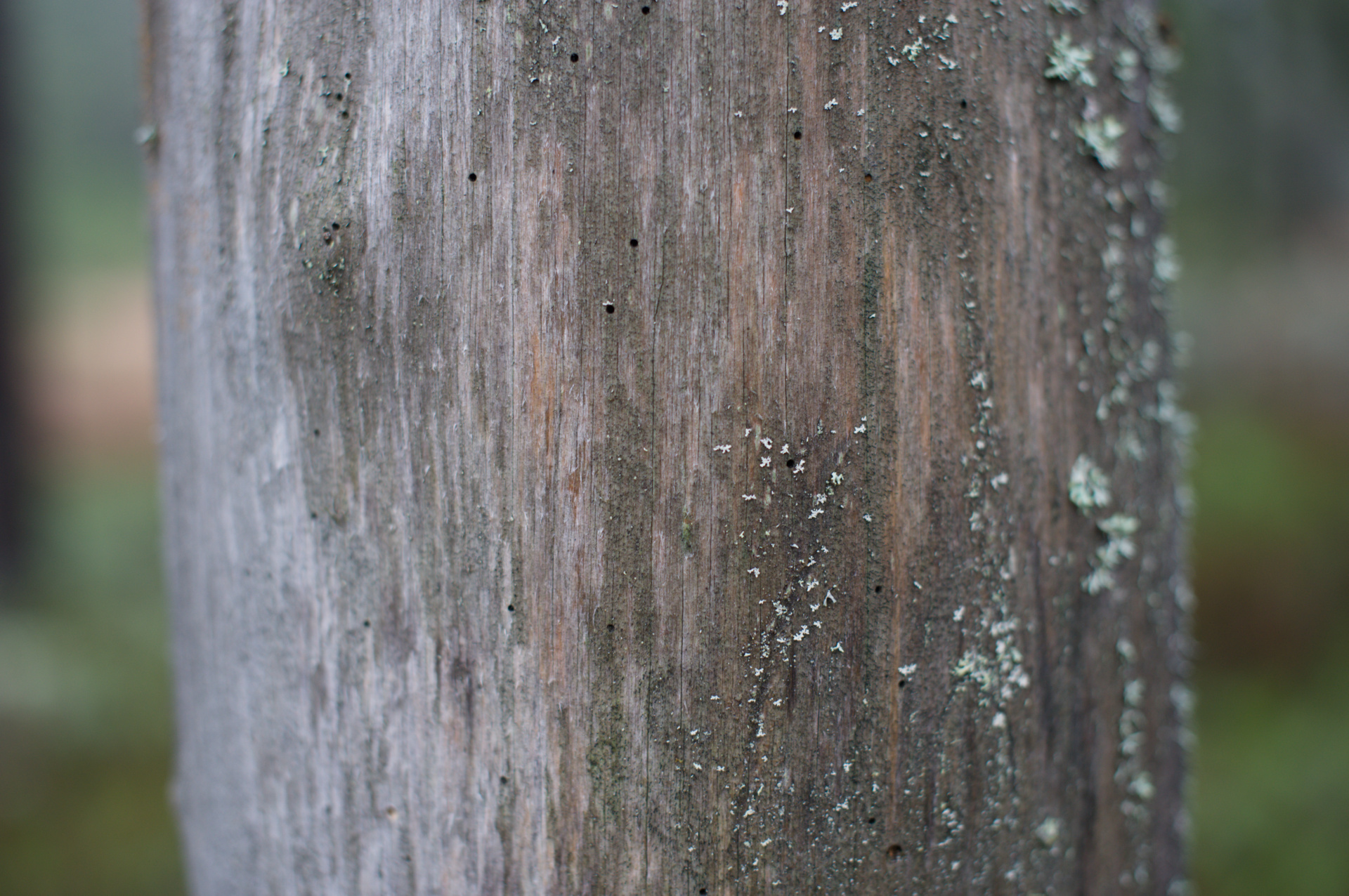
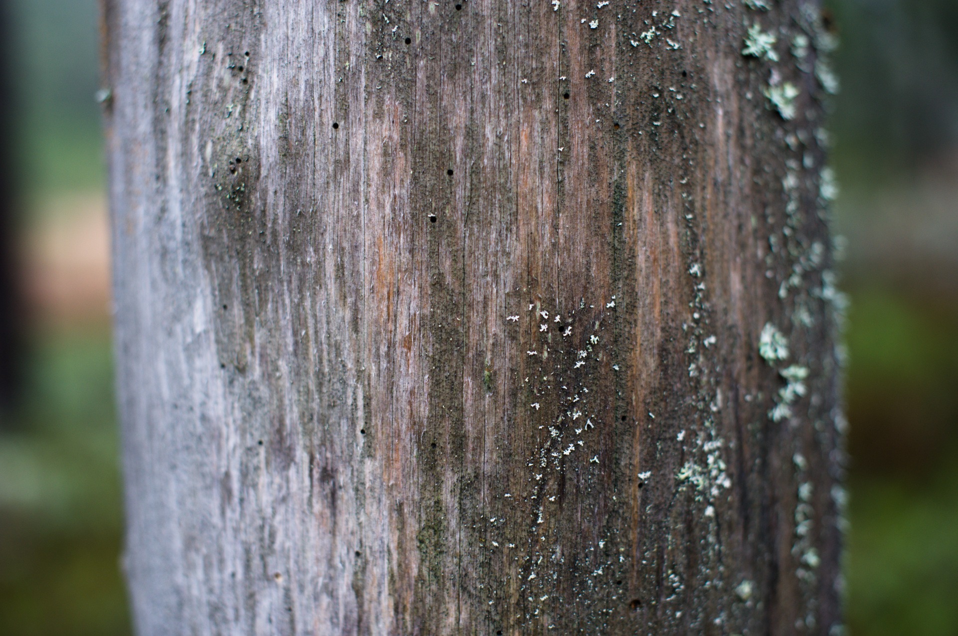
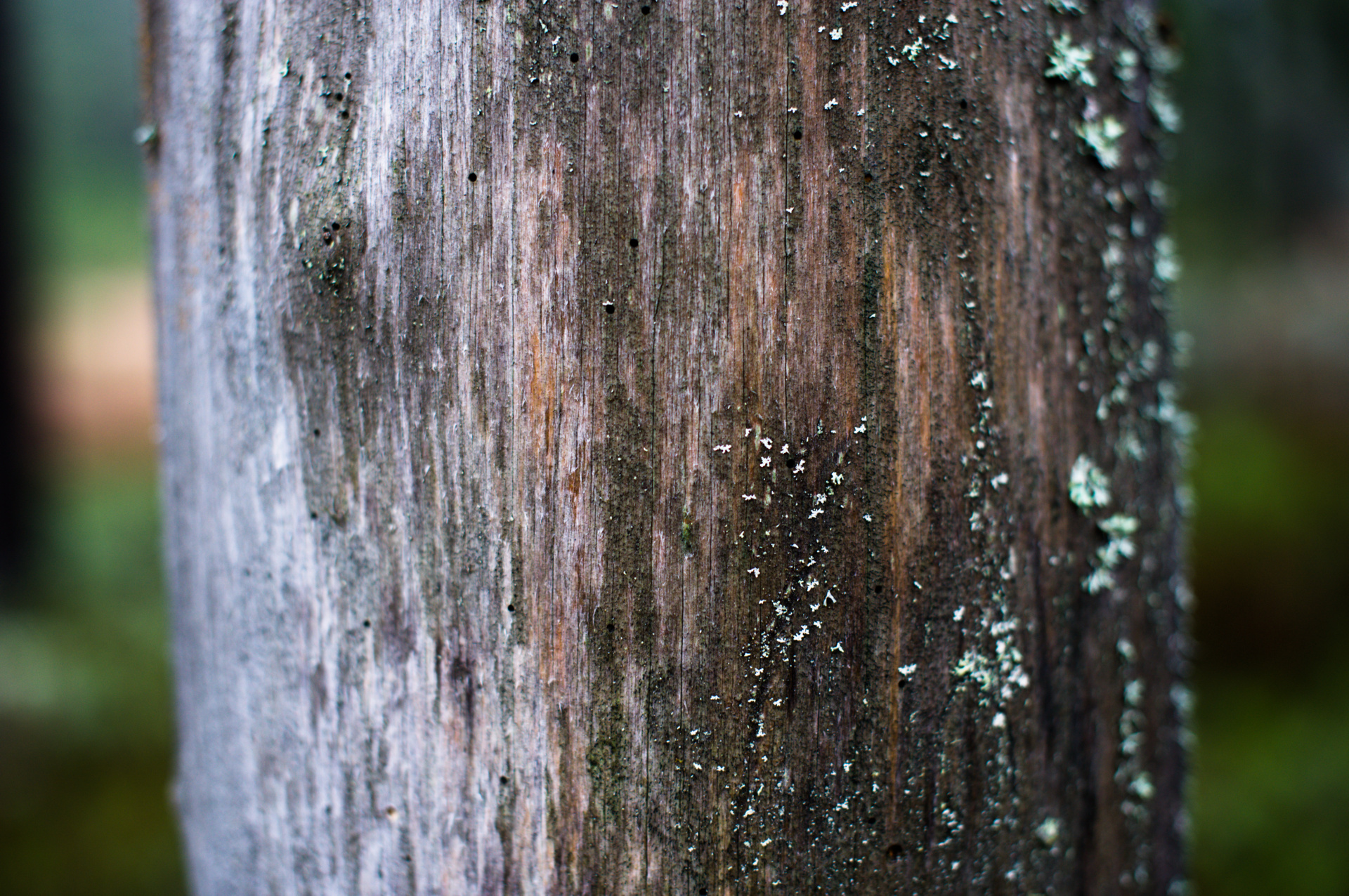
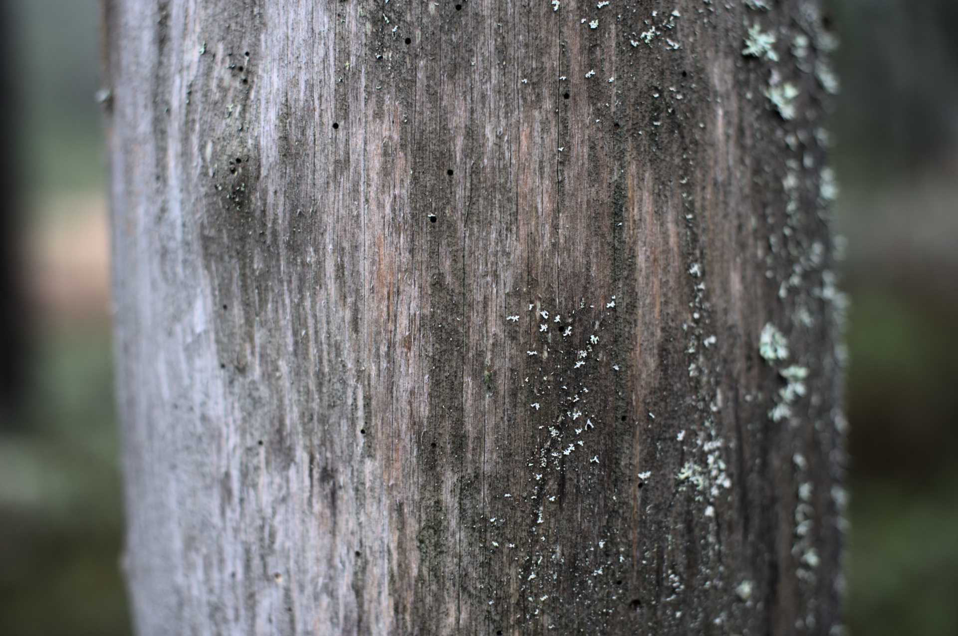
Here is a set of different contrast settings from an image with low contrast at capture. Notice how the chroma of the image follows along with the increased contrast.

contrast = 1.2 (similar to the original linear picture) contrast = 1.6 contrast = 2.4 contrast = 3.2

This is different compared to the color balance rgb where the contrast parameter only changes the intensity of the color and the chroma slider is orthogonal to the contrast. The “rgb ratio” preservation option in the sigmoid module (or any of the preserve color options in filmic) is on the other hand similar to the color balance rgb contrast option and only changes the intensity of the pixel without adding any chroma changes to the image. This is sometimes what you want and it is also what is used in the Reinhard tone mapper (achievable using the sigmoid module with contrast = 1, skew = 0, and rgb ratio as color mode). The effect is kind of weird when you try to add contrast to an image in the tone mapping stage:

contrast = 1.2 (rgb ratio) contrast = 1.6 (rgb ratio) contrast = 2.4 (rgb ratio) contrast = 3.2 (rgb ratio)

Noticed how the image seems to desaturate when the contrast is increased? It didn’t from a mathematical standpoint. A good example of that the perceptual effect can be quite different from the mathematical intention. I think this might be one of the reasons why some users have struggled with the filmic module and why the middle tones saturation slider was added to that module. Many simply experienced that filmic desaturated their image in the same way as the slide deck above. I guess this effect has a name after some old dude that I just haven’t found out about just yet, if you know the name please share it!

Saturation from contrast!

Back to the preserve hue option which changes both intensity and chroma with increased contrast. This behavior can actually be exploited when combined with the orthogonal settings of the color balance rgb module. First reducing contrast and then increasing contrast actually leads to an overall increase in saturation!

sigmoid contrast = 1.6, color balance, vibrance = +35, linear chroma = +35 sigmoid contrast = 2.6, color balance, contrast = -35

Isn’t that interesting? They are almost identical but the processing path is totally opposite!
Why? Well, the sigmoid color change for the “preserve hue” mode can be explained as an exposure + linear chroma change. I.e. first a common factor for the rgb triplet and then a linear chroma scaling as in the color balance rgb module. The amount of chroma change is however not uniform but is instead a function of the original pixel intensity and chroma. This input-dependent amount has two very nice properties, it is smooth, and it approaches the gamut limit but always stays inside of it. Colors with high chroma are thus not changed as much as colors with low chroma, a bit like the vibrance slider in color balance rgb! This is also why colors desaturate to white as the intensity increases as has been shown in an earlier post. Also, remember that hue is kept constant throughout this operation in the same way as for “rgb ratio” and in the filmic module.

The same method can be used on pictures with high dynamic range, not only for low dynamic range pictures like above. Take for example this image from HDRI heaven:

sigmoid contrast = 1.6 (default) sigmoid contrast = 1.2 sigmoid contrast = 1.5, color balance rgb contrast = -20 sigmoid contrast = 1.9, color balance rgb contrast = -40

Compared to using rgb ratio (or filmic with preserve color) and increasing chroma in color balance rgb:

sigmoid contrast = 1.2 (rgb ratio) sigmoid contrast = 1.2 (rgb ratio), color balance, vibrance = +25, linear chrome = +25

So what do I want to say with this post? Increase your image saturation using the " contrast on contrast method"? No, definitely not, it will most certainly bite both you and me in the butt later on. No, I had liked to say these three things:

  1. A chroma increase is necessary when increasing contrast as the image otherwise will look desaturated.
  2. The preserve hue option, gives that for free, with robust properties, in the tone mapping.
  3. The relationship between contrast and chroma usually needs adjustment and that is where the color balance rgb shines the brightest! My current approach when editing using the sigmoid module is to find a sigmoid contrast setting that minimizes the needed work in the color balance rgb module.

All of the above of course also works for the opposite use case. You can decrease the saturation of an image by increasing contrast in color balance rgb and decrease the contrast in the sigmoid module. But again, probably not advisable as the main method of working with color in your image.

Now I’m interested in what you think about these observations!

10 Likes

Deep breath Alright, as interesting as reading this thread has been, on that note, it’s really time for me to dig in and get my hands dirty. Thanks for sending a torpedo into my non-existant free time. :wink:

On a serious note, without having tried it, but spending a lot if time watching the conversation, I wanted to thank you for sharing your project with the community here. Some conversations seem frustrating, but the back and forth has been fascinating to watch unfold.

I also wanted to thank you for being so patient with every type of response, and having such a positive attitude. :slight_smile:

14 Likes

Hi @jandren, thanks for this interesting information. It fills out another white patch on my sigmoid map. Will test it soon :grin:

1 Like

Recently found two really nice Play Raw images that I tried the sigmoid module on. I also rebased the branch to the latest master so I could play around a bit with the new diffusion module. A very interesting module indeed. So far only used it for some sharpening.

First this: [PlayRaw] Mairi Troisieme - #89 by Joan_Rake1

And this: Mountain ash blossoms - #26 by Gotflute

6 Likes