I recommend this too!
4 Likes
Exactly, the clipping indicator is nothing more then saying “have a look here, is this what you want?” If yes don’t change anything, if not get back to work.
I very often ignore it completely. But I do check often. The ‘o’ key and ‘shift-o’ keys are often used to check.
2 Likes
Wrt Agx, also from the defaults you can impact the red quite a lot and even the blue…the hue preservation slider, the working primaries ie try setting it to srgb rather than rec2020 and the post TM red hue rotation slider (maybe even the green one or the blue depending on the “red” in your image) which by default don’t do anything post tonemapping unless you set the master away from zero …so you can try to play with that as well… even just enable the rotations to see how that looks by setting the master to 100%
All this assumes that you didn’t play with that already and if so ignore me… but I could see quite a range of reds and the blues too by just playing with these and not changing purity or attenuation though you could as well…
1 Like
DSC09286.ARW.xmp (34,3 KB)
7 Likes
6 Likes
5 Likes
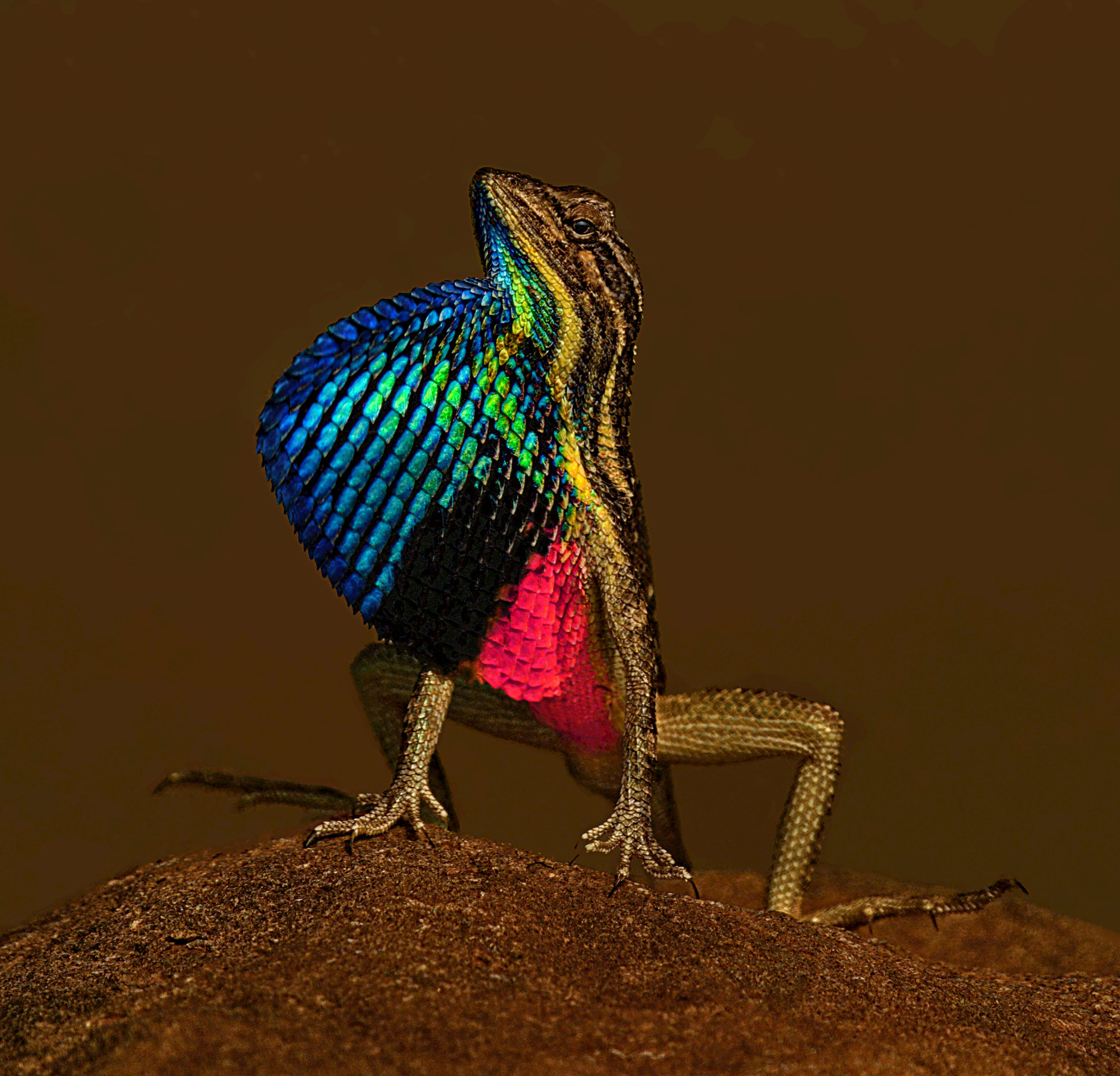
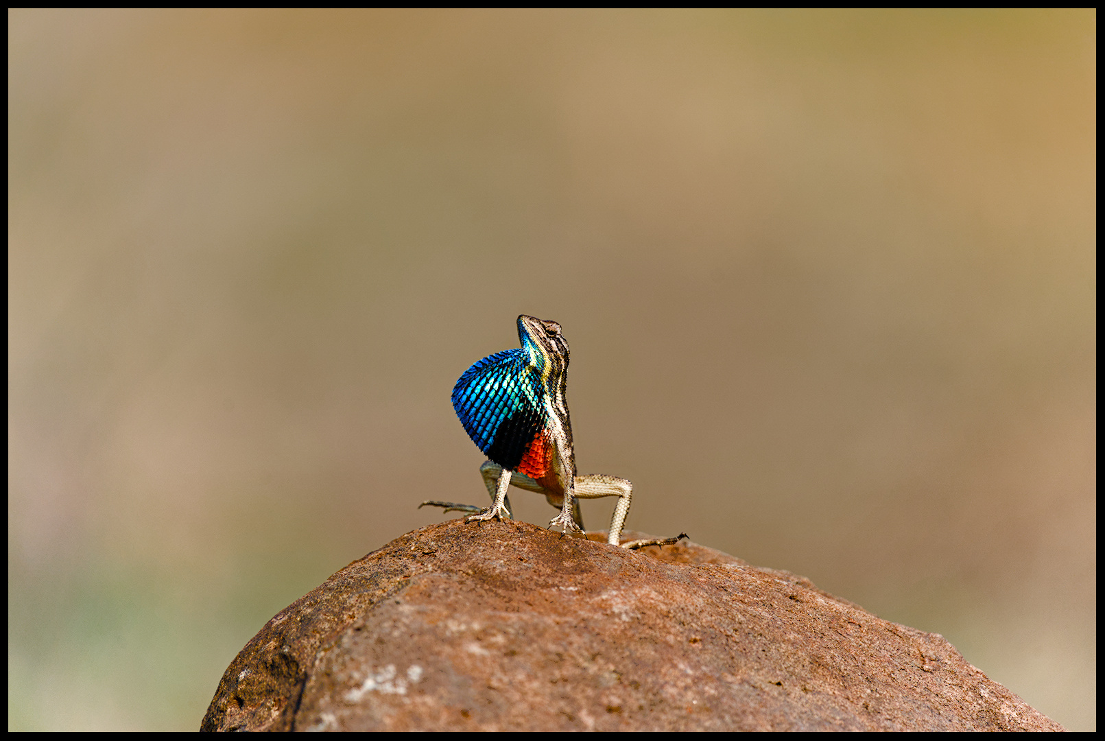
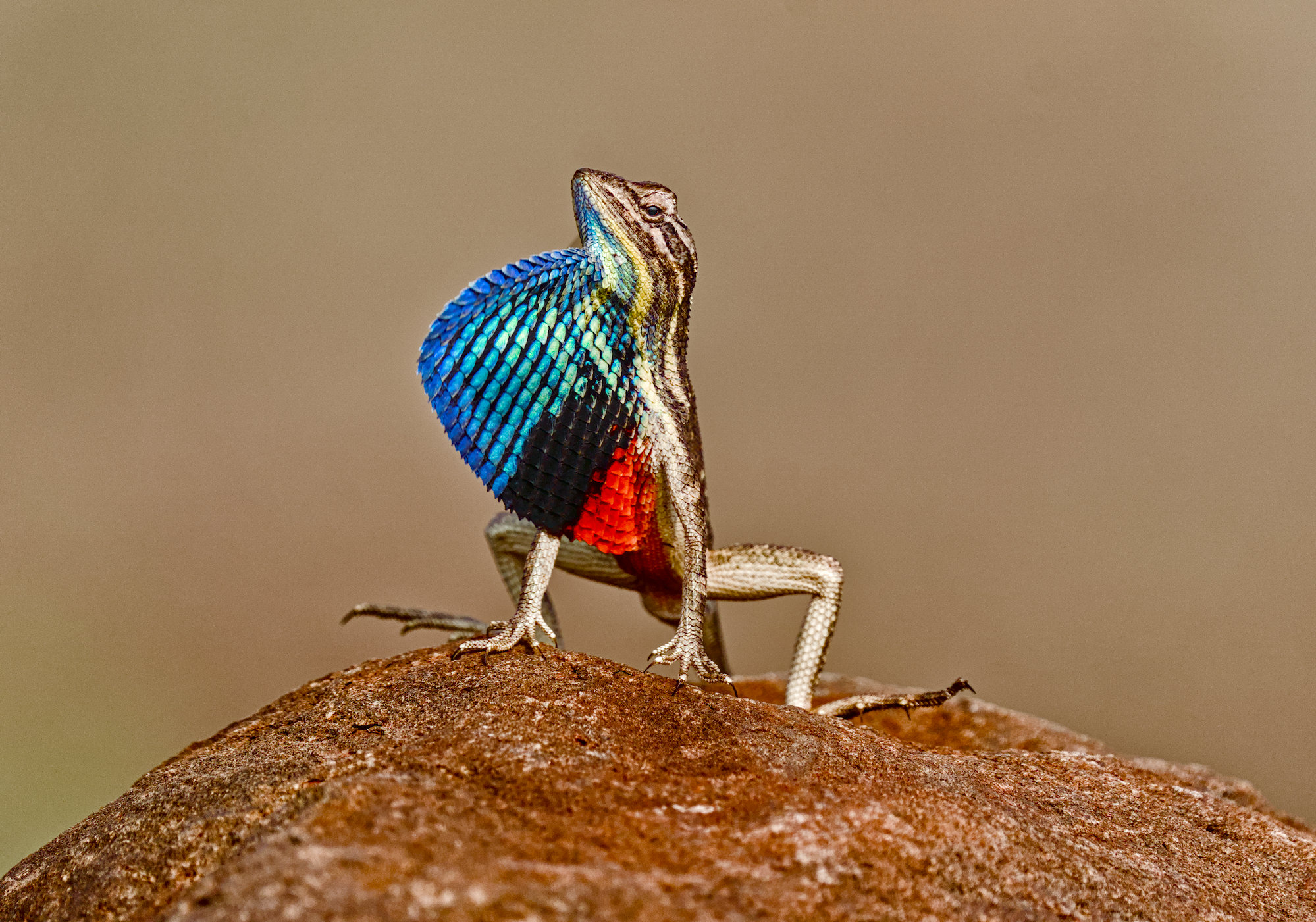
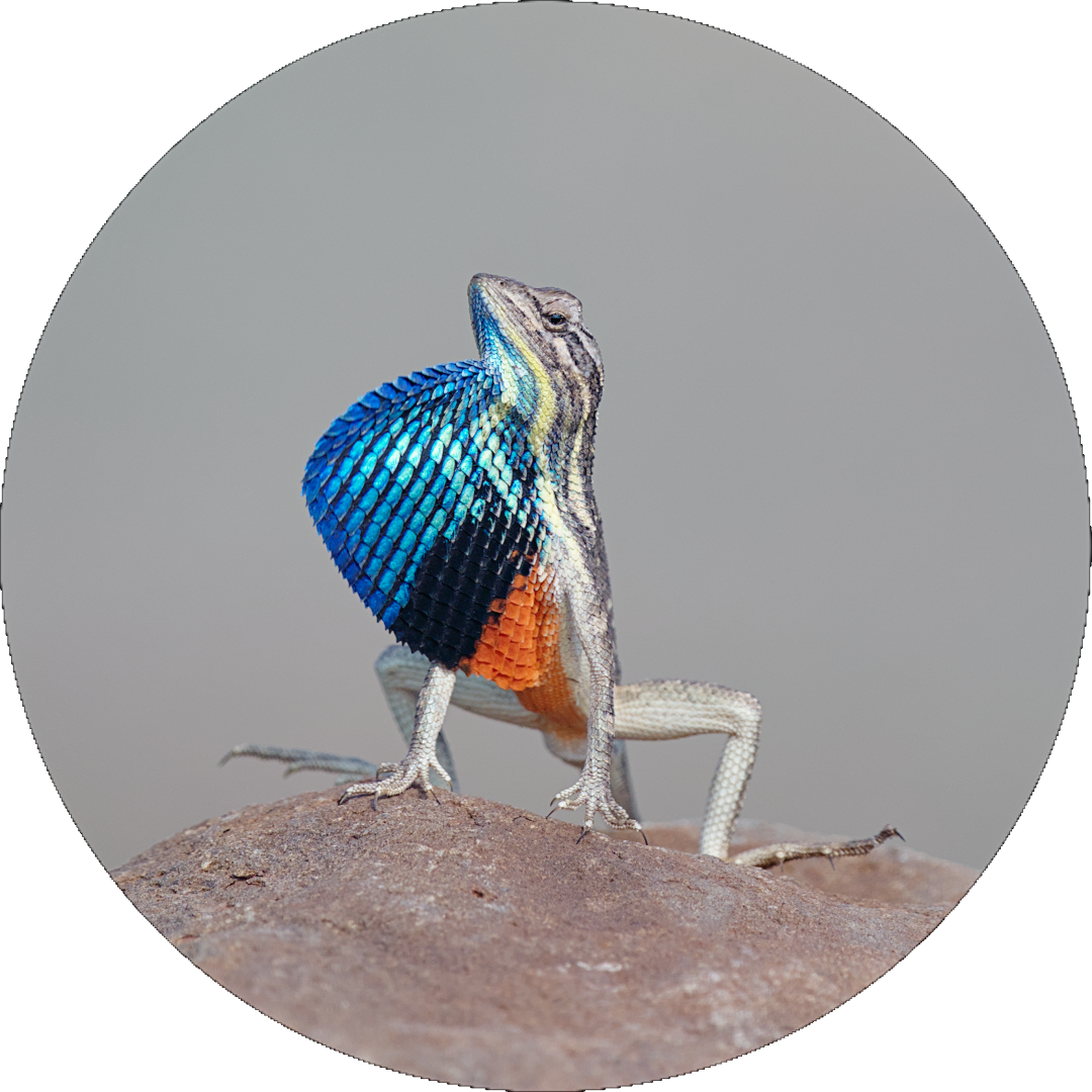
This lizard has the clipping indicator built in in the always activated setting! There’s no way around it.
3 Likes
Nicely held back interpretation!
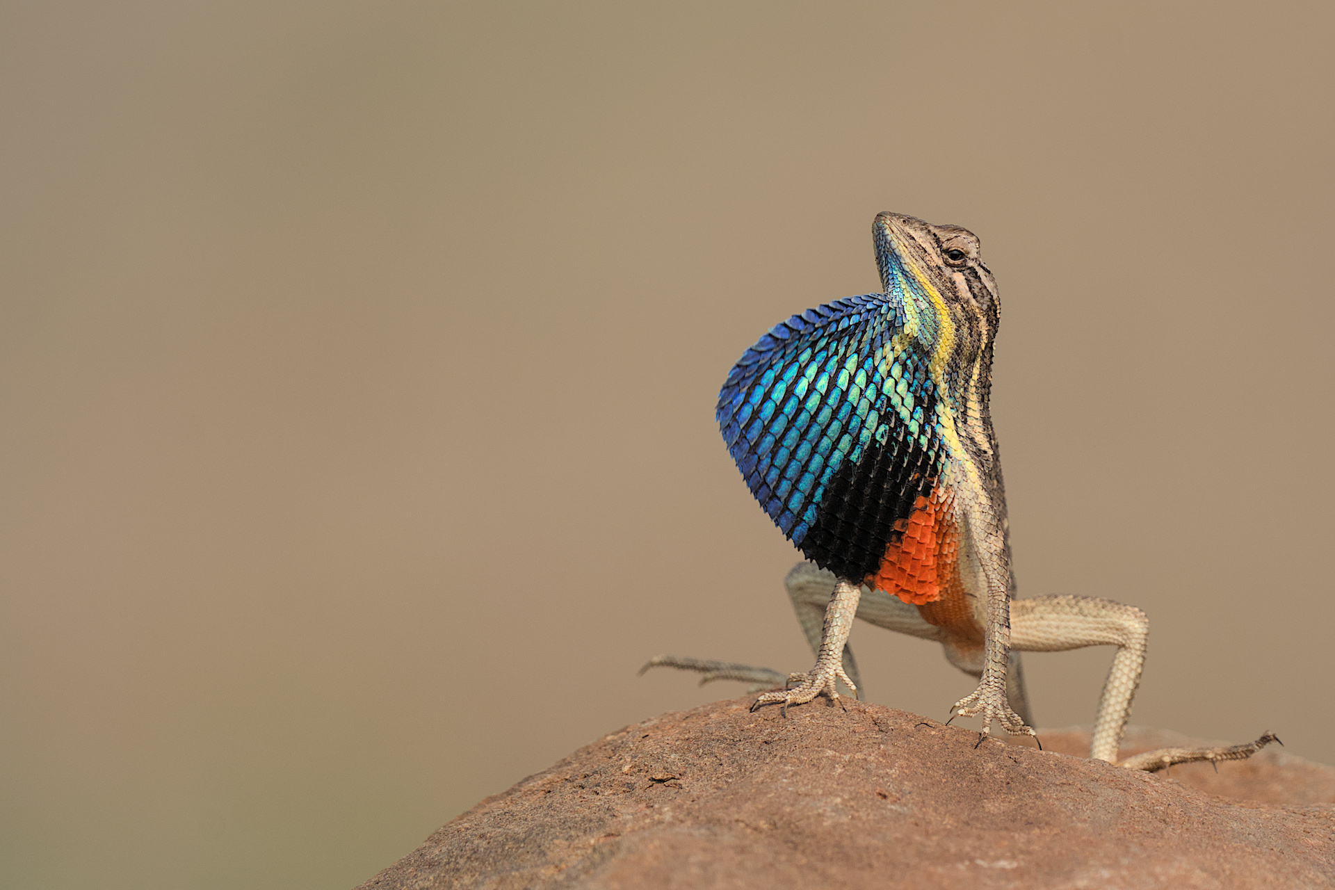
DSC09286.ARW.xmp (15.2 KB)
4 Likes
Now come the hard questions:
- which one is the most natural looking?
- which one you like best?
- and foremost why?
Oh, and there’s no pressure nor any reason to answer if you hesitate…
it’s just my curiosity
What a pretty little fellow. Not sure I am accomplishing anything that has not already been done, but I had fun!
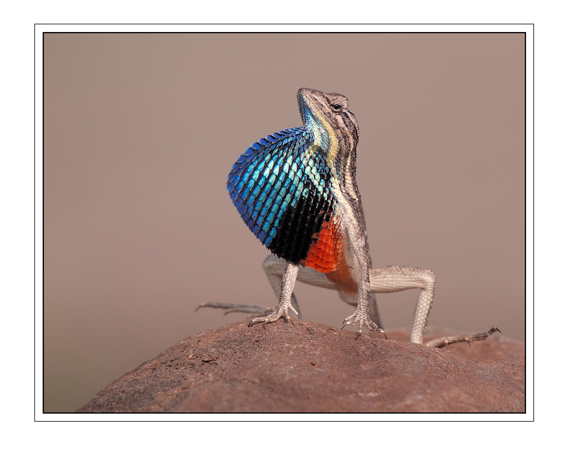
DSC09286.ARW.xmp (17.6 KB)
6 Likes
I saw Boris Hajdukovic change the working primaries to srgb in one of his AgX edits. I forget why.
I shoot a lot outdoors and under-exposed (ETTR). I’ve had some photos keep better detail in the highlights if I switch from rec2020 to srgb (even after messing with the white point, shoulder power, etc.) Per the histogram, this shifts some of the highlights a little left and down.
1 Like
Setting sRGB early may clip colours before AgX has had a chance to desaturate them in the highlights. One of the original Blender AgX developers, Eary Chow, suggested that larger spaces often make dealing with difficult colours easier.
1 Like
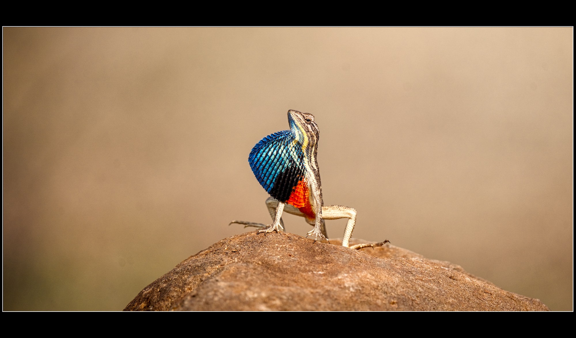
6 Likes
Even thou I like your rendition, my most like is for this creature pose. 

3 Likes
I would surely hesitate to do this myself… 
1 Like
Here is my ‘clipping and contrast’ version. Kofa’s message has me worried because I’ve been setting base primaries to sRGB for everything recently. But I actually prefer what I get in the reds here with sRGB instead of wider spaces.
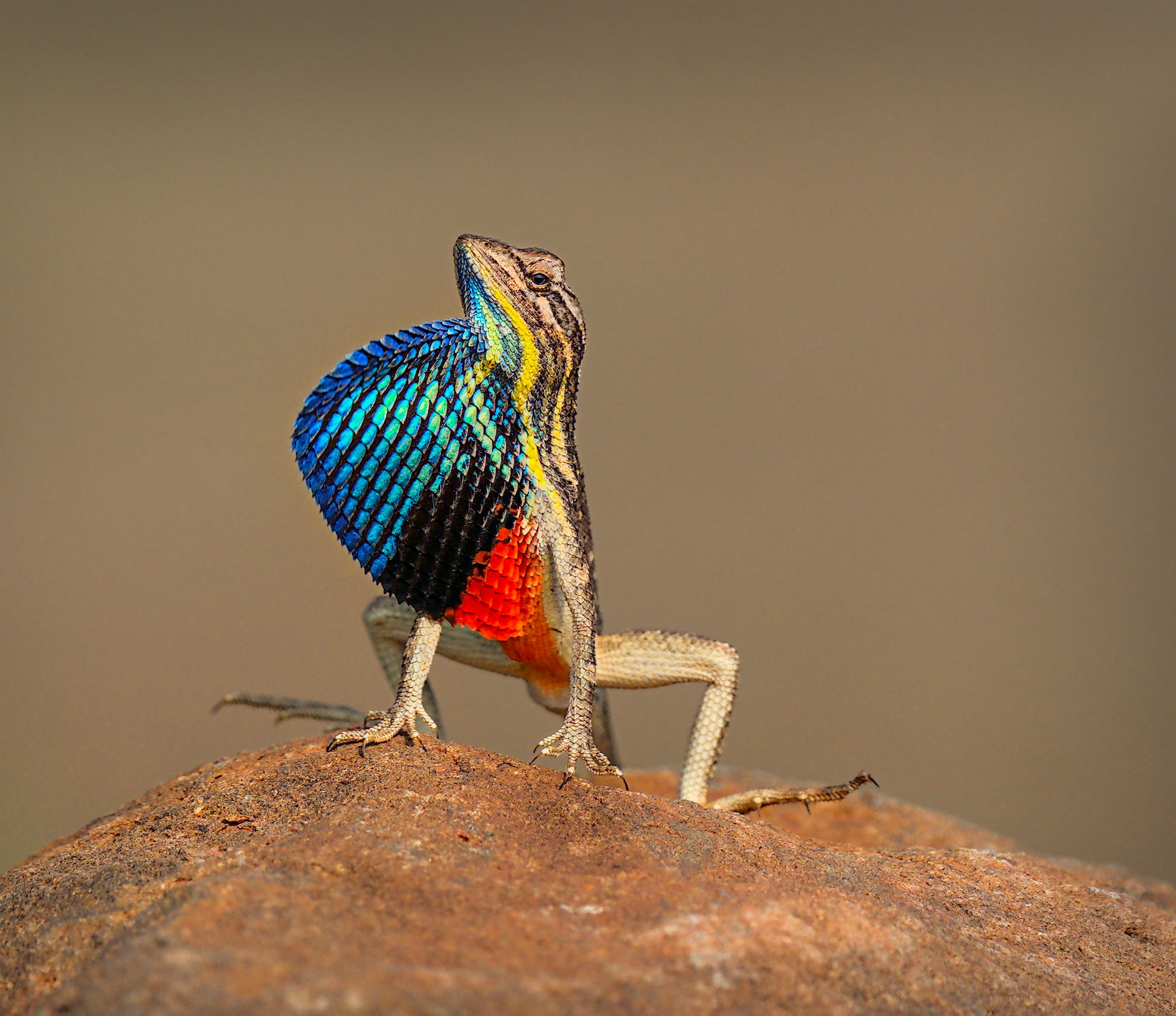
DSC09286_03.ARW.xmp (20.9 KB)
3 Likes
There are many great edits here.
A few have a white balance set that is much cooler than what it was in the field. It was a hot and bright day. And some which are much darker and more contrasty than what it was. But then, you are doing it with just the image.
I will have to pick yours @Jetze for the crop which lets you have the eye contact, for the work done to the eye and the white-balance correctly set!
Thank you for all the edits and the constructive suggestions!
5 Likes
Seeking a natural scene without stridency or excessive saturation…
Sorry for hijacking the thread, but this is exactly what I got criticized for during my photography class. Most teachers, including mine, work with Lightroom and treat the default Lightroom rendering as neutral, even though, technically, it isn’t. The default DT rendering is less punchy, but, due to the tone mapper’s tendency to desaturate colors, it’s not neutral either. And that matters, because people make editing decisions based on the first impression that happens when they look at the image in their editor. I made the same mistake of trusting the default DT rendering as the source of truth during my class.
It got comical: “you overedited your photo by raising shadows too much” - while what I did was lowering the shadows using the Tone Equalizer (of course, after setting the correct blacks and whites in AgX), and my photo was, in fact, underedited.
I know Lightroom edits are normally off-topic, but here (for illustrative purposes, not intended to be a good edit) is what Lightroom Classic does by default. I think this exception is warranted, as this is explicitly a non-edit, and I am discussing teacher/competition compatibility and image evaluation methodology, not art created with Lightroom.
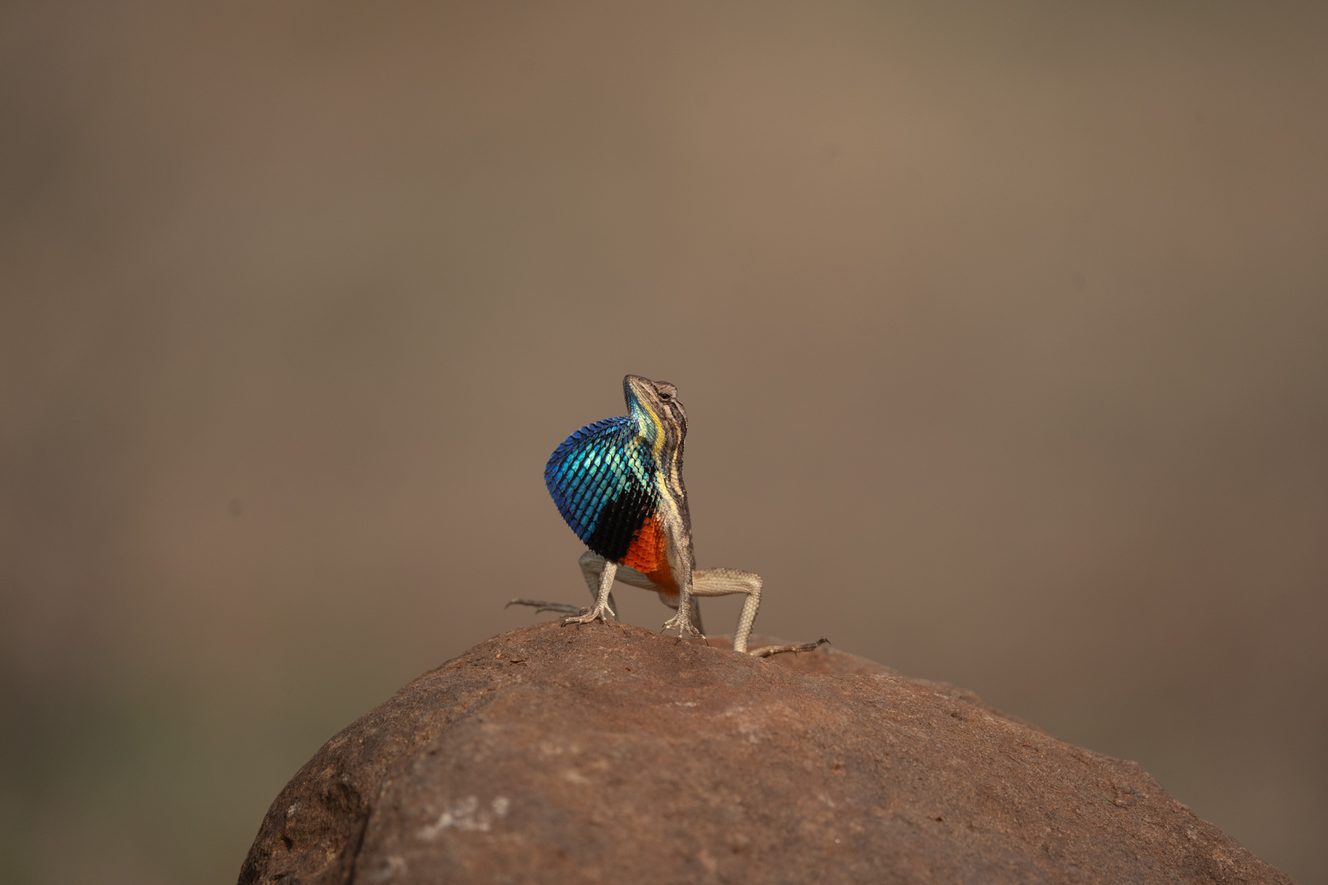
That said, most of the edits above yours are more contrasty/saturated than the default Lightroom rendering.
My advice would be to create a preset that achieves the same level of contrast and saturation as the default JPEG out of your camera, and use that, not the default DT rendering, as the baseline to look at to decide which edits are necessary.
2 Likes