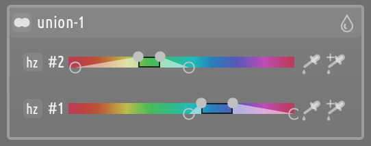
To reiterate what Todd already said: this is just an experiment. We don’t know if or when it will be included in darktable, and if it does it may be in a different form and the edits that you do now may be incompatible with the released version.
So, by all means play with it and test it but don’t use it for edits that you care about.
Hello. Sorry for the really basic question, but could you please point me to a (surely already existing) guide that will tell me how do I install your build to test without affecting my main install? I use Windows and am afraid that I will end up with two programs simply called ‘darktable’ and not know which is which, or that this build overwrites my current (5.6) installation. I wish to create a brand new database (image library) only for the test purpose that I can later uninstall cleanly, so that I am back to my usual working 5.6 version.
Thank you for this work, looking forward to try it out so I can send some feedback.
You can also find how to build it yourself…look in the packaging directory and then WIndows on the official repo for darktable. The instructions are simple and once you set it up its basically running a script each time for a new or updated build.
To build this version you would just need to clone and checkout the branch that @Masterpiga is using for this extra code…
The link shared by @mino should cover the main considerations…ie set it to run in a specified config folder which you can delete once you are done testings…this will contain all the config files and info for your test version and turn off xmp writing so that you don’t accidentally corrupt your main installs edits…I have 5 versions running right now with various features…if I was more clever with git I could likely have one custom one but doing that might create errors from that process that are unique and not helpful to test and integrate the specific ones found by keeping each separate and unique…
Thank you, @Masterpiga, for all your efforts to improve on dt.
This work on mask etc. is tremendous. I really hope it will lead to a change in a new dt version.
Will it be more immediately understandable (for a beginner) and not need an explanation (as @don51’s request seems to illustrate), if “bypass” is rather called “disabled”?
I think so.
Hello @Masterpiga. I had a chance to play with the flexi panel, and have some notes - in no particular order. The notes are based on this playraw edit.
The plentiful functions of the flexi panel are very nice. The fact that I can do a lot of things with each individual element is what decides of the new panel’s power. The fact that all of them are documented in the popup tooltip makes them all somewhat accessible. However, I wonder if these are all easy to use? There is so much that can be done, but the shortcuts are… so many, and so disjointed. For example, ctrl+click:
when selecting a mask element tool - allows to add multiple elements one-by-one quickly
when interacting with the mask group header, allows renaming
when interacting with a specific mask, inverts it
…this will definitely go beyond the scope of what you are asking, but perhaps it is worth noting here anyway - such shortcuts also matter when considering other modules. For example, ctrl+click OR right-click both make the pipette in the color picker module select area instead of a point. But in the channel masks, we have two pipettes, one of which works similarly, and the other… doesn’t? Sorry, this is not a constructive point, and again - likely out of scope - but hope worth highlighting.
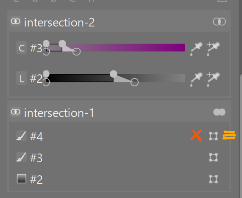
I think I would appreciate an interface that surfaces more functionalities. For example, each individual mask element can have it’s opacity adjusted by hovering over it in the image canvas with the mouse, and the ctrl+scrolling. I would be happy to see the current opacity of each element in the flexi panel - and perhaps little icons that allow actions like delete an element, or a ‘scrubber’ handle to grab-and-reorder? A truly atrocious illustration of what I am thinking of is at the bottom of this post.
I think I may have lost the ability to visualise the hue channel by mousing over the relevant mask and hitting the ‘c’ key (itself one of the super useful features, but very obscure to know about - and sometimes fiddly to trigger. Maybe it would warrant its own UI button?)
When using the ‘import an existing shape, or reuse another’ button, it does not appear to parse correctly special characters in other module names. I see “contrast & ; texture” rather than “contrast & texture” listed
in the same menu, when I pick something from the list “use the same shapes as”, the new shapes are appended, rather than replacing existing ones. Which I think is desirable, but the wording “use the same shapes as” suggests a replacement will happen.
This is probably beyond the scope of what you set out to do, but I think still worth highlighting. I do the following:
I create a mask in the flexi panel (just a simple one to test, one shape only) on module 1
in another module 2, I use the “use the same shapes as” and select module 1
the effect is as expected, module 2’s mask now is the same as module 1’s
I go back to module 1, and make two modifications to its mask a) I change the existing shape, and b) I add a new shape
I go again to module 2, and observe that change (a) was reflected, but change (b) was not. Therefore, my masks for modules 1 and 2 are not “synced” anymore. This makes sense and I understand the logic behind it - the “use the same shapes as” only imported the shapes as a one-off instead of placing a permanent sync between the two modules’ masks. But - maybe that would be worth considering as an additional option, so that I can in the beginning define my main areas of masking and then use multiple sets of modules per each masked area - and if I want to refine mask of any one area, all these refinements are then propagated to all the relevant modules. I hope this is a helpful suggestion, and apologies for bringing this up again if not. I am still tremendously impressed and grateful for the flexi panel anyway.
Lastly. I could not reproduce it so cannot provide any useful detail, but when I was moving mask elements around and turning them on and off, darktable crashed for me once. No error, just instant window shutdown. I am on Windows 11.
Phew, sorry for this mess of a brain dump. I really hope this might be a little helpful. I am keen to do more testing if you think it’s worth it?
Yes, you are right. I did not really think too much about the shortcuts. In this version I just wanted to expose and test the functionality. As the main features are settled, I will start iterating on the details.
(With “details” I do not mean that it is not important, but rather things that can be changed quickly and iteratively.)
You can do that with SHIFT+Click already. There was an icon for that before. I removed it because the UI was too cluttered. The plan is to expose all the actions available for each row in the row icon menu (i.e., the one that you use to change the between-groups operator).
It still works (at least, it should). It also works if you press c when you are over the button to add a parametric channel, as well as if you do on the slider after adding it to the mask. You may have to wait a fraction of a sec before the overlay shows up.
Noted.
I would use a raster mask for that. The mask will be always be whatever the other module publishes, which changes with every edit.
Yes, that is to to be expected. It is a huge code change and at this point I am not aiming for perfection, just for something that works well enough to test the idea.
By all means, this is all super useful, thank you so much!
I will do more testing and try to come up with more specific useful notes.
In the meantime:
Amazing, this is super useful. Maybe we can have a little chevron to show this additional detail panel next to the solo mode icon - this could allow to expand and collapse the extra sliders? I really think it would help to surface this functionality.
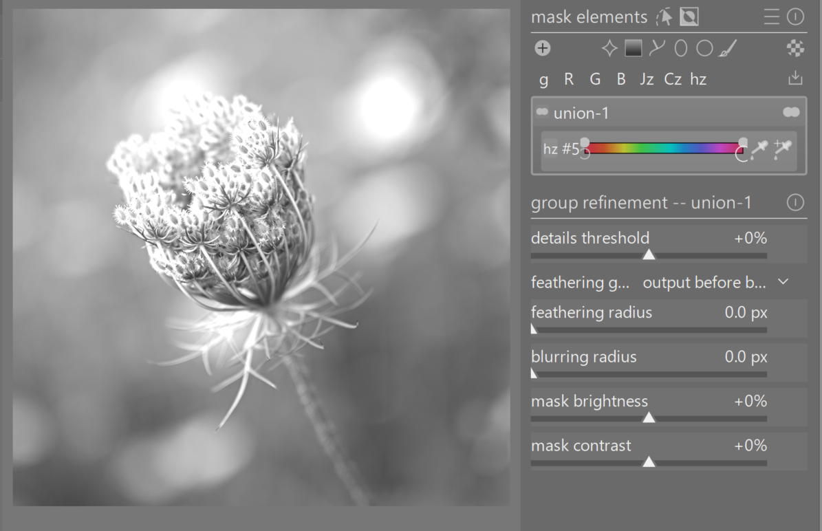
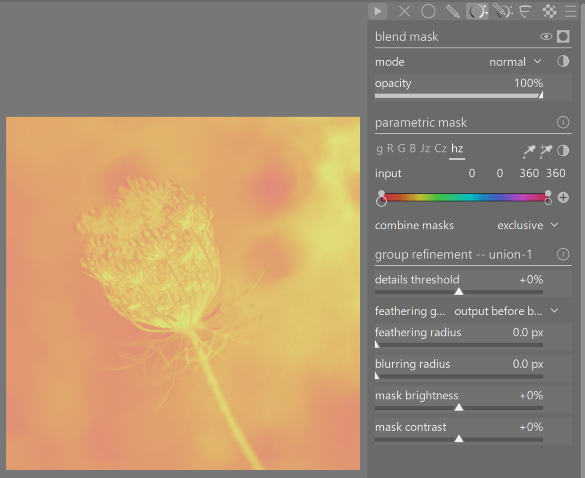
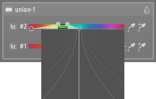
I might be doing something wrong, but when I mouse over the hz “rainbow” and hit ‘c’ I see this:
Thanks again. I’ll think more carefully through the specific questions you asked in your initial post.
EDIT: couple more things I am noticing:
I think something may be off with mask elements overlay. Steps to reproduce a bug:
create a new group with union within-group combine mode
draw 3 circles
change the group’s within-group combine to intersect
observe that the first circle is still included in the mask in its entirety
change the mode to union and back to intersect
observe the resulting mask is still not what’s expected
delete the first circle, add a new (fourth) circle
observe the resulting mask is now as expected
I think it would be useful to be more explicit on what does ‘screen’ within-group combine mode do? It’s an unusual term, I think. I know it from raster blending modes, but have difficulty to imagine what it might do here, because union and intersect are typical logical operators, but screen is not.
It looks like I can drag-and-reorder mask elements within groups but in a confusing way, because:
it is useful to reorder groups since the different operators make them behave differently
reordering groups, or dragging mask elements from one group to another has visual cues that suggest these are supported operations
reordering elements inside groups should have (I think?) no real effect, their order would not matter to the within-group operators
there is no visual cue that reordering is possible - but when I do drag elements, their order does appear to change
…in any case, it is nice to be able to move an element from one group to another.
It is a soft union, useful to prevent feathered regions to create harsh transitions. It is mentioned in the README and in the user docs.
Indeed, it is a no op. As explained in the docs, each group is a bag-of-elements, the order does not matter. Maybe I should disable within-group reordering altogether, but then some people may like to rearrange the elements in a way that makes it easier for their mental model, so I would keep it around.
Yes, there used to be handle to reorder. Removed (like the chevron for the properties) to reduce clutter. As I commented in a post above, darktable’s philosophy is to try and avoid cramming everything possible functionality in a UI widget. Some things, you are just supposed to know them.
This is not necessarily a philosophy that I agree with (as a matter of fact, I mostly disagree), but in the specific instance I kind of do agree. Mask editing is very click and action intensive. If you want to expose every functionality through the UI, you end up with something that is either (1) very nosy and crowded, or (2) very click intensive or with long menus, where you have to click five times or navigate through list of options to get anything done. The alternative would be to reduce functionalities, but this would definitely be not darktable’s way
So, there needs to be some judgment call being made as to which functionality to expose in the UI and how.
I do not claim that the choices that I made are the best ones, and they are certainly far from final, but the end result will necessarily include some compromises wrt what has a UI widget and what does not, because the main goal is to have something that is quick and efficient to use for those who know how to use it, while still being reasonably self-documenting and discoverable.
So, feedback in the form of
It would be nice to a have a UI allowance for X
is not very useful, in the sense that we all agree that, ideally, all functions would be exposed via an explicit UI widget. OTOH, feedback like
I would have an explicit widget for X rather than Y because of Z, or
I would expose functionality X like this, Y like that, and Z like so, or
The most important things to have in the UI are: X, Y and Z
is very useful because it gives me concrete elements to weigh when I have to decide how to allocate to UI real estate.
Concrete UI trade-off example
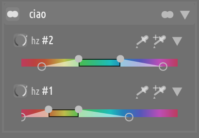
In the previous update, I dropped the “properties” chevron icon and the separate icon for parametric mask rows. This freed some space on each element’s row header, which allowed me to move the parametric slider directly in the row header, which saves a lot of vertical space (the 2nd screenshot is wider, but this is just by accident):
So, we pay a discoverability penalty for a real estate advantage. As everybody here is very passionate about vertical real estate, I think that this is a net win.
A counterpoint thought on that particular example…
I’m passionate about image real estate: I like it to be as big as possible. This means that I hide, or keep to a minimum, all other areas. The downside to this is precision in slider/etc movement over a shorter distance. This might particularly apply to a parametric slider: things get very close.
For the long-term details list…
About the ‘c’ visualisation shortcut: it also works with CTRL-C. This is a nuisance: one cannot copy the history if a parametric mask instance is open.
Thought of reporting it as a bug. But with bigger changes sometime in the future (maybe), I hadn’t bothered
I was wondering, if these parametric mask sliders of Hue, Chroma, etc. could also get this right-click fine-adjustment mode, as we have if for exposure and many others.
I often have pictures where I need to adjust some of these four pickers by a very tiny amount, which is not so easy. In the current parametric mask controls, there are also the resulting numbers output in the GUI, but one is not able to edit them (which would also be fine from my point of view).
How do others think of this? Or am I alone with this “need”?
Good idea! It’s something I’ve only recently started to use, and I suspect it isn’t well known. I hadn’t thought of it for parametric masking. No of course: it isn’t there.
Whether it’s the answer or not I don’t know. But tiny adjustments in this instance are critical, and very hard to make
You might know this already, but right click does ‘select’ or deselect the individual triangle/value so you can use mouse wheel to increase/decrease it without moving it first.
Is it more suitable than a precise input box? Not sure.
Thanks, that is useful to know. But I have wanted the value adjustment scrubber popup so I could see which side of the mask was responsible for a mask error without permanently changing the value, or changing it but then being able to make the change more subtle before the value is committed. For this use case, one click to make an aggressive change works (as it will be undone), and the value scrubbing popup is even better, but mouse wheel adjustment doesn’t fit the workflow.
One issue: if right click brings up the value scrubbing popup, it would break the triangle select functionality you just mentioned. Does the scrubber also work with the mouse wheel?
Oh I didn’t know that. I realized that the triangle gets highlighted when right-clicking it, but I didn’t know that mouse wheel would change its value. Good to know and thanks for pointing to that. I typically work with the trackpad of my laptop, middle-mouse and pointing-stick (which should be emulating the wheel) scrolls the list of modules
Unfortunately no: you move the value by dragging the indicator with the mouse. The mouse wheel just changes the “zoom” level of the scrubber pad, i.e. the current min-max span. So perhaps, it could be worth to introduce key-accelerators here, to also allow for adjusting with the mouse wheel.
Mouse wheel does nothing for me here. I think it is because I have it set to scroll modules: I do that all the time, so this is totally set in my use pattern
Is this scrubber pad are we talking about the “whisker control popup”…if so at least with the mouse it has two nice features…ie the proportionality ie the further out you are on the whisker the more precise the adjustment and secondly if you enable it and just move the mouse pointer without left clicking it makes the changes visually so you can move it around until you like it but if you don’t left click and just hit esc the value is not changed, if you do left click when moving the whisker then the change will move the value when you let go…
Edit acutually even better you don’t need to hit esc just moving the mouse pointer outside the popup closes it with no change applied…
Edit
Regular sliders have a modifier as well for the mouse wheel… Shift does 10x the default single increment and ctrl does 0.1 for finer increments… Finally preferences has a setting to scale the slider to the min and max… I am not exactly sure but likely it just adjusts the default based on the span of the slider if you go beyond the soft limits??
Ikeep meaning to check the documentation to see what the “official” name for it is, but I don’t think it can be any better than Whisker Control.
I think it could be a great help in the parametric panels. But the response of the image preview or (possibly more important) the yellow show-mask overlay needs to be very reponsive.