Because this post apparently caused some misunderstanding: I’m not saying that the exact hue-shift I’m using here is the be-all-end-all although imho it does many of my images a lot of good.
However, the main takeaway is what I’m writing towards the end of the post, which most people appear to have overlooked:
Following on from this thread, where I opened by quoting an editing tutorial video (it was this video by Youtuber That Icelandic Guy; he’s using LR, but that’s immaterial for what I’m after):
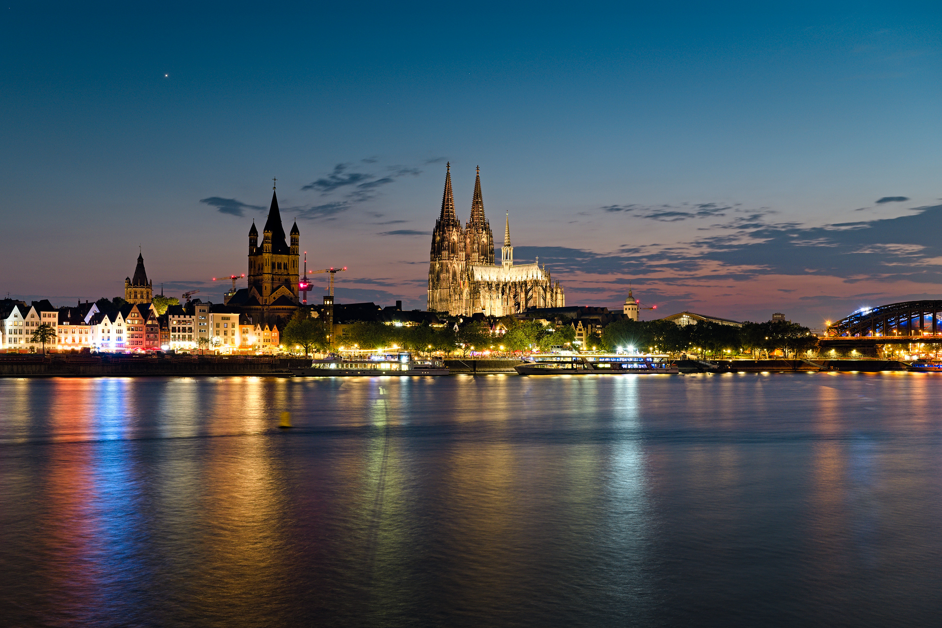
I have heard about issues specifically regarding the blue color range in several other processing tutorials / advice videos I’ve watched (e.g. this one by Omar Gonzalez in which he talks about blue daylight reflected in whites) and I’ve often noticed both in PlayRaws and in my own edits how I was rarely ever satisfied with the blue color tone of skies in my edits (nor in my JOOCs), especially in evening light, and how amazing the blues look in many other people’s edits. This is the case both with images from my old Nikon Z5 and with my new Sony A7C II btw; getting blue to look good is an editing challenge in and of itself I find.
Following a spontaneous hunch, I went back to two images I had posted here as PlayRaws and simply adjusted the blue hue in RT’s HSV Equalizer module (ART, like LR, uses HSL which I’ve so far haven’t been able to use to my advantage as much as HSV in RT; your mileage may obviously vary).
I simply shifted the blue range of the spectrum down a little bit towards the greenish turquoise.
I love the new edits with the less purple-ish blue and I think I’m making this a basic staple in my processing from now on, to at least try and see what carefully hue-shifting the blue color range accomplishes. It’s such a tiny simple thing but it makes so much difference in images with a lot of visible sky.
I have never had a Fujifilm camera, but from what I read and hear, part of the appeal of Fuji’s in-camera JPG engine is that they often green-shift the blues as well. Maybe Fuji users can weigh in on that.
I recall from when I was young and interested in cars. In those days, body shops fixed cars instead of just replacing parts. They mixed their own paints to match the rest of the car. What I always heard them say was that blue is the most difficult color to match.
And if you done it for a long time, you get bored of having all the time a turquise sky on every picture. And after a while you think, ahhh there is this guy who has this great photos with this purpelish skys. Maybe I should try this with my photos as well…
Isn’t it like that with every fashion? Just like achromatic cars and retro style cameras?
Maybe, but there are also things that you see one time and it instantly clicks and never fades. I doubt that e.g. most veteran Linux users would describe using Linux as a “fashion”, no?
Kidding aside, I’m fairly sure that I’ll never just blindly accept sky color ever again; imho that’s the main takeaway here: deliberate choice vs not choosing at all.
I love this tip. I have duplicated several of my edits that have a lot of sky, and IMO it has improved every one. It only needs a small change to the sky’s hue, though.
Even just blending a module of rgb CB in the blue channel or in chromaticity blend modes and then playing around brightness and saturation/chroma changes either globally or with the tonal sliders can do some really dramatic and interesting changes to the sky
I remember spending a lot of time fiddling with the sky colours on my photographs, changing hue, saturation and brightness in all kind of ways with no satisfying results, until I realized that my problems have nothing to do with photography. I simply do not like the colours of the sky, even less in combination with the horrible green vegetation.
Alternatives can be going black & white, avoiding the sky altogether, or changing the colours radically. Anything goes.
Yes, we should bear in mind the effect of surroundings on color appearance, or in this case the effect of nearby large areas of e.g. cloud, snow, sand, vegetation, na-ni-na …
In fact and in this case, how it looks on your screen probably outweighs hue numbers i.e. the same hue number sky can look different in different images, not to mention at different lightnesses!