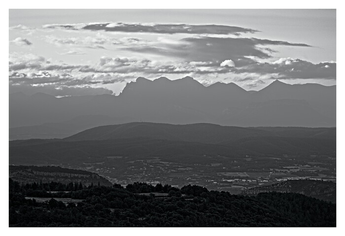
Today I started playing around with the “Framing” feature introduced with RawTherapee 5.12. I wasn’t really thinking about it initially, and I had yet to frame any picture of any sort until today, but I came across a case that seemed to benefit from it:
But here’s the catch: I’m not sure I can put into words what made me think these specific pictures would look better that way. Appart maybe that they have “an air of solemnity or mystery”, and even this doesn’t quite convince me.
It might just be a matter of personal tastes (well… I’m kinda sure it is), but I currently think that:
Pure-white frames are blindingly bright, and prevent me from focusing on what’s in it.
Non-fixed-thickness frames (like, thicker horizontally than vertically, etc.) look a bit odd to me despite the fact that it seems to be the default behavior in RawTherapee.
It’s hard to find a non-black color that would fit anything.
So for now I saved the .pp3 above as a standalone, reusable profile and called it a day. But I’m still curious about what everyone thinks. (I noticed in Play Raw threads that some users are big framing fans.)
That’s an interesting point, but I tell myself that, by using ImageMagick scripts (or anything similar that I don’t know about), it is way easier to add a (possibly more complex) frame to a batch of pictures (preferably creating copies of those pictures instead of overwriting) rather than removing an existing frame.
Similarly, I can re-run RawTherapee’s CLI on the to-be-printed pictures’ raws and ask it to combine the original .pp3 with a framing-focused .pp3. I already do something similar, but for resizing, when publishing slideshows online.
For me a white frame is essential in every photo. Once you become used to it you can’t go back, it really aids your visual system knowing what white is and properly “know” how bright the image is. Even better if the background is grey, but for me it’s optional whereas the white frame is non negotiable. This is of course true only for screen viewing. For IRL viewing you already have other frames of reference and usually your picture’s brightness is determined by your light sources
Hum but when I publish my pics on my website, there’s already naturally a white background (and I could fiddle at will with this via CSS).
Sorry, it probably sounds like I’m just brushing off every piece of advice thrown my way, but I swear I really do appreciate all these inputs. I have absolutely zero experience when it comes to printing and exposing pics, so it’s interesting to hear about those aspects as well.
As for trying out stuff before applying a frame for real, perhaps a quick hack would be to use the feature in RawTherapee that changes the background colors, but (maybe I have yet to fully master some settings) the non-default colors display (greyed out, but displayed nonetheless) the cropped-out areas of the picture, so this kinda ruins the test. Edit: It’s exactly the opposite the default, theme-based background color is the one that displays the out-of-crop areas. So it’s OK-ish.
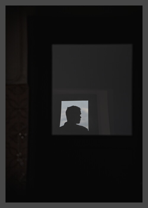
First attempt at a white frame (which will be kinda useless on my website, but still): it seems they are pretty cool on black-and-white (or nearly so) pics. At least that is a very simple heuristic.
(Almost ditched this dull-ish picture – an overkill use of the HDR mode that ruined my histogram – but I kinda like it now. I went a bit crazy on tone mapping at the end, and it seemed to help. It was very early in the morning and it was hard to get any details to show up.)
As I’m starting to realize that white frames are not so bad after all (used a couple of other ones after the example from the other day), I’m starting to consider adding a grey background on my (future, not necessarily past) online slideshows, otherwise the white frames would just look like random extra padding. Is there any particular shade (in terms of hexadecimal code) that you’d suggest? I’m considering #dadada.
My current, old, unedited, white-background layout looks like this:
For my image viewer I copied darktable’s middle grey background. For my website I went a little lighter so I’d say it’s best to experiment and see what you like best, as different shades of grey with white borders will provide different levels of perceived contrast in your photos
But I don’t necessarily want to frame them all, and not necessarily always with the same color I guess I’ll have to experiment even more, to see whether the grey background is too distracting in some cases. Will see; no rush, there. Thanks.
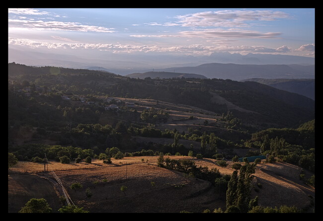
Jokes aside (even if this was not really a joke because it actually works pretty well), the strong asymmetry of that picture seems to make it quite unfit for frames (to my eyes, at least). Yet another heuristic added to my mental notes.
Perhaps a colored frame for that image, e.g. blue whereby you get a reasonable complementary color contrast (blue vs brown) at left but less luminous contrast at right because blue is not a “bright” color, unlike green …
… based on the linear formula:
Y = 0.3red+0.6green+0.1blue
Many years ago, I played with the idea of content-aware framing where one could select a colour and framing dimensions based on a photo’s properties. The algorithm or workflow may work for a few images and stop working for another set: override the method or create a custom one per batch or series.
Another approach would be to let your users decide. Let them choose the frame and the background.
Better yet, add accessibility tools to let users tweak the website viewer to suit their own preferences and surround ambient light.
I think I kinda get the general idea, but I’m having a bit of trouble understanding how you apply that formula. Not sure what the Y stands for; depending on that, it could lead to any color. Did you mean 0.3 r = 0.6 g = 0.1 b?
(Grr, one issue with my “prototyping with the image viewer” strategy is that it uses hex codes while RT uses three 0–255 sliders. Need to go through a converter and stuff.)
Also, I try not to force myself to frame everything, so if a picture “resists me” for too long I just let it live (and leave) like it is.
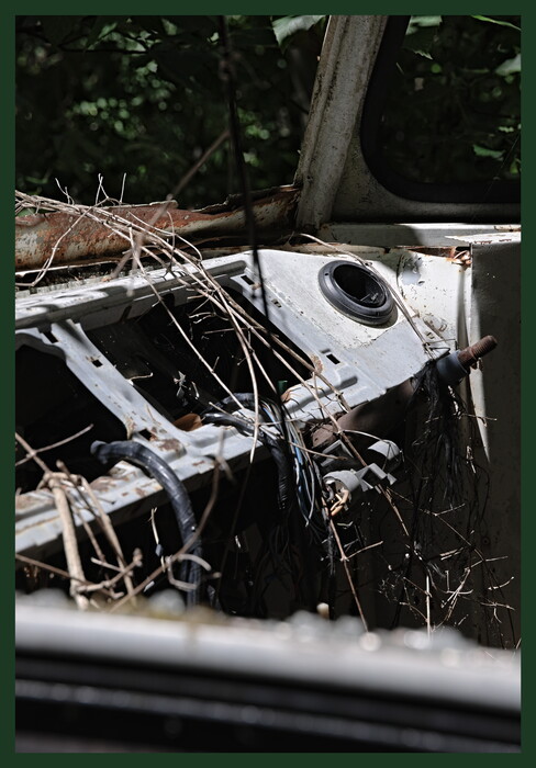
I used a dark green frame yesterday, but you may think it’s horrible taste haha. I made it a bit thinner so it’s not that obtrusive in my opinion:
Yeah that crossed my mind, but it’s probably hard to get right.
Yeah, it’s still a bit bare-bones. I coded something rudimentary in that spirit for pages like Merzbow, « Pulse Demon » – Janvier 2018 (Alice M.) (the ugly thing in the upper-left corner). (It became kinda obsolete for article-like pages now that most browsers have a built-in “Reader view”.) But I know that if I go down that way again I will spend ages fine-tuning stuff.
Y comes from the CIE XYZ color space which is the basis for all things color. Y stands for the apparent brightness of a color. A similar formula calculates Y’ which accounts for gamma (perceptual).
I included the formula to show that blue might be a border color choice for that image; you don’t have to “apply” it to anything during processing.
Suppose you choose pure blue border color, say 0, 0, 118, then Yborder = (0x0.3 + 0x0.6 + 118x0.1) = 19/255.
Knowing the apparent brightness of border color relative to adjacent image colors might help you and might not. I’m thinking perhaps not and this thread is probably not the place for Color Science 101, sorry.
Oh OK. Well, regarding brightness choice, I think trial-and-error is as good a method as any.
I’m playing more and more with the thickness of the frame, too. A black frame four times thinner than what I started with seems to guide eye focus without producing the gloomy atmosphere that thicker black frames sometimes yield. I wish RawTherapee allowed one extra decimal place for the “Size” setting’s number, but it’s probably a good thing that the app sometimes puts limits to my perfectionism.
I cheated a little bit with an LLM and implemented a “night mode” on my new slideshows. I also noticed that my default background was not totally white, so the white frames were already visible enough in my opinion, even in “day mode”.
 despite the fact that it seems to be the default behavior in RawTherapee.