Thanks! I’ll go through your document and try to organize my comments in sections.
Exposure basics
whites turning grey in the case of the “Highlight compression” slider
I guess you second my notes about not pushing this particular slider too far, then. If I gather all the highlight compression values from the stuff I put on my website and sort them numerically, it quickly falls below 30, with the bulk of the values being in 5–20.
Edit: Wow, later you seem to say that you allow values up to 100.
I still fail to see the point of the associated “highlight compression threshold” slider. It just seems to make the compression result weird or suboptimal to me. I think the only time I used this was when I desperately tried to make the sun “look good” without ruining everything else, or something like that. Overall, that slider always seemed to be a rather niche feature to me.
From your notes, I see that it was probably right of me to avoid using the Exposure slider too much. The “auto levels” feature tends to go crazy with it, while I personally prefer to leave the heavy-lifting work to other sliders and tools. Hence the fact that I basically tell people, in my own notes, to use the Exposure slider while focusing on the highlights and clipping. Hmmm, I notice that my notes were somewhat lacking in that part. I’ll edit it a bit. Need to tell readers to avoid extreme values.
making small adjustments with several tools
I often get the feeling that my processing is a sum of nearly unnoticeable changes, haha. Sometimes the difference between some of my snapshots is absurdly subtle.
Selective Editing (using a Global spot)
I never used global spots – it sounds so counter-intuitive, in a “selective editing” tool, haha. I see that, oddly enough, there is both a “global” mode and a “full image” mode. I’ll need to check the docs about this.
Color Appearance (CAM16 & JzCzHz)
I never used this either, mostly for stupid reasons I guess. It has a creepy name, and I think I read stuff somewhere like there were two competing implementation of that stuff living in different Git branches of the project. I don’t remember exactly, but basically it gave me the impression that using this tool would be a threat to backward compatibility. Last but not least, most of the sliders within sound cryptic as hell to me. I guess I’d need to do quite a bit of RawPedia reading on that.
I gave it a quick try and was surprised by how fast the computations are – it barely slows down the preview – with respect to good old Tone Mapping. What kind of dark magic is that, haha?
Camera profiles
Yep, after creating [Questions] How to choose a DCP profile (if at all), I ended up using a neutral-ish profile (Canon EOS R6 Mark II Camera Neutral.dcp) basically systematically. If I want to exaggerate anything later, I can still do so via the various tools.
Dynamic range
I used to make an obsession of making the histogram touch both ends, but now I honestly do what “feels” and “looks” right, paying more attention to the preview itself. I don’t necessarily want my highlights to feel needlessly “brutal”. If an image “looks flat and lacks contrast”, as you point out, we’re generally able to notice that issue anyway, to some extent.
Plus, some histograms are “naturally ugly and weird”, especially on pictures meant to be dark, and I find it hard, then, to decide what “touching both ends” even means:
(This is the final histogram of
https://www.alicem.net/photos/2025-figs/pics/G79A1769.jpg, on which some blown highlights drove me half-insane.)
Similarly, years ago, I used to use the black point and white point trick on the curve (the points that create flat areas on both ends, as you show on your screenshots), but now I rarely do that – or just a little. But… well… my curve is often nearly flat on both ends, so I get something that looks similar, I guess. I just like to remain able to slightly adjust stuff, even if it’s just for very few pixels. And it gives a less “extreme look”, as I mentioned earlier.
Well, despite what I say, other tools like Local Contrast or Tone Mapping often end up stretching the final histogram regardless, haha. But keeping some “headroom”, as you put it, for such tools at this step instead of going all out is a good idea IMHO.
set Method to Color Propagation
Whaaaaaat?! I always kept the default. I think it used to be “Blend”, and now it’s “Inpaint Opposed”. But I honestly don’t see much of a difference. I guess it’s more visible on extreme cases.
Dynamic Range Compression tool and set the Amount slider to around 20 or less if possible
I agree about the “20 or less”. As I say in my notes, some pictures even manage to get surprising benefits from this with a strength of 1 or 2, haha.
Perceptual […] but you can change it to any of the other modes later on if you wish
While I don’t absolutely forbid myself from changing the curve mode midway through, I try to avoid it if I can: I noticed that my favorite curve shape varies depending on the mode. Sure, the changes are not radical, but still. If I ever change the mode, I make sure to go through all my points and adjust them according to my tastes – except perhaps the leftmost ones, if I’m being lazy.
As pointed out in my own notes, I basically go for 1) film-like for an average look 2) standard for a lively, exaggerated look and 3) perceptual for a subdued, melancholy or dreamy look. And I try to decide on this early on if I can. Or at least on a “draft” of a curve, before going all out to make it as perfect as I can.
If the shadows become oversaturated you can switch from the default RGB color space to the L*a*b* colour space
Interesting. Never did that. Indeed it gives a more “perceptual” look. But I guess it’s more noticeable for extreme slider values. While you seem to be OK with Shadows values up to 80, I honestly rarely go past 50. If this, plus range compression and whatnot, is not enough to save some dark parts of the picture, I cowardly let those parts die, haha. Mostly for fear of generating weird artifacts or making these parts feel unnatural.
Tonal contrast
Tone Equalizer
I always got the impression that the effect of this tool could be emulated with the ones I already use (especially the tone curve), so I never used it. Maybe I’m wrong. Not sure how to decide whether something warrants its use. But I seem to add significantly more points to the curve than you do – maybe that’s why.
Abstract Profile
I never used that. Sounded too esoteric to me, and I thought it was screen-calibration-related or something. I tried to fiddle with it right now and it seems quite hard to master.
I think the user interface also made me overlook that tool: when it is folded back on itself, it looks like it’s just a tiny tool made of the “Output Profile” part.
Fine-tuning
last step […] using the Tone Equalizer and the L*a*b* Adjustments tools
If the histogram displayed in the background of the tone curve is to be trusted, I think the Tone Equalizer is applied before the tone curve, in the rendering pipeline: the curve-histogram jiggles when you change Tone Equalizer settings.
Therefore, I would advise against fiddling with Tone Equalizer after having drawn the curve, unless it’s for really minor changes (especially for the sliders dedicated to the darkest or lightest tones). L*a*b* Adjustments does not seem to have this issue, which is one of the reasons why this is one of the very last tools I adjust.
it can be useful sometimes to use the LC curve
That one sounds interesting. I was always afraid of those L*a*b* Adjustments curves. I was like “What the hell? Nine curves? Are they trying to kill me? I already need ages to be satisfied with the basic tone curve!” but I guess some of those curves are more popular or useful than others? And do you generally tick the checkbox that asks to restrict the effect of that curve to reds and skin tones?
the luminance (L*) curve
I don’t quite understand what this specific curve adds to the usual tone curve. I guess it is color-friendlier?
subtle adjustments to the hue, chromaticity and lightness of individual colours
Oh, indeed. I gave it a quick try right now. Looks fun, and more straightforward than the RGB curves from the Colors tab (I mean, you don’t have to perform mental color-computations from red, green and blue to target specific hues). But I fear that if I try playing with this there will be no end to it, haha.
What about…
- I’m kinda surprise you did not mention the Color Toning tool in those exposure-focused notes of yours. In “Color correction regions” mode, the Slope, Offset and Power sliders provide ways to make fine adjustments without too much hassle. (But I generally do that fairly late in my process.)
- Do you ever use Haze Removal? I find it quite hard to compensate for its darkening effect, and it seems to invalidate many of the choices I make in the Exposure tab. The fact that it uses lots of processing power makes this even worse.
- I recently started experimenting with HDR mode (I used to think it was redundant or even impossible to toggle on when shooting in raw…) and it seems to help a bit, during capture, to avoid clipping in the first place. You then have all the room you need during processing (except in very extreme pictures, of course). It can make it harder to decide which shot has the best potential, though, due to how dull it makes things look while still unprocessed. I circumvent that by generating JPGs using a fairly simple profile that applies automatic exposure and stuff.
“Meta” aspects of the topic
I’ve made several attempts to do something similar for personal use over the last few years but I keep changing my mind
I think it’s pretty normal for stuff like that to evolve over time, and it’s part of the deal, so to speak. One interesting thing about my notes being on GitHub is that this provides me with a built-in, hassle-free history of my changes. Random commit as an example.
But of course, this is mostly interesting with text-based, non-WYSIWYG formats. The AsciiDoc tool I used to that end is pretty nice to quickly take notes that can be rendered fairly prettily. It allows to focus on content without struggling with formatting consistency and so on (by the way, the sections in your notes seem to jump from 4 to 6 – perhaps you deleted one at some point?). It even has a set of “UI” macros (that I made heavy use of) to typeset menu paths, keystrokes and interface button labels. And you can define custom “attributes” that are reusable at will; for example, I can just type {lab} and get “L*a*b*”.
 Traduction
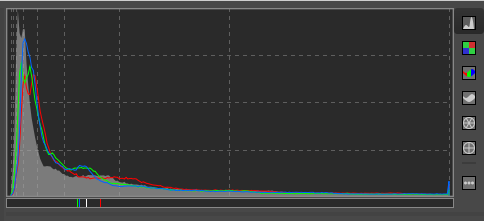