How do you professionals set a white balance when the things that are white (as in painted white) have a color due to the lighting? If I “correct” it to make the painted white things look white, the whole scene looks wrong. So do I just set white balance “by eye” or is there a technique to get an accurate representation of the scene? I hope this makes sense 
1 Like
I’d have shot a photo of a gray card or color checker under that light. Likely the walls are not neutral white. In the abscense of a gray card, do it by eye.
Hi.
Not exactly what you want to know, but it may add some context:
Agreed. Most materials are not neutral white and even if they were their properties may still make them unsuitable for white calibration. How the reference is taken by the camera matters too. Etc.
At the end of the day, do what looks good. If you have quality grey cards, colour charts or high quality materials you could make a DIY kit out of, and know how to set them up and work your camera profiling magic, then that would be the best bet.
In my opinion, the more you push the white balancing in post-processing, the more the image will distort, since we are working with simplistic matrix math to convert the colour ratios. If you couple that challenge with a huge colour cast, you may not even have enough detail to recover.
Some times I will take it to neutral with CC and then switch to custom if it does not go there…then I just adjust the chroma…backing it off to zero is no correction and lowering it is less and increasing it will correct even more based on the selected hue… I find you can usually reintroduce a pleasing amount of the natural light by taking the neutral starting point of CC and then dropping the chroma… it wont always work and you can also play with the hue but in the absence of a good reference you are kind of left with your eyes unless you know or guess at the temp of the illuminant present…
That is the whole point of white balance. The white things always have a “color cast” due to lighting. In general the human eye (and brain) adapts to this, especially when the light source is natural (cloudy day vs sunny noon vs sun set). But the adaptation is not complete, e.g. things look redish at sun set. When the light is even more extreme “colored” the compensation works only partially. So, all in all, this is more of a perception effect and cannot be completely corrected by physical methods (WB). A correction “by eye” is therefore not inappropriate.
2 Likes
Another reason that setting a “correct” white balance can be difficult is the nature of artificial lighting:
“traditional” white balance assumes ight with a spectrum close to “black body radiation”; while the traditional incandescent lights (those with a glowing filament) did produce such light, modern lamps like LEDs don’t.
And while your brain does correct for coloured light, that correction isn’t perfect. So even when perfect white balance is possible, you may want to move away from it to get the “feel” you want in your image (usually a bit on the warmer side of neutral, but that depends on your taste and the scene/image).
A final complication (but that’s more of a treatment artifact): if your image highlights are close to the upper limit, the white balance can push the red (and even the blue) channel into the “clipping” zone. That is, the values after white balancing are larger than the raw white point. That means that highlight reconstruction will clip affected areas to white (not uncommon with bright reds and yellows). Solution: don’t use hightlight reconstruction in such cases (I actually disable it in my “basic” style)
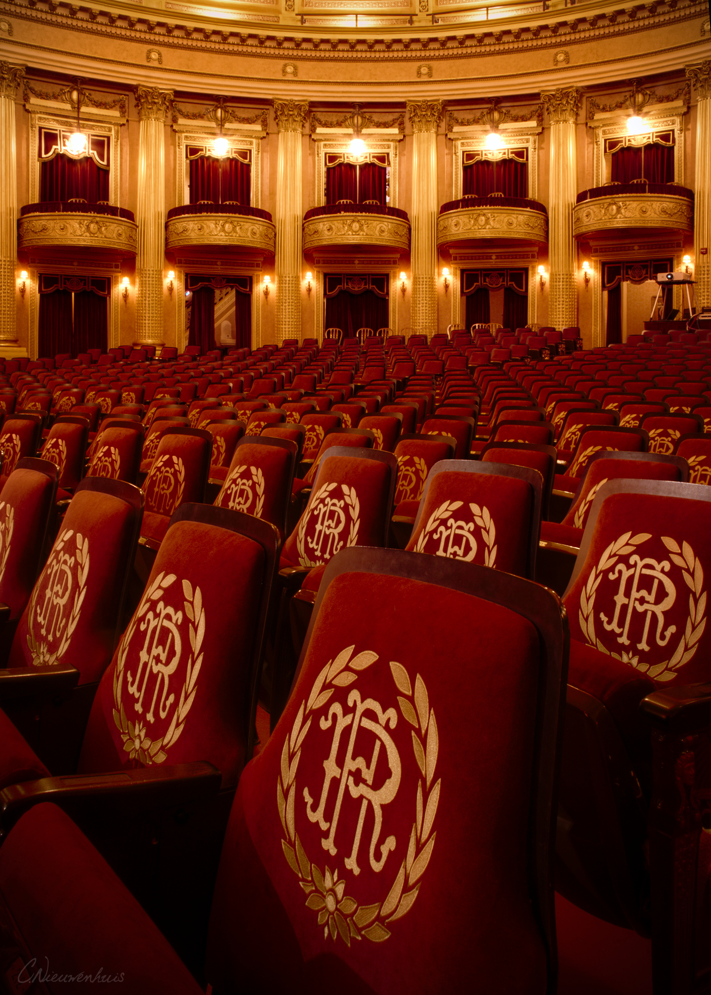
In that particular case, I wouldn’t neutralize the color cast. If you do, you’ll make the concert hall look like it would in neutral sunlight. But that’s never what it looks like in real life, so a bit of a color cast is expected and should remain in the image, IMO.
2 Likes
Yup. @Thomas_Do 's post outlines why this is - human color constancy is only partial.
Thank all of you for your comments. They are helpful and for the most part answer the question I asked, but I don’t think I asked my question the right way because something is still nagging me. I’m in agreement with the idea that white point is not an artistic setting, but rather a mathematical setting that allows other sliders and modules to do their thing predictably. If so, how does one determine this “mathematical center” for a scene that one wants to accurately represent in a photo but has no middle gray in the scene? I mean in a place where the lighting would colorize a gray card itself if one were used? Say there’s a red glow everywhere; how do I accurately reproduce the color of the glow in my photo if I can’t measure it?
Accurate assumes a lot of things, ie your camera capture the color profile your monitor profile etc etc and then your memory and perceptual interpretation. Unless you had a card either color or gray card you are always going towards something that is your best guess and pleases your eye if you have no true or approx reference for correction…at least IMO…
First off, the red light doesn’t “colorize” the grey card, which will still have the same reflective properties as under white light…
Further, everything depends on how you define “accurate”: representing the spectrum of reflected light as it was present in the scene would be “accurate”, but probably not what you want. On the other hand, representing the object colours as if they were illuminated with the standard light prescribed for Lab measurements would also be “accurate”, and equally not what you want (depending on the scene, of course).
The whole idea behind a white balance card (which is not the same thing as a gray card, the latter is aimed at standardising the exposure) is that you have a known colour in the scene, which can be used to correct for “non-standard” light colours. From there, you as the photo editor can decide which way and how far you want to deviate from that theoretically ideal situation. E.g. most portrait photographers I’ve seen posting tend to go to a slightly “warm” rendition.
In the situation you posed (red glow everywhere), I’d probably end up somewhere between a “daylight” (4300K) rendition and a “red light” rendition (the first showing the red glow in all its glory, the second showing the colours as if the scene was lighted with daylight ). And the final setting would be eyeballed, more than anything else.
Eyes and brain tend to correct for coloured light up to a point only, so at the time you would notice the strong red colour. But I’d be looking at the final image under fairly neutral light, meaning that my eyes and brain are not correcting for the extreme red cast, so leaving it in full force would be too much.
All that assumes of course that there is enough blue and green to have a chance at correcting the red cast. Not always certain in e.g. theatre lighting…
5 Likes