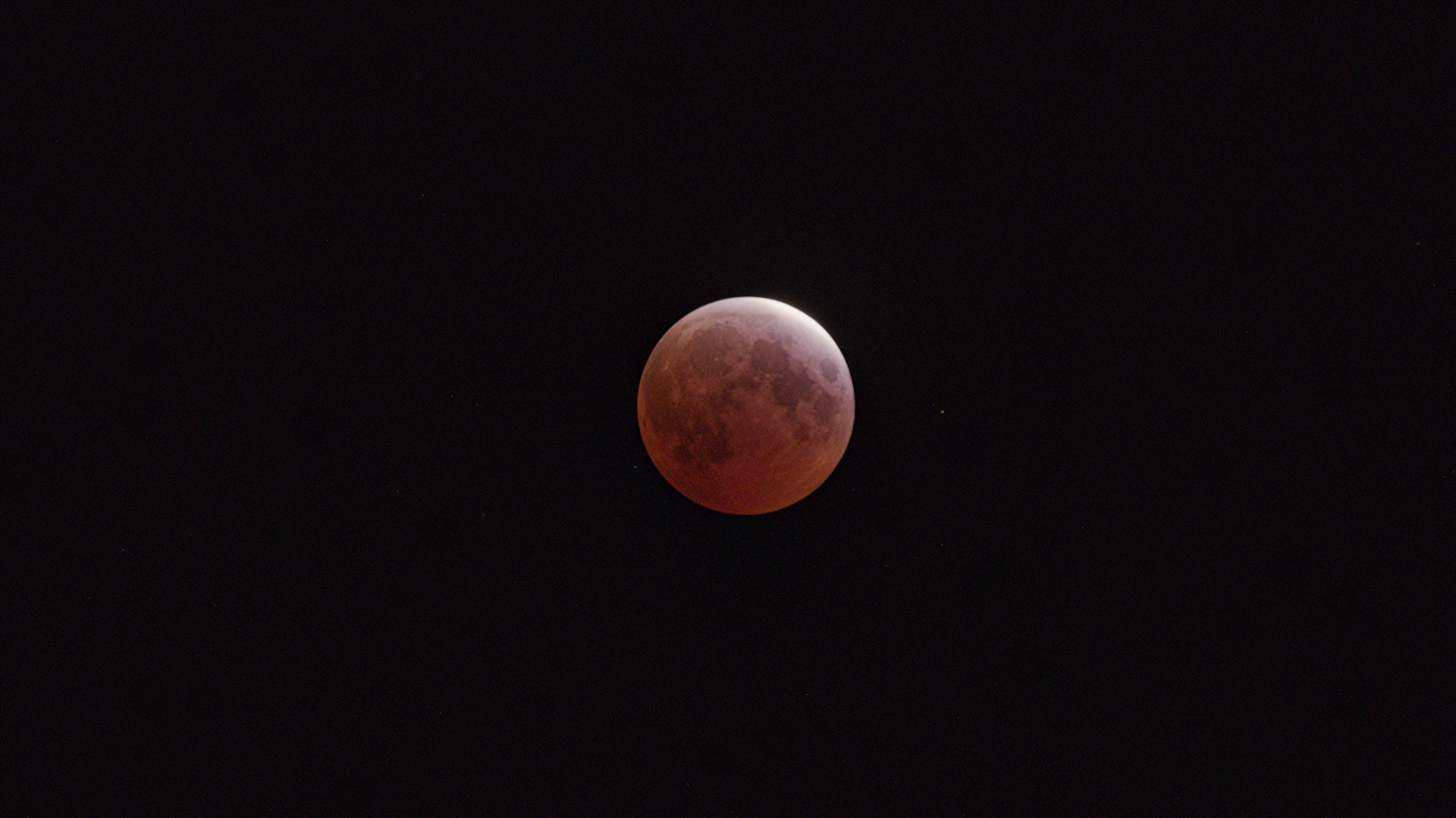
I was really surprised to not see any images here from the total lunar eclipse on Thursday night, so I’ll fill that gap. I recently picked up a new Sigma 100-400, and this was my first chance to do something with it, as well as my first time trying to “seriously” capture the moon. Lesson learned: even though the 100-400 is supposed to behave like a 150-600 equivalent on APS-C (the lens was ported from full frame land), it’s still puny for the moon mid-sky. And I wasn’t super happy with the focus I got (probably a me problem). Anyway.


22 Likes
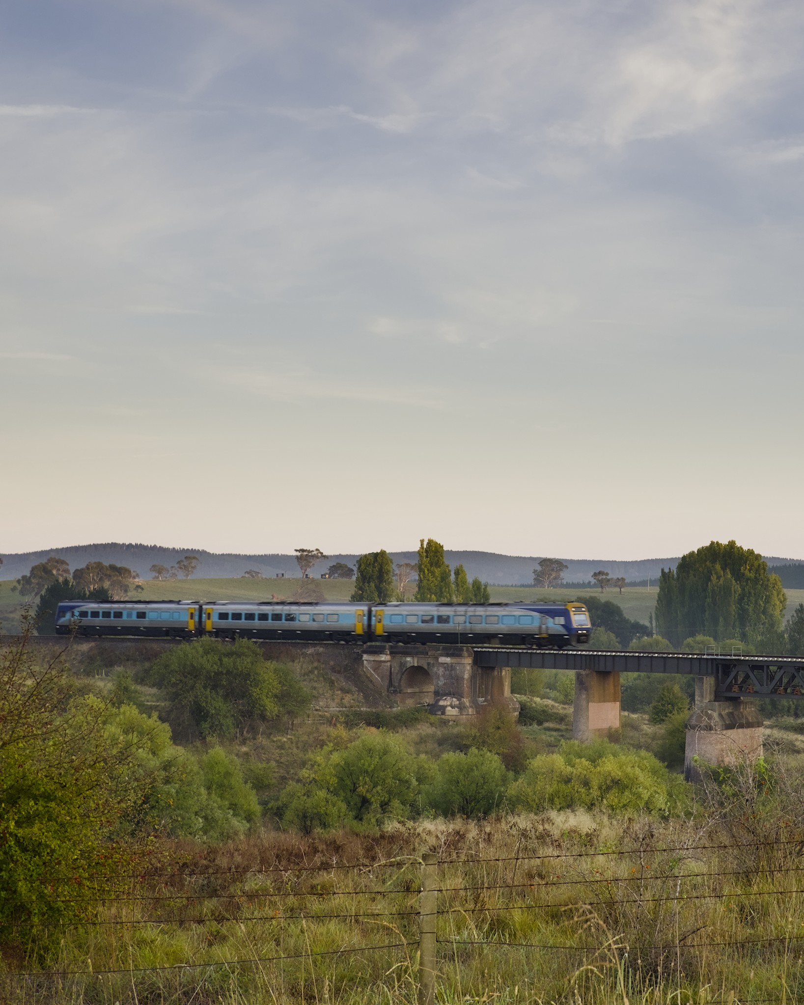
I’ve been taking a lot of photos with the phone these days, but a trip to the NSW Coast was an opportunity to take the camera out and leave the phone in the pocket.
I’m also on a challenge keeping to the one prime - 20mm on the Olympus.
I won’t lie, it’s quite a challenge to stick with the one focal length, but also satisfyingly constrained.
All processed using darktable.


13 Likes
And this morning’s sunrise.
I gave the intentional camera movement (ICM as the cool kids say) go too… don’t mind the effect.
All photos Olympus with Lumix 20mm lens, processed in darktable - while watching the Australian F1. ![]()


18 Likes
That’s definitely no birding lens, and yet you managed to capture some. Nice!
1 Like
On my 70D with a Sigma 120-400 and a 1.4x TC I get about 1000pixels on a moon diameter. This also means that the moon is moving at 8 pixels/second on the sensor so sets the lower exposure limit for a sharp image
4 Likes

I just “measured” using the crop tool and found I was getting moon diameters about 870-900 px. No TC, because my lens is apparently not compatible with TCs on X-mount.
Something I hadn’t even thought about. Likely a part of my lack of sharpness. Thanks!
2 Likes
It moves quote fast, a full diameter in 2 minutes, so if you want under 1px of move blur, the longest exposure is 120/moon_diameter.
5 Likes
I’m a bit of a fan of Jame Popsys’s style and quite like having something more in the landscape images. Birds make for a handy point of interest in the frame.
Also getting used to just the 20mm (40mm FF Equiv) frame of view is challenging. ![]()
1 Like
The cemetery at Logierait has some a Pictish stone, plus several interesting gravestones:


I am moderately satisfied with these, however I am going to post one of them as a “play raw”, to see if others can do better than I.
8 Likes
Found a jackpot location of Bald and Golden eagles and tried shooting them over two days…first time not great, lots of fuzzy images.
This last time I got much better results after changing some settings.
I’ve been shooting at manual focus for the last 7 months because my lens adapter doesn’t have the circuitry to drive the af motor…so I’ve cut back on wildlife photos.
But yesterday I put the body in burst mode, iso 400, and a min shutter speed of 1/800 and managed to capture some acceptable images.
Heavy crop and edited in dt 5.0. Using a max 200mm lens and subjects were over 60 ’ away.


17 Likes
Your pictures are very good, but I thought golden eagles were an Asian thing. ???
Thanks Tim, I’m only basing their identification on a quick search that identified both bald and golden eagles as being present in this part of North America.
If I’m wrong, it wouldn’t be the last time ![]()
![]()
1 Like
I had to check (I don’t really trust “local” names, just compare the US robin with the UK robin ![]() ), but golden eagles are present in most of the Northern hemisphere. In Europe, mostly in mountainous areas (Alps, Cevennes, …)
), but golden eagles are present in most of the Northern hemisphere. In Europe, mostly in mountainous areas (Alps, Cevennes, …)
1 Like
According to Wikipedia, it is “still” present in sizeable numbers in Eurasia, North America, and parts of north Africa. So, I was partly right, but mostly wrong. ![]()
1 Like
So it might actually be the first time? Well done! ![]()
1 Like
@luator I must confess that I overlooked your watch photo. Not the type of composition that certain watch photographers would like, but I do and that is what matters.
Particularly, I like motion blur of the second hand (do not correct me, @martbetz!). Shows the flow of time on the timepiece.
1 Like

Now this is the second hand of a second hand watch! (but I think that rather belongs to the other thread).
I agree with you, I have another shot exactly the same but a few seconds earlier without the hand in the frame. First, I wanted to use that, as the lettering is less occluded, but then discarded it, as it felt much more lifeless and boring in comparison.
1 Like
