Parametric masks for Color Calibration with multiple light sources

Several threads already discuss the color grading of scenes with multiple light sources (see *links with example pictures in the threads below).

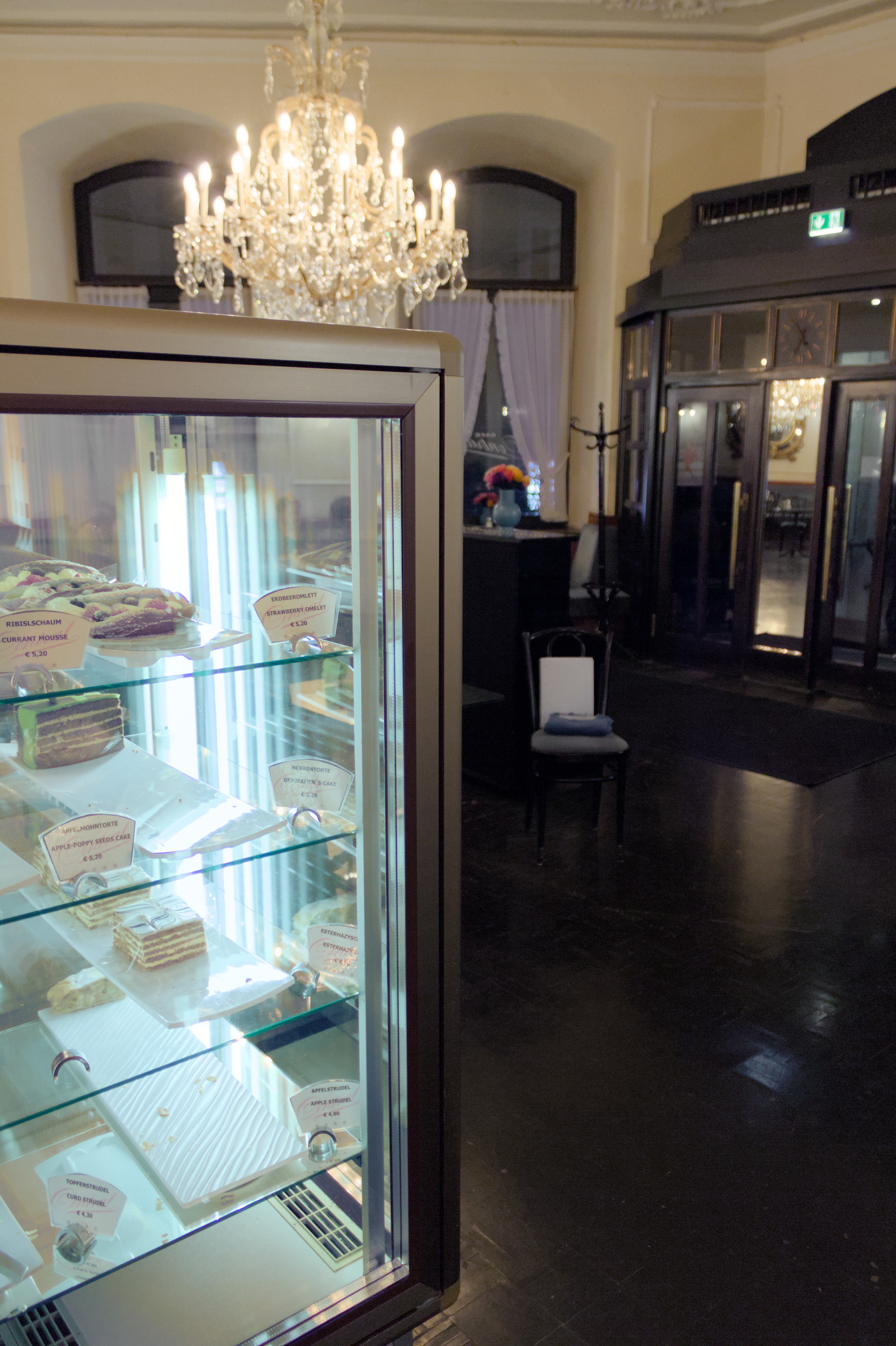
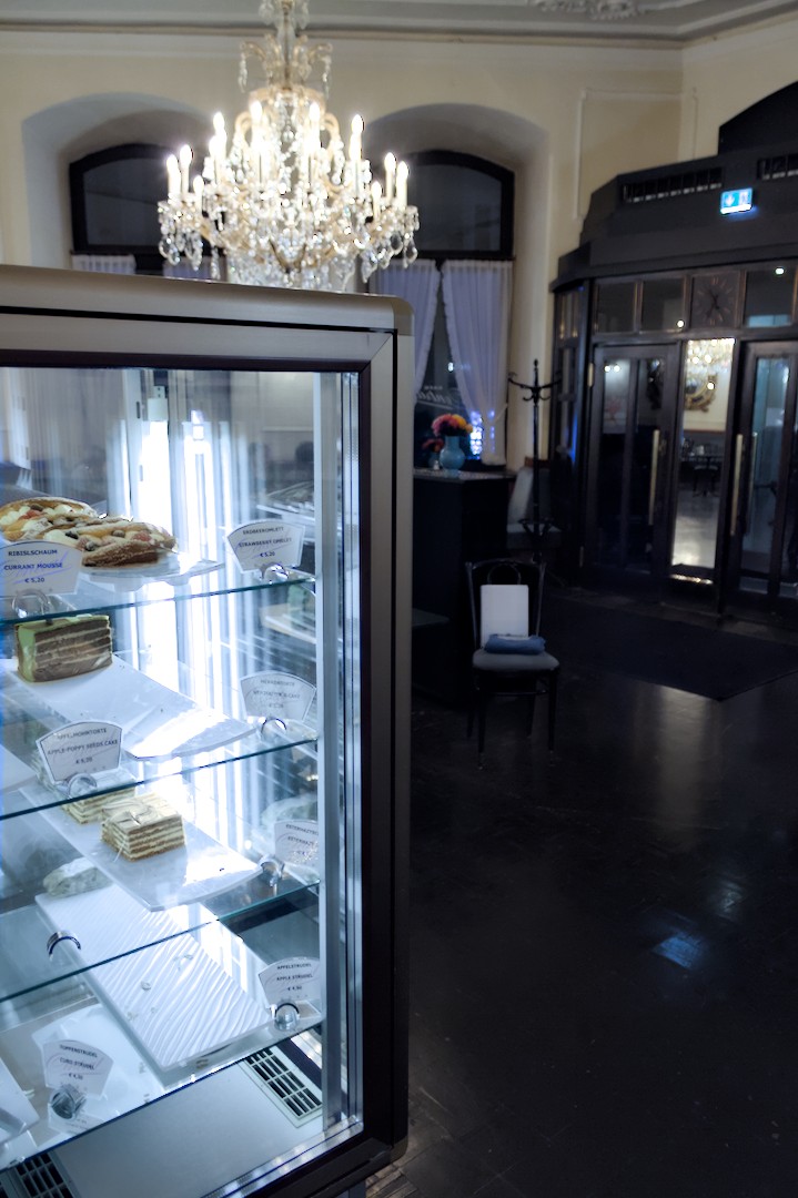
The assumption: Tungsten light inside a room, mixed with limited/smaller zones with daylight from windows or a white-light-colored illuminant. Of course, this also works in night scenes of tungsten streetlights with single white LED lamps from cars.
The problem: Normal whitebalancing (i.e. using one instance of color calibration) pushes the white light into blue, partly even out of gamut.
From the paper below (Hsu et al. 2008), you’ll notice that Adobe and even the MIT are working on this problem with complex algorithms, but I’d like to try a more amateurish solution - which currently works only partially.
Note that other proposed DT solutions have focused on desaturating all blue areas with either gamut compression, color zones or rgb primaries.

I don’t know if this has already been proposed elsewhere, but my plan would be to use two instances of color calibration, with the first correcting for tungsten light, and the second one correcting for the blue zones, limiting that instance with a parametric mask.
I find this more feasible than directly including a parametric mask (to filter out white light areas) in the first and only instance - since I don’t know any way of filtering for white light (instead of any specific hue) with our current filters.

After the first instance of CC, I usually meet the following situation:

Title: After 1st instance of Color Calibration for warm light Originally under warm light Originally under white light
Gray object gray medium blue: correct back to gray
Blue object medium blue: do not correct back to gray deep blue: correct back to medium blue

The specific problem is that both a blue object in warm light AND a gray (or non-blue) object in white light end up as “medium” blue after this step.

This brings me to the challenge to fine-tuning my parametric mask: While I can limit the “blue filter” to areas with a high saturation and high luminance (to tackle at least the more extreme cases of color shifts), this corrects “fake blue” of white light areas only halfway. If, on the other hand, I set the limits of saturation and luminance lower, real blue objects (under warm light) will be affected too.

This compromise could be avoided if parametric filters could “hark back” to the moment in the pipeline both before and after the first instance of color calibration was applied, allowing me to only select only those areas not affected by the warm light (or rather, bloomed over by the white light with its broader spectrum). Of course, the current philosophy is that DT modules are regarded as isolated blocks.

Is this currently possible, would it be a desirable github request, or are there better solutions?

*Other threads with similar problems:

try a raster mask of the first instance of parametric mask with the second instance and invert the mask. Maybe provide an image as a playraw challenge.

6 Likes

I do what @Terry suggested. I use the exposure module to create masks of the seperate areas, then use the raster masking option in each of the color calibration instances.

I find keeping feathering and blur to the absolute minimum is (often) necessary. If using a shape, keep the feather size as small as possible too. The transitions from feathering can make for really bad outcomes.

3 Likes

First of all, thank you both for the hint about raster masks! I was weirdly unaware of the possibility of doing this.

Before you read the rest: I just took two pictures and did a quick edit with my bad usual routine. Should I post that here or as a separate thread in play_raw?

Regarding raster masks: I’ve tried now, but I just can’t get it right.

  1. If I create a mask within the first instance of color calibration (or before, using Exposure):
  • It is hard to isolate areas illuminated by pure white light (an open glass cake fridge with fluorescent light) - maybe even because the general warm light is also shining in there. Rather, these areas only come out well-identifiable as (false) blue if I apply the first instance of CC indiscriminately.
  • The same goes for isolating blue objects (clothes) under warm light: Before the first instance of CC, the colour is hardly distinguishable from the rest of brown-ish colours resembling each other (when I try to use the hue channel of JzCzhz).
  1. This is why I’d need to compare or contrast the resulting blue areas with whether they were more white-ish or brown-ish before the first instance. My problem is that you (seemingly) cannot form intersects or otherwise modify raster masks in DT.

At this point I would post something and see what folks can do to it or what you have been able to do so far…

1 Like

OK, right, here we go.
Main file:
IMG_0136.CR2 (21.8 MB)
IMG_0136.CR2.xmp (11.2 KB)
Additional perspective, with the paper turned away from the white light source:
IMG_0129.CR2 (21.0 MB)
IMG_0129.CR2.xmp (12.3 KB)

I’ve added a white block of paper and a blue sweater to demonstrate the problem that with my current (bad) method, even “real” blue under the warm light is getting desaturated. The effect is similar if you crank up gamut compression or use rgb primaries instead of a second instance of CC.
It is very important to fully correct the very warm light from the chandeliers.

Main file:


Additional perspective:

All files are licensed Creative Commons, By-Attribution, Share-Alike.

1 Like

For what it’s worth, this technique was discussed in a video years ago by Aurélien Pierre, the author of the module. Unfortunately, he has recently removed all his darktable videos from YouTube.
The technique is also mentioned in the user manual, but no examples are provided:

It is also worth noting that, unlike the white balance module, color calibration can be used with masks. This means that you can selectively correct different parts of the image to account for differing light sources.

To achieve this, create an instance of the color calibration module to perform global adjustments using a mask to exclude those parts of the image that you wish to handle differently. Then create a second instance of the module reusing the mask from the first instance (inverted) using a raster mask.
(darktable user manual - color calibration)

2 Likes

I tend to use a parametric and drawn mask for situations such as this. The parametric mask to find the blue-light areas, with a large blur and feather to cover the area completely. And then a drawn mask to exclude other blue objects in the scene.

It usually takes some finagling to get it right. But the initial parametric mask is usually pretty good for the main subject.

3 Likes

If the areas are more easily discerned after processing, you can try using the output sliders:

Two sliders can be shown for each associated data channel: one that works on the input data that the module receives and one that works on the output data that the module produces prior to blending. The sliders for the output data channels are hidden by default and can be shown using the show output channels option in the blending menu.
(darktable user manual - parametric masks)

Also, have a look at the great work done by forum members on my problematic stage lighting shots, involving a mixture of techniques:

2 Likes

Sorry it took so long for me to get back here. I just remembered today to check back.

This was a very quick and dirty edit, which is normal on my first pass of any image. You can see I did not use the normal exposure module mask-thingy. I did use some drawn and parametric masking in Color Calibration.

I started with the background room since you mentioned the warm light really needed to be corrected. I balanced on the trim near the ceiling because that is often a flat white paint that contrasts with the wall color (to make it pop). I am assuming that the walls are not actually white, but rather a beige/tan/slight orange to begin with…again only because I saw this a lot when working in the trades.

That does make everything in the case very blue, so a quick and dirty mask in another Color calibration module using the light as the balance. I needed to modify with hue parameter to remove some of the background wall you can see through the case…and I desatrated to get something more pleasing.

You will see a 3rd Color Calibration instance where i drew a mask around the items in the case because they were looking wierd.

I did NOT fix all the blue artifacts in the plastic pieces inside the case. You can do that with Color Calibration or Color Balance and some drawn masks ( or use a pixel editor like GIMP) easily enough.

These are not in order, so use the “show mask” to differentiate what is where.

Finally, I slapped some contrast, color grading, and saturation just to give an idea of where it will go.


IMG_0136.CR2.xmp (16.6 KB)

2 Likes

What I can say is that the cake looks gorgeous with the effort you put into those drawn masks.

And yet he left “geektable 4.0 : the future is backwards”. Quite something…

1 Like

Combination drawn and parametric masks are pretty much unavoidable in these situations. You’ve made very good parametric masks, just adding a few roughly drawn blobs will get you most of the way.

Apart from drawn masks on your CC1 module. I’ve added a colour equaliser instance to boost the blue sweater and vase, and adjusted CC1 for the display case to remove the green tinge. Otherwise, kept to your original sidecars:


IMG_0129_01.CR2.xmp (22.2 KB)


IMG_0136_02.CR2.xmp (26.2 KB)

Addressing your other post, the challenge with most of these scenes, and your test shots in particular is that there was no “white light”, let alone pure. Pure white light is daylight (broad spectrum blackbody radiation attenuated by the atmosphere.) The chandelier is a very warm white, the display case is slightly cooler. The CC module measures approximately 2300K and 4000K respectively. So “white” objects under these lights should not be neutral (R=G=B), the amount of tint is a matter of taste and intent. LEDs and fluorescent tubes have peaky spectrums, though the lights in the test photo isn’t too bad in terms of colour rendering (only a slight tint when corrected to the correlated colour temperature), colours still look artificial and lacking colour contrast. The final problem is that there isn’t much light to begin with, and not much blue light in particular.

The sweater looks grey because it is grey (with a blue tint) per the RGB ratios, it appears as a blue object only in the immediate context of the scene. Localised edit with drawn and parametric mask can help you bring the sweater to the blue you feel it should be. Which is probably bluer than it actually was, if that makes sense.

2 Likes

You can get not a bad starting point even with just agx…then you could from here improve the display and the room …

IMG_0136.CR2.xmp (12.0 KB)

Maybe a little tone eq

1 Like

After I learned about the hidden output sliders, I started trying to move into one single instance of CC. This saves the step of selectively reversing the effect of CC1, often also catching “real” blue and being forced to use far too much gamut compression, which effectively de-saturated all blues.


IMG_0136_03.CR2.xmp (12.8 KB)


IMG_0129_02.CR2.xmp (12.3 KB)

Almost losing my head over numerous new test profiles on different scenes, I started using an excel sheet, noting the varying ranges on certain notable points (uncorrected, overcorrected etc.). If you want to repeat/improve this, don’t meter from reconstructed “raw-clipped” areas!

A general challenge was the “open” ceiling of scene-referred parametric masking:
The best indicator to filter out those areas not originally affected by the warm light is a comparatively high value in the (output) chroma (cz) channel.
The challenge arises if I want to apply this filter (with varying values of the global warm light source) in other scenes: Different scenes and main light warmth will lead to lower or much higher chroma values than in my test image. As far as I get it, at this stage (display-referred, before the tone mapper), there is no “correct” maximum value above which I could generally cut off the effect of CC.

My conclusion is currently that I had to turn the mask into something more non-linear by setting the mask opacity slider (i.e. shifting its tone curve) to -99% and adjusting the boost factor of the cz channel “as high as possible” without losing the intended effect with regard to different test images. That way, I thought, the effect (of excluding increasingly higher chroma values) could work with increasing intensity - flexibly applicable in different situations - instead of a random cutoff point. It also results in a faster increase in low-chroma areas, compared to the linear rise of the normal min-max approach. Yet, I could be wrong about this, but I tried with zero opacity change and just couldn’t get the same results.
Additionally, I started adding a luminance filter with the Jz channel to weaken the filter effect on brighter areas and allow it to work more on darker ones too.

For me, this filter works for a number of scenes with warm lighting, including night street photography. Just don’t put the light source value much lower than what would be appropriate via metering!
I’m currently working on a combination of two CC instances to attenuate the golden light and blue shadows in “golden hour” photos. There, you potentially need to adapt not only the color of both light sources, but also the opacity of the reversed mask in CC2.

This sent me down a rabbit hole. I started reading too much about our eyes’ ability to maintain “colour constancy,” and now I question my own perception.

One thing that also gave me trouble understanding were curtains with warm light shining on them from the inside, or scenes with windows where a faint mirroring light overlays the view outside: In both cases it took me a while to accept that - even despite the relative whiteness of the raw image in those areas - these may be bluer without the curtain or mirroring window pane.

I’m looking forward to agx, but currently I’d have to catch up with about half of the ongoing discussion thread.
What I’d like to know is whether it will contain a “highlight reconstruction” component that allows you to let highlights fade into pure white.

Graceful and controlled fade to white is what AGX is all about… :slight_smile:

1 Like

Thank God!