Show me your artistic face!

RAW: het.fortuin.rw2 (18.6 MB)
License: CC BY-NC-SA 4.0

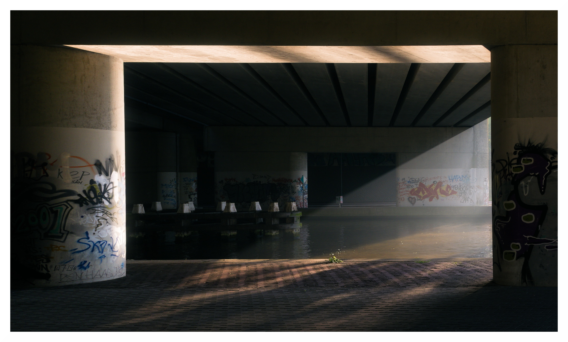
Base edit was done using RawTherapee then pulled into Krita to apply a gradient map based on a self made, svg based, gradient (script I wrote that use ImageMagick). Result pulled into G’MIC to apply Pencil Portrait to give it a slightly drawn feeling and to align the pen strokes with the way the sun diagonally divides the frame.

As the title of this topic suggests: I would love to see artistic and/or unconventional edits. Step out of your comfort zone, I surely did…

Then again, this is Play Raw, so do what makes you happy!

7 Likes

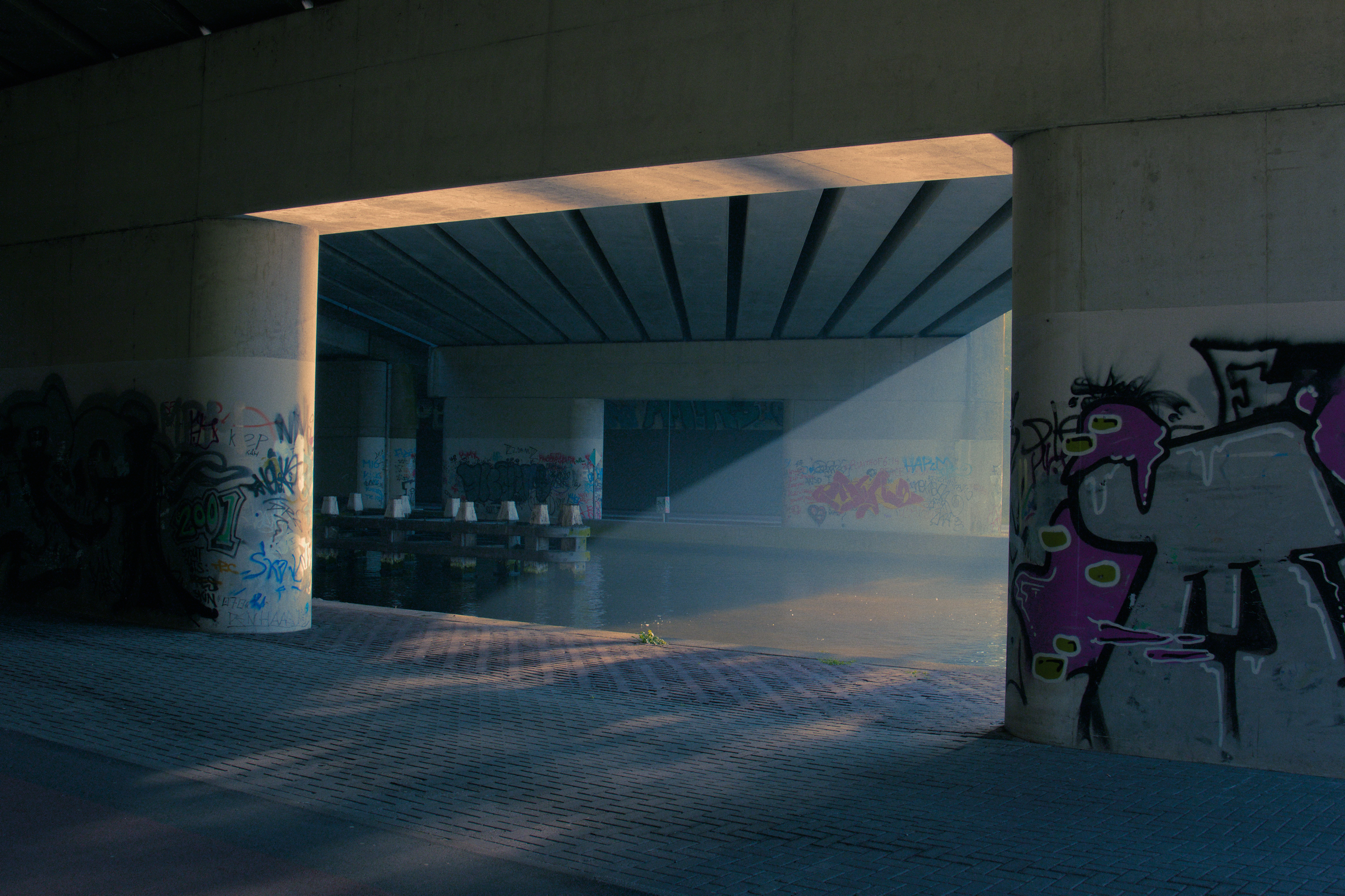
Single handed couch tweak. More aggressive colour grading than I would normally do. Went for a soft feel. Mainly local edits with log and vibrance warm/cool.

het.fortuin-pastel.jpg.out.pp3 (18.1 KB)
RawTherapee, version 5.8-2738-g8ca07e858

edit: forgot to mention i cropped so that the diagonal of the light becomes parallel to the diagonal of the image and shifted the frame to the left.

10 Likes

Lovely!

Here’s mine – thanks for sharing!

14 Likes

@nosle: Nicely done.

@agriggio: That perspective change is rather nice! I assume this is an ART edit.


het.fortuin.rw2.xmp (20.5 KB)

3 Likes

het.fortuin.pfi (34.7 KB)

4 Likes

Experimenting with some out-of-the-comfort-zone color grading.
Thank you for the prompt and the nice image.
With darktable 3.5


het.fortuin.rw2.xmp (11.5 KB)

I couldn’t resist and I made a second one with inverted colors and a different color grading.


het.fortuin_01.rw2.xmp (11.1 KB)

2 Likes

Everything very restrained here. A little more pizzazz …

het.fortuin.rw2.xmp (9.6 KB)

5 Likes

Nice!

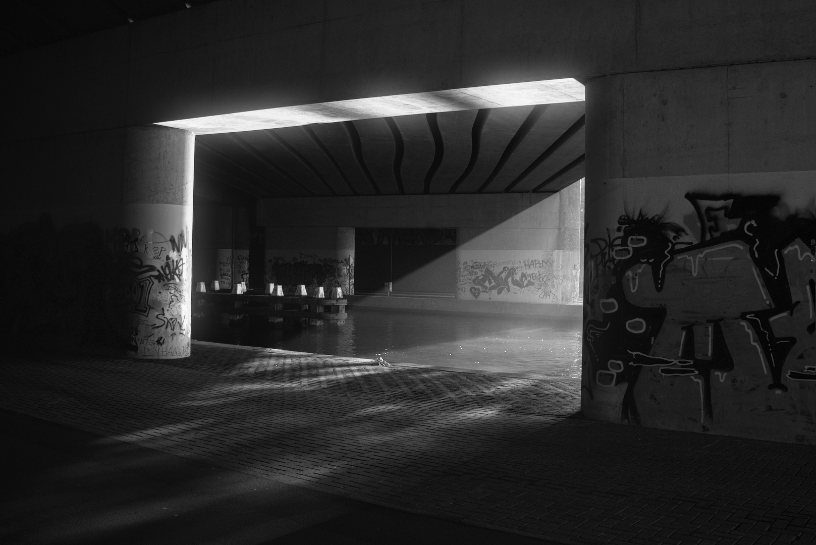
Reminds me of the solarization experiments I did back when I had my own darkroom. Those where B&W, but I imagined the colour version to look a bit like the one you just created. The split that the diagonal line creates due to the dark/light is rather interesting.

I’ll have to keep this in mind when I ever need to create a silver or gold glow on something.

1 Like

Another red and green version. :slight_smile:
With darktable 3.5


het.fortuin_02.rw2.xmp (12.3 KB)

And an even grungier pinkish-red, partially inverted and faded:


het.fortuin_03.rw2.xmp (14.6 KB)

2 Likes

Exactly same workflow as my take Sunset on Brusvikken - Darktable filmic vs sigmoid - #57 by afre. Maybe different colour space on PF export…?

Raw PhotoFlow.
Play G'MIC.

Second one in particular looks like expired film, nice work.

Trying out my new aerochrome film stock

artistic-face-het.fortuin_01.rw2.xmp (13.6 KB)

dt 3.4.1

3 Likes

@arctic : Both are nice, but I think I prefer the first one. Both are nice examples that show that adding “grain” (digital noise) can make a positive difference.

@afre : That is a remarkable difference between end results if the workflow was identical. I initially missed your second Sunset on … edit, which is really nice and soft by the way and the above result doesn’t come close to that. Interesting…

@Soupy : Artistic complementary (or the RYB model) works well here doesn’t it?

1 Like

I saw something in the original that I also wanted to explore but did not in my first edit. Inspired by all the other edits I decided to give that idea a go.

Toxic messenger:

RawTherapee + Krita

4 Likes

Depends on the stats of the image. It is simply a bunch of curves, denoising, blending and sharpening. With a few more steps:

1 Like

RT 5.9 Dev.
het.fortuin-1.jpg.out.pp3 (37.1 KB)

1 Like

Love the picture. This screamed out to me for this anamorphic lens flare but I could not create it. Has anyone a good tutorial how to create anamorphic lens flare with GIMP or similar?

1 Like

Is this what you are looking for? I can teach you how in RawTherapee Dev.


anamorphic.jpeg.out.pp3 (27.8 KB)